The network for creativity
Join 1.25M professional creatives like you
Connect with clients, get discovered, and run your business 100% commission-free
Creatives on Contra have earned over $150M and we are just getting started
Back to feedPost
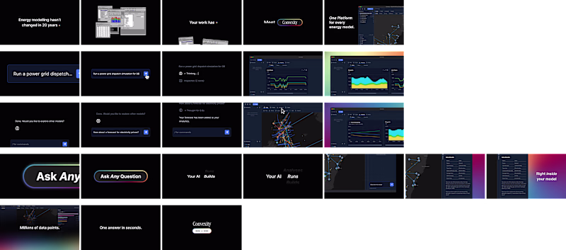
Taste Test
Working on a new project and can't decide which services section works better.
☀️ Light or 🌙 Dark?
59 voted
27%
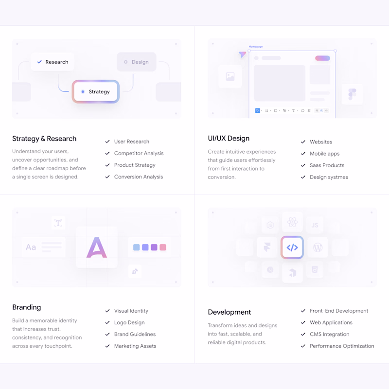
157 voted
73%
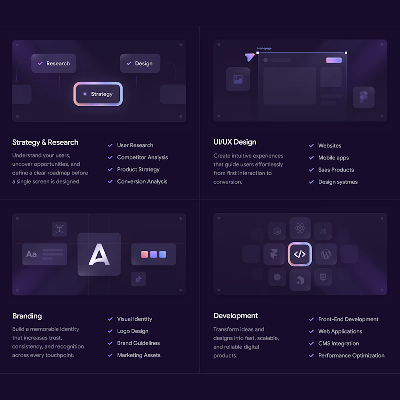
216 votes
Closed
dark design
The Dark section feels more responsive.
Dark section looking nice.
light always glow 😉
Am going for the dark theme
I love Dark
I will prefer dark option because in this option all the elements are visible and futuristic.
The dark theme look's more interactive
white one looks classy 😎
The Dark looks perfect 😊
Looking very clean! 🪞I struggled to decide what to focus on in the light version. But in the dark version my eyes moved smoothly from image, heading, list, and lastly text. UI/UX card didn't grab my attention though.
i will go for the dark section
The dark section draws my eyes more
I love the dark theme
nice work~
great work
The dark theme feels much stronger. It creates a modern, futuristic vibe and improves the visual hierarchy, making it easier to see the cards. The images also stand out much better, while in the light version they tend to blend into the background and lose visibility.
Wow, they look so different in vibes:
Dark: elegant, luxury
Light: optimistic, clean
Let users decide
The dark one looks amazing!
Very polished design, great job 👌 (Both)
The Dark section looks much better in terms of readability.
Great job! I prefer the dark version, it looks more striking 🔥
In my opinion the light version is more attractive
I am working on similar project and this is what i have done so far.
Awesome
The dark one is looking more modern and professional
Dark looks way better, but honestly I am always a little biased for dark mode.
The network for creativity
Join 1.25M professional creatives like you
Connect with clients, get discovered, and run your business 100% commission-free
Creatives on Contra have earned over $150M and we are just getting started
Related posts
New dark mode storyboard 🌙 The client asked for simplicity: Which is more simple while still being effective?
30 voted
94%
2 voted
6%
32 votes
Closed
Going Dark here. The color gradient hits in the right spots without pushing too far into moody territory, which usually works better when clients are comparing slides in a meeting.
Working on a new website for bem, would you like to see the brand identity behind it?
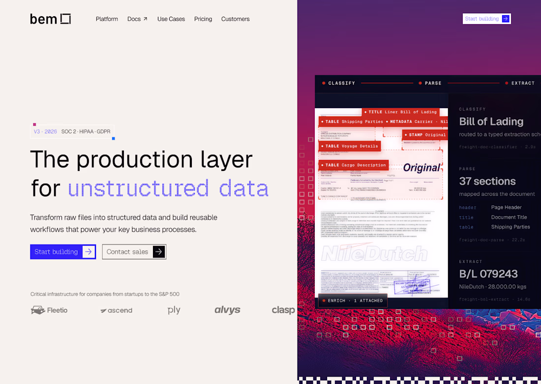
Yeah sure I will love to
Stop making flat Figma prototypes — make them feel 10x more realistic! ❌
Last call to join the Config Makeathon and get a chance to win $100k!
This single feature just changed my entire design workflow forever ✨
Trending
Claude
Claude has entered the design space. How are you using Claude Design?
Contra University
Learn from expert creatives how to earn more using next-gen AI tools.
MagicPath
The canvas is infinite, and exploration is becoming the workflow. How are you using MagicPath?
creativeaiflow
Creative AI workflows are evolving. What tools do you use, and what are their strengths and weaknesses?
freelancerlife
Freelancer life is wins, pivots, and everything in between. What’s yours right now?