The network for creativity
Join 1.25M professional creatives like you
Connect with clients, get discovered, and run your business 100% commission-free
Creatives on Contra have earned over $150M and we are just getting started
Back to feedPost

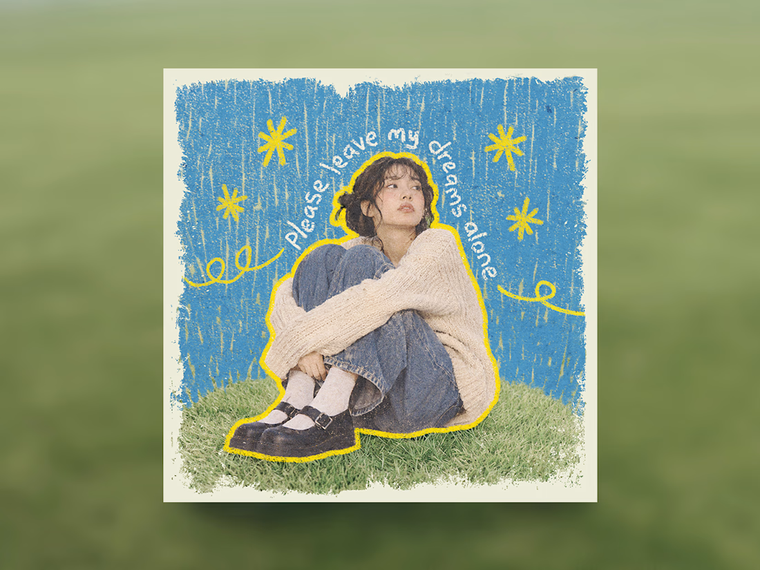
Some people think having text on an album cover is tacky.
But I think it really comes down to how the typography is incorporated.
There's a difference between simply placing text on an image and making it an integral part of the artwork.
So I decided to explore this idea by designing a fictional album cover of my own.
For this concept, I used playful colors, handwritten text and hand-drawn elements to capture the album's imaginative and whimsical personality.
Rather than treating the title as a separate element, I wanted it to feel like a natural part of the overall design.
What do you think?

Nice work!


Treating the handwritten title as part of the artwork rather than a label on top is the right call. Email designers fight the same battle with hero images: text baked into the picture looks great until an inbox blocks images. Which came first for you, the lettering or the collage?

nice design

The hand-drawn title curving around her is what sells it. It reads like part of the drawing, not a label on top. Did you sketch the type first or the illustration?

The handwritten lettering and crayon textures give this such a playful, personal feel.

Love the sketch texture. Text fits seamlessly, nothing tacky about it. It's lovely! ✨

I agree with you, Karina! 🎨 Text feels tacky when it's just placed on top of an image, and it works when it belongs to the artwork. Handwritten lettering and hand-drawn details are a smart way to match the playful, whimsical mood. Thanks for explaining your thinking behind it!


They stand out well, not every product needs a futuristic A.I. aesthetic. Being genuine with your work builds trust.


I think the key is making typography feel like part of the artwork rather than just adding a title on top. Your playful colors and handwritten elements create a natural connection between the music's personality and the visual design.

Really nice work.

This is so good! Love it. 🙌 😊

I love this! ❤️ Typography can become part of the story rather than just text on an image. Such a creative approach to album cover design


You are right

Apart of your creative album cover, your caption is amazing

Great designs
The network for creativity
Join 1.25M professional creatives like you
Connect with clients, get discovered, and run your business 100% commission-free
Creatives on Contra have earned over $150M and we are just getting started



Related posts


Is text on album covers really tacky?
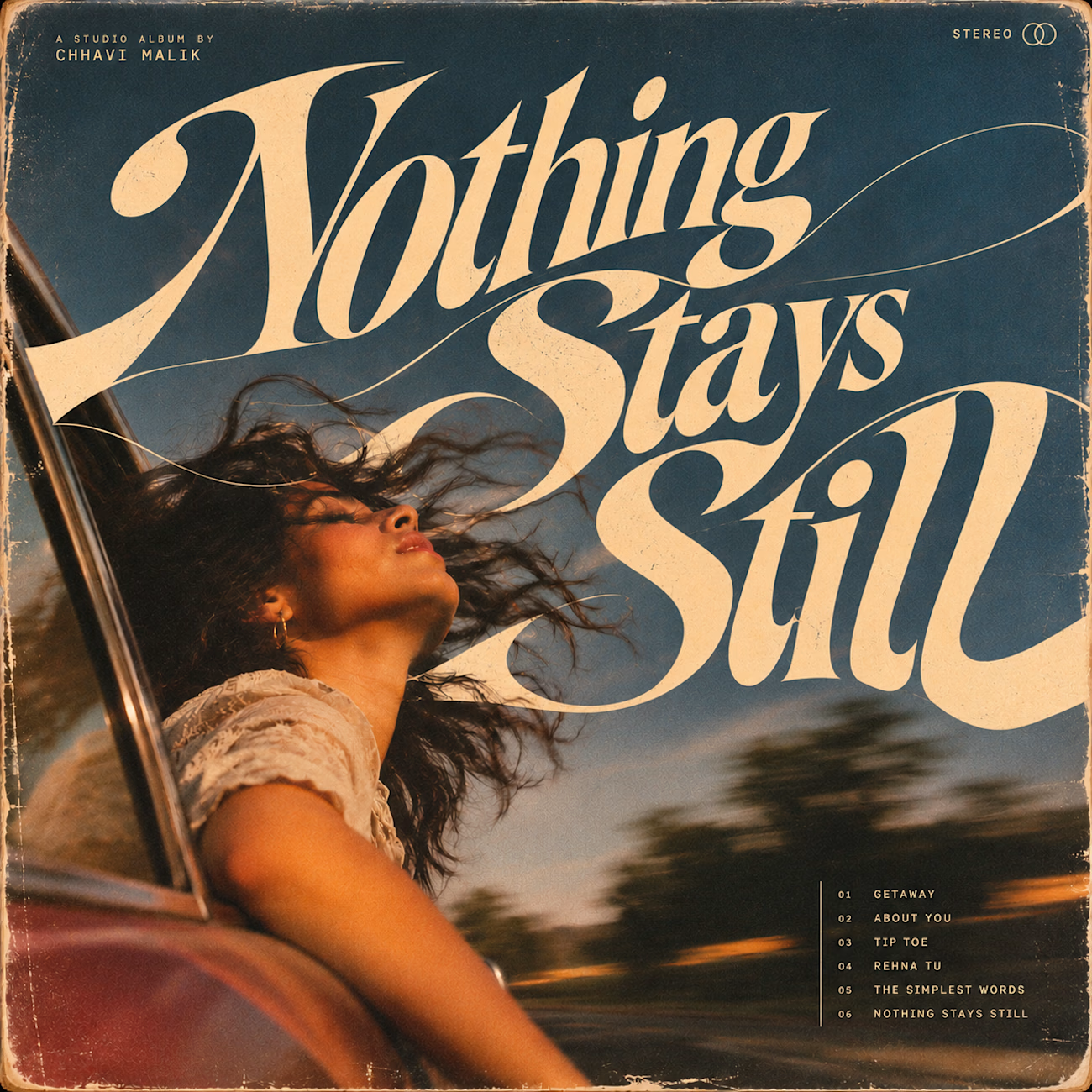
This question has been doing the rounds on X and I have to say, I'm firmly on the other side of that argument. I've always loved seeing typography become part of the artwork rather than just a title sitting on top of it.
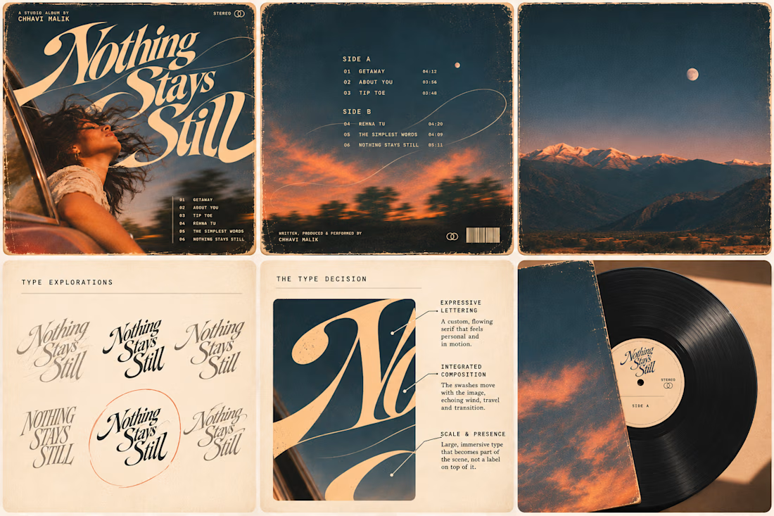
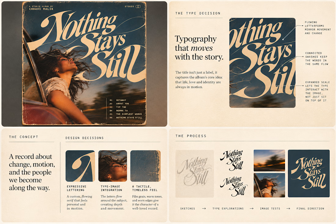
So I wanted to put that idea to the test with an imagined album called Nothing Stays Still, inspired by change, fleeting moments and everything in between:)
I played around with the lettering until it felt expressive, a little restless, and inseparable from the photograph.
Because I think badly considered typography is tacky. Typography itself? Give it a chance :)
What's an album cover where the type really makes it for you?


Text on album covers is tacky? Whatever 🤌🏼 Vienna Starlight Boom 😒
Typography can ABSOLUTELY make an album cover.
During the pandemic, I got obsessed with album cover design. I'd spend hours looking at covers, researching the designers behind them, and trying to understand the decisions and creative processes that made them work.
It was one of those design rabbit holes I could never get tired of. 💀
I'm bringing that interest back with a new cover inspired by the music I love, including Neil Young's Harvest, Bandalos Chinos' Paranoia Pop and Uncle Acid & The Deadbeats' Vol. 1.
Looking at these alongside other great album covers, one thing stands out: typography CAN be the image!
I took inspiration and designed one as well!
What's an album cover where the typography is impossible to separate from the artwork? Show me your favorites.
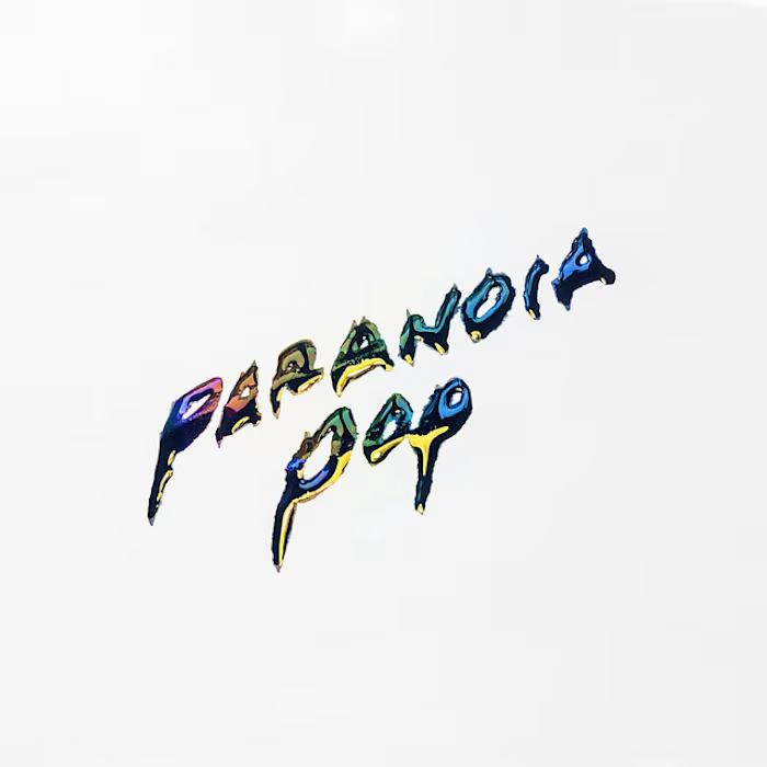
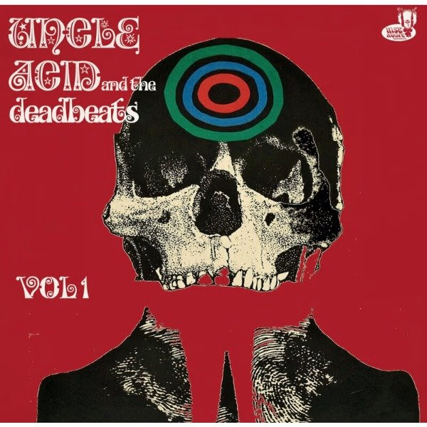
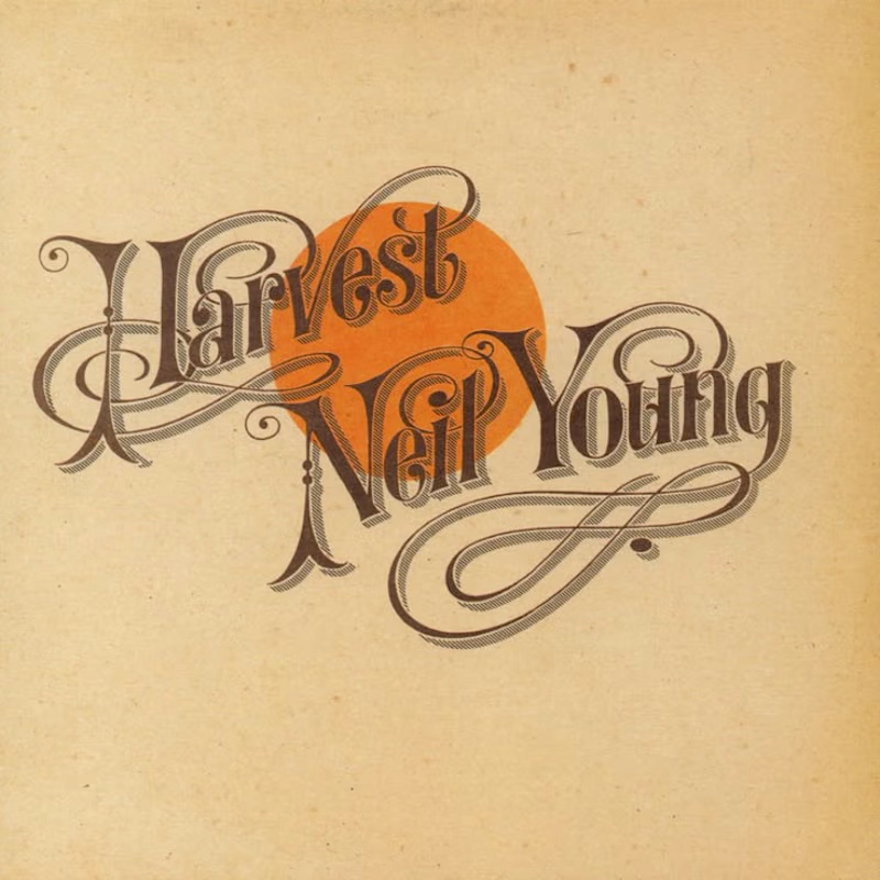
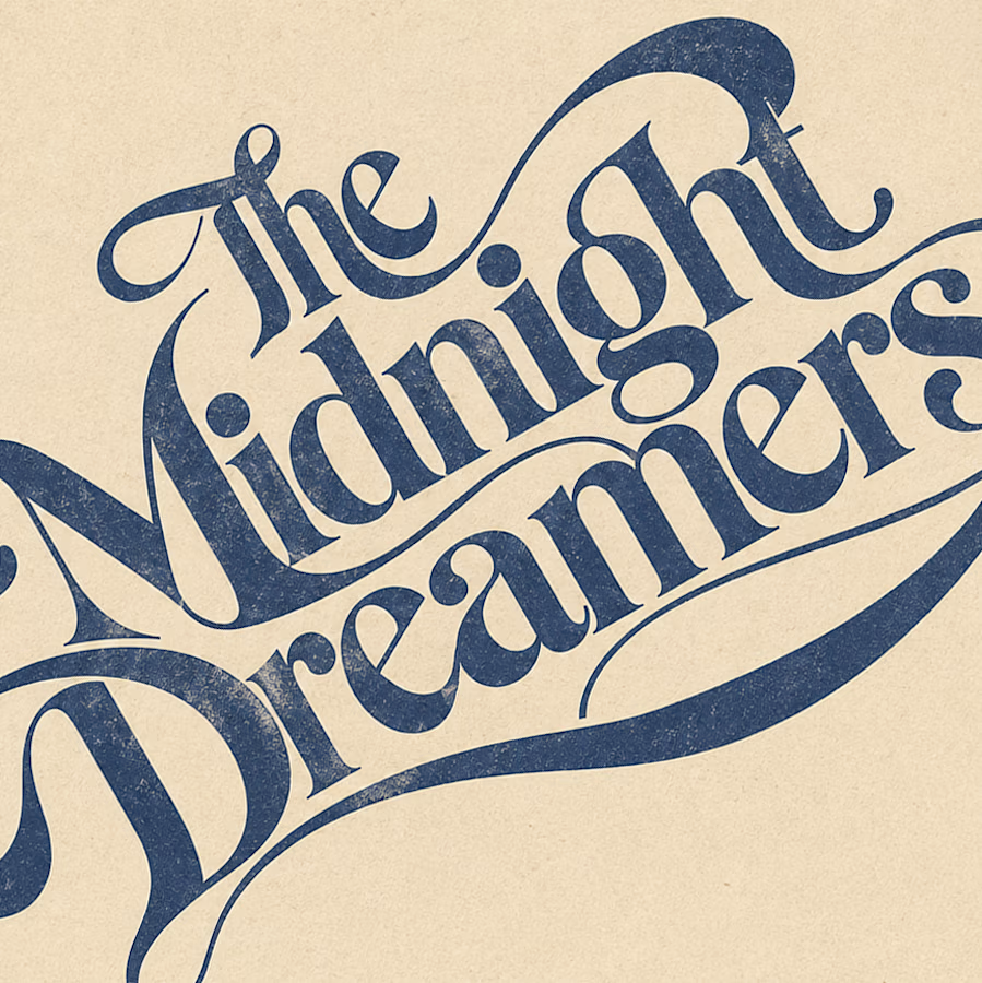

Reid Miles' Blue Note covers are my pick, where the cropped oversized lettering carries as much mood as any photo could. Your Paranoia Pop treatment has that quality too, the letterforms feel poured into the image rather than placed on it.

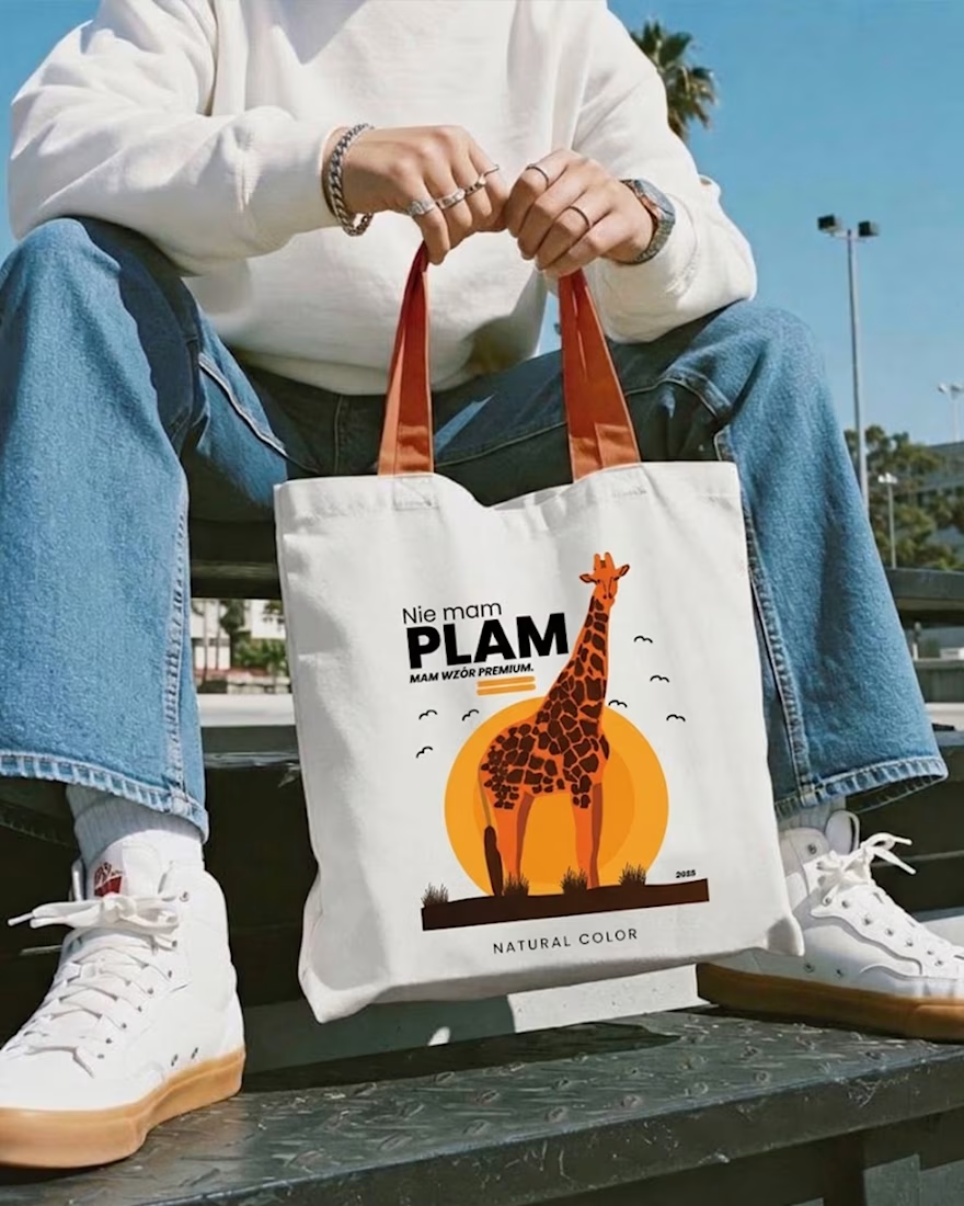
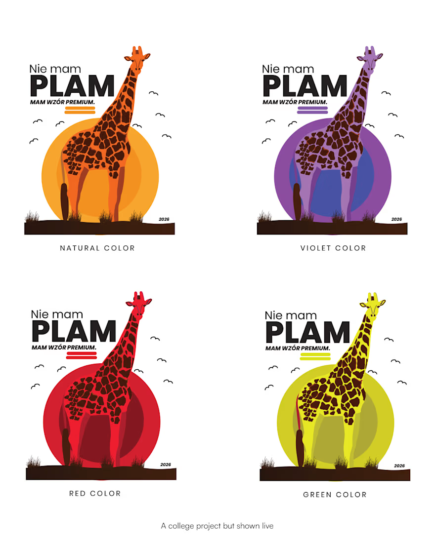
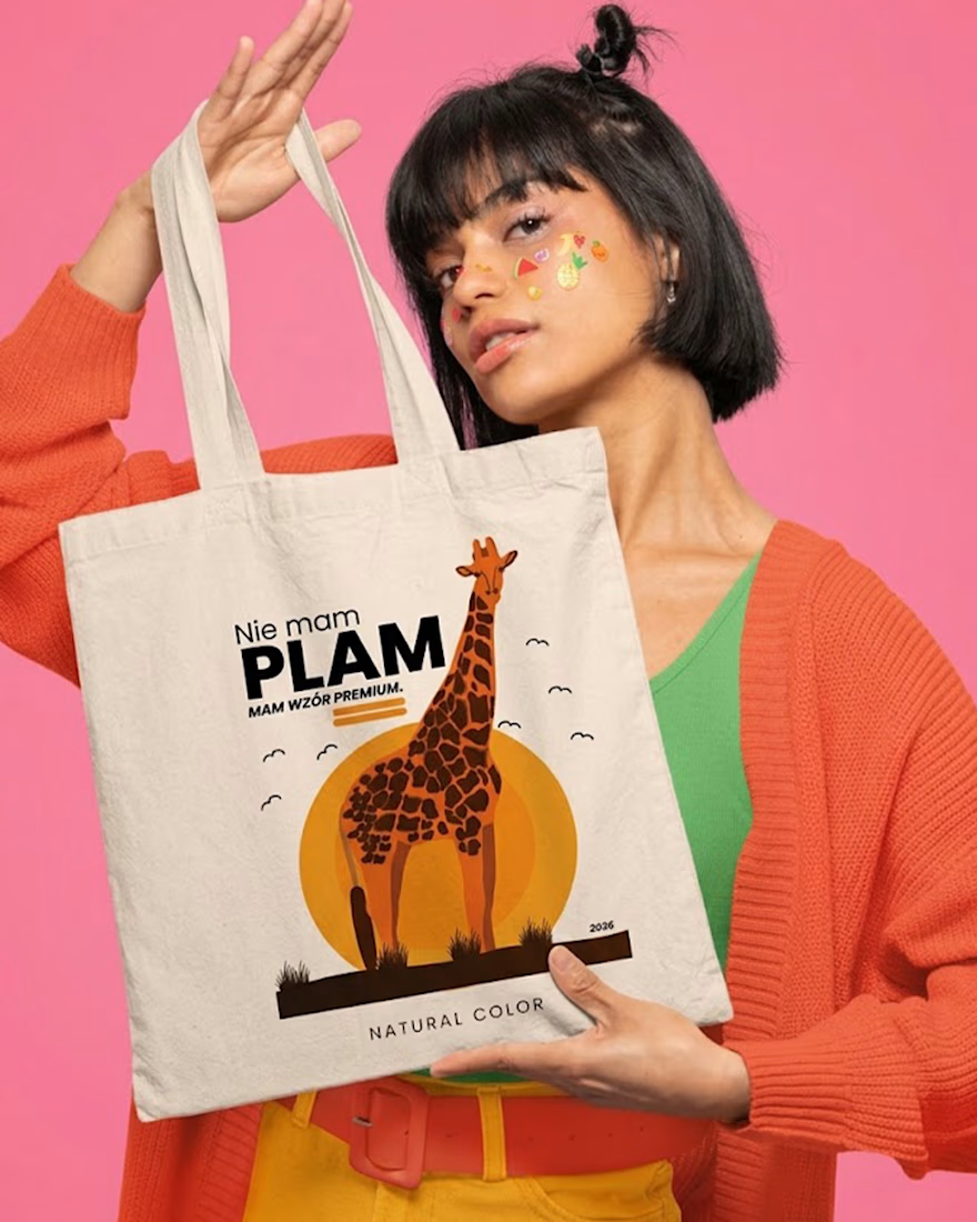
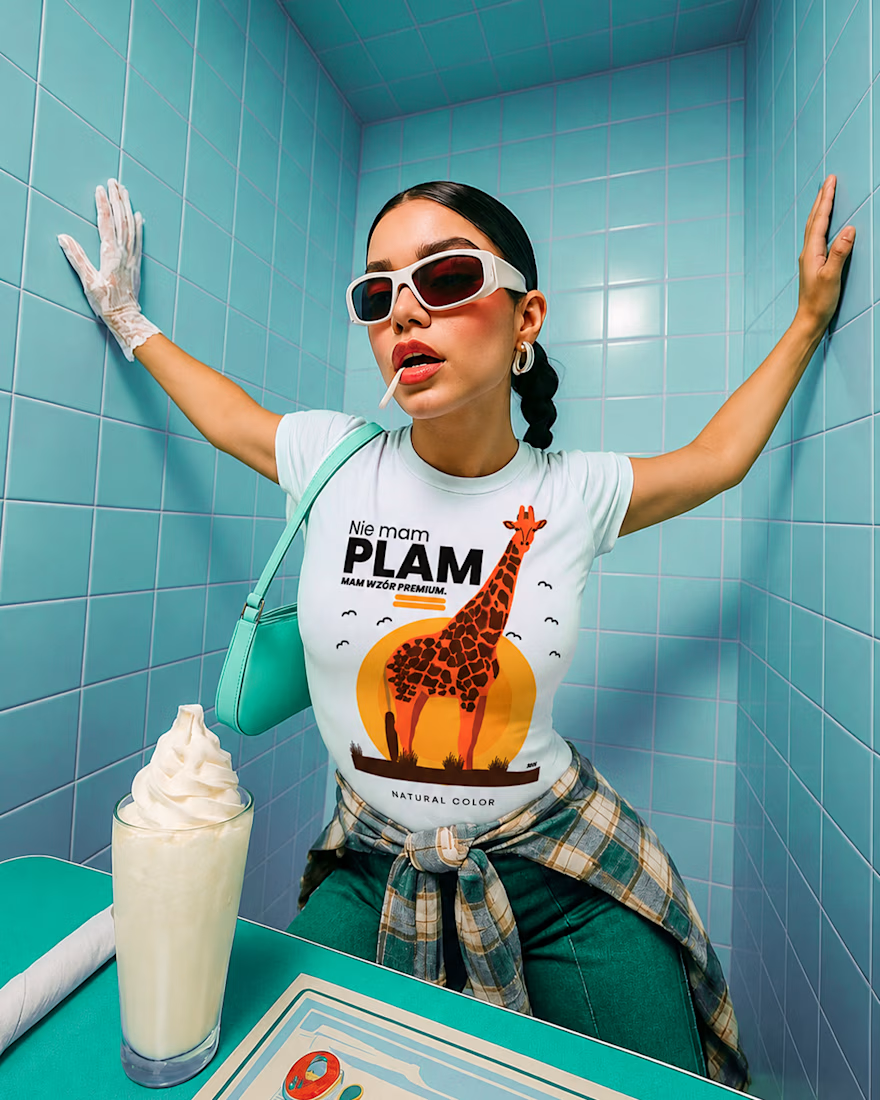
Not spots. Premium pattern 🦒
Started as a doodle in a lecture, ended up on tees and totes. One giraffe, one rising sun, and one line: “Nie mam plam. Mam wzór premium.” (“I don’t have spots. I have a premium pattern.”)
Four colorways, flat warm illustration, and a joke that works on any animal: zebra, leopard, dalmatian, cow are next. 🧡
Sometimes the best idea is the one you draw when you’re supposed to be taking notes.