The network for creativity
Join 1.25M professional creatives like you
Connect with clients, get discovered, and run your business 100% commission-free
Creatives on Contra have earned over $150M and we are just getting started
Back to feedPost
Storm Riders Web design - Built on framer
The challenge with Sthorm Riders was building a site around a brand that has no single sport, product, or category to represent it, but a mindset and a movement to carry the message. So we let the riders carry it. The palette stays dark and high-contrast, footage feels raw rather than polished, and negative space between sections gives each rider room to breathe before the next one cuts in.
Check it out on https://www.sthormriders.com/


🪂✨

🚴🏻🩶

Bold always gold


Thanks! 😎
Most welcome, mate! 🙂 where did you create the motion?
The network for creativity
Join 1.25M professional creatives like you
Connect with clients, get discovered, and run your business 100% commission-free
Creatives on Contra have earned over $150M and we are just getting started











Related posts

The most serious brand I’ve ever worked on mails you a phone shaped like a shell.
Deadpan voice. Inflated letters. One strange object a month.
STILL LIFE SERVICE, case study out now.
Would you open the box?


I'd open the box for sure! Inflated letters with a deadpan voice is such a fun mix.

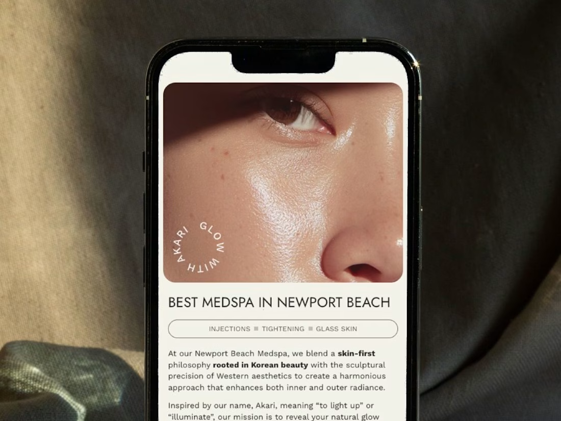
A restructured, clean website for Akari Medspa that turns scattered information into an intuitive experience as precise as the treatments they offer.


Too perfect buddy


this is really nice 100%. nice job