The network for creativity
Join 1.25M professional creatives like you
Connect with clients, get discovered, and run your business 100% commission-free
Creatives on Contra have earned over $150M and we are just getting started
Back to feedPost

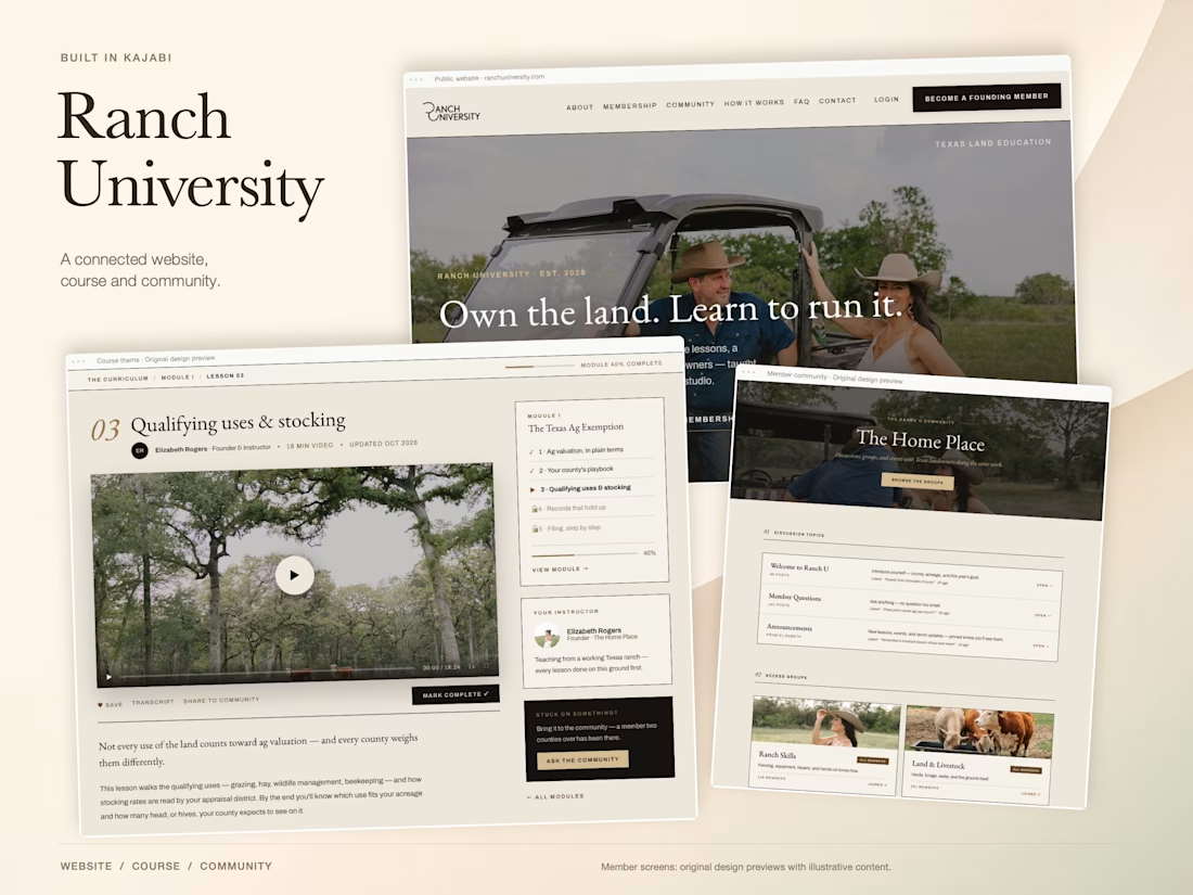
For Ranch University, I designed and built a custom Kajabi website and course platform + community around ranch ownership and life on the land.
Earthy colors, ranch photography, and spacious layouts carry through the site, membership pages, and course presentation. I also handled the course structure and offer setup behind the scenes.


Lovely project, John!

Nice work

The photography does most of the persuading here, and the spacious layout lets it breathe instead of competing with it. For a course platform, the membership pages are usually where trust breaks down, so carrying the same earthy palette through those pages is a smart call. Did...

Handling the course structure and offers alongside the website is an important part of this build. How did you organize the first-login path between lessons and the community, so a new member knows where to begin?

Always great to see creative professionals pushing ideas further. Beautifully done!
The network for creativity
Join 1.25M professional creatives like you
Connect with clients, get discovered, and run your business 100% commission-free
Creatives on Contra have earned over $150M and we are just getting started




Related posts


We are testing two ways to browse a large template library.
Load More
Users initially see 9 cards. After clicking the button, 9 more are added while the previous results remain visible. Browsing feels continuous, but the page gradually becomes longer.
Pagination
The catalog is divided into numbered groups. When users select the next page, the current 9 cards are replaced with a new set. They can jump to a specific part of the catalog and easily return to where they were.
Load More creates a smoother browsing experience, while pagination offers greater control.
Which option would you choose for a template library?
17 voted
68%
8 voted
32%
25 votes
Closed

Load more



My new website is live 🌓 Welcome to my Universe!
I designed it as one continuous space: real-time 3D scenes you move through, with my products and work inside them. Orbiwatch, Unveil3D, AnyRun, Dr Sophia AI, Newbold Connect and more.
I put a lot of love and care into every detail of it, and I'd love to do the same for you.
The redesign is here to show what's possible, and to connect me with the kind of businesses I want to partner with. My favourite work is on products where there's room to take care over every detail. Those details shape how people feel when they use a product, and I always want that feeling to be a good one.
Take a look and tell me what you think: vladkutepov.com


Great job