The network for creativity
Join 1.25M professional creatives like you
Connect with clients, get discovered, and run your business 100% commission-free
Creatives on Contra have earned over $150M and we are just getting started
Back to feedPost

What should a beekeeping website explain before asking someone to choose a hive?
For Bee Girl, I designed and built a complete Shopify website around a clear journey: meet the colony, understand what’s inside a nucleus hive, compare the options, and connect with the beekeeper.
Honey yellow, hive black, warm cream, and bold typography bring the same visual language across desktop and mobile layouts.
One design decision that ties it together: the page explains the colony and its five frames before introducing the hive-quantity choices. Education gives the product selection context.
I handled the complete website project for the client through Fiverr, using Shopify. This video walks through the homepage.
Which would you explore first—the hive options, field classes, or the beekeeper’s story?
Explore the full Bee Girl case study: https://contra.com/p/WqNFR67b-bee-girl-shopify-website-design-for-beekeeping
If you’re building a Shopify website for a specialist business, I’m available for website design and development projects.


Really impressive work! The bold typography, warm color palette, and clean layouts give the brand such a distinctive personality. Everything feels thoughtfully designed.
Thank you, Muhammad. That is exactly what I was aiming for with Bee Girl. The bold type and warm palette had to carry the personality of the brand, while the layouts stayed calm enough for a first time buyer to compare hives without feeling rushed. Glad that balance came through.

Love how the visual identity translates across different screen sizes. The yellow and black combination works beautifully, and the overall design feels modern, engaging, and consistent.
Thank you. Keeping that identity consistent across screen sizes was one of the trickier parts, because the yellow and black can easily overpower a small screen. I kept the hierarchy the same on mobile and let the photography do more of the talking, so it still feels like the same brand at any size.

Such a refreshing approach to a beekeeping brand! The photography, playful details, and strong visual hierarchy make the whole experience feel authentic and memorable. Great execution!
Thank you. Authenticity was the test for every detail here. The photography had to show real beekeeping, not stock imagery, and the playful touches only worked because the hierarchy stayed clear underneath. If a visitor remembers the feeling of the brand after leaving, the page has done its job.

Thank you, Ibad. That was the heart of the brief, really. A beekeeping site has to teach a newcomer enough to choose confidently, but if the education slows the page down, nobody stays to learn. So the learning is built into the flow itself, in the colony and frames section,...

Thank you, Hemad. That is the nicest compliment for this one, because a typical Shopify store was exactly what the client wanted to avoid. The honey yellow does a lot of the work, but the personality really comes from the beekeeping story behind it. Once the story is clear, the colour choices start to feel inevitable.

Thank you. I appreciate that. The Bee Girl brand gave me a lot to work with, the beekeeping story, the honey palette, the five frame hive, so the design really started from the product itself. Was there a section that stood out to you?

What stands out to me is how naturally the storytelling leads into the product selection. You're not just showing people what to buy, you're helping them understand why. That's a smart UX decision, and the execution looks super clean.
Thank you, Steve. You have picked up on the decision I am proudest of here. Most stores show the product first and explain later, but a first time beekeeper does not know what a five frame hive actually means yet. So the story does the selling by giving the choice context first,...
The network for creativity
Join 1.25M professional creatives like you
Connect with clients, get discovered, and run your business 100% commission-free
Creatives on Contra have earned over $150M and we are just getting started



Related posts
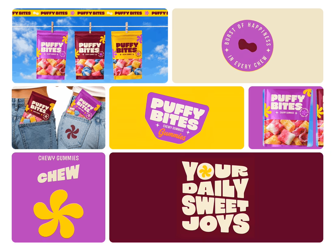
What makes a candy brand recognizable across every pack?
For Puffy Bites, I built the identity around rounded lettering, expressive symbols, and a palette of burgundy, purple, yellow, and cream.
The same visual language carries through pouch packaging, smaller wrappers, campaign imagery, and an animated brand showcase.
One design decision that ties it together: the packaging color changes, while the logo placement, product descriptor, and supporting graphics maintain a consistent structure.
I handled the full client project, from logo and visual identity to packaging and campaign applications.
Which colorway would catch your eye first—purple, burgundy, or yellow?
Explore the full Puffy Bites case study. If you’re developing a candy or snack brand, I’m available for branding and packaging projects.

Love it,
Great work

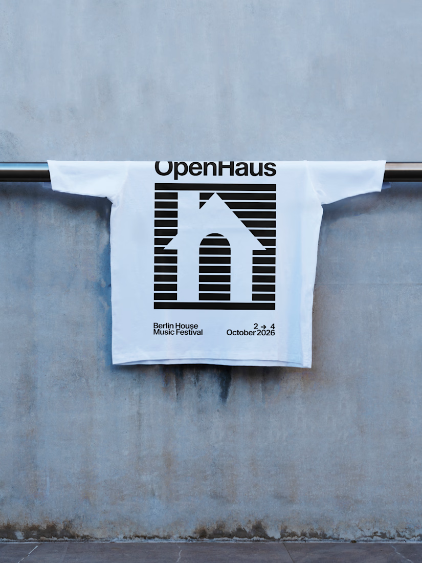
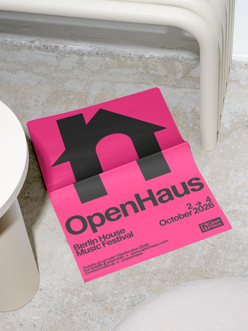
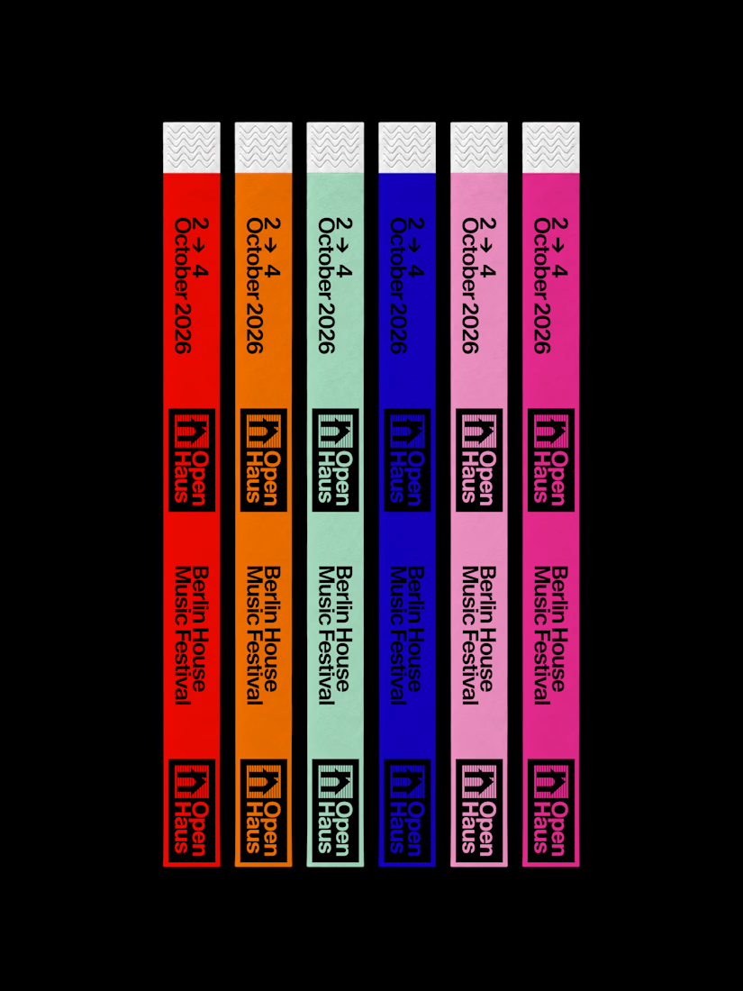
Introducing OpenHaus, a vibrant house music festival, made for anyone and everyone.
The visual identity leans into bold, saturated color paired with bold typography and structured, grid-based layouts. It feels colorful and inviting on the surface, but stays grounded by a level of restraint that gives it a more considered feel.
The logomark combines a lowercase "h" with a triangle, forming the silhouette of a house, a small, playful nod to the genre and the name itself.
View the full project here:

Great color palette and logo design 🎉🎉

Redesigned the ModaZ fashion e-commerce storefront with a clean, modern shopping experience focused on product discovery and brand presentation. The project included a refreshed homepage, curated product collections, new arrivals, best-selling sections, and responsive layouts.
I also focused on improving navigation, product visibility, and the overall shopping journey to create a more engaging online store.
Have a fashion brand that needs a storefront upgrade? Let's talk.


I love the layout. Impressive work