The network for creativity
Join 1.25M professional creatives like you
Connect with clients, get discovered, and run your business 100% commission-free
Creatives on Contra have earned over $150M and we are just getting started
Back to feedPost
❝ A logo can look beautiful on a screen and still fail in the real world. ❞
Why does that happen? 🤔❗
◾️ Because a great logo isn't just about how it looks. It's about how well it works.
Imagine a real estate brand with an intricate logo filled with gradients, fine lines, and unnecessary details.
It looks impressive on a large screen. But what happens when it's printed on a business card, embroidered on a uniform, or reduced to a tiny app icon?
► The details disappear. The identity loses its impact.
That's why simplicity is not a lack of creativity. It's a sign of strategic design.
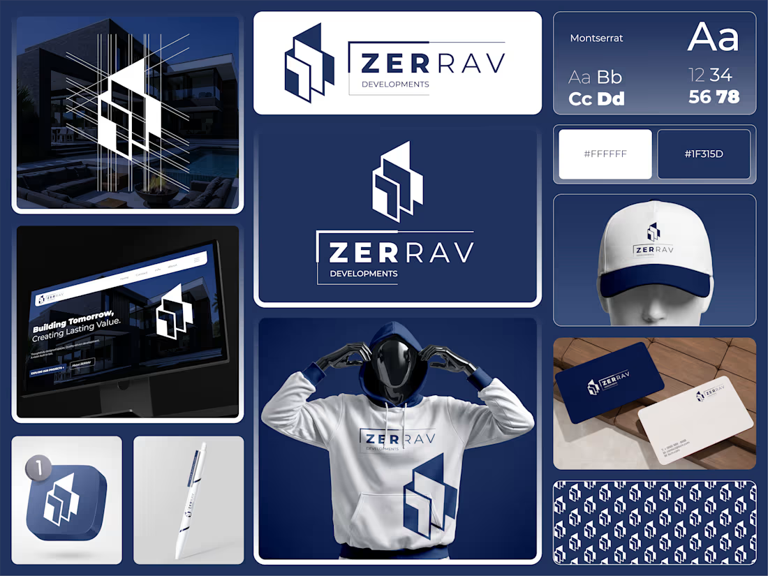
When developing the identity concept for (ZERRAV) Developments, I focused on three essential principles:
➊ Geometry with Purpose
Architectural angles and balanced geometric forms create a visual connection to modern real estate while keeping the symbol clean and recognizable.
➋ Color That Builds Trust
Deep Navy #1F315D paired with White #FFFFFF creates a confident, professional visual foundation suited to a premium property brand.
➌ Typography That Works Everywhere
⚫ Montserrat provides a clean, contemporary look with strong legibility across digital platforms and printed materials.
But a logo is only the beginning.
From property signage and website headers to business cards, uniforms, and branded materials, every application should feel like part of the same identity.
Because a premium brand shouldn't just look impressive. It should look consistent, recognizable, and trustworthy everywhere.
That's the difference between designing a logo and building a brand identity.
Here's a question for fellow founders and business owners:
If your logo were reduced to the size of a small app icon, would people still recognize it?
👉 Best Design: www.fiverr.com/sellers/rifatislam149/edit
👉 Portfolio: https://dribbble.com/artoryxrifat
#BrandIdentity #RealEstateBranding #LogoDesign #VisualIdentity #ZERRAVDevelopments #BrandStrategy #GraphicDesign #CorporateIdentity


Exactly! A logo should look great on screen, but it also needs to work in the real world, from business cards to storefronts. That’s why simplicity, versatility, and readability matter so much in logo design. 😊
The network for creativity
Join 1.25M professional creatives like you
Connect with clients, get discovered, and run your business 100% commission-free
Creatives on Contra have earned over $150M and we are just getting started








Related posts

One of our older branding projects, but it still feels surprisingly fresh.
Cashbox started with a very simple idea: a box-shaped logo.
The identity went a little more out of the box.
Still a good example of how we like to work: keep the core idea simple, then push the visual system much further.


the design here is so immersive & innovative, love it.


🌶️ Spicy take from my latest identity project
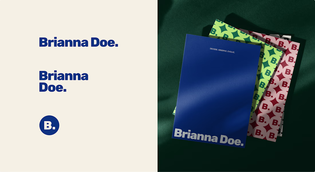
Brianna Doe’s entire logo is her name and a dot. And it does more work than most of the “unique” logos I scroll past on socials.
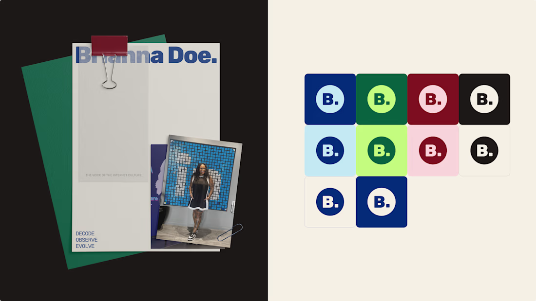
A logo only has to IDENTIFY a brand. Defining it is the job of everything else: creative direction, color & font systems, imagery.
Complicated logos impress other designers, simple ones work for the client.
Check out the full case study to see how a simple logo carries an entire brand identity
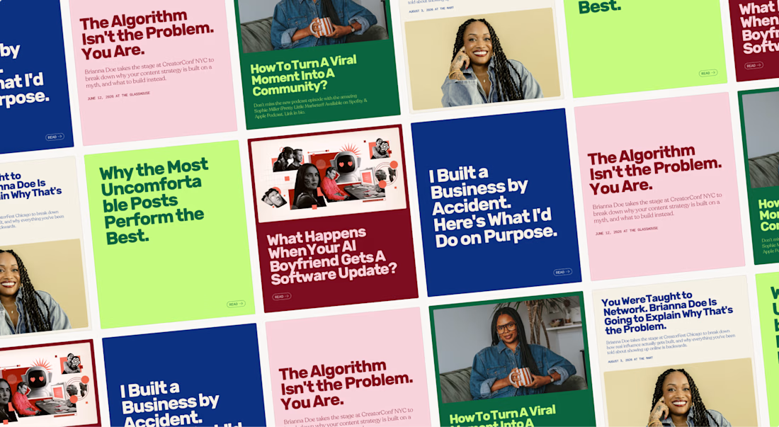

Lovely palette. I'm sure the client is stoked.

How does a logo creation start?
After the briefing, once I understand the business inside out, I start with pen and paper. Drawing isn’t my main skill, but it helps me organize my ideas and try dozens of different ways until I land on a great result, before taking it to the computer and vectorizing it.
Here’s a glimpse of that process, from first sketches to the final “M”.
I invite you to see the full journey through the visual identity of Muzo Estudio. I’m really proud of the result and the process. Hope you like it.


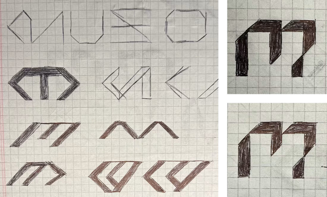


pen and paper before the computer is the part most people skip