The network for creativity
Join 1.25M professional creatives like you
Connect with clients, get discovered, and run your business 100% commission-free
Creatives on Contra have earned over $150M and we are just getting started
Back to feedPost


🌶️ Spicy take from my latest identity project
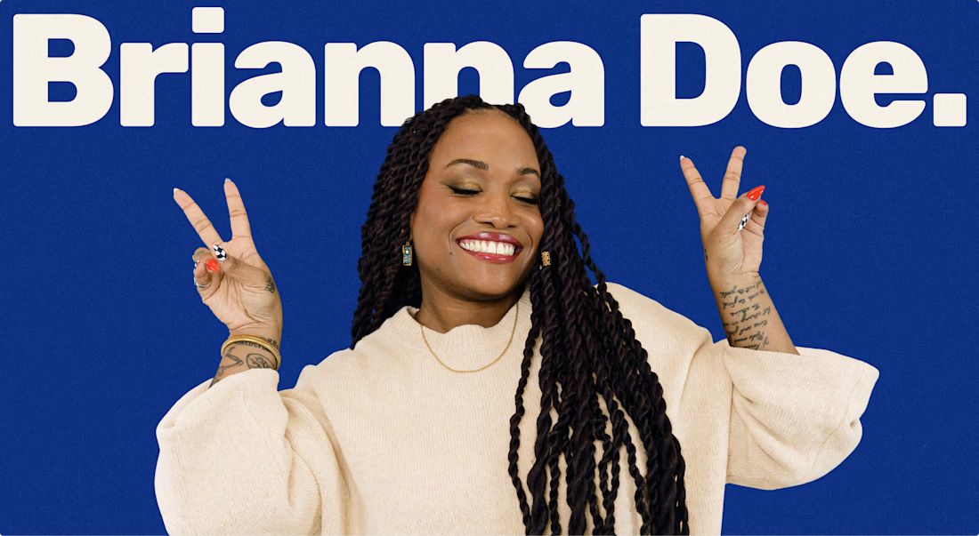
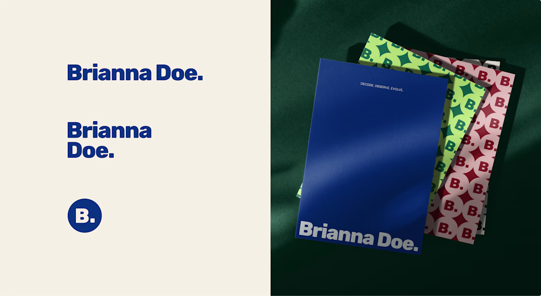
Brianna Doe’s entire logo is her name and a dot. And it does more work than most of the “unique” logos I scroll past on socials.
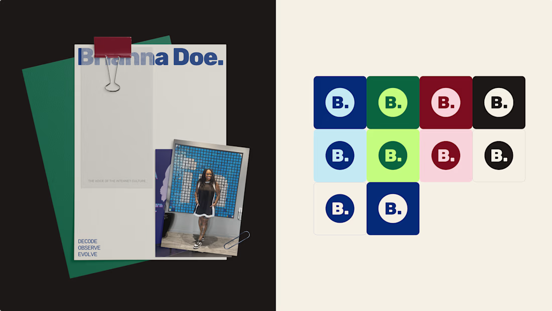
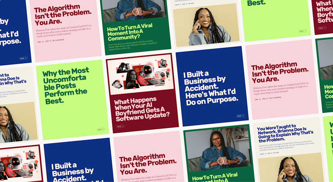
A logo only has to IDENTIFY a brand. Defining it is the job of everything else: creative direction, color & font systems, imagery.
Complicated logos impress other designers, simple ones work for the client.
Check out the full case study to see how a simple logo carries an entire brand identity

Lovely palette. I'm sure the client is stoked.

Great work


Great work. You can tell Brianna's energy from the brand immediately

Agree on the split of labour - the mark identifies, the system defines. Brianna Doe's single-dot approach proves the point: restraint in the logo frees the creative direction to do the heavy lifting.

Looks fantastic! 💎

I like your business card design logo designs and posters they are great nice job Hanna 🎉🎉🎉
The network for creativity
Join 1.25M professional creatives like you
Connect with clients, get discovered, and run your business 100% commission-free
Creatives on Contra have earned over $150M and we are just getting started

Challenges
View all


Related posts

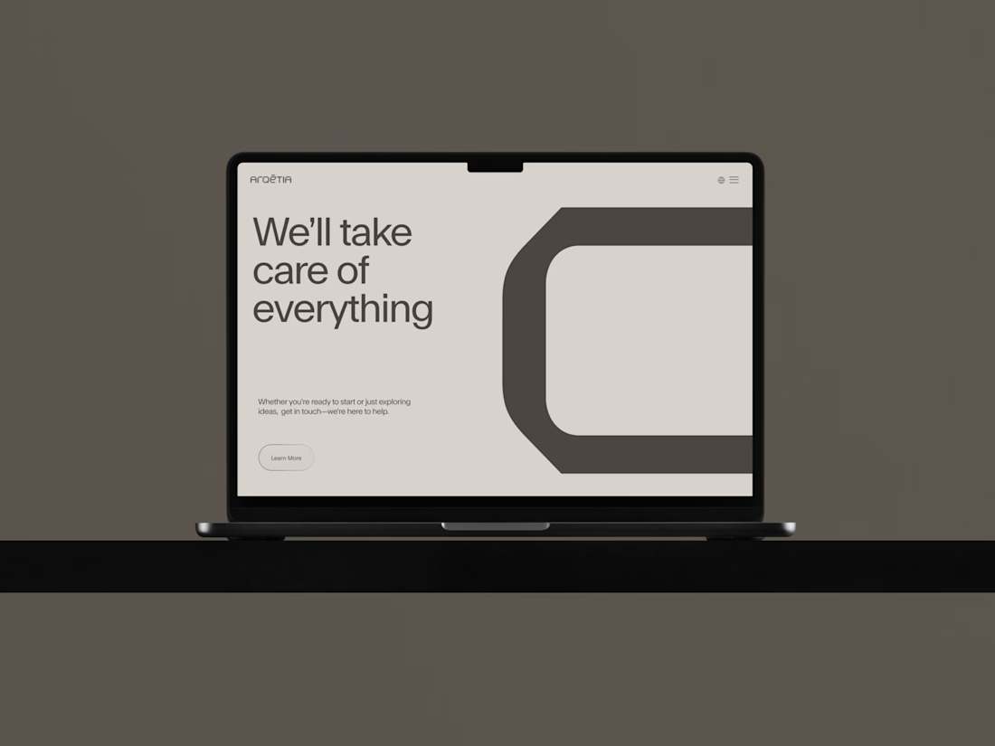
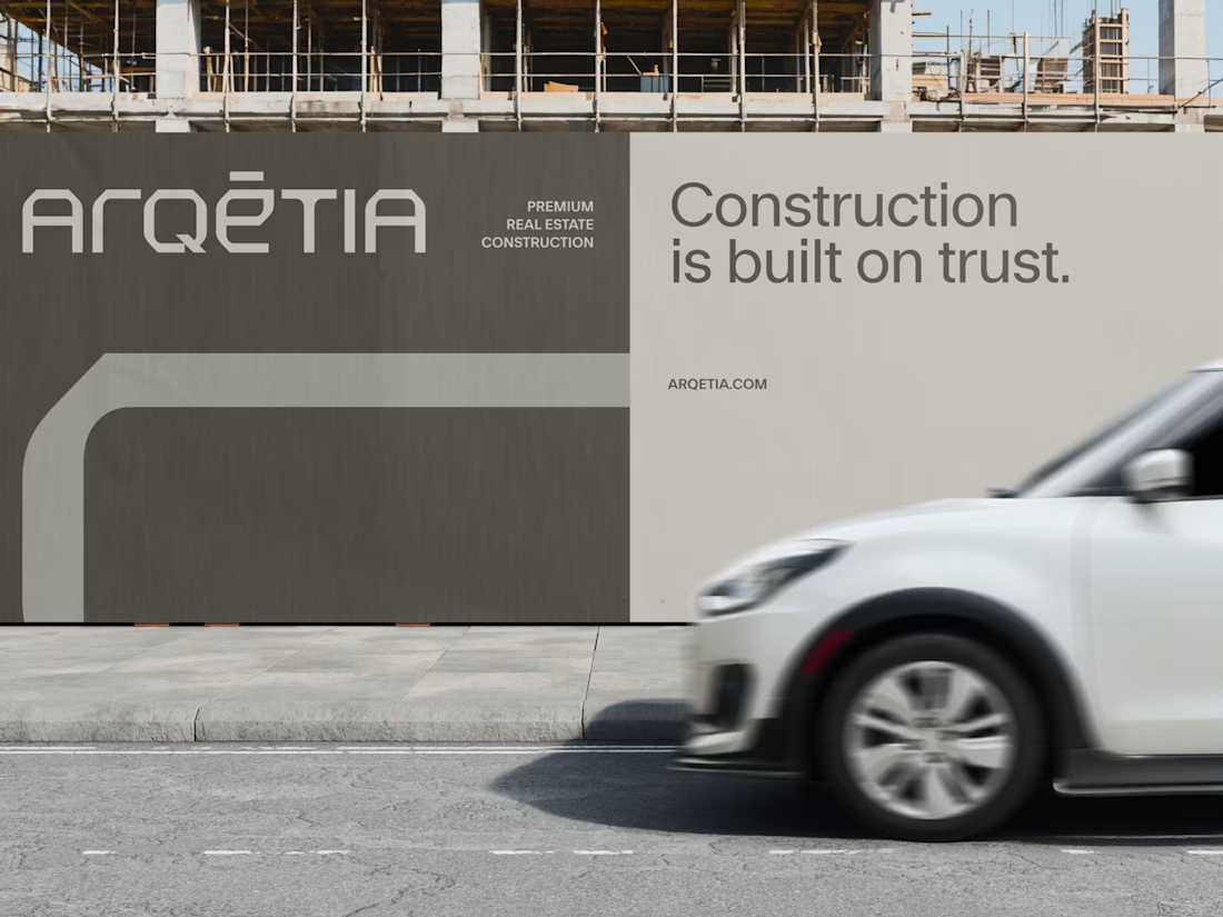
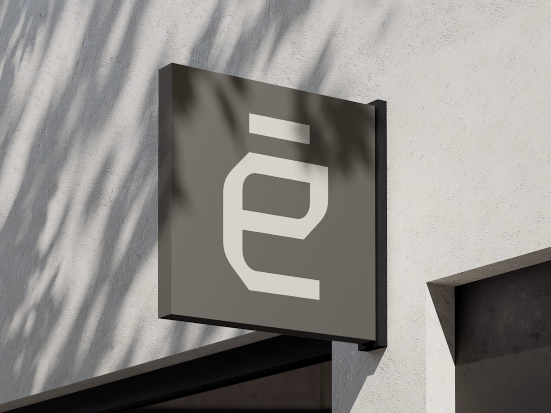
What if construction felt as clear as the space it creates?
For Arqētia, we built a visual identity around one of the industry's most important client needs: transparency. A direct response to the uncertainty often associated with construction, from unclear processes and budgets to timelines and decision-making.
The concept makes transparency tangible, translating it into a visual system that feels open, structured and precise.
check it out


Very clean identity work

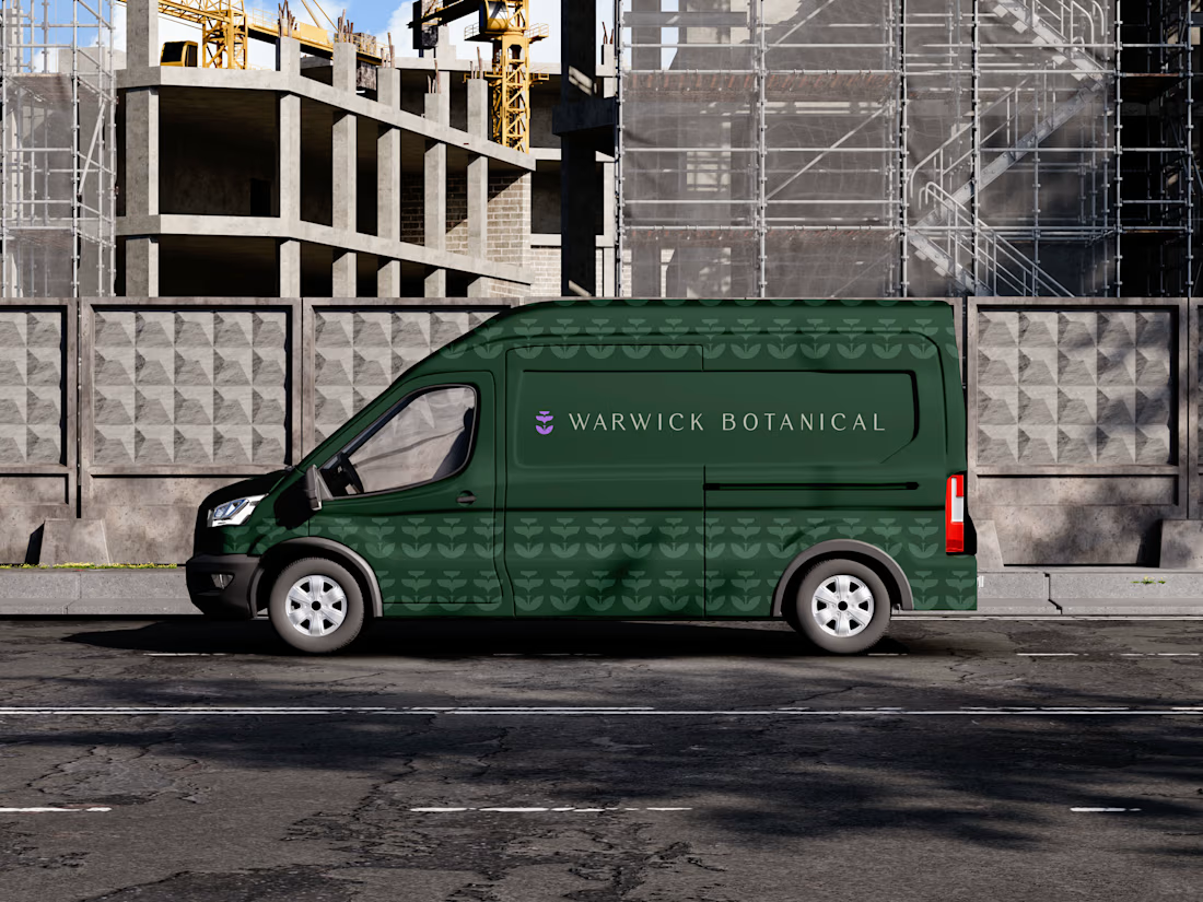
For brand identity, I like to show mockups to test of the identity system: the logo, pattern, and color palette all needed to work at a much larger scale without feeling overdesigned.
That’s where a flexible brand system really starts to prove itself.
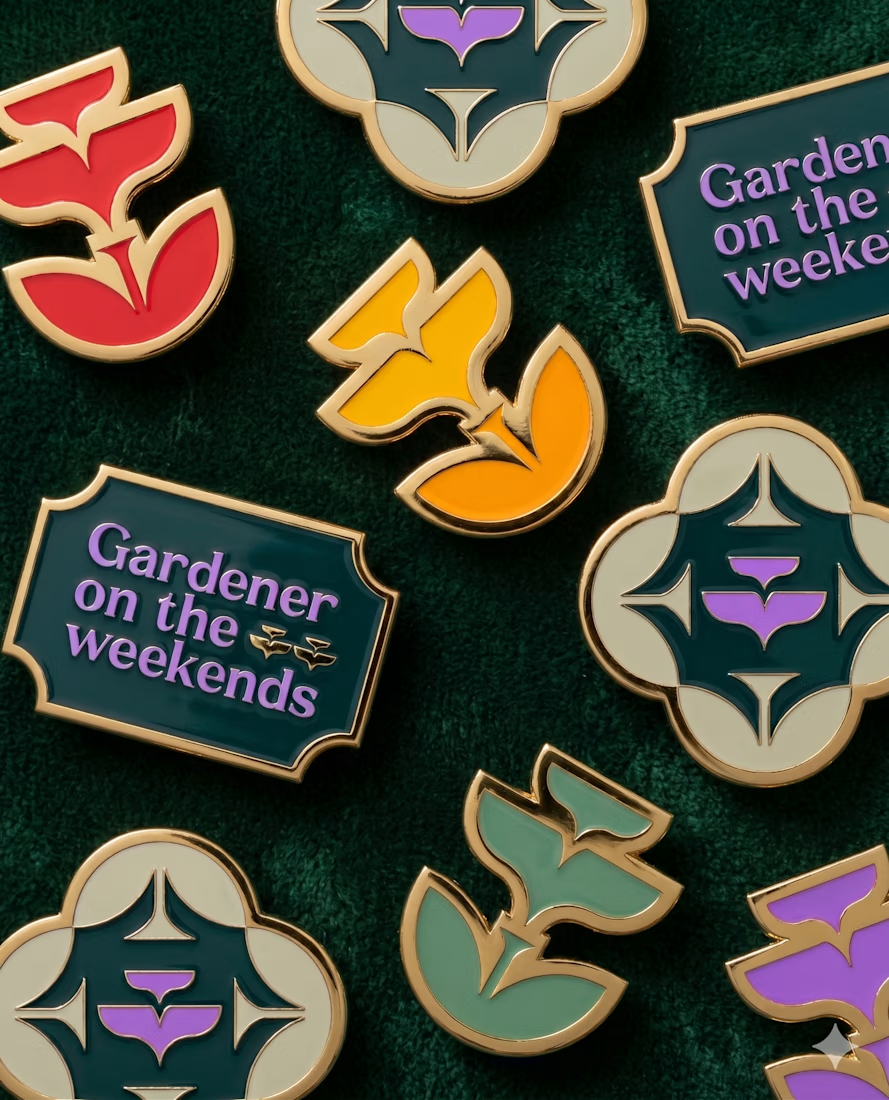
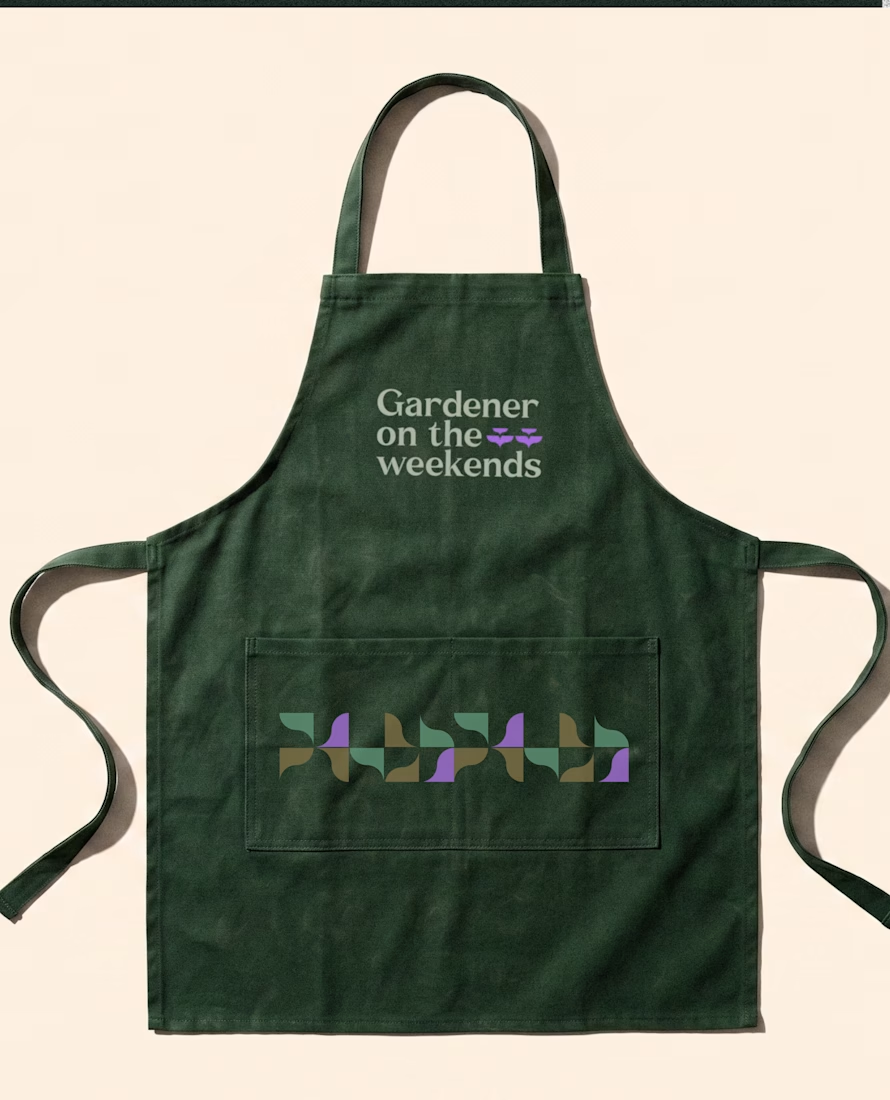
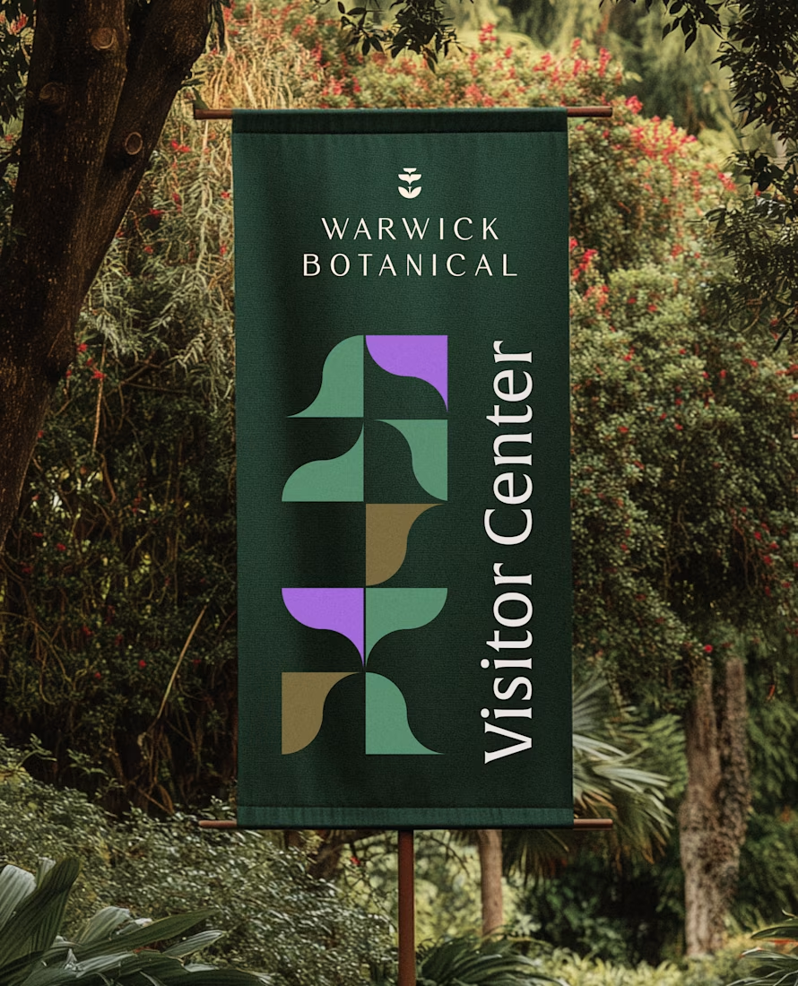

Powerful greenish look 👌

Apparently, my Ambrosia post has been featured on Contra! Haven’t figured out where yet, but I’m taking the win 🙌
Thank you, Contra. A lovely little surprise today!



Beautiful!