The network for creativity
Join 1.25M professional creatives like you
Connect with clients, get discovered, and run your business 100% commission-free
Creatives on Contra have earned over $150M and we are just getting started
Back to feedPost

New on Contra, not new to design.
I draw logos by hand, then build everything around them: the brand, the website, the store. Lately I also make product films and ads with AI.
Recent work: an RY monogram and site for a Koreatown law firm, a winged W for a defense firm, and my family's golf eyewear brand, from the mascot to Shopify.
Starting a brand, or have one that doesn't feel like you yet? Show me what you're building.

Love this!

Welcome to Contra! Wishing you all the best on your journey here! ✨
I appreciate you, thank you 3and design.

Honestly I just wanted it to look cool. Drawing it by hand let me find a way to connect the two partners’ names, the R and the Y, into one mark.

That's smart 🎉🎉

Welcome to Contra. Drawing logos by hand and then building the brand, the site and the store around them is a clear point of view, and the painterly hill and the red creature behind the MADE BY HAND title make a memorable showreel opener. Contrarian note: your intro lists three...
Fair point. I know “jack of all trades” usually sounds like a weakness, but with how fast design and AI tools change, being able to adapt has become a skill of its own. Product brands are where I’m leaning, but I want to keep learning new styles from every client.

love this .amazing work

Lovely piece of work, nocturne!

A valuable reminder that strategy should always come before execution.

Nice 🔥

The logo-led system reads tight because the wordmark sits clean in the negative space instead of fighting the emblem — when a brand has that kind of restraint, the Shopify store usually carries the same hierarchy into the product grid and checkout without inventing new rules....
logo first for sure. i drew the nicoya mascot by hand way before the store existed, then built the site around it
That's exactly how a mascot should behave - it shouldn't need to be the star, but it ends up holding the whole brand together. Nicoya sounds like a great study in building everything around the mark first.

Very clean design

Welcome to Contra! 🎉


Welcome, nice to meet you...


absolutely stunning!

Drawing the logo by hand first and building everything around it is such a solid approach. Welcome to Contra, the monogram work looks sharp.

Nice work

Experience matters! You will get the work soon

Your designs are amazing! Welcome to Contra

This is Brilliant!
You’re welcome here

Welcome 😊


Hand-drawn logos just hit different

Amazing!

Brilliant work! As a fellow creative, I'm really inspired


the mixed case in the PoRTFoLio title next to the little red guy on the hill sets the tone really well. is he the mascot from the eyewear brand or a separate character?
He was actually made for a crypto project that was sadly discontinued, so now I show him as a passion project. The mixed-case type and the UI came later, built for the first version of my portfolio reel. I went for a glitchy, cyber feel because I thought it looked cool, and it gave some contrast with the soft painted hill.

Nice Work

This is really splendid I like the concept... What AI tools do you use?
Higgsfield has been a really good tool lately but before I was using Midjourney
Thanks for sharing definitely going to try it out 💯

mascot-to-Shopify journey sounds fun🙌

hand drawn first means it still reads at favicon size, that's the part AI logo tools usually miss
true, it's also scary and interesting how well these tools are getting better at just imitating
Same, the imitation keeps getting better faster than I expect it to.


hand-drawing first building the system around it is rare, most start in figma and the logo ends up generic
yeah, sketching first is where the ideas actually come from. a pencil gets any thought down fast, and that looseness carries into the final mark. after that, ai kinda becomes like my sparring partner in a sense. it throws back many variations and colorways i’d never try on my...
The network for creativity
Join 1.25M professional creatives like you
Connect with clients, get discovered, and run your business 100% commission-free
Creatives on Contra have earned over $150M and we are just getting started




Related posts

One pixel grid. A whole brand.
For Appy, a London product studio for impact-driven startups, the wordmark, icons, 3D smile and Appy Pixel, its custom typeface, all come from the same grid.
Appy Pixel won Typography at the Online Design Awards.
Type first or symbol first: where do you start a rebrand?


thats so nice, i loveee

working on a case study for my latest project - brand identity for Coral Pay.
need your help choosing the best cover video for it:
35 voted
23%
118 voted
77%
153 votes
Closed

Lilac looks amazing with the 3D shining.

"Is it too late to eat?"
"Not yet."
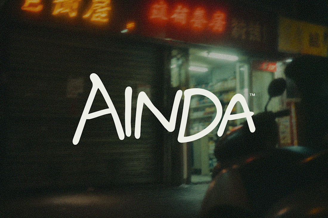
That's pretty much where AINDA started.
It's a fictional Chinese neighborhood restaurant I'm designing around the hours between today and tomorrow. Somewhere to have a proper meal, sit for a while, and maybe stay a little longer if the conversation isn't over.
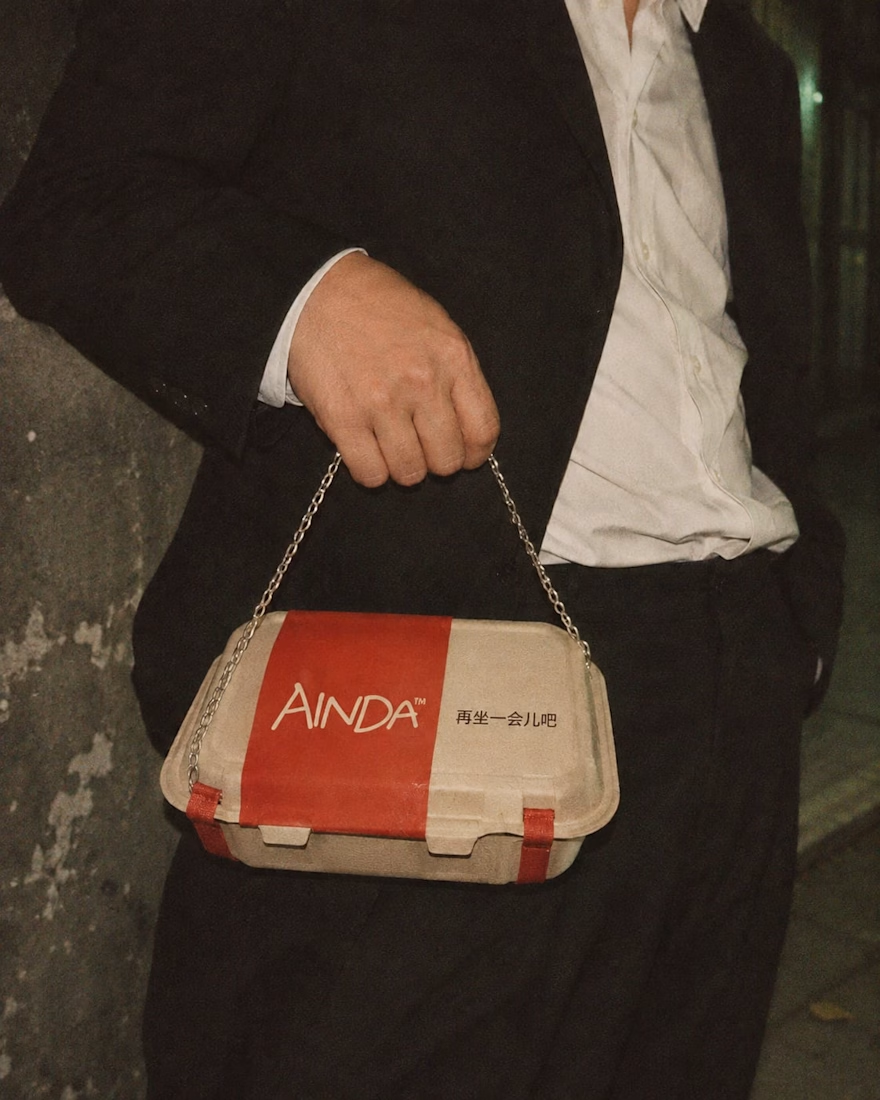
I've been developing its identity around that everyday feeling, from the hand-drawn lettering and late-night atmosphere to the packaging and service objects, some of which have gotten a little out of hand.
Here are a few experiments from the project so far. Still a lot to explore.
The restaurant doesn't exist, but apparently its takeout already has places to be.

Love this! Turning a takeout box into a handbag is genius — strong brand storytelling. I do brand & packaging concepts like this too, my DMs are open for collabs. 🔥