Brand On Fire - Brianna Doe

Hanna Woa 🔥
Verified


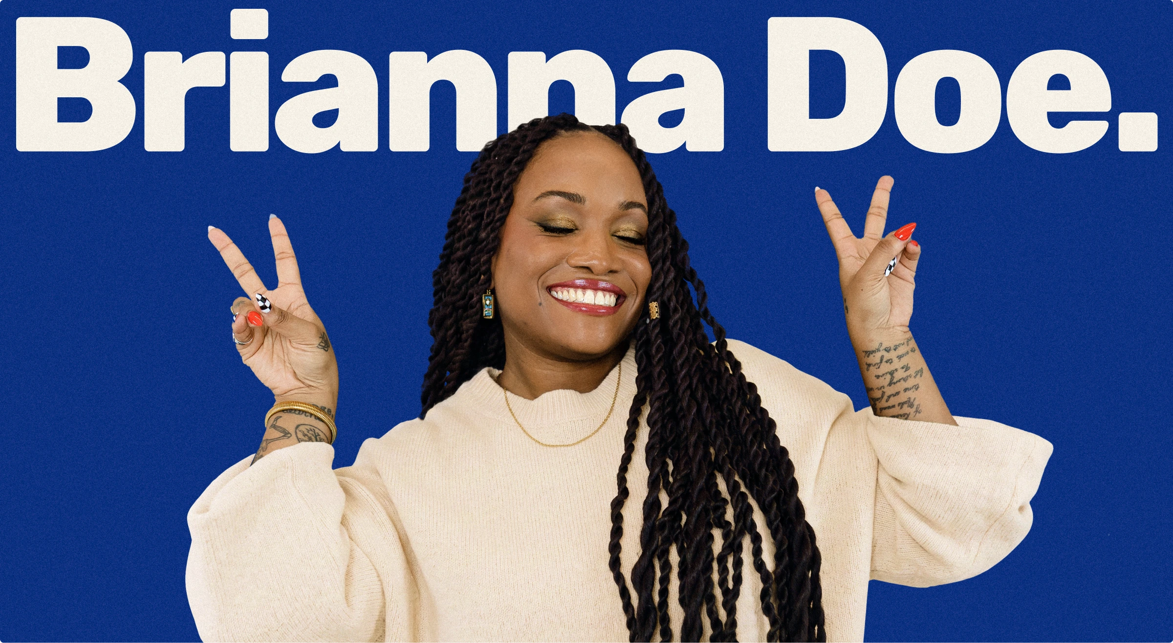
Everyone building a personal brand ends up with the same soft palette and a nice font pairing. But this wasn't going to work for someone whose entire value is having a sharper point of view than everyone else in the room.
The project
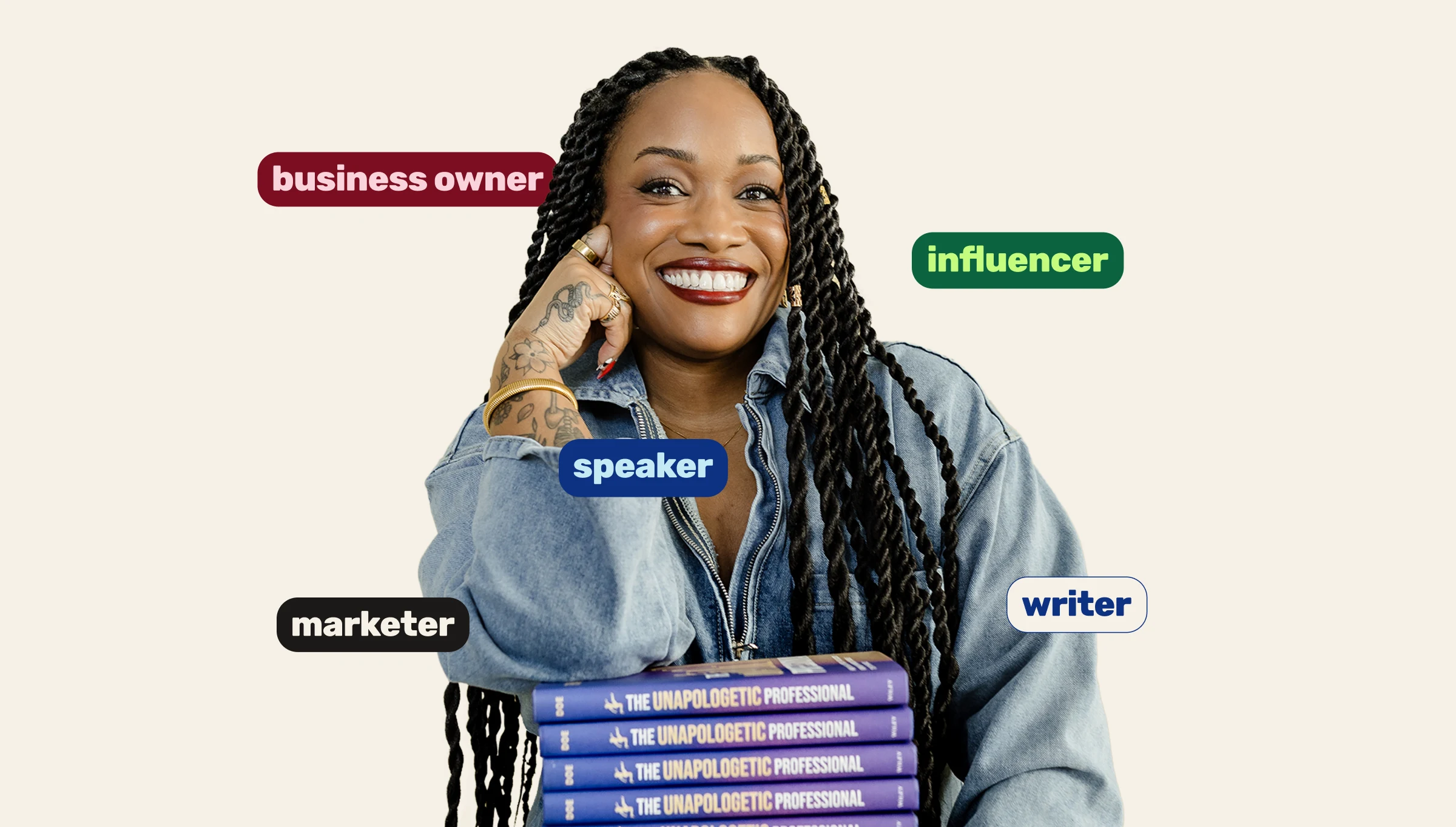
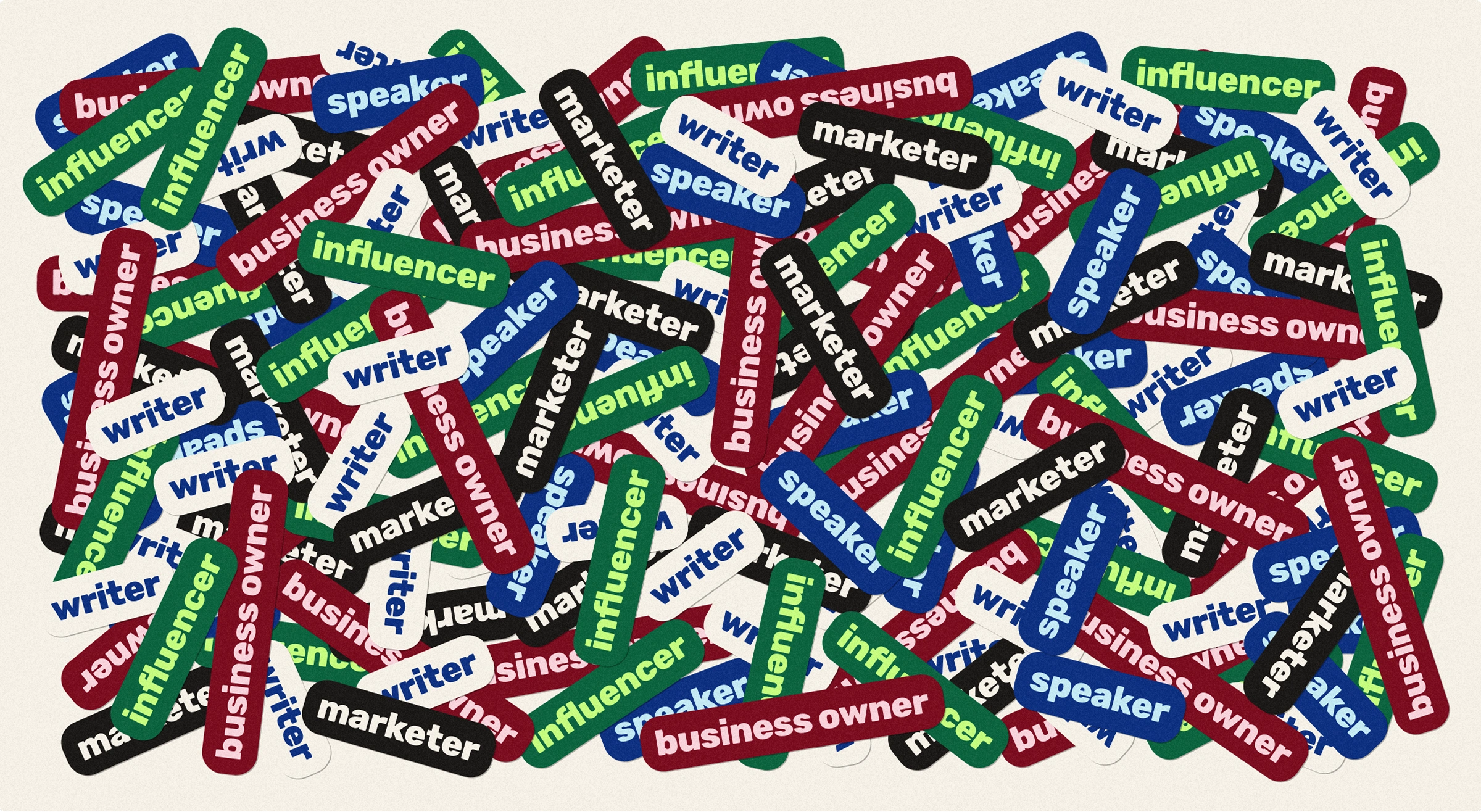
Brianna Doe is a speaker, writer, and founder of Verbatim, an influencer marketing agency she's run for 14 years. She hosts a podcast and writes for an audience of 325,000+ people, decoding internet culture from the inside. This was our third project together and I handled the brand identity from start to finish.
Two problems to solve
Problem #1
Brianna's content already had the range: voice, edge, warmth, a genuinely different take on internet culture. Her visual identity didn't carry any of it. First impressions relied entirely on the writing doing the work, not on the full experience backing it up. Without a distinct visual language, she risked reading like every other "marketing expert with a personal brand," despite having 14 years of practitioner experience and a lens nobody else in her space has. The personality was already there but it needed something to holding it together.
Problem #2
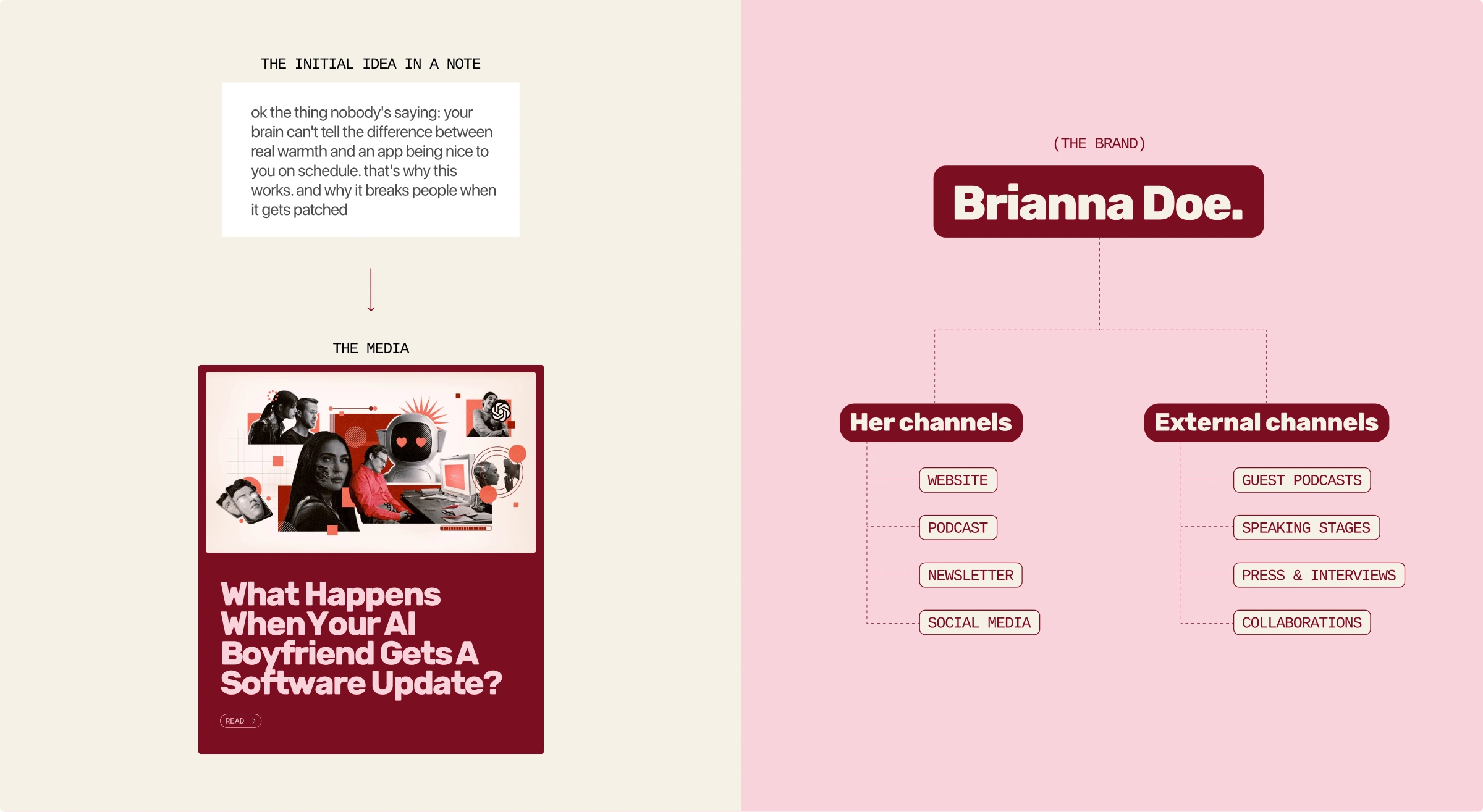
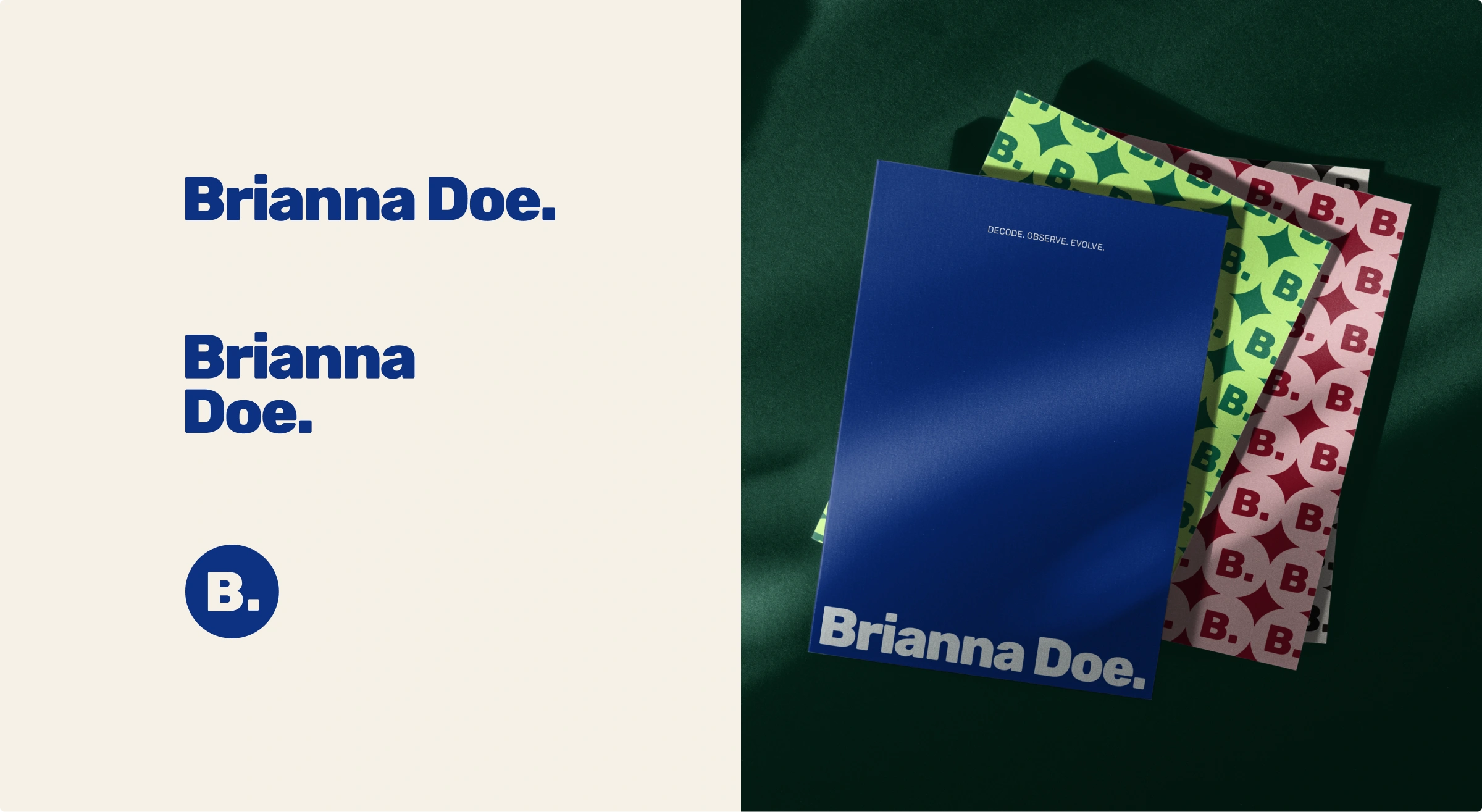
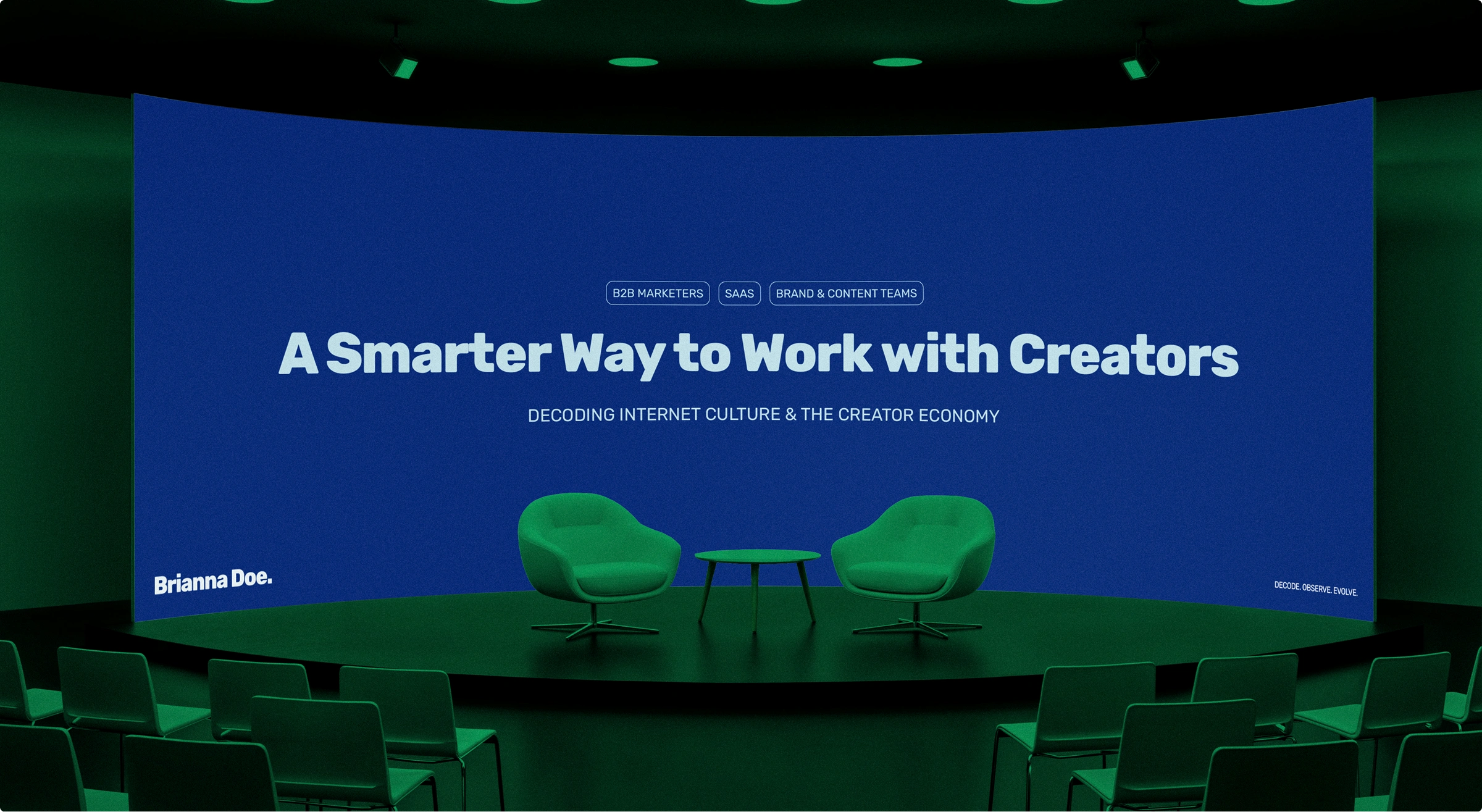
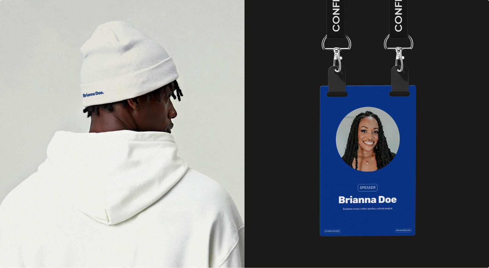
Brianna isn't one channel. She runs an agency, hosts a podcast, wrote a book, speaks on stages, and she's constantly guesting inside other people's brands: someone else's podcast, someone else's event, someone else's feed. Most personal brands are built for personal spaces: branded profile, branded website, branded book. The goal of hers is to survive being dropped into a different environment every week and still read as BRIANNA DOE.
Two strategic solutions (creative direction)
Objective #1: Give her the structure of a publication, with her personality at the core.
A great publication isn't faceless (i.e The Cut, The New Yorker), they all have a strong point of view. What they have that a personal account usually doesn't is structure: the same voice holds up no matter which piece you land on first and Brianna's personality already had that range. It just needed that same structure, so it reads the same everywhere instead of only working on her main feed.
Objective #2: Keep it simple enough but NOT generic.
She's constantly sharing space with other people's brands, so anything complicated gets lost or clashes. The system runs on a few key identity moves (the wordmark, the period, the color logic). Simple enough to survive anywhere, specific enough to still be hers.
Color system
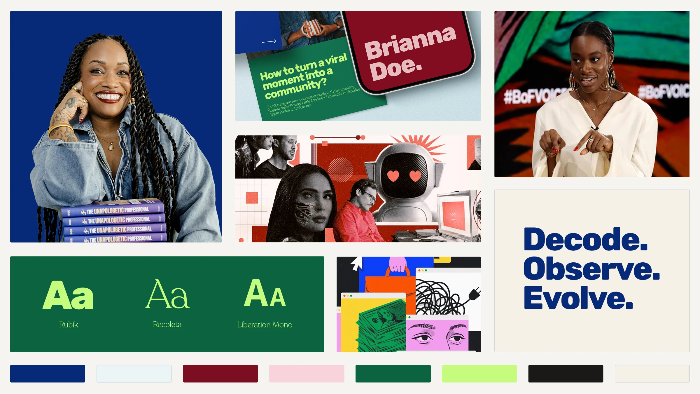
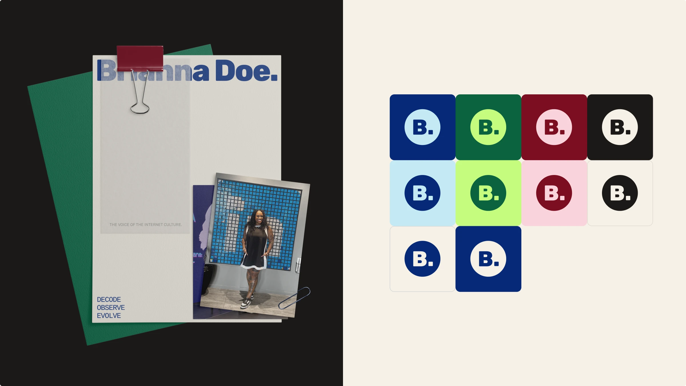
The palette runs on one rule: a fixed base (deep navy and warm cream) paired with a rotating cast of saturated accents. Every single piece stays strictly bicolor, one accent against the base, which keeps production fast, so a new post never has to wait on a new complex design decision.
The idea is to make the result reading energizing instead of simply “loud”, and intentional rather than “decorative”.
Font system
Three fonts, three jobs:
Rubik Extra Bold handles headlines: it’s a geometric, heavy and direct font, built to make six words feel like a media cover line.
Recoleta Light sits at the opposite end for body text, a soft serif that brings warmth and intimacy (because it’s all about Brianna’s own pov) the moment it shares a layout with the headline.
Liberation Mono in all-caps fills the overline role: labels, categories, metadata; Giving that profesionnal/archive look and reinforce the “media” side of the direction.
Together they replicate the architecture of a well-edited publication: a loud headline that stops you, a body that earns your time, a label system that tells you where you are.
Logo design suite
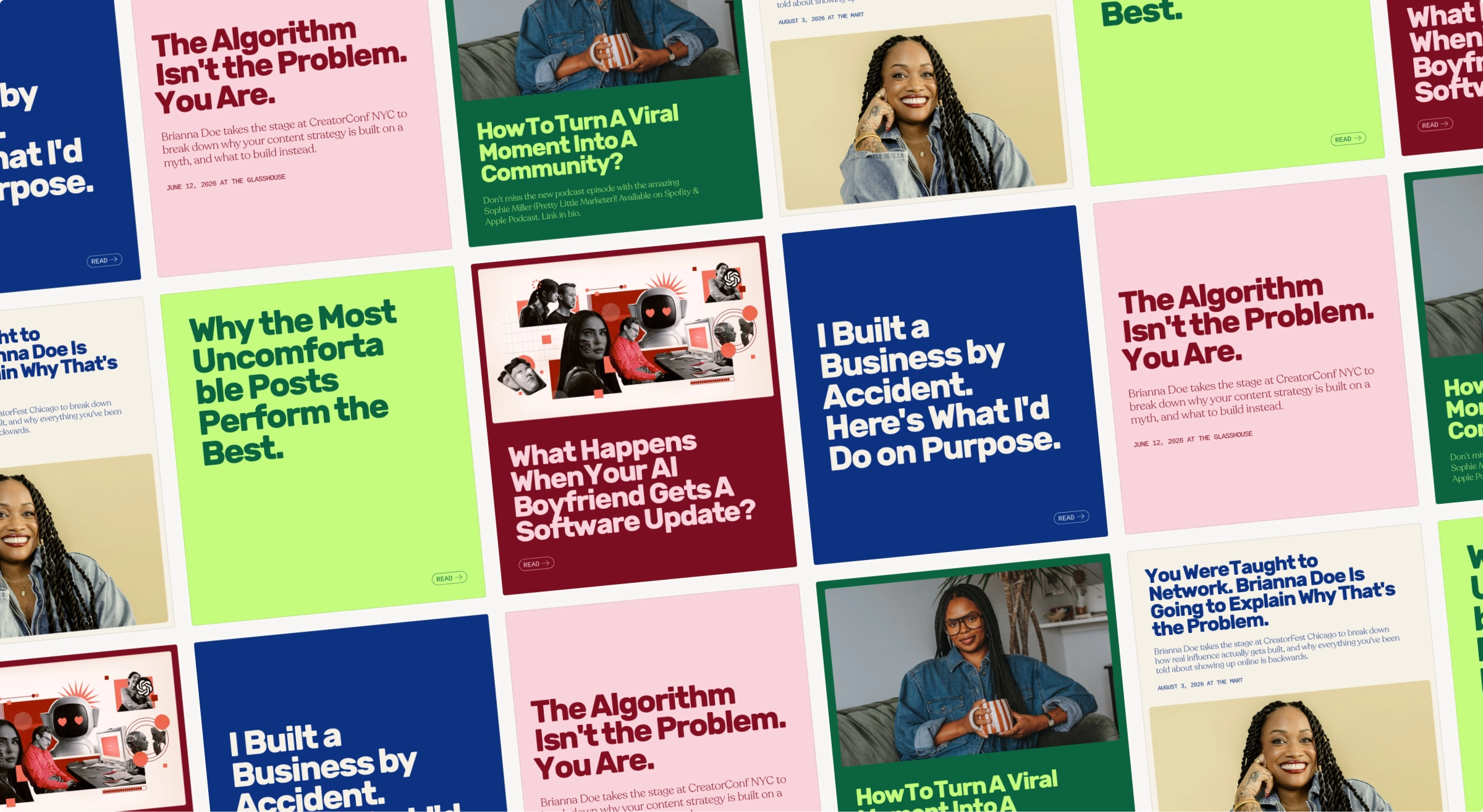
The wordmark trades a typical logo separator for a full stop: "Brianna Doe." runs as one name, closed with a period. No extra symbol or added flourish but the simplest move available, and it was chosen on purpose. That period carries through the whole system, showing up again in the "B." monogram. Sometimes the sharpest choice isn't the most complicated one but knowing exactly which single detail can carry the whole brand.
Tagline
The tagline “Decode. Observe. Evolve.” doubles as a hidden signature: D.O.E (Brianna's own initials). Each verb maps to a brand pillar: decoding the internet and culture, observing the systems and behavior that drive it, evolving as a human inside all of it.
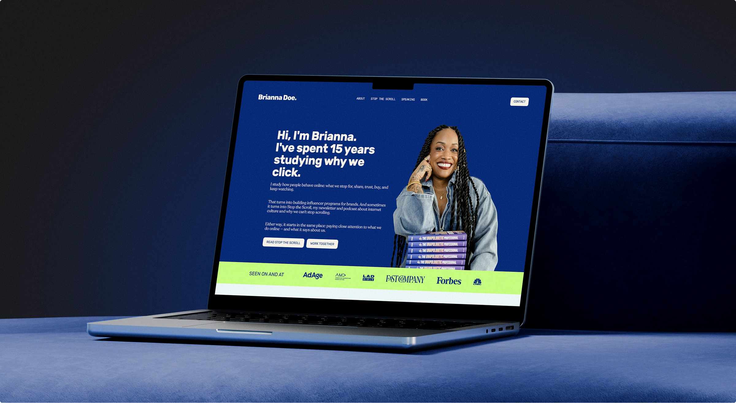
Going even further: The website
After the brand identity was finished, Brianna brought me back to lead the website as well, which made this our third project together.
If your expertise deserves to look like it has a point of view before anyone reads a word just like Brianna, you probably need the Brand On Fire 🔥
Like this project
What the client had to say
This is our 3rd project together, and Hanna has crushed it EVERY TIME. She's a joy to work with, always communicative, and brings so much creativity + a fresh perspective to our projects. I couldn't recommend her enough!!


Brianna Doe, Verbatim
Jun 6, 2026, Client
Posted Oct 13, 2026
A brand identity that gives Brianna’s personality the structure of a publication and holds up across her podcast, stages, website and guest appearances.
Likes
0
Views
3
Timeline
Apr 13, 2026 - Jun 6, 2026
Clients
Verbatim

![[Brand On Fire] Of Many Generaciones 🫶](https://media.contra.com/image/upload/c_fill,w_700/rowl4s3p30ijajhxbb9t.avif)
![[Brand On Fire] Love Killa 👙](https://media.contra.com/image/upload/c_fill,w_700/fxyya5g4kusoskvg5lw4.avif)
![[Brand Blast] Wally's NFT👾](https://media.contra.com/image/upload/c_fill,w_700/oshyst23mwlhgv944de6.avif)