[Brand On Fire] Of Many Generaciones 🫶
Hanna Woa 🔥
Verified
Of Many Generaciones is a community-based platform and e-commerce store dedicated to sharing Latin American experience and culture.
About the brand
OMG believes that the Latin culture is more than just a label, it's a vibrant and dynamic community that transcends borders and boundaries.
They celebrate the rich tapestry of Latin culture and strive to create a platform where everyone can reunite to share their stories, experiences and passions through music, food, art and more.
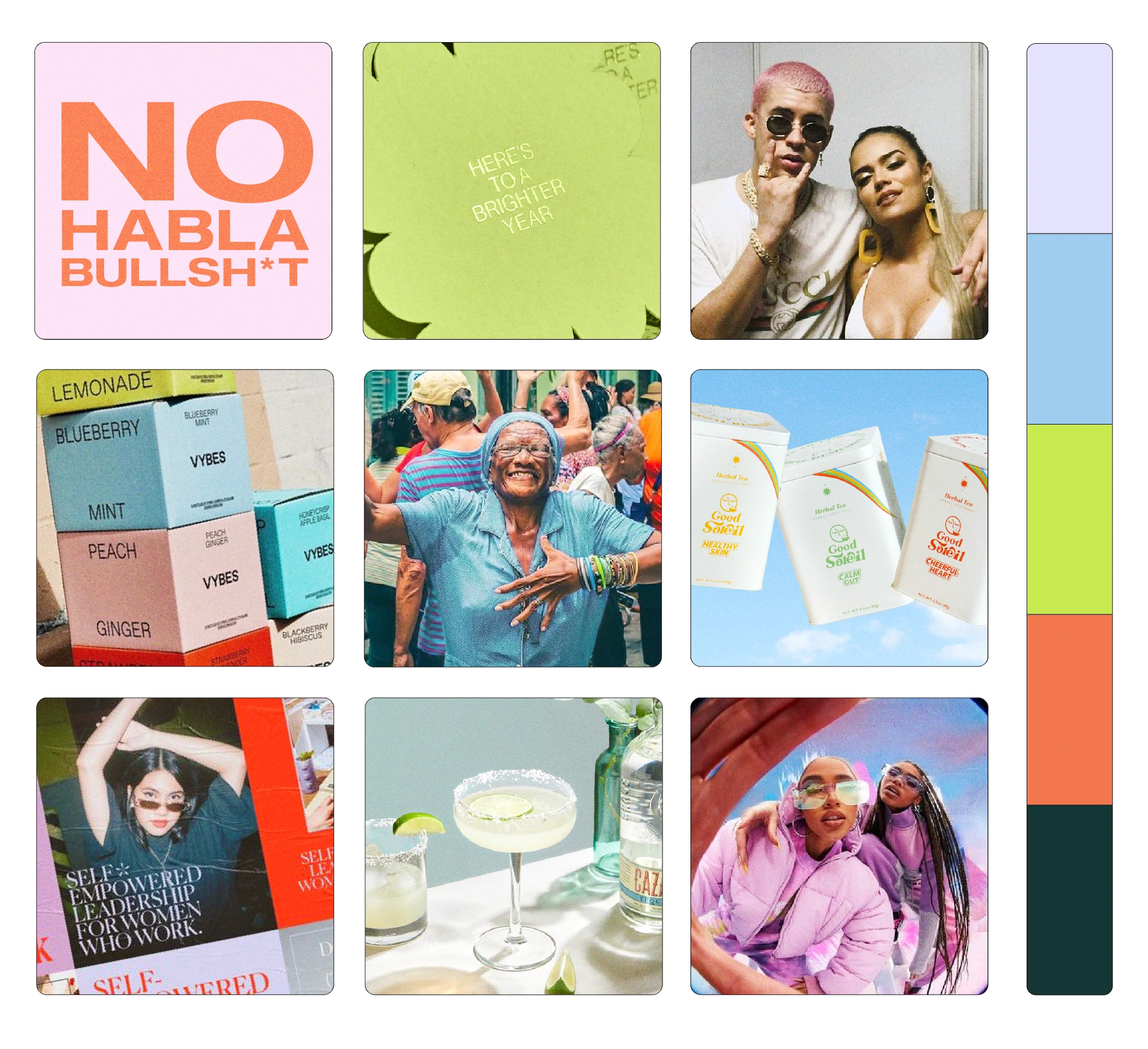
Of Many Generaciones - Moodboard
As a 1st generation Latin American and with 2 kids I see how were losing our culture. I want this platform to help navigate Americans in their journey to get in touch with their roots.
Layla - Owner of OMG
Brand concept
This creative direction was one of the two options provided, and it contrasts with the first option which was aiming to be energetic, captivating and amusing. This one is meant to be softer, refined but still affirmed.
The main reason for this creative direction is that Latins are known to make an impression everywhere they go and with everything that represents them (colorful, joyful, explosive in all terms). This is a counter approach that will differentiate you from all possible competitors.
«Contrast creates focus» is the idea to appeal to the target audience.
It's not about making an immediate connection, but rather about sparking curiosity and encouraging people to explore a new brand and fall in love with it.
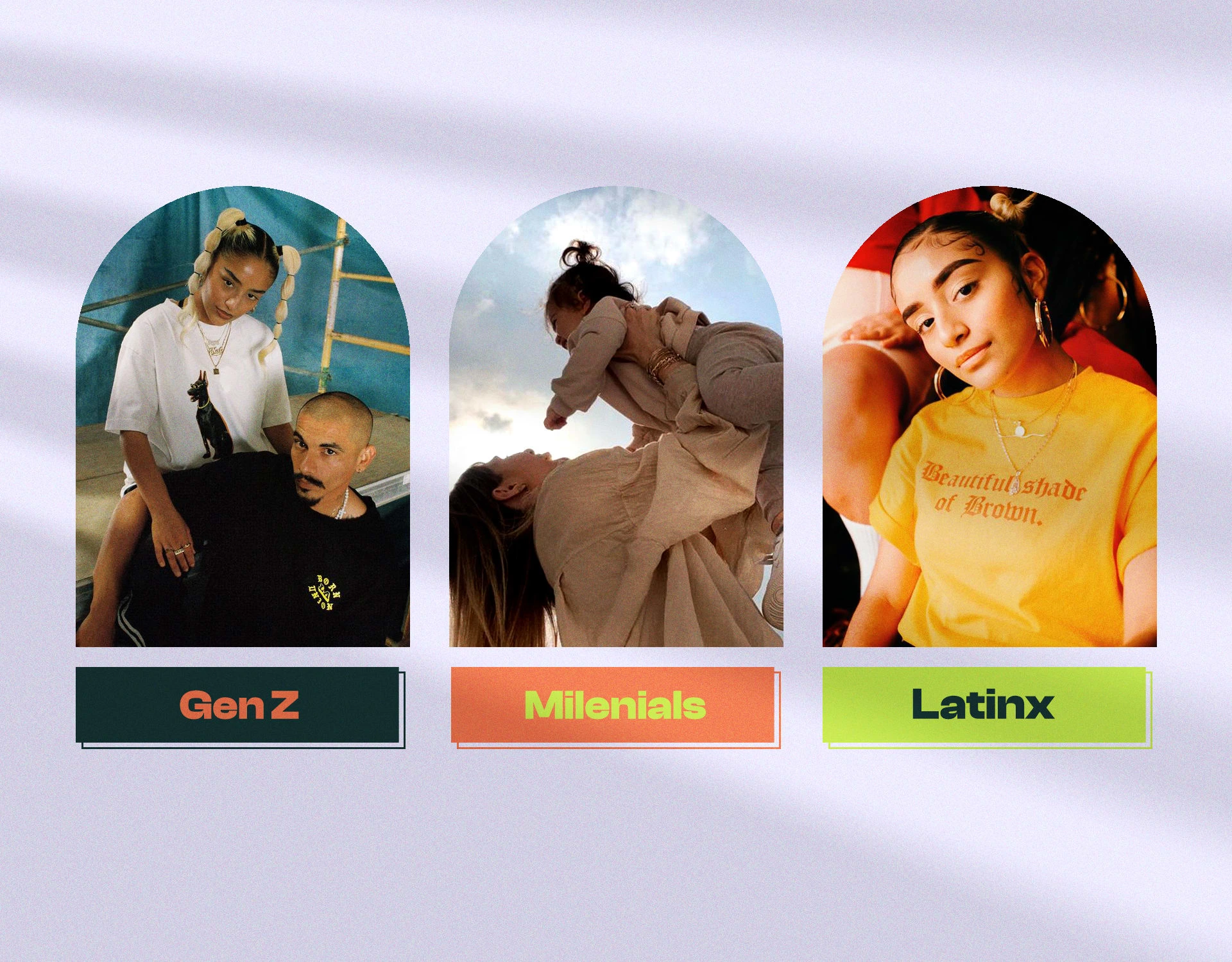
Of Many Generaciones - Target Audience
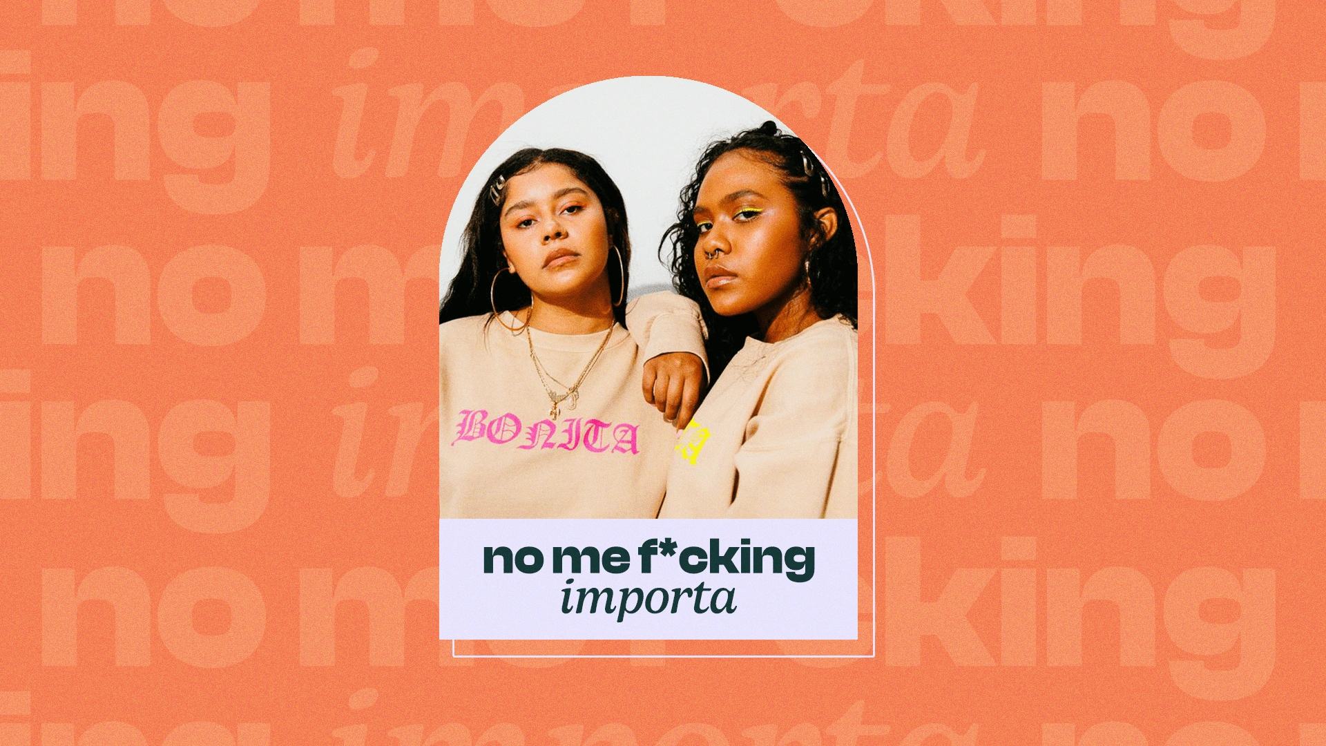
Logo design concept
The logo design suite is a typographic style and uses a straightforward approach. The main reason is that OMG is a long name, adding other visual elements or complex hints would make the logo too heavy.
I went for a genuine and candid approach, empathizing the “many” of OMG on both concepts, highlighting how the brand embraces all generations and is all-inclusive.
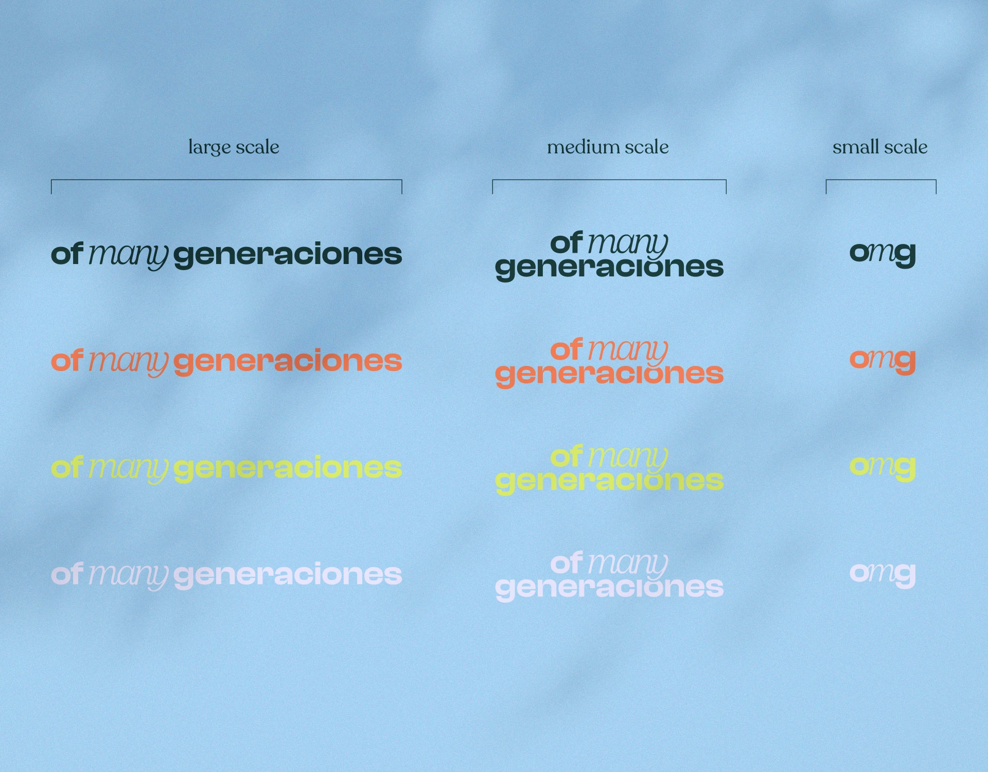
Of Many Generationces - Logo design scale
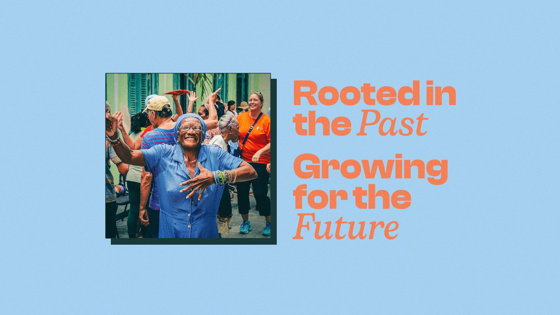
The name “Of Many Generaciones” represents all the generations that came before us and all the generations that will come after us. It’s a heritage from “many” generations that is beautifully infused in this brand.
“Many” is emphasized with a serif font. Serif typography are classically known to add complexity, depth and history everywhere they’re used (because they are historically more used in traditional and official assets). Since the generations that create OMG are from the past and future, I wanted to make it stand out in the logo design, with a hint to the past.
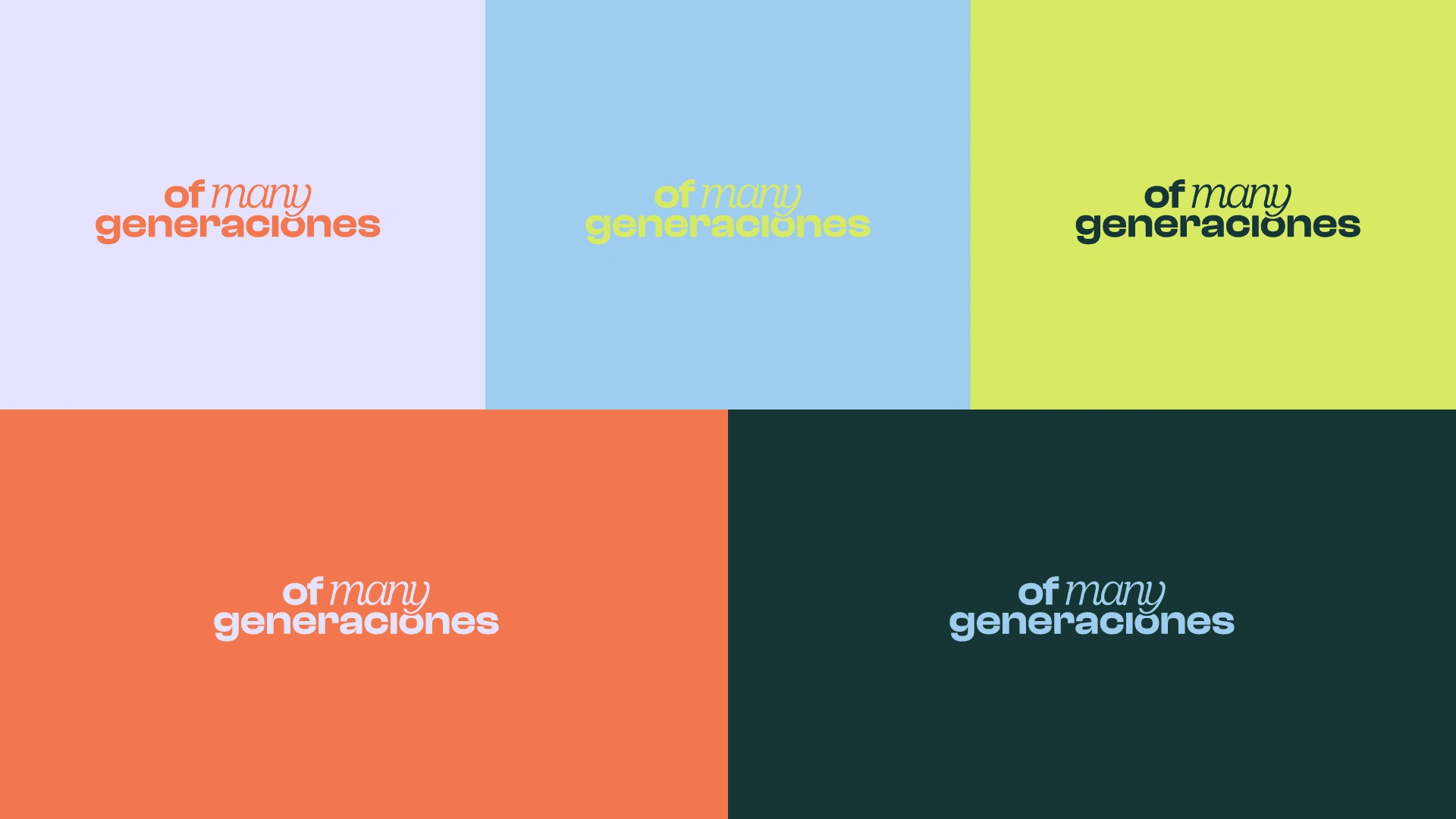
Of Many Generaciones - Logo design showcase
Ligatures were added to the “many” letters, so that they can be linked to each other, it also shows in the icon version of the logo suite.
The other words “of” and “generaciones” uses a bold sans serif font, translating a bold and fresh look.
“I want people to connect with the Past, and embrace the future.”
Layla - Owner of OMG
Color palette & font system
The colors are mostly pastels, highlighting the «soft power» of Latins. They don’t always have to be loud to be noticed.
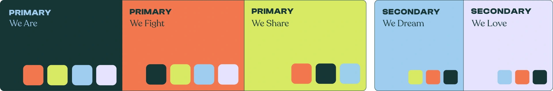
OMG will treat a lot of topics and sub-topics (culture, history, music, food, places, advices etc), so I created a rich color system that could be used to differentiate the different topics & sub-topics. Example:
Dark green/lavender: highlight Latinx-owned brands
Orange/lavender: cooking/recipes/restaurants finds
Lime green/dark green: fun facts
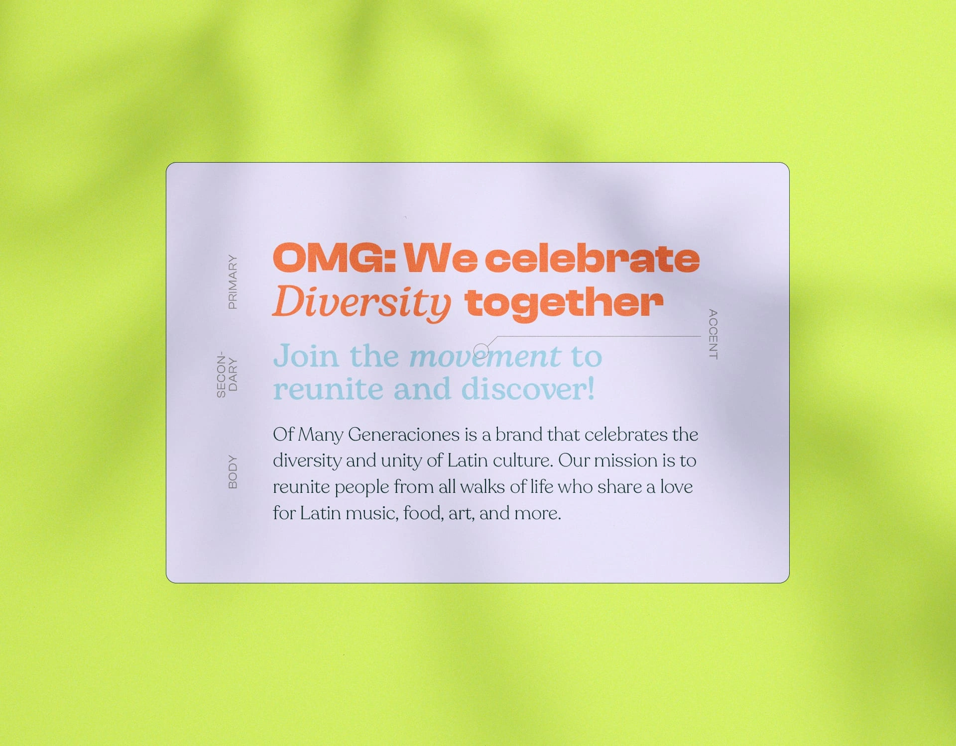
Of Many Generationces - Font system
The font system follows the logo suite and brand general concept, interchanging with serif and sans serif fonts. The serif fonts are used to either emphasize on a specific word and create focus on it, or it’s used as a secondary font, in a more “classic” way.
The serif & bold font is mostly used for headlines, to make them look daring & affirming. This goes with a confident and forward voice & tone that has previously been agreed with the owner, Layla.
Stickers
These stickers were meant to be use as brand elements, digitally or printed.
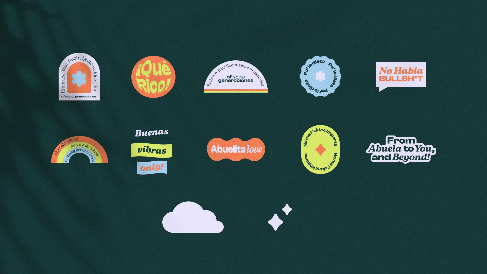
Note: The stickers set was an add-on to the Brand On Fire service.
Like this project
Posted Jun 5, 2023
Of Many Generaciones is a community-based platform and e-commerce store dedicated to sharing Latin American experience and culture.
Likes
33
Views
5.8K
Timeline
Feb 23, 2023 - Mar 11, 2023

![[Brand On Fire] Love Killa 👙](https://media.contra.com/image/upload/c_fill,w_700/fxyya5g4kusoskvg5lw4.avif)
![[Brand Blast] Wally's NFT👾](https://media.contra.com/image/upload/c_fill,w_700/oshyst23mwlhgv944de6.avif)
![[Brand On Fire, packaging & social media] High Fever 🌶️](https://media.contra.com/image/upload/c_fill,w_700/u7dlb2myoisqr59xdjl3.avif)
![[Brand Blast] Capricious Gaming 🎮](https://media.contra.com/image/upload/c_fill,w_700/bcgnbtnm1jeyvycz9dwa.avif)