Beau Society: Making a 400€/month membership feel obvious
Hanna Woa 🔥
Verified
Everyone launching in the Lyon wellness market looks the same. That was the problem we had to solve before the doors even opened.
The project
Sylvia was launching Beau Society: a premium wellness membership in Lyon that gives access to the city's best studios, spas, and practitioners under one subscription.
She came in aligned, ready, and with a clear vision. My job was to make sure the brand matched that clarity before anyone else had a chance to occupy the same territory.
This was a collaboration with Zenpo Agency. I handeled the strategy & brand identity from start to finish.

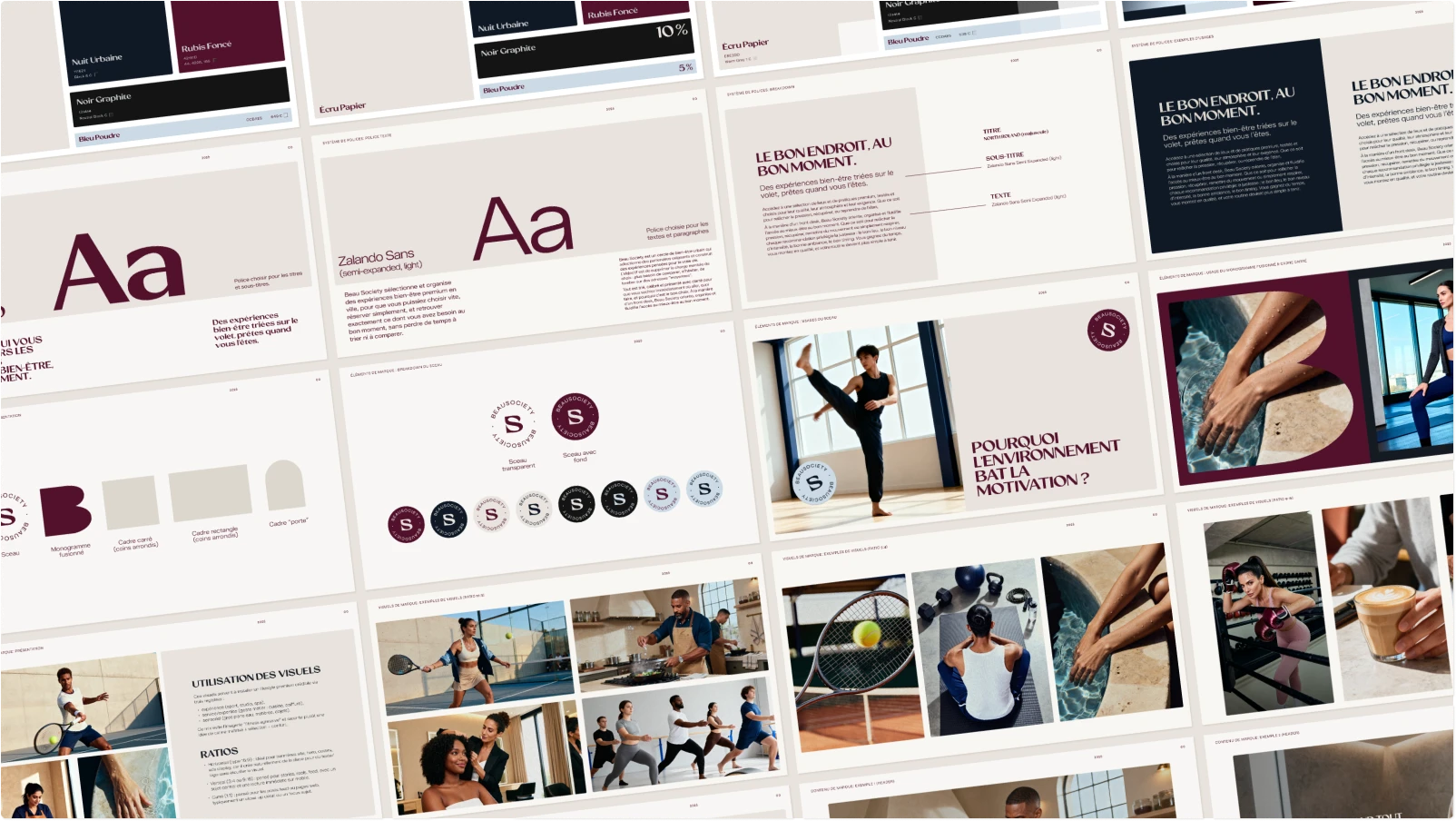
Beau Society brand guide
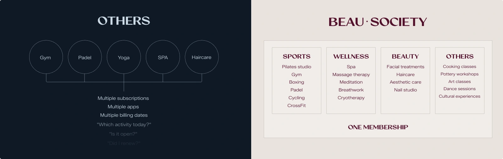
The market problem
In Lyon, premium wellness options exist but they are scattered. A studio for yoga, a separate membership for the spa, and another again for fitness. For Beau Society's target audience this creates a familiar pattern: multiple subscriptions to manage, multiple environments with their own standards, and the constant mental load of deciding where to go and whether it is worth it.
There was no premium holistic membership, and Beau Society's challenge was to become the club that replaced all of them, without being perceived as just “another pass”.
The market problem explanation
The strategic solution
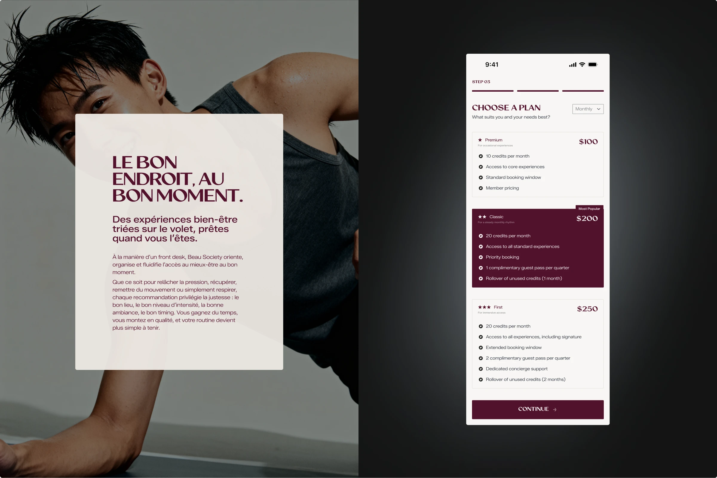
The answer was one word: Cercle (Circle). A membership in a curated circle, where the thinking is already done. The studios, the spas, the practitioners are pre-selected to a standard.
You join something that has already made the decisions for you, which is exactly what separates a club from a pass: This is what makes a 90€ up to 400€ monthly membership feel obvious instead of expensive.
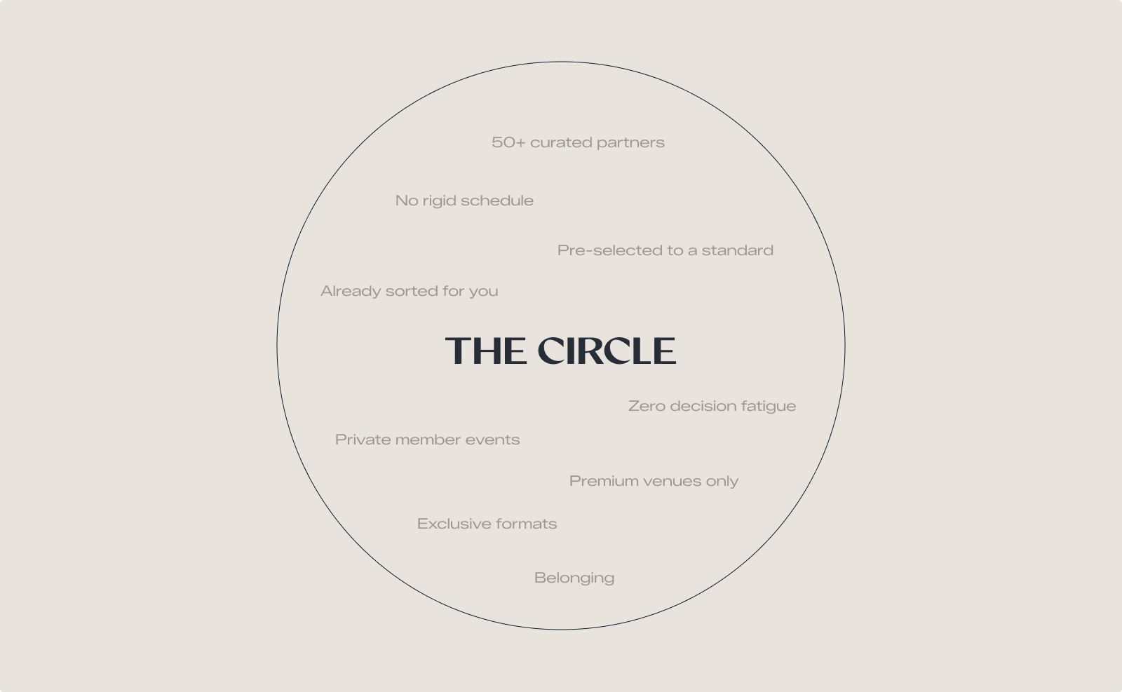
What "The Circle" means for Beau Society
Brand identity as a solution
The initial idea Sylvia had in mind for the visual identity was a black and white concept, but this was a decision that could quietly undermine everything else.
Every time a member is inside a partner studio or spa, that space's identity surrounds them. Members will leave remembering the massage, the instructor, the room and not the membership that got them there.
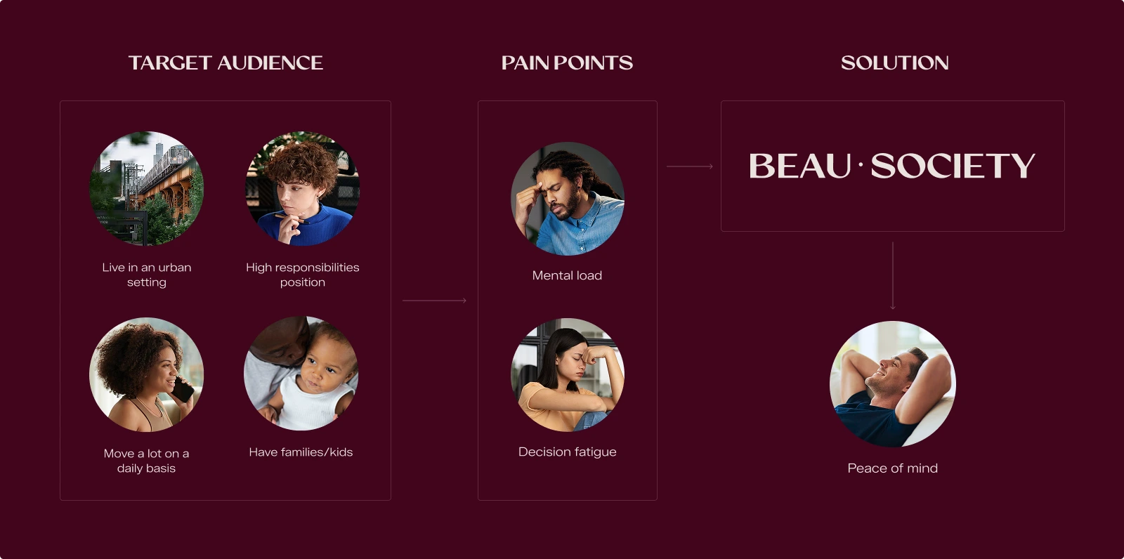
Beau Society's target audience is someone whose life is full and whose standards are high. Not someone who lacks the desire to take care of themselves. They have already decided wellness matters to them and they can afford it, what gets in the way is the decision itself. 'Where, when, which studio, is this worth it' is the reason they never actually do it.
So, Beau Society takes care of that entire decision before they even have to think about it.
Building a brand identity that fits the target audience
Creative directions
Two creative directions were explored:
“The Front Desk” positions Beau Society as the premium entry point that has already sorted everything before you arrive, precise and restrained, built around service over inspiration.
“Maison des Rituels” takes the same brief from a different angle, building Beau Society as the reference home for your wellness routine, something stable and recognizable you return to without having to start over, leading to easier decisions as well.
Both creative directions were strategically aligned with Beau Society, each solving the same market problem from a different angle. The choice was Sylvia's, and she picked The Front Desk.
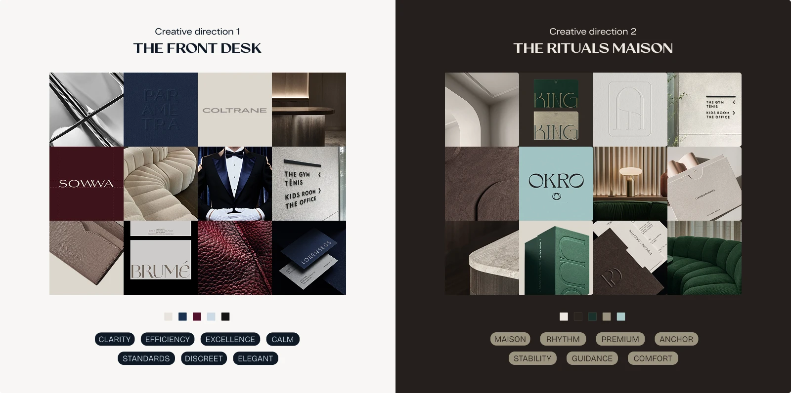
The two creative directions explored
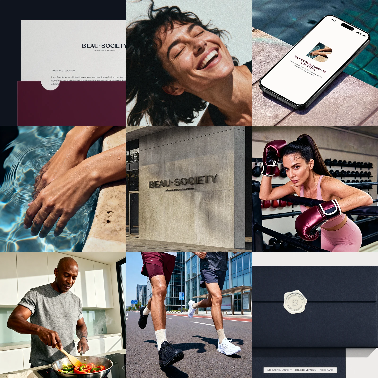
Brand final image spread (with the chosen creative direction)
Color system
The color palette built to feel premium and service-coded rather than soft or expected.
Écru Papier is the warm dominant base, Nuit Urbaine brings the conciergerie authority, and Rubis Foncé is the charismatic statement color, a deep burgundy that stands apart from what this industry defaults to. Noir Graphite and Bleu Poudre complete the system as structural neutral and light accent.
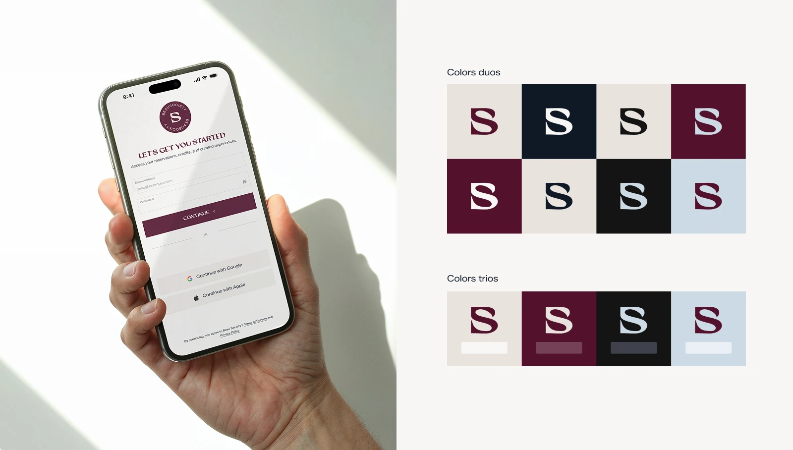
Color system in action and pairings
Typography system
In a membership brand operating across multiple spaces, typography has to carry the brand identity independently: the card, the app, the check-in screen, the logo is not always there.
North Roland was chosen because it carries luxury codes without falling into cliché, which is exactly right for a premium membership that needs to feel elevated without feeling overdone.
Zalando Sans Semi-Expanded was a deliberate contrast to the clean neutral sans-serifs that dominate this industry. The semi-expanded width is unexpected in wellness, and that unexpectedness is the point: it opens the reading experience rather than compressing it, bringing a sense of calm that runs through the entire direction.
Together they create the same emotional register as the system: authority without pressure, and ease you do not have to work for.
Typography system (visual and website)
Typography system (visual and application screen)
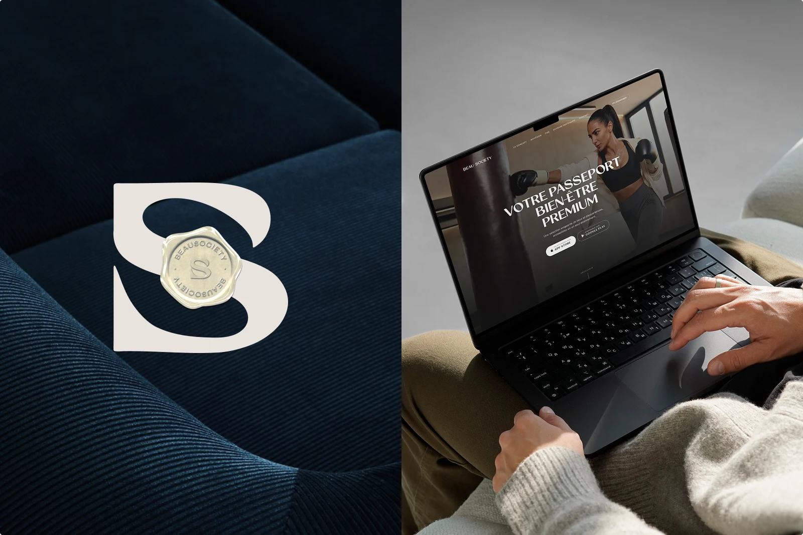
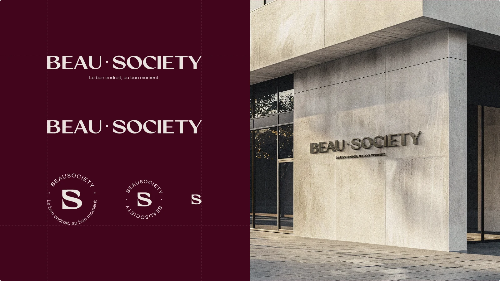
Logo design suite
The logo design suite was built to show up in many different places, both digital and physical. The wordmark positions Beau Society as a premium service signature: stable, built to last rather than to follow trends, with enough elegance in the curves and weight variations to keep it from reading as strict.
The fused BS monogram completes the system as the discreet belonging mark, versatile enough to live across objects and touchpoints without ostentation.
Together they directly translate the host and concierge role defined by The Front Desk direction: precision, high standards and a calm authority that guides without talking down to you.
Logo design suite and visual
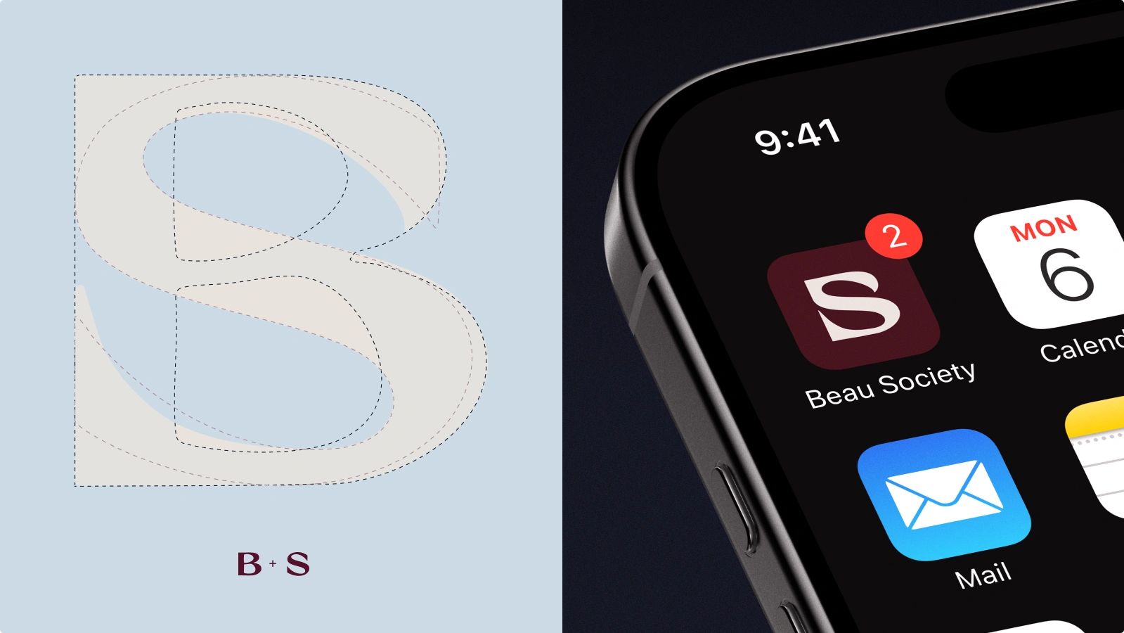
Monogram breakdown and visual
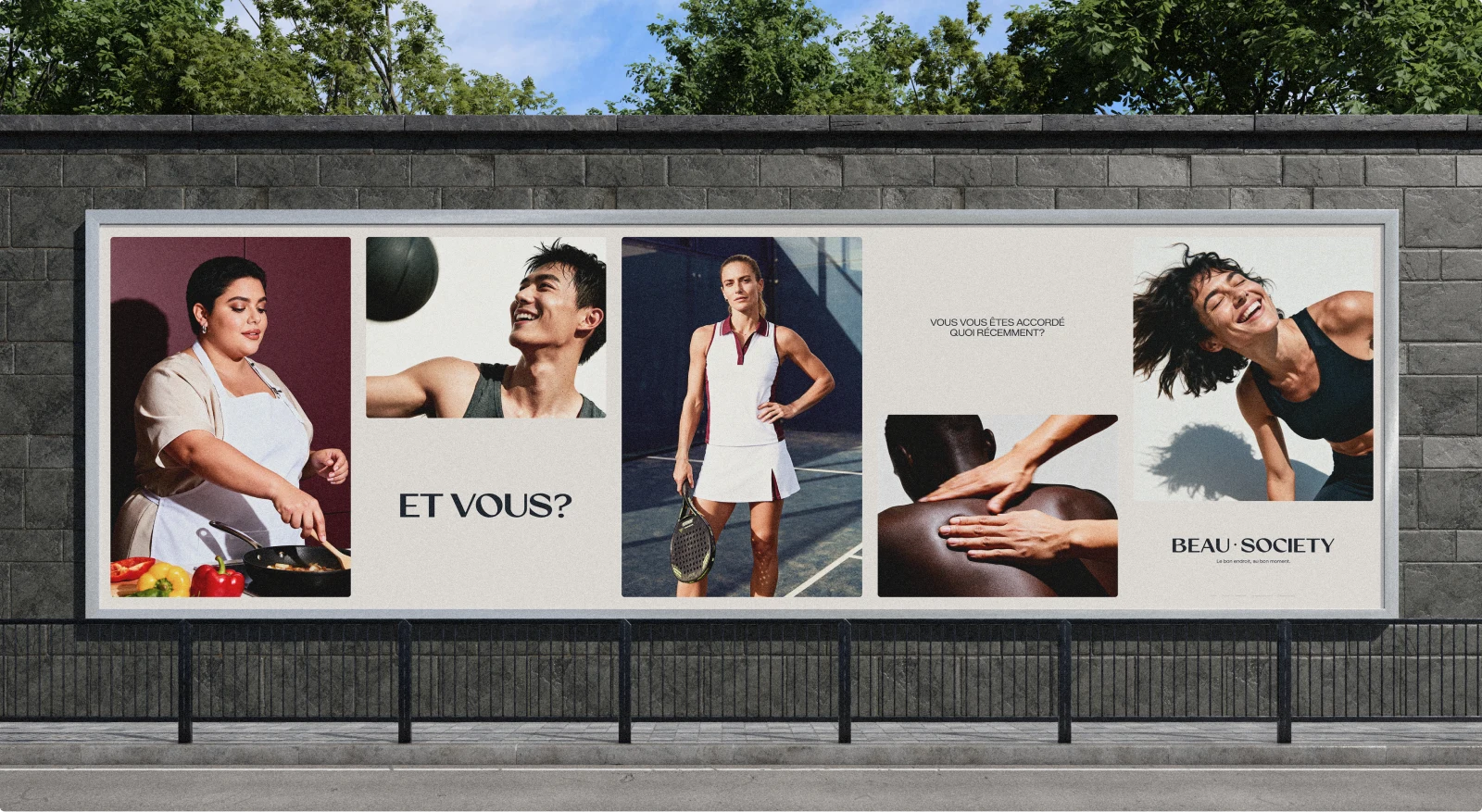
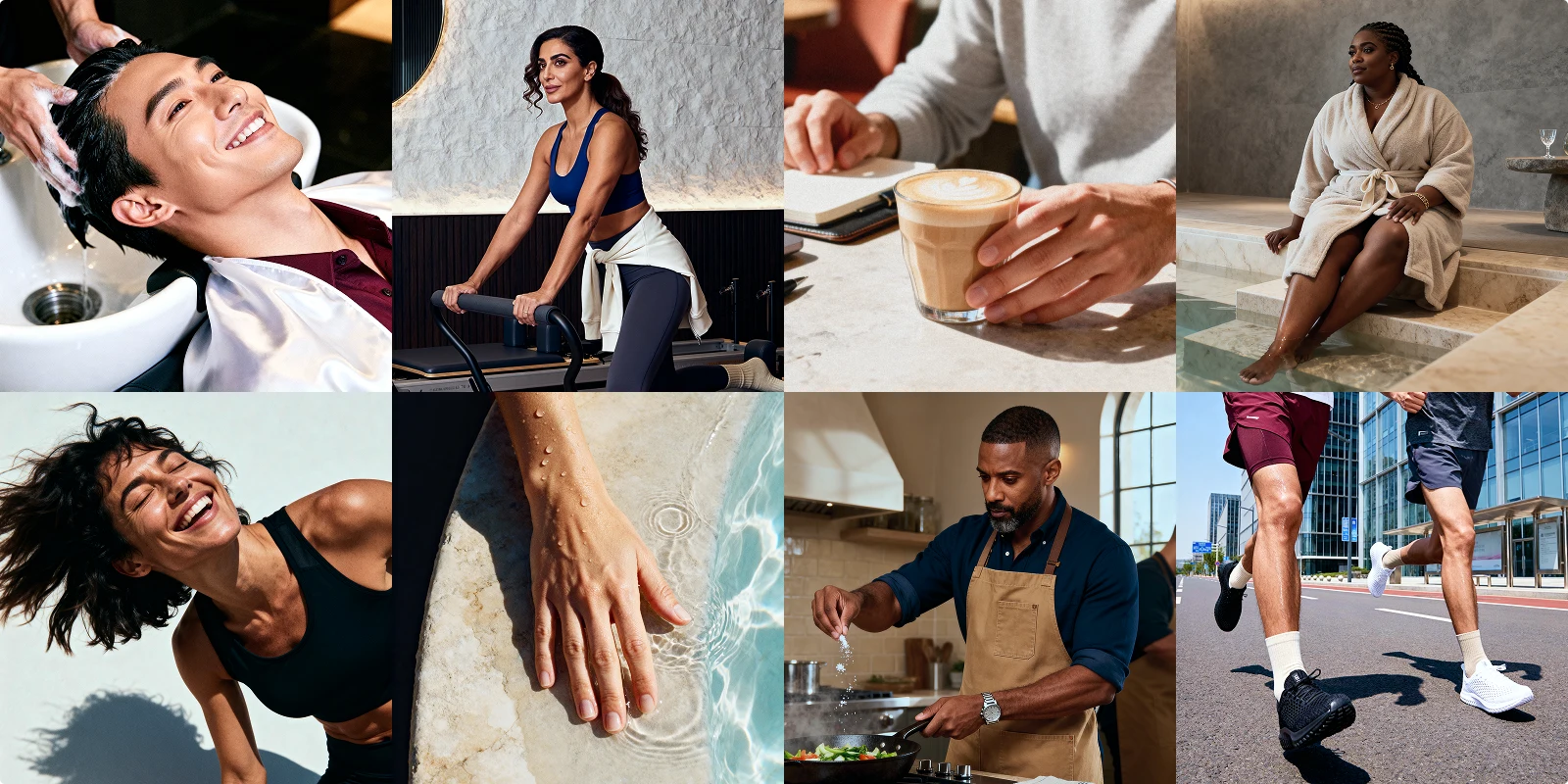
Brand imagery
The brand imagery is built around three registers:
Experience (sports, studio, spa),
Expertise (professional movement or close up)
Sensory (fabric, ambience, mood).
Anything that reads like performance culture or transformation pressure was deliberately excluded. Beau Society is selling ease, and the imagery has to make someone feel what it is like to already be a member before they have signed up.
Brand imagery
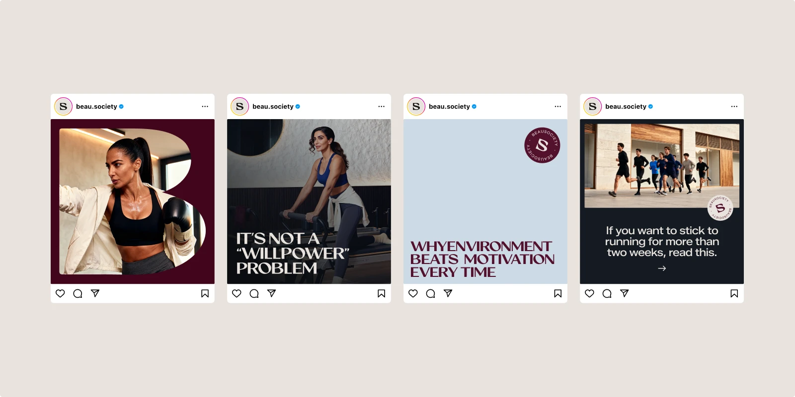
Brand content creation examples
Brand social media and collateral
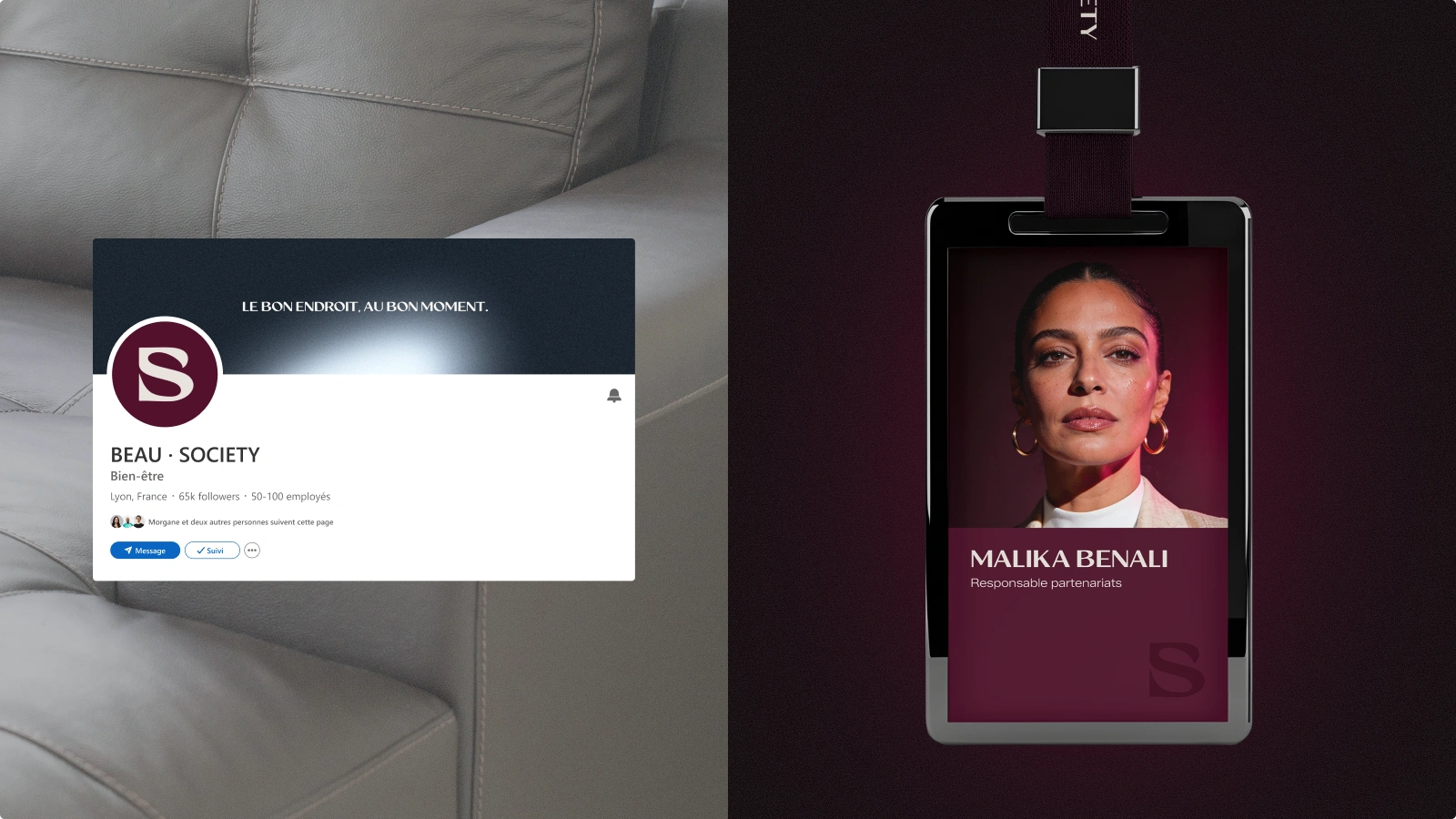
Brand image spread
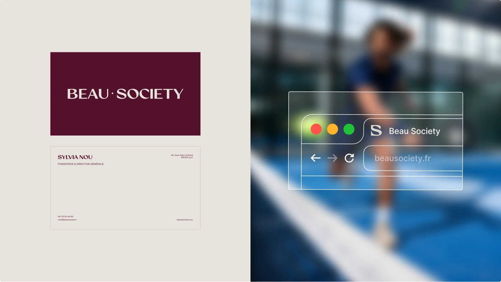
Business card and favicon visuals
Beau Society brand guide
"Every time you presented, whether it was the brand strategy, the creative direction or the branding, it had a wow effect on me. You were able to translate exactly what I wanted in a surprisingly accurate way, at a level above what I had imagined myself. Everyone who sees our creative direction absolutely loves it, and it's a truly inexplicable pleasure to be able to talk about the project. It clearly allows me to focus on the real work, development and growth, and to feel more confident and more grounded in the project." Sylvia, founder of Beau Society
If your brand needs to hold its own before you even open the doors, you need the Brand Blast ☄️
Like this project
What the client had to say
As always, amazing ! She works fast, she’s organized, and above all she really cares about delivering something great. I honestly couldn’t be happier with her work
Djiby Barry, Zenpo Studio
Jan 23, 2026, Client
Posted Jul 1, 2026
Strategy and brand identity for a premium wellness membership. Objective: make a 400€/month feel like the obvious answer.
Likes
3
Views
29
Timeline
Sep 22, 2025 - Jan 23, 2026
Clients
Zenpo Studio
![[Brand On Fire] Of Many Generaciones 🫶](https://media.contra.com/image/upload/c_fill,w_700/rowl4s3p30ijajhxbb9t.avif)
![[Brand On Fire] Love Killa 👙](https://media.contra.com/image/upload/c_fill,w_700/fxyya5g4kusoskvg5lw4.avif)
![[Brand Blast] Wally's NFT👾](https://media.contra.com/image/upload/c_fill,w_700/oshyst23mwlhgv944de6.avif)
![[Brand On Fire, packaging & social media] High Fever 🌶️](https://media.contra.com/image/upload/c_fill,w_700/u7dlb2myoisqr59xdjl3.avif)