The network for creativity
Join 1.25M professional creatives like you
Connect with clients, get discovered, and run your business 100% commission-free
Creatives on Contra have earned over $150M and we are just getting started
Back to feedPost
Taste Test


SMALL MOCKUP TEST. BIG DIFFERENCE. 👀
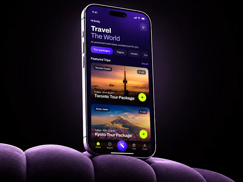
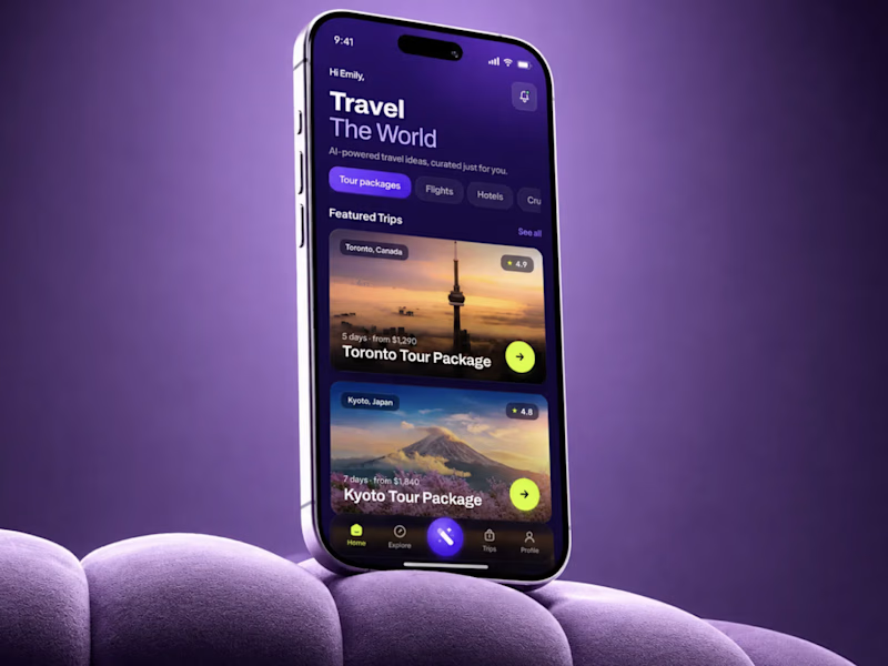
Same AI Travel App UI.
I changed only the background.
Not the UX.
Not the flow.
Not the product logic.
Just the visual context.
And the darker version instantly made the app feel more premium, focused, and easier to read.
That is why presentation matters in mobile app design.A weak frame can make good UI look average.
A strong frame can make the product feel more valuable before the user even taps anything.Expected impact:`
+35-45% first-screen engagement
+25-30% trip card interaction
+20-28% faster package discovery
+30-40% perceived product value
Sometimes design is not about adding more.Sometimes it is about removing what steals attention.
🟢 Book a Mobile App Strategy Session
https://calendly.com/asol_design/book-diagnostic-call-linkedin-clone

26 voted
67%
13 voted
33%
39 votes
Closed

A for me

Love this approach. It's fascinating how design can completely change how people feel while using a product.

Mockup A

Voting B (dark version) — the darker background creates such a premium, focused feel that instantly elevates the product. Context really is everything in mobile design, great experiment!


Love them both

going for the darker one

I had to look twice to notice it. The darker version creates slightly stronger contrast, which helps direct attention to the product.

Voted A. The dark background doesn't just look better, it stops competing with the UI. The purple version splits your attention between the environment and the app, whereas the near-black version just disappears and lets the content breathe.



Love this!



Really interesting comparison. It's surprising how much perception can change without altering the UX itself. The darker background definitely makes the interface feel more focused and premium. Have you noticed similar engagement improvements across other app categories, or does...




the left one is just sick 🔥
I love how the color of the phone blends seamlessly into the color of the couch

This is good

love concept B really great work
The network for creativity
Join 1.25M professional creatives like you
Connect with clients, get discovered, and run your business 100% commission-free
Creatives on Contra have earned over $150M and we are just getting started
Trending

Claude
Claude has entered the design space. How are you using Claude Design?

Contra University
Learn from expert creatives how to earn more using next-gen AI tools.
creativeaiflow
Creative AI workflows are evolving. What tools do you use, and what are their strengths and weaknesses?
freelancerlife
Freelancer life is wins, pivots, and everything in between. What’s yours right now?








Related posts



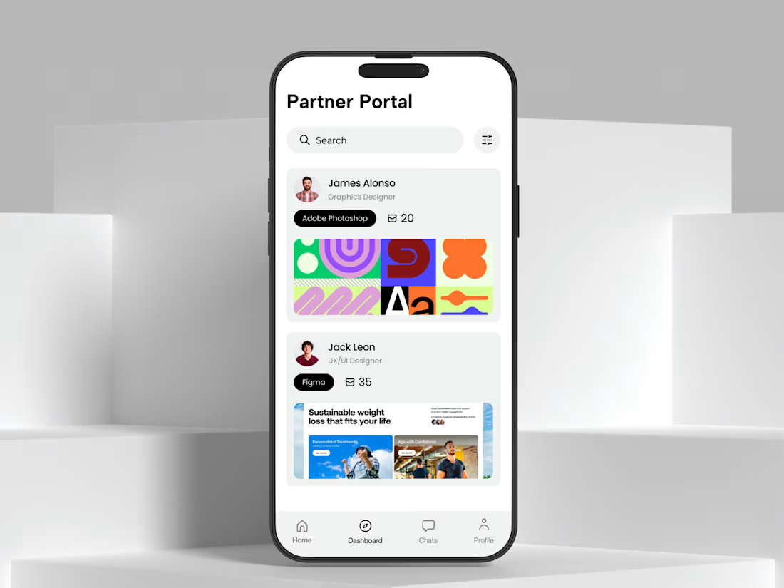
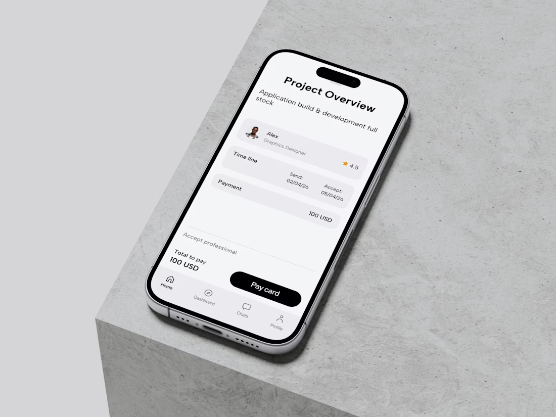


Looks great!

You can fix your brain in Brainrot! Turning on Focus mode lets you heal your brain and bring him back to top shape!
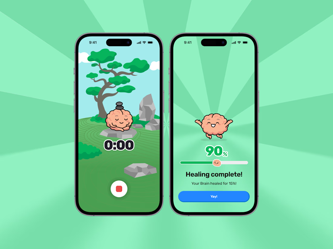

This looks cool.

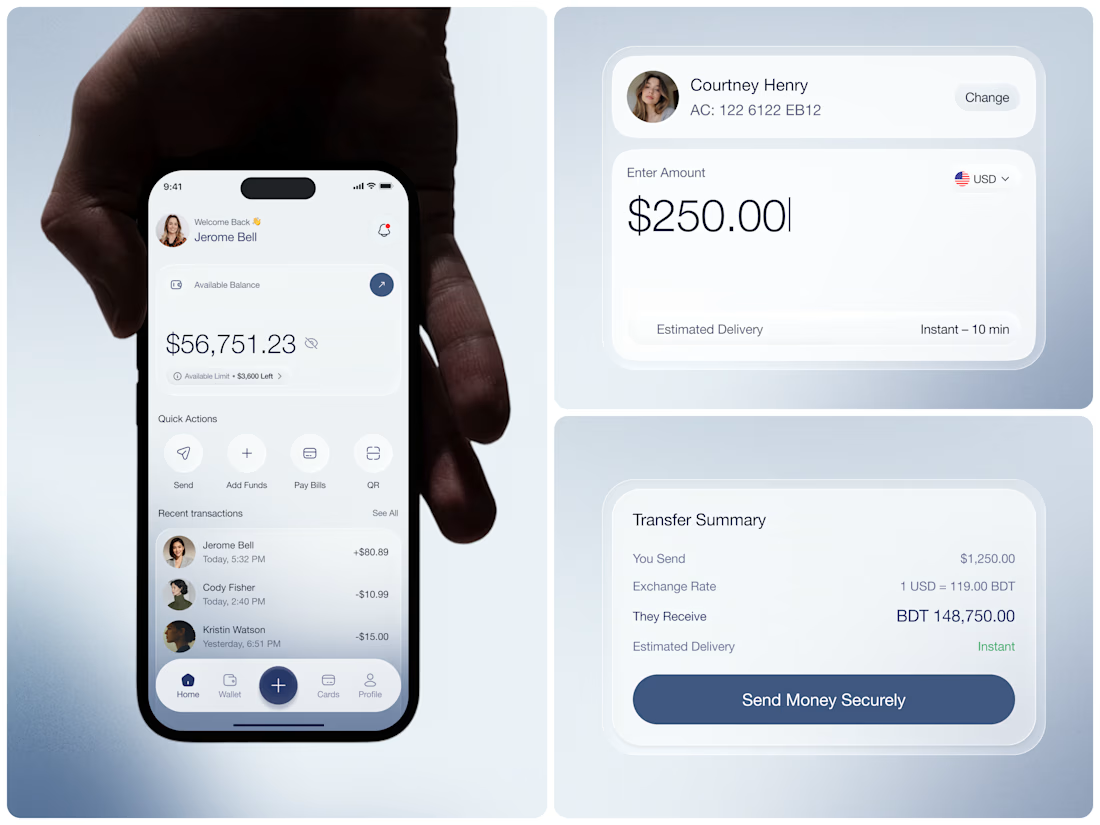
Banking apps have a reputation for making simple things feel complicated. This one was designed to fix that.
Payno is a mobile wallet built around clarity onboarding that takes four steps, a home screen that shows your balance and recent transactions at a glance, and a transfer flow that handles multi-currency sends with live exchange rates and zero transfer fees.
$56,751.23 available. $250 sent. Instant 10 min delivery. ৳148,750 received on the other end.
Soft blue gradients, clean white cards, and a layout that never asks the user to think twice about where to tap next.
Banking made simple. The design proves it.
Does this feel like the mobile wallet experience users have been waiting for? 👇
Tools: Figma
#MobileDesign #FintechUI #BankingApp #UIDesign #AppDesign #ContraFreelance #ProductDesign #MobileWallet
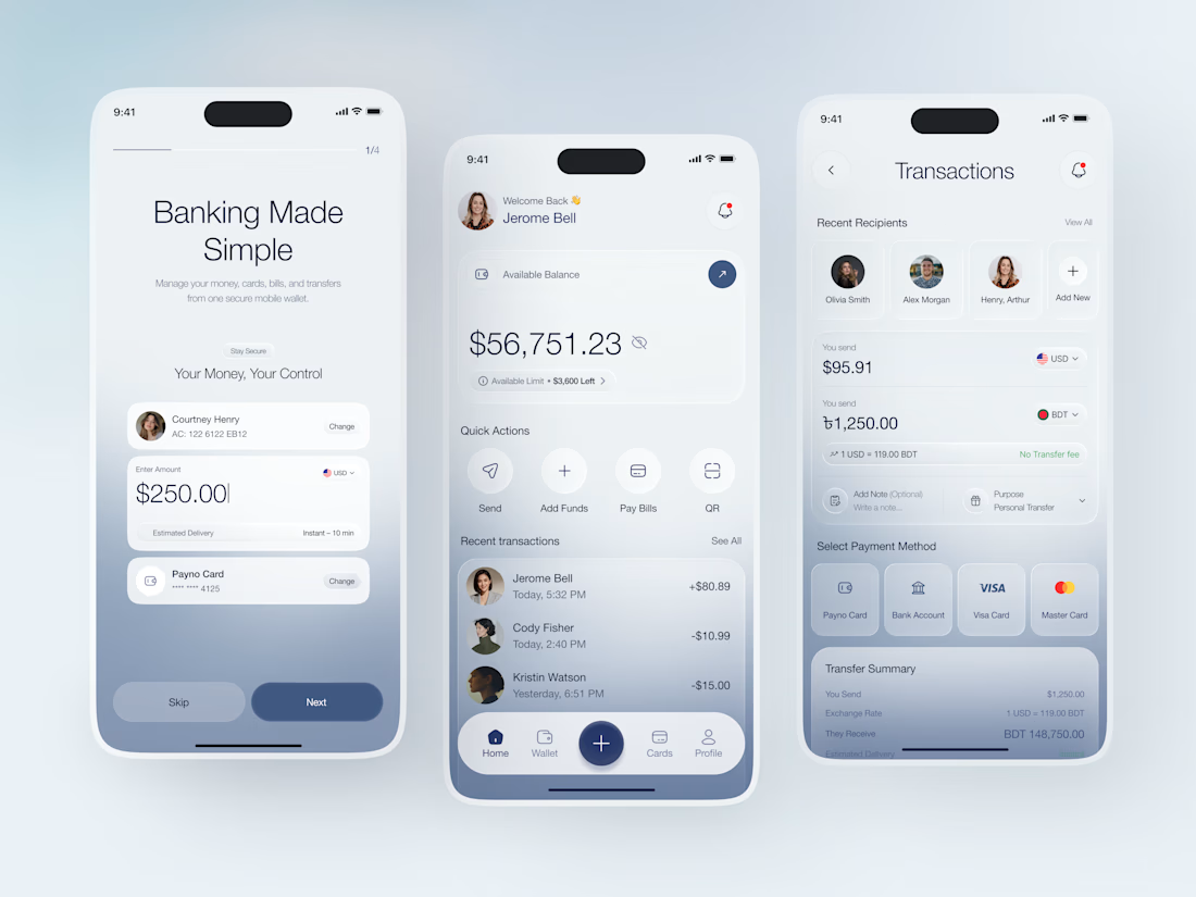

Everything feels so balanced.