The network for creativity
Join 1.25M professional creatives like you
Connect with clients, get discovered, and run your business 100% commission-free
Creatives on Contra have earned over $150M and we are just getting started
Back to feedPost

Check it out my Branding project for Experify 🚀
The Behance design gods approved! Super thrilled to share that this project earned a 🏆 Behance Gold Ribbon in Graphic Design! 🎉


Congrats on the ribbon. For a real-opinions product the tricky part is usually making authentic read as trustworthy rather than scrappy, and that warm orange with the tight geometric mark lands on the right side of it. What pushed you toward the bold C over something more literal?

Nice work! Congratz.
BTW, what was your inspiration when you did motion design for this project?

Creative


So cool and engaging!
The network for creativity
Join 1.25M professional creatives like you
Connect with clients, get discovered, and run your business 100% commission-free
Creatives on Contra have earned over $150M and we are just getting started

Challenges
View all





Related posts


Like the word mark

Photorealistic 4K Sneaker Loop - Built for E-commerce Conversion
Goal: Create ad-ready product video that shows material detail.
How I did it:
PBR materials + HDRI lighting in Blender
8s seamless loop, 4K render
Post in After Effects
Result: 95% material accuracy, client ready for ads. Open for freelance product videos - DM me!
#3DRender #ProductVisualization #AIvideo


wow ,


This is one of the most beautiful pieces of art I have ever seen, with a deep message. Great work😍

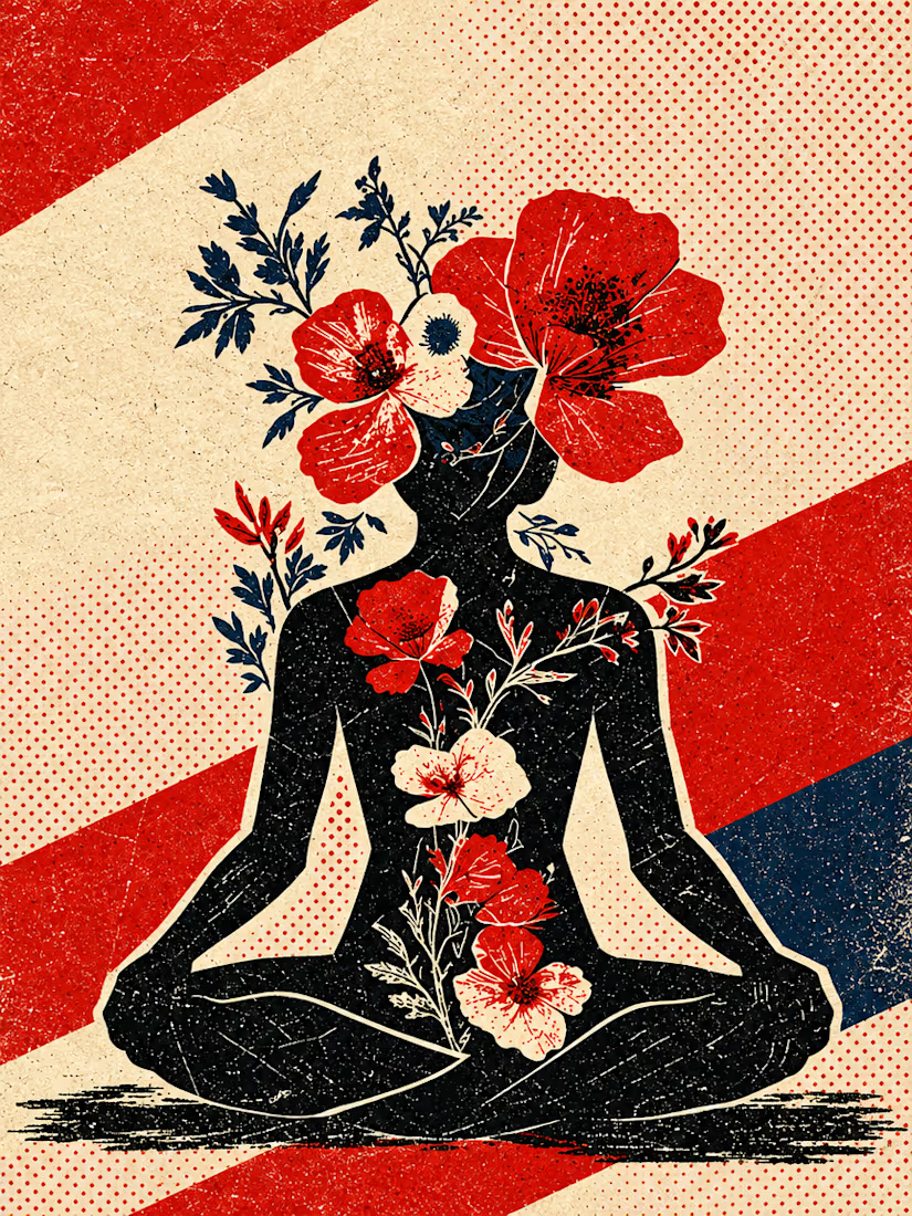
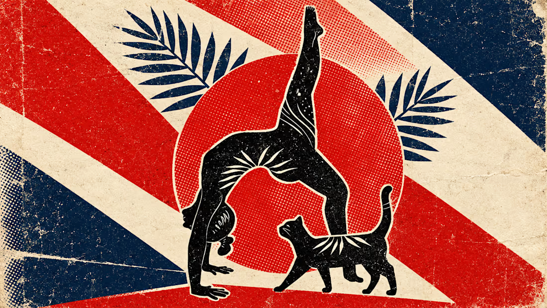
What happens when propaganda designed to erase the self gets pointed at the self instead?
Soviet propaganda spent 70 years trying to erase the individual soul in favour of the collective machine. I pointed that exact visual language at the thing it was built to suppress.
I kept...


beautiful work!