
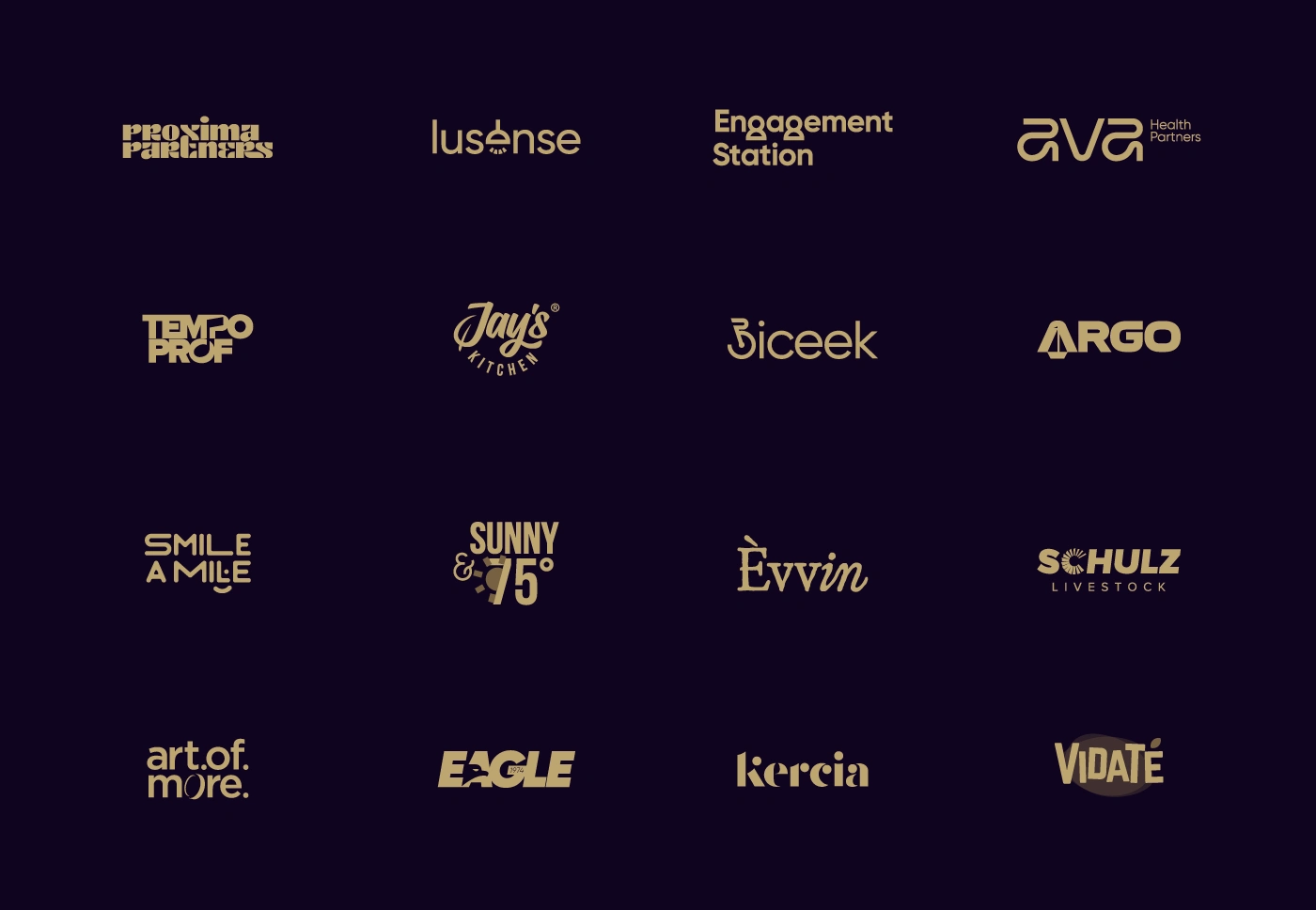
Wordmarks are all about the details. This collection brings together 16 custom wordmarks I designed for clients across different industries. Each one is built from scratch: no off-the-shelf fonts, just hand-drawn and adjusted letterforms, with attention to spacing, rhythm and proportion.
Custom stacked wordmark with dense, interlocking letterforms and playful details in the X and R.
Clean geometric lowercase wordmark with a pendant lamp and light rays replacing the letter e.
Bold stacked wordmark with rounded forms and tiny human figures built into the g’s. See it in use https://engagementstation.com/

Monoline wordmark built from smooth, looping geometric strokes, with a compact descriptor.
A good wordmark has to work at every size. I draw letters geometrically, then refine the curves and kerning by eye, and test each logo from a favicon to a billboard.
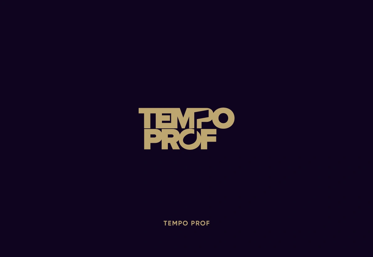
Heavy condensed wordmark with tightly interlocked letters and a music note hidden in the negative space.
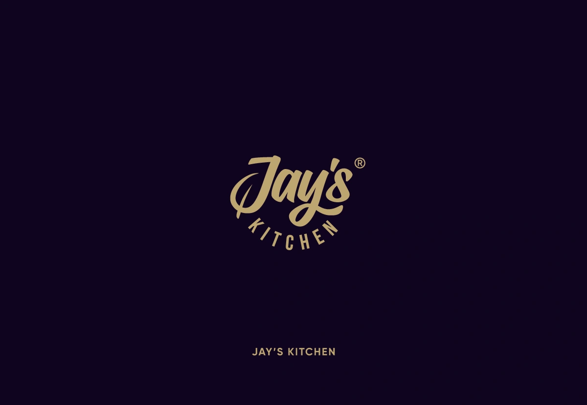
Hand-lettered script wordmark with a leaf hidden in the “J”, an arched secondary line and a registered mark.
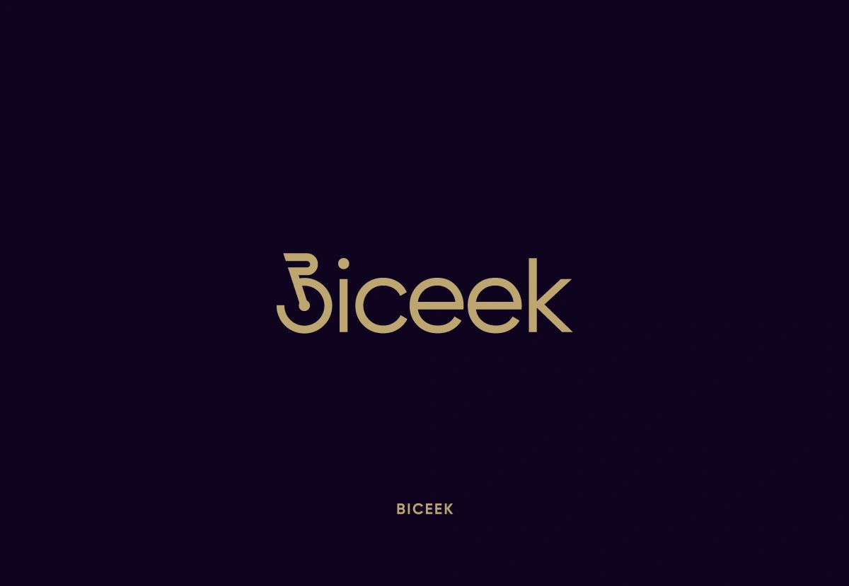
Light geometric wordmark where the first letter is built from a bicycle handlebar and wheel.
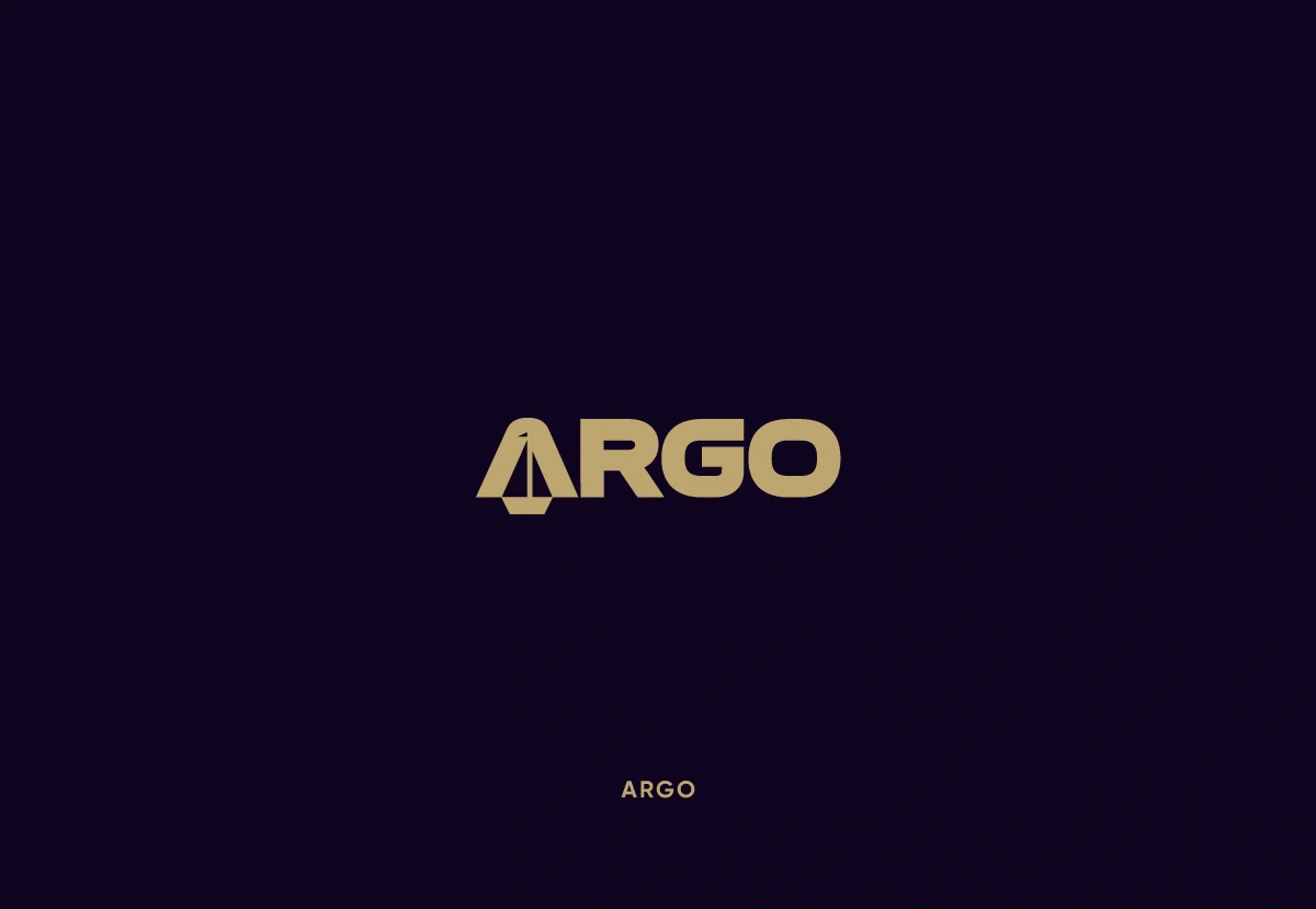
Bold, wide wordmark with a sail-like ship shape built into the A.
Wide geometric wordmark in two lines, with a smiling face integrated into it.
Condensed bold wordmark with a sun worked into it.
High-contrast serif wordmark.
Strong wordmark where the “C” is formed as a windmill wheel with radial blades, plus a widely tracked secondary line.
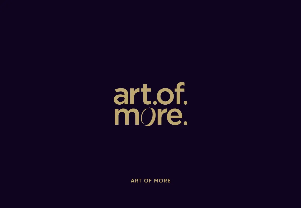
Rounded lowercase wordmark in two lines, with a coin forming the “o” in “more” and periods adding rhythm.
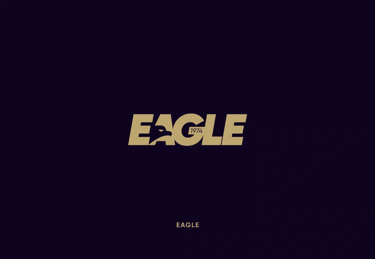
Heavy italic wordmark with an eagle head hidden in the negative space and a small founding-year mark.
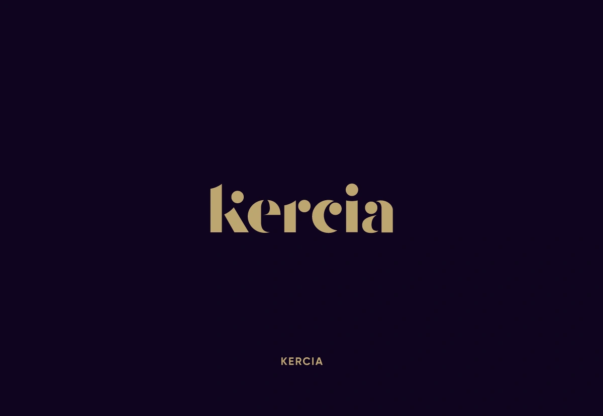
Compact, chunky lowercase wordmark with soft, curved terminals. See it in use https://www.kercia.com/
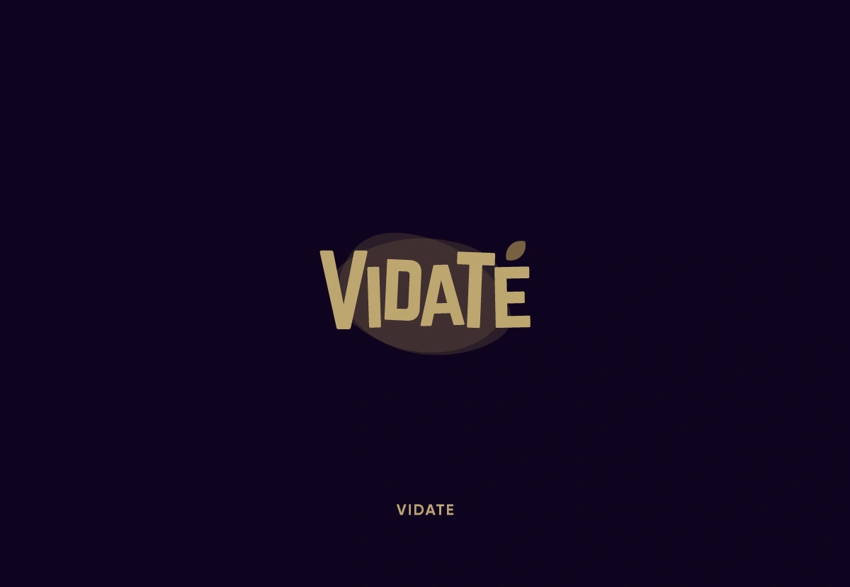
Bold condensed wordmark where the accent over the “e” is a tea leaf, set on a soft organic shape.
Many of these marks carry a hidden idea inside the lettering: a music note in negative space for Tempo Prof, a bicycle wheel as the first letter of Biceek, a tea leaf for the accent in Vidaté. The goal is a mark that reads clearly first, and rewards a second look.
Looking for a custom wordmark for your brand? Send me a message and let’s talk about your project.
1 like · 13 views · Oct 16, 2026
Wordmarks are all about the details. Here’s a collection of custom lettering and typography explorations for brands across different industries.


