The network for creativity
Join 1.25M professional creatives like you
Connect with clients, get discovered, and run your business 100% commission-free
Creatives on Contra have earned over $150M and we are just getting started
Back to feedPost
What happens when propaganda designed to erase the self gets pointed at the self instead?
Soviet propaganda spent 70 years trying to erase the individual soul in favour of the collective machine. I pointed that exact visual language at the thing it was built to suppress.
I kept flat 2–3 colour print, no gradients, no softness, ink-on-paper style, and honestly, I didn't expect it to come out this cool.
Does it give spirituality or propaganda vibes for you?
What other era and modern theme you think would be an interesting blend?
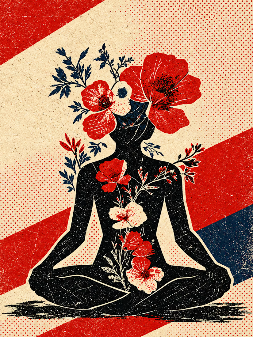
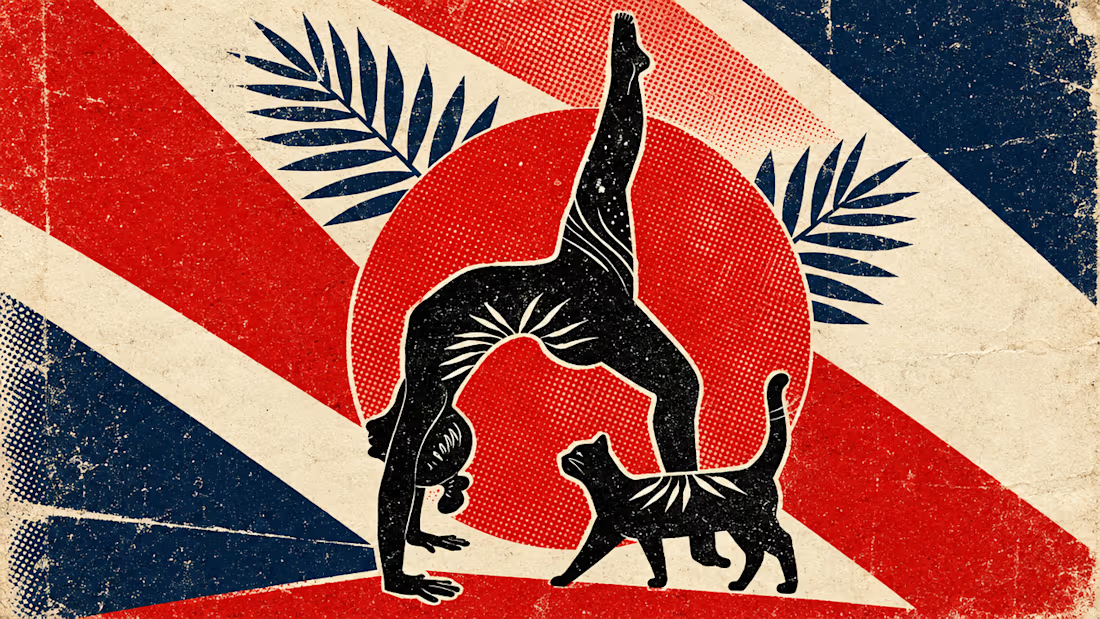
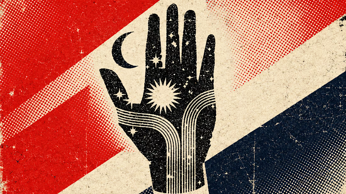

The flat 2–3 colour palette and ink-on-paper texture make the symbolism land with real weight; the flowers against that rigid geometry are a striking contrast.

I'm a fan of the texture, and I like your point of flowers contrasting the rigid geometry.

Reads more propaganda to me honestly, the flat color-blocking keeps it too graphic to feel purely spiritual even with the lotus pose. I'd love to see this same treatment turned on social media aesthetics, that curated "perfect life" feed culture feels like its own quiet kind of erasure.
It hits propaganda through for me as well, I'm wondering if it's true also for those who were not exposed to this particular conditioning in one or the other way.

Simply brilliant!


The ink-on-paper texture makes this feel genuinely timeless. There's something poetic about using a system built to erase the self as the canvas to celebrate it.

Sharp


propaganda vibes for me, in a good way

honestly reads way more spiritual than propaganda to me, the flowers soften the whole thing. that flat ink on paper texture is doing so much of the work here.
id love to see this same treatment on like 70s psychedelic poster era, think it would go kinda crazy
Great to see different opinions :)
Psychedelic era applied to spirituality, like gas on fire..

Love this so much!! 🔥
To answer your question though, I was part of a music event collective called Samizdat for several years and this is exactly the kind of design style I leaned towards when designing collateral for our events. I just love it! Nice work.
Wow, love it. Would be so cool to see some of your design work for the festival. Can drop it here in comments if you still have it? :)

These are incredible works; a very beautiful combination of colors.
Hehe, great to see love for this bold experiement.. :))

Great work and beautiful presentation

This work is so beautiful!
Thank you Olha ;)

It's good. but the colors
Not a fan of colours? :)

Nice one!


I think spirituality has its own "collective" that is separate from the Soviet vibes. Hard to describe, but I think the inherent nature of tapping into the individual soul that helps you better support others.
I completely agree that spirituality has its own collective.. :)


The balance between the limited color palette, bold composition, and vintage print texture is really well executed. The way historical visual language is translated into a contemporary graphic style makes the work feel both authentic and fresh.

Wow, such a unique style! Keep up the great work!

This deserves more than just liking, this deserves to be featured! 🏆 Pointing Soviet propaganda visual language back at individual identity creates such a powerful artistic statement.

Outstanding work!

excellent 💥💯

Perfect typography choice!💯


Beautiful

It feels like a cool mix of both. The bold colors and retro poster look feel powerful like old propaganda, while the flowers and yoga pose make it peaceful and personal.
The network for creativity
Join 1.25M professional creatives like you
Connect with clients, get discovered, and run your business 100% commission-free
Creatives on Contra have earned over $150M and we are just getting started





Related posts


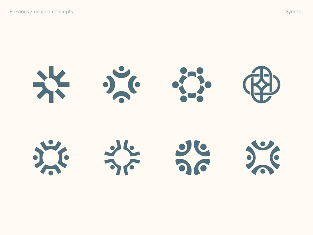
Rejected logo concepts exploring collaboration, shared expertise & working side by side

Which hero visual feels right for this brand?
While working on the homepage for Halfspace, a website design and SEO agency, I explored two different hero visuals for the same headline and layout. Same message, same structure, just a different visual metaphor and mood.
Option 1 - Rocket Launch. Bold, literal, and energetic, visually reinforcing the "launch your business" message with motion and fire.
Option 2 - Glass Cube. Abstract, sleek, and premium, giving a more refined, tech-forward feel without relying on a literal metaphor.
Would love your honest UX/UI take, which direction feels more impactful, memorable, and aligned with a web design/SEO brand, and why?
11 voted
41%
16 voted
59%
27 votes
Closed

Both design are great; it's hard to choose one

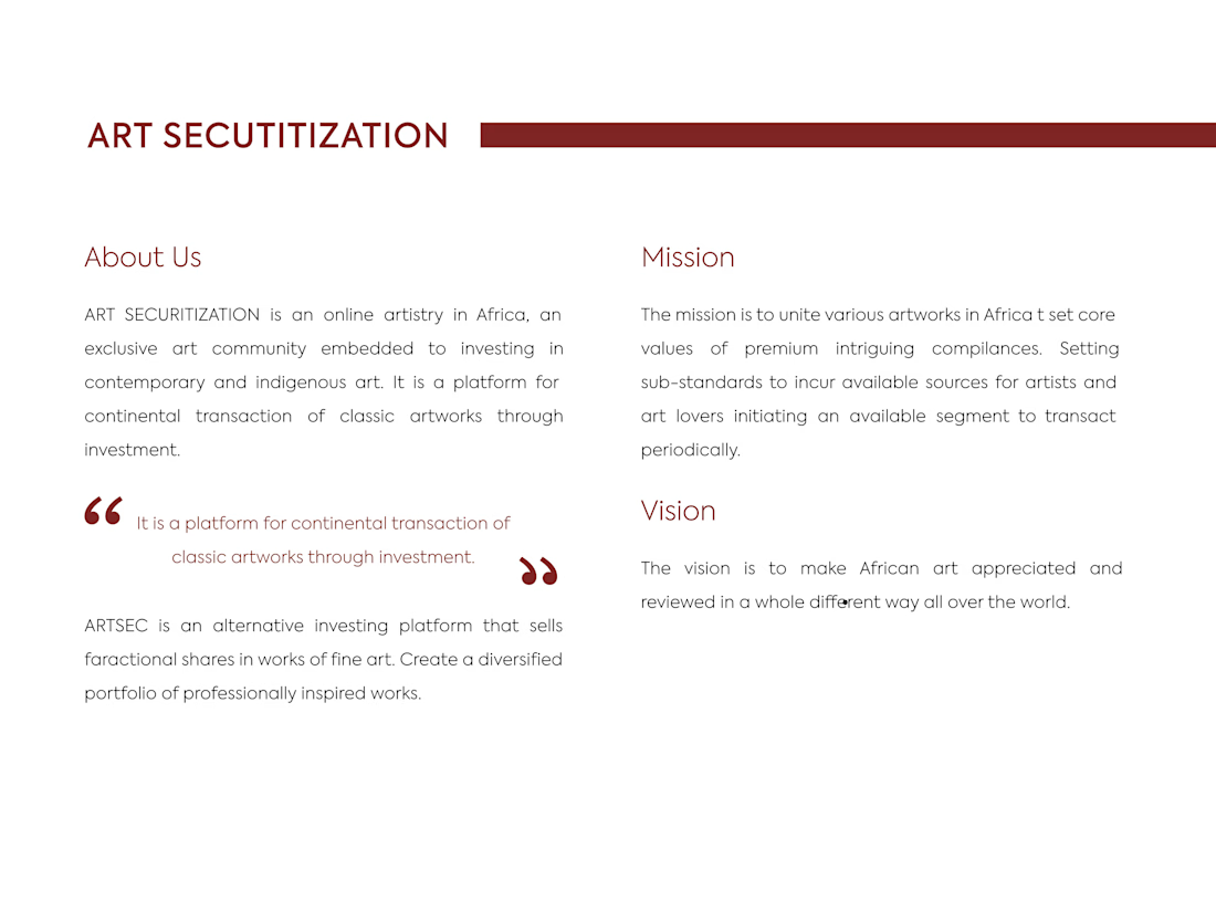
ARTSEC is an art investment platform focused on making African contemporary and indigenous art more accessible to collectors and investors.
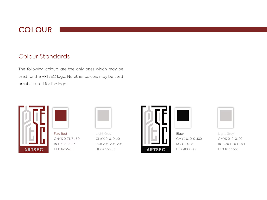
I developed a complete visual identity system for the brand, including the logo, colour palette, typography and usage guidelines.
The identity was designed to give ARTSEC a distinctive, consistent visual presence while reflecting its connection to African art and culture across print and digital applications.


Can't stop looking at this! 😍