The network for creativity
Join 1.25M professional creatives like you
Connect with clients, get discovered, and run your business 100% commission-free
Creatives on Contra have earned over $150M and we are just getting started
Back to feedPost
Taste Test

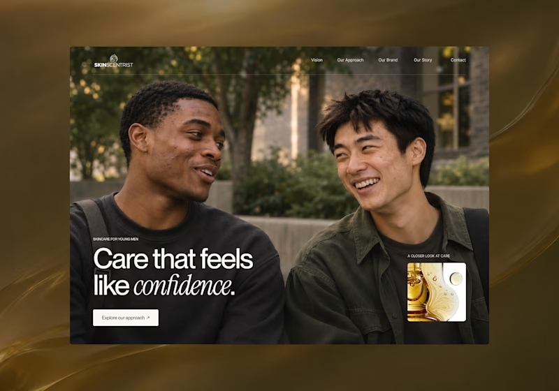
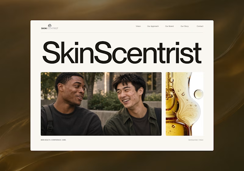
I’m exploring two homepage hero directions for SkinScentrist, a skincare brand focused on helping young men feel more confident in their skin.
Both concepts use the same imagery but take very different approaches to storytelling and visual hierarchy.
Direction 1 feels more emotional, immersive, and lifestyle-driven. The full-screen photography and bold messaging create a stronger connection to confidence and self-care.
Direction 2 feels more minimal, editorial, and brand-focused. The oversized typography, clean layout, and product imagery give it a more refined, contemporary skincare feel.
Direction 1: immersive, personal, emotional
Direction 2: minimal, editorial, premium
Which direction feels stronger for a modern skincare brand?

10 votes
Ends in 1d

Direction 1 looks clean!

I guess we're all united on this one haha!

1 🔥

Direction 1 The big full screen photo, welcoming headline and clear "Explore our approach" button make it feel personal and easy to connect with right away. Direction 2 looks super sleek like a luxury magazine but lacks a clear button to click.
The network for creativity
Join 1.25M professional creatives like you
Connect with clients, get discovered, and run your business 100% commission-free
Creatives on Contra have earned over $150M and we are just getting started

Related posts

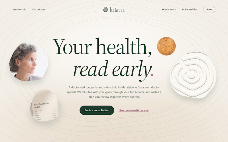
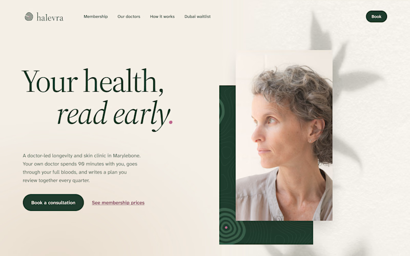
I’ve been building Halevra, a concept brand for a doctor-led longevity and skin clinic in Marylebone. This week was the homepage hero.
Same words, same brand kit, two different layouts.
A puts everything in the centre. The growth rings from the logo run across the whole page, with a few small pieces of the clinic around the headline.
B is quieter. The words sit on the left, one portrait on the right, and a leaf shadow on the wall behind her.
Which one would make you book the consultation?
3 voted
50%
3 voted
50%
6 votes
Closed

I would go with B, the editorial split. For a doctor-led clinic the portrait and the calm space around it do a lot of the trust work, and the headline reads clearly without competing with the rings. In A the rings are lovely but they pull the eye away from the message and the...

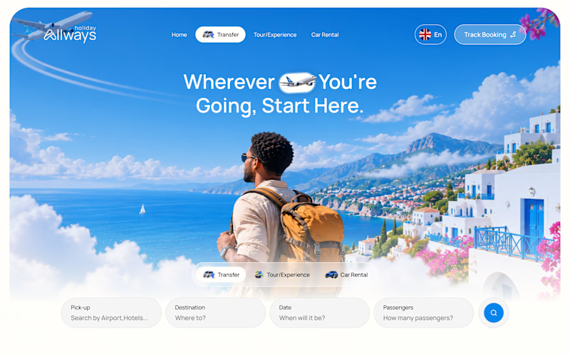
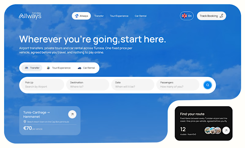
I missed an important detail in th first design direction, and the client rejected it.
After revisiting the feedback, I came up with another directiona nd it got approved
Both designs serve the same product, which one do you think got accepted for a web application?
Direction 1
Direction 2
9 voted
69%
4 voted
31%
13 votes
Closed

Dir 2 for sure!

Need a second pair of eyes 👀
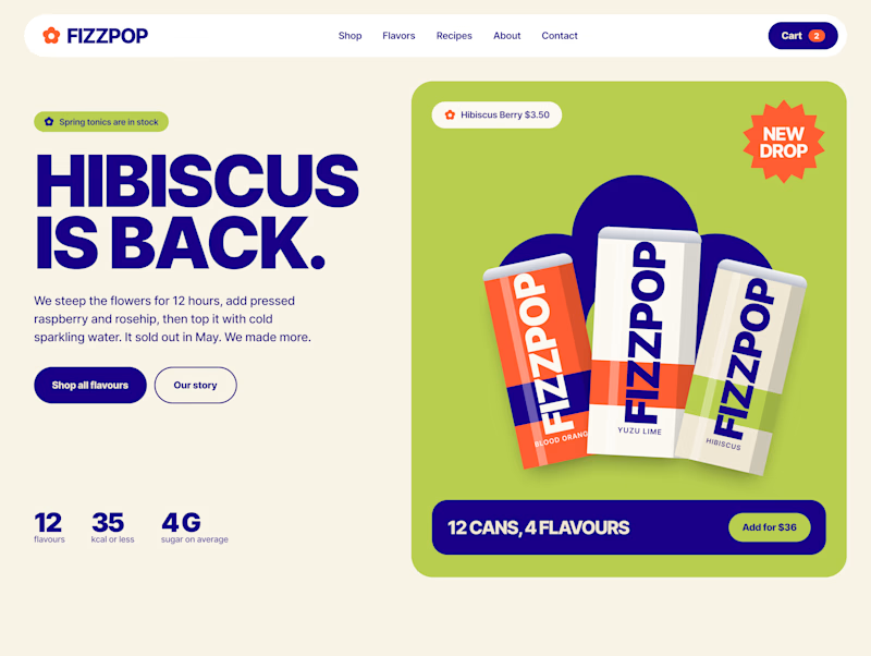
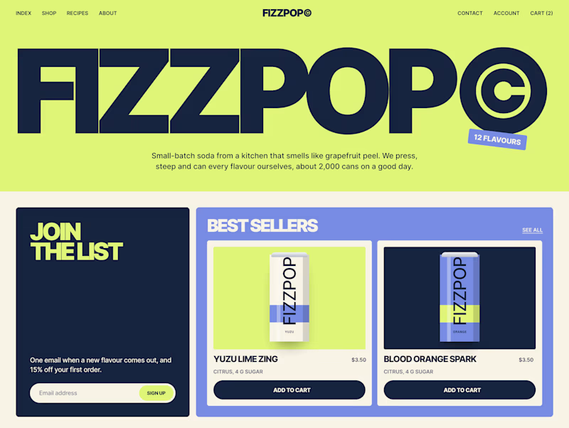
I'm designing the online store for FizzPop, a craft soda brand: all-natural sodas, sparkling waters and botanical tonics.
Flower Fizz(A): eggshell, tiger orange and deep ultramarine, with flower shapes and stacked colour swatches for the flavours
Corner Shop(B): lime, soft blues and navy, editorial layout with a giant wordmark and menu-style flavour tiles
38 voted
44%
48 voted
56%
86 votes
Closed
