
Samuel Ijever
UI Designer
Profile in progress
Samuel is building their profile!


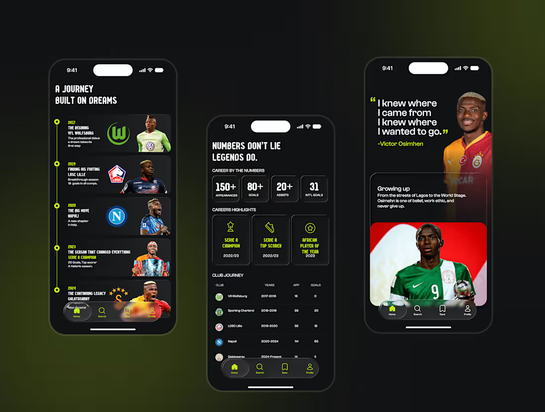
This project challenged me in many ways. The process involved multiple iterations, layout adjustments, and constant refinement, but I continued nonetheless — and enjoyed seeing the concept gradually come together.
BEYOND is a football storytelling experience that goes beyond traditional player statistics.
Instead of focusing only on goals, assists, and trophies, the concept explores the stories behind the players: their journeys, breakthroughs, achievements, career-defining moments, and personal stories.
The experience includes:
⚽ Player discovery
🛣️ Career journeys
📊 Statistics and achievements
📖 Personal stories
📸 Memorable moments
The goal was to create an immersive experience where users don't just view a player's profile — they explore their story.
BEYOND — Beyond the numbers. Beyond the game.
Available for work
I'm currently open to freelance UI/UX design, product design, mobile app design, and creative collaborations.
If you're building a product or have an idea you'd like to bring to life, I'd love to work with you.
📩 msonterijever
twitter is still too long
Got you — here's a much shorter X/Twitter version:
This project was tedious, but I kept going.
Introducing BEYOND ⚽️ — a football storytelling experience that goes beyond stats to explore players' journeys, stories, achievements, and defining moments.
Beyond the numbers. Beyond the game.
✨ Available for UI/UX & Product Design work
📩 msonterijever@gmail.com
#UIDesign #UXDesign #Football
0
49
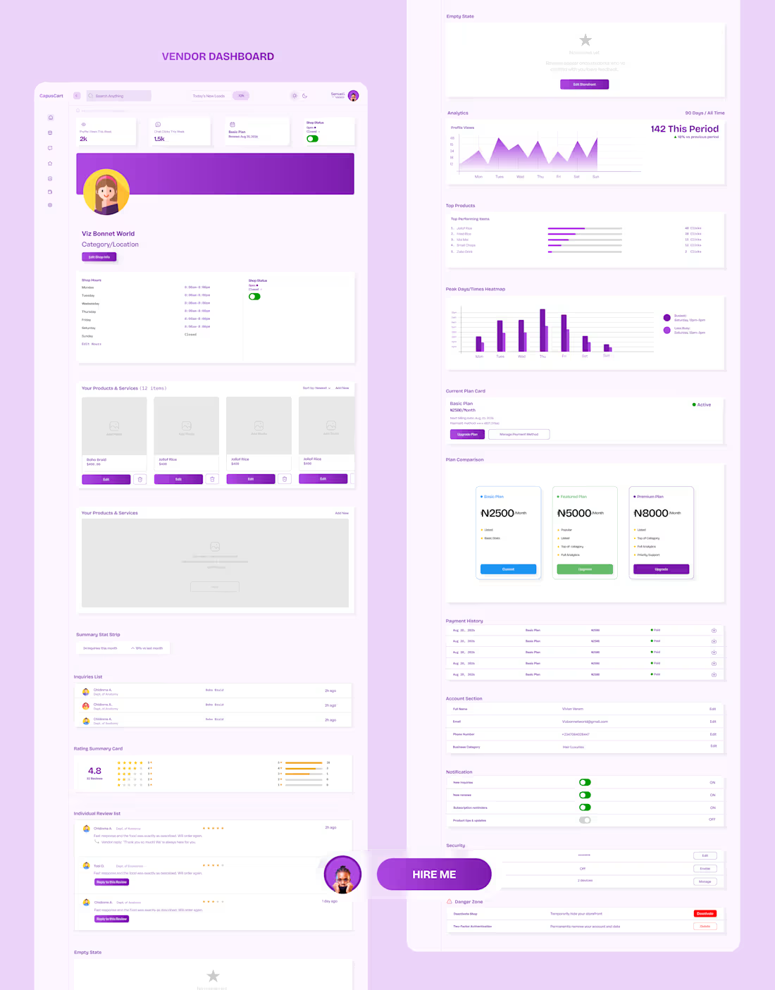
Project title: CampusCart — Vendor Dashboard (UI/UX Design)
Description:
A full 7-tab vendor dashboard designed for CampusCart, a subscription-based vendor discovery platform connecting university vendors with students.
Scope: End-to-end UI/UX design of the vendor-facing dashboard, including Overview, Storefront management, Inquiries log, Reviews with reply functionality, Analytics (views, top products, peak-time charts), Subscription/billing with plan comparison, and Account/Security settings.
Key design decisions:
Built around a "no commission, flat subscription" business model — every screen is designed to visibly justify the vendor's monthly fee
Analytics translated into plain-language takeaways, not just raw charts, for a non-technical small-business user base
Consistent design system carried through from the public landing page into the authenticated dashboard experience
Tools: Figma · Design system built from scratch (color, type, spacing, component library)
Available for similar dashboard/SaaS design work — reach out if you're building something in this space.
0
45
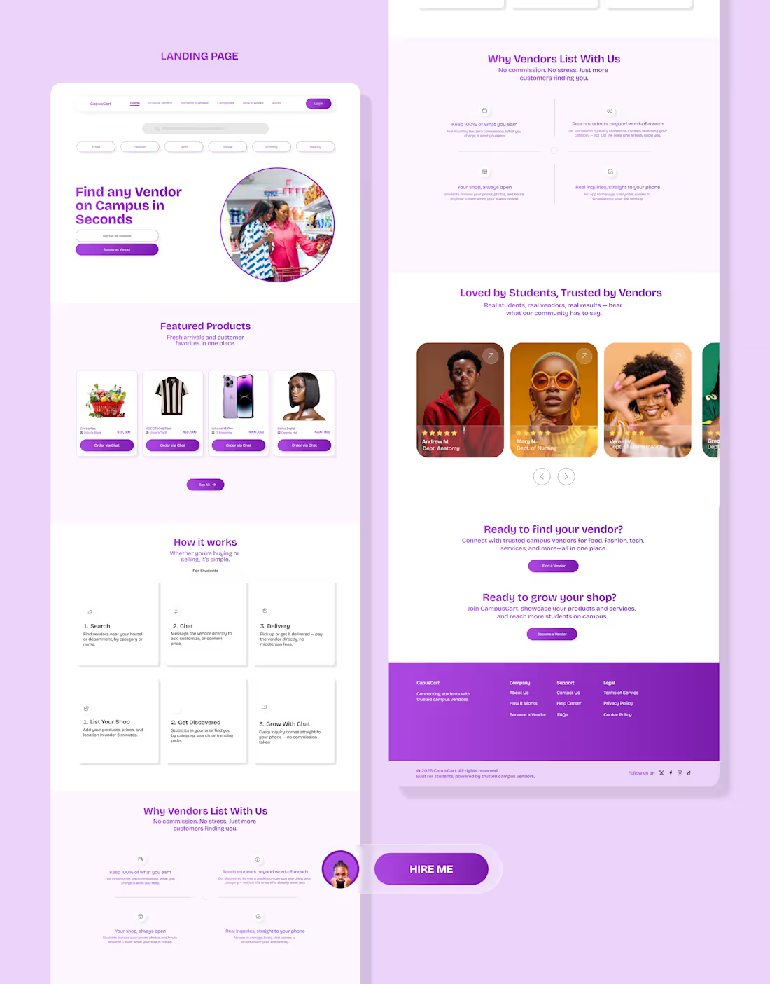
Most marketplace apps take a cut of every sale. I designed one that doesn't.
The problem
Every university campus has amazing small vendors — food sellers, tailors, phone repairers, thrift hustlers, printers. But almost none of them are easy to find.
They rely on word-of-mouth, scattered social pages, or just being "that one guy everyone knows." Students, meanwhile, waste real time and energy hunting for things that should take seconds.
The business decision that shaped everything
Instead of building a traditional marketplace that takes a commission on every sale — which means payment infrastructure, dispute handling, and real liability — vendors pay a simple flat subscription fee to be listed and discovered. Students browse and contact vendors for free.
The transaction happens off-platform, the way it already does today (chat, call, meet-up).
That one decision changed almost every design choice after it — from the CTA hierarchy, to the copy, to the fact that a "no commission" message shows up multiple times across the page.
The design concept
Rather than defaulting to a generic marketplace or SaaS-blue look, I grounded the entire visual system in something every student already trusts: the campus noticeboard flyer.
You know the ones — tear-off tabs with a phone number, pinned outside lecture halls, torn off one at a time.
That became the product's signature interaction — every vendor card ends with a dashed "tear-tab" that lifts slightly when tapped, as if being peeled away.
Small detail, but it's the thing that makes the product feel designed for this specific use case, not assembled from a generic template.
Designing for two very different users
Students want to find something fast, without creating an account.
Vendors need to quickly understand what a monthly fee gets them and trust it's worth more than just posting in a WhatsApp group for free.
Rather than build two disconnected experiences, I used the same design system throughout but shifted register where needed — the "Why Vendors List With Us" section deliberately flips to a dark background, a quiet visual signal that says "this part is speaking to you" without needing a label.
The result is a landing page that does two jobs at once, without feeling like two different products stitched together.
This project reinforced something I keep relearning: the best design decisions usually trace back to a business or user constraint, not an aesthetic preference.
The "no commission" model wasn't just a feature — it became the whole design language.
Would genuinely love feedback from this community — designers, founders, anyone who's built for a two-sided audience. What would you have approached differently? 👇
Full case study dropping on my portfolio soon.
hashtag#UIDesign (https://www.linkedin.com/search/results/all/?keywords=%23uidesign&origin=HASH_TAG_FROM_FEED) hashtag#ProductDesign (https://www.linkedin.com/search/results/all/?keywords=%23productdesign&origin=HASH_TAG_FROM_FEED) hashtag#UXDesign (https://www.linkedin.com/search/results/all/?keywords=%23uxdesign&origin=HASH_TAG_FROM_FEED) hashtag#DesignProcess (https://www.linkedin.com/search/results/all/?keywords=%23designprocess&origin=HASH_TAG_FROM_FEED) hashtag#StartupDesign (https://www.linkedin.com/search/results/all/?keywords=%23startupdesign&origin=HASH_TAG_FROM_FEED) hashtag#Marketplace (https://www.linkedin.com/search/results/all/?keywords=%23marketplace&origin=HASH_TAG_FROM_FEED) hashtag#DesignThinking (https://www.linkedin.com/search/results/all/?keywords=%23designthinking&origin=HASH_TAG_FROM_FEED) hashtag#Fintech (https://www.linkedin.com/search/results/all/?keywords=%23fintech&origin=HASH_TAG_FROM_FEED) hashtag#TechForGood (https://www.linkedin.com/search/results/all/?keywords=%23techforgood&origin=HASH_TAG_FROM_FEED)
1
63
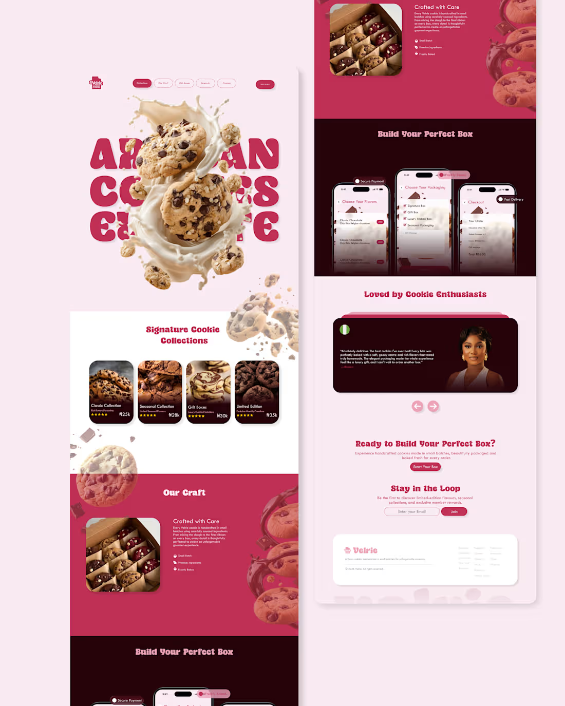
Designing a landing page that makes you taste the product before you even click ‘Order’—that was the challenge behind this artisan cookie experience.
I recently designed this landing page for an artisan cookie brand, focusing on creating a premium yet approachable experience for dessert enthusiasts.
The objective was to present the product story in a visually engaging way while maintaining a clear, conversion-focused flow from discovery to box customization and checkout. The layout guides users through signature collections, craftsmanship details, and a step-by-step “Build Your Perfect Box” journey, supported by social proof and a newsletter sign-up section.
Key considerations in this design included:
Establishing a cohesive, dessert-inspired visual language that reinforces brand personality
Structuring information to reduce cognitive load and support quick decision-making
Using clear CTAs and consistent hierarchy to move users smoothly from browsing to purchase
Aligning mobile and desktop layouts to ensure a responsive, seamless experience
This project was a great opportunity to blend visual storytelling with product thinking, and to refine how microinteractions and content blocks support a delightful yet efficient e-commerce flow.
0
48