


Bebo Rae’s Social Kitchen | Restaurant Branding & Visual Identity
Category: Brand Identity · Logo Design · Brand Guidelines · Packaging · Social Media Design
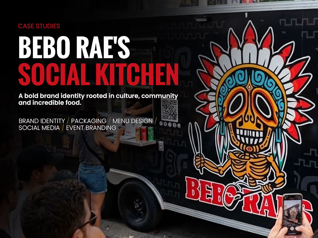
Bebo Rae’s Social Kitchen is a restaurant branding project inspired by the fusion of Texas BBQ, Mexican cuisine, and cultural heritage.
The objective was to create a bold, memorable visual identity that communicates more than food — celebrating tradition, community, and the experience of bringing people together.
At the center of the identity is a custom-illustrated mascot combining a Mexican calavera with a headdress inspired by Indigenous cultural references, including the client's Lipan Apache heritage. The character incorporates cooking utensils and expressive details to communicate the brand's culinary personality.
The visual system combines striking red, black, and white branding with energetic accent colors, decorative patterns, and typography that balances personality with readability.
Beyond the primary logo, the project includes brand guidelines, logo variations, promotional graphics, packaging concepts, merchandise applications, and food-truck branding.
The result is a distinctive and flexible visual identity designed to maintain a recognizable personality across both physical and digital touchpoints.
Creative Focus: Custom mascot illustration, culturally inspired visual storytelling, brand identity systems, and real-world brand applications.
2
1
85
Curl Me Nation | Beauty & Lifestyle Brand Identity
Category: Brand Identity · Logo Design · Visual Identity
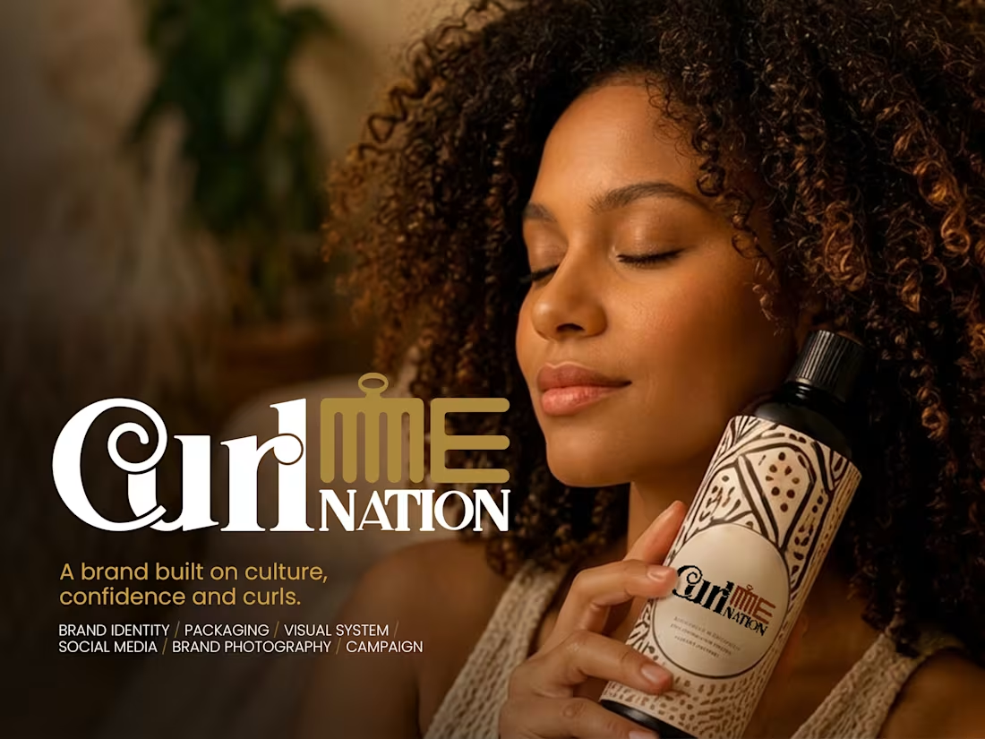
Curl Me Nation is a beauty and lifestyle branding project built around individuality, self-expression, and the celebration of natural curls.
The creative direction explores how a distinctive visual identity can communicate personality, confidence, and an approachable brand experience.
The goal was to establish a memorable identity that connects with its intended audience while balancing expressive character with professional presentation.
By focusing on recognizable branding, visual harmony, and flexible applications, the project demonstrates how thoughtful design can help a beauty brand establish its own personality in a competitive market.
Creative Focus: Expressive branding, individuality, audience connection, and lifestyle-oriented visual identity.
0
60
Powerlifting United — Logo & Brand Identity
Brand Identity | Logo Design | Sports Branding
Powerlifting United is a strength sports organization built around competition, dedication, and community.
The goal was to create a bold, recognizable visual identity that reflects the power, discipline, and competitive spirit of powerlifting while establishing a strong foundation for the organization's branding.
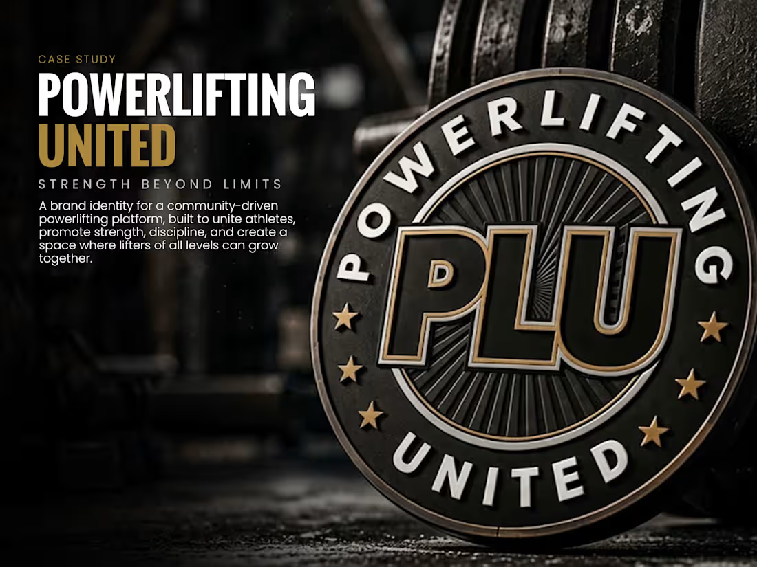
The identity centers on a distinctive circular emblem featuring a prominent PLU monogram, bold typography, and a black, charcoal, silver, and gold color palette. The badge-inspired composition communicates strength, unity, and professionalism, while the metallic accents give the design a premium, championship-inspired appearance.
Designed with versatility in mind, the logo provides a consistent visual foundation for competition branding, promotional materials, apparel, and digital platforms.
The result is a strong, memorable identity that represents Powerlifting United and its growing community of athletes.
0
14
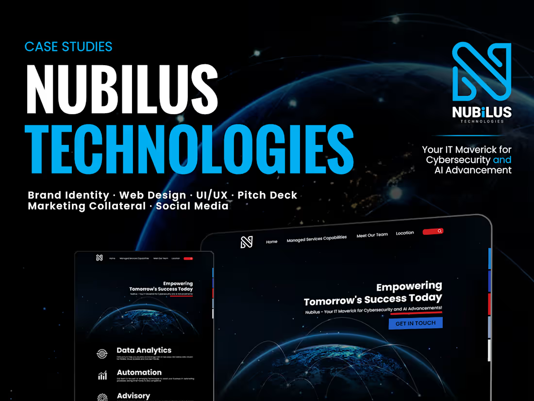
Nubilus Technologies | Brand Identity & Visual Design
Project Type: Brand Identity, Logo Design & Visual Identity
Project Overview
Nubilus Technologies is a technology-focused brand requiring a professional, distinctive, and contemporary visual identity.
The design approach focused on creating a strong visual foundation that communicates innovation, reliability, and forward-thinking technology. The goal was to develop an identity that feels modern and confident while remaining clear, recognizable, and adaptable across different applications.
Creative Approach
The visual direction emphasizes simplicity, structure, and precision. Through considered typography, visual balance, and a cohesive design language, the identity was developed to communicate the brand's technology-driven character.
Rather than relying on unnecessary visual complexity, the approach prioritizes a memorable identity that can maintain consistency across digital and physical touchpoints.
The Outcome
A contemporary brand identity designed to support Nubilus Technologies with a recognizable and professional visual presence.
The project demonstrates my approach to translating a brand's personality and industry positioning into a clear, functional, and visually engaging identity.
0
65