
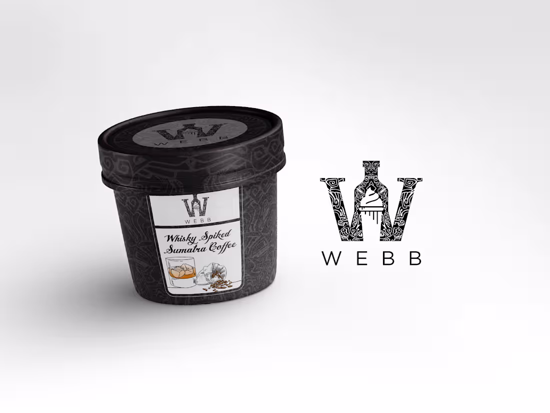
WEBB brand, packaging and Ui designs
2
4
224
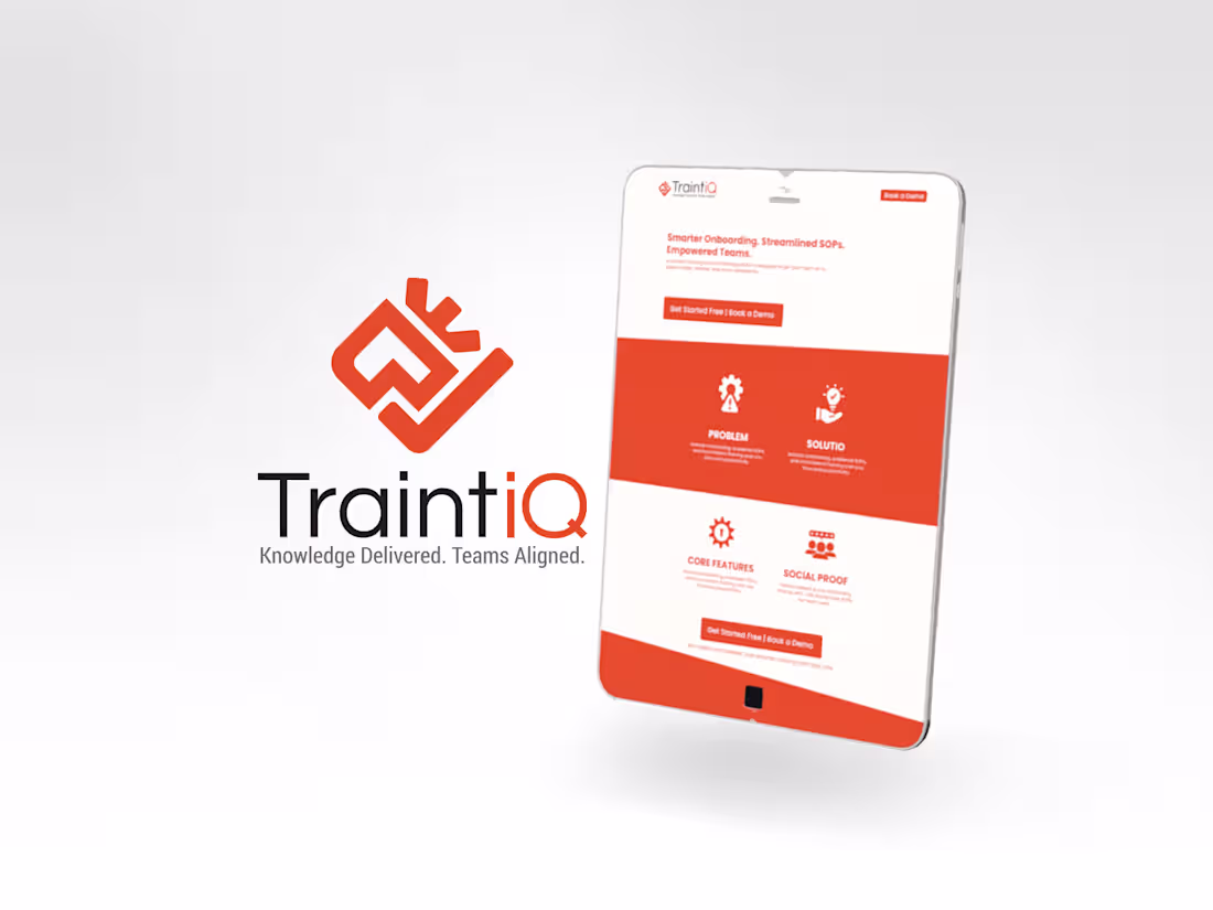
TraintiQ Brand Design
The icon is a modern, abstract design combining a brain and a checkmark. Its sharp, geometric lines convey professionalism. This dual imagery suggests intelligent learning and successful outcomes, reinforcing the brand's focus on effective training.
2
182
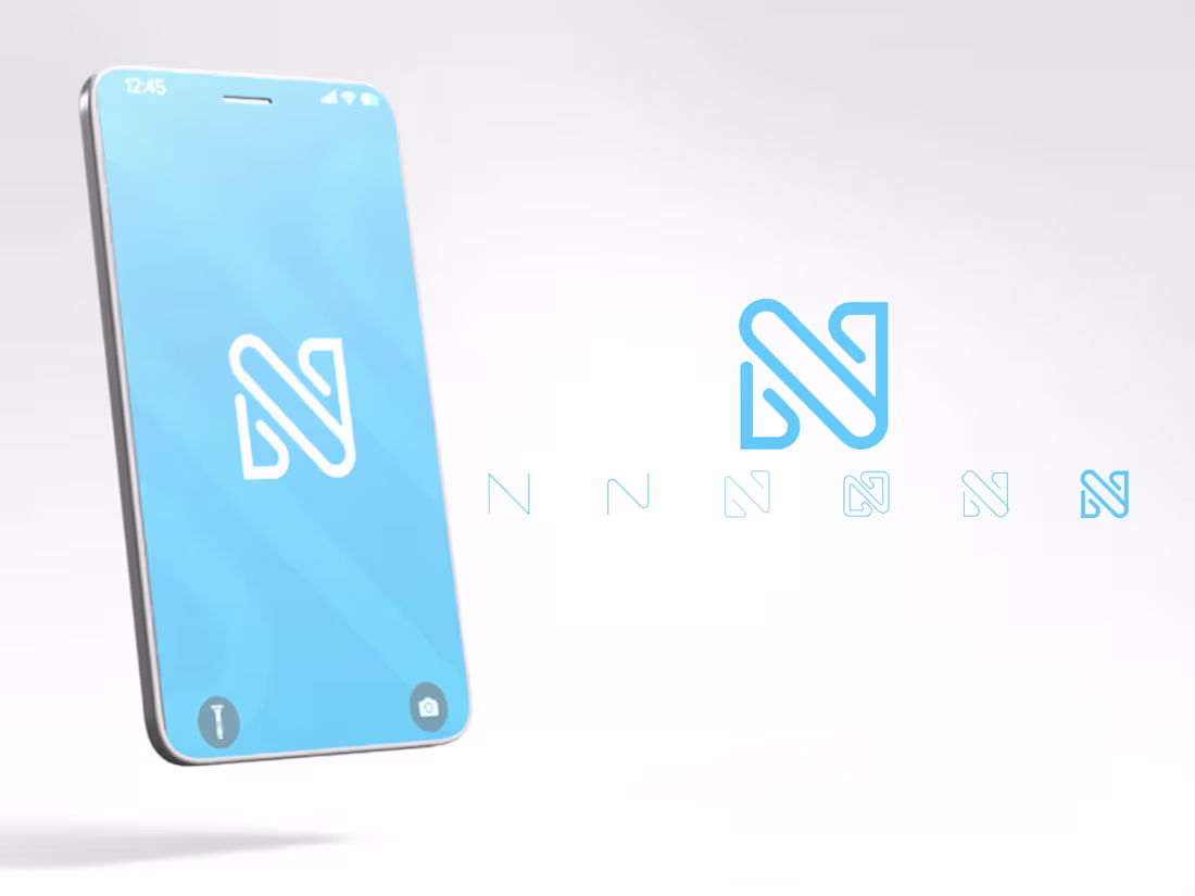
The Nubilus Technologies Brand Design
The Nubilus Technologies logo is a sleek and modern representation of the company's expertise in technology.
The stylized letter "N" with smooth, curved edges exudes elegance and innovation.
Set in a captivating shade of blue, the logo exudes trust, reliability, and intelligence.
With its distinctive design and harmonious composition, the Nubilus Technologies logo stands as a symbol of the company's commitment to delivering cutting-edge solutions with sophistication and efficiency.
2
154
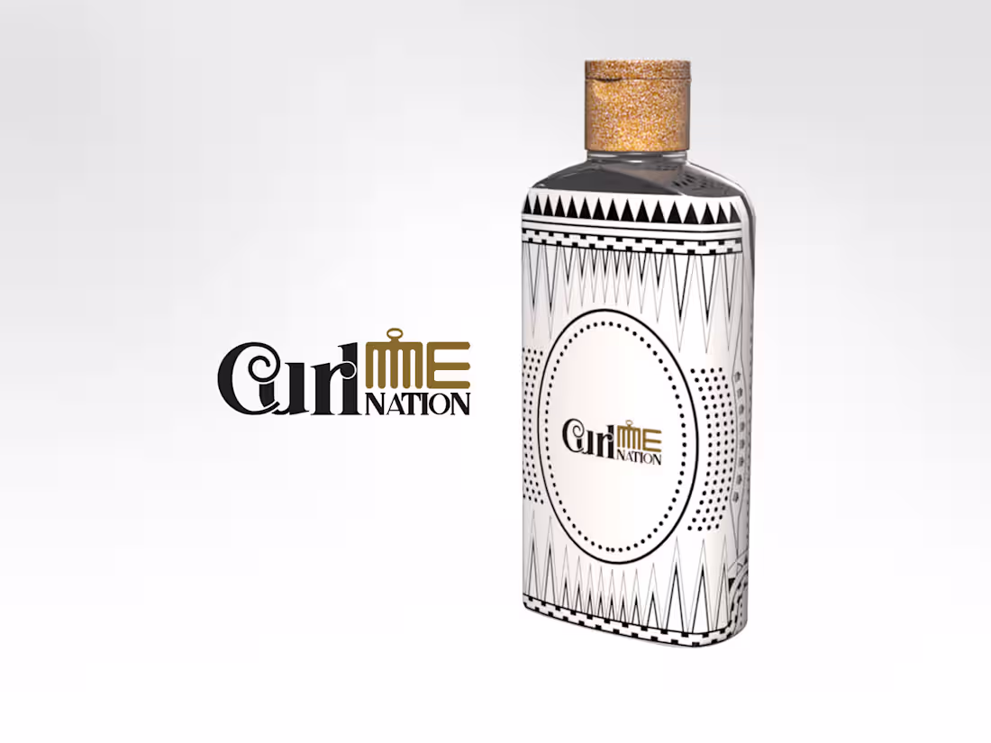
The Curl Me Nation Brand design
The Curl Me Nation logo brings an elegant and culturally rich refinement to the brand's identity. The bold, serif typography in the word "Curl" adds a touch of heritage and sophistication, giving the mark a timeless quality. The elegant curve of the "C" holding the spiral still pays homage to natural curls and ancestral symbolism, making it both visually memorable and emotionally resonant.
3
195
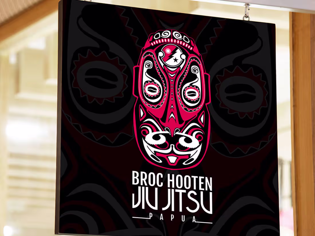
Broc Hooten Jiu Jitsu Logo design
0
20
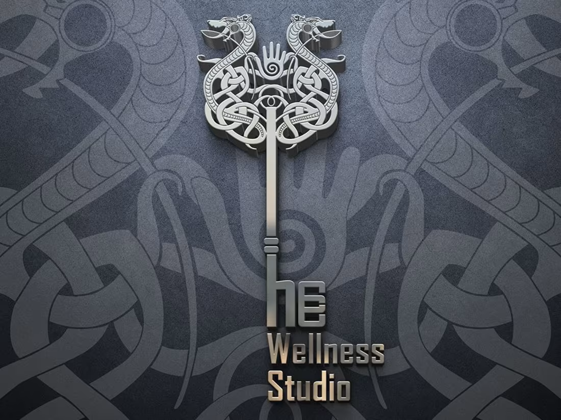
Tribal logo design for Hcc Wellness studio
1
44
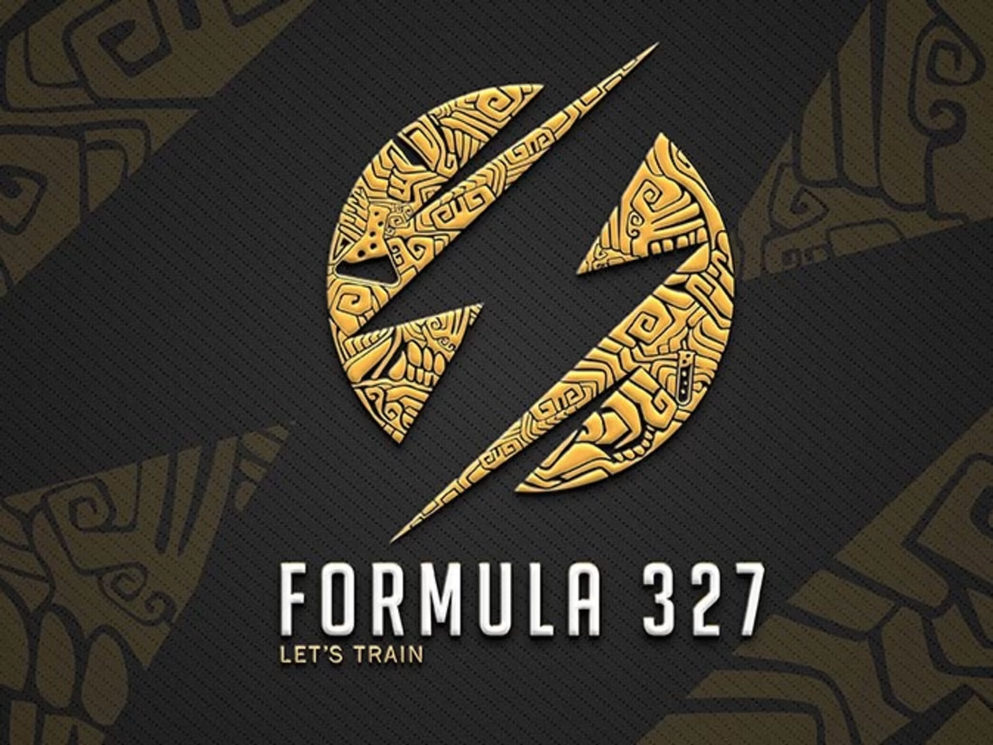
Tribal logo design for Formula 327 - MADX Designs
1
1
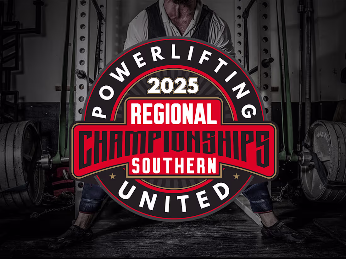
Powerlifting United | 2025 Regional Championships Brand Identity
Overview The 2025 Powerlifting United Regional Championships required a visual identity that captured the raw strength, intensity, and prestige of competitive powerlifting. The goal was to create a unified "master brand" that could be easily adapted across five distinct geographical regions while maintaining a consistent professional look.
The Concept The design centers on a heavy-duty badge aesthetic, drawing inspiration from industrial metalwork and vintage athletic seals. By utilizing a bold, angular display typeface for the "Championships" wordmark, the logos convey a sense of weight and stability—essential pillars of the sport.
2
90
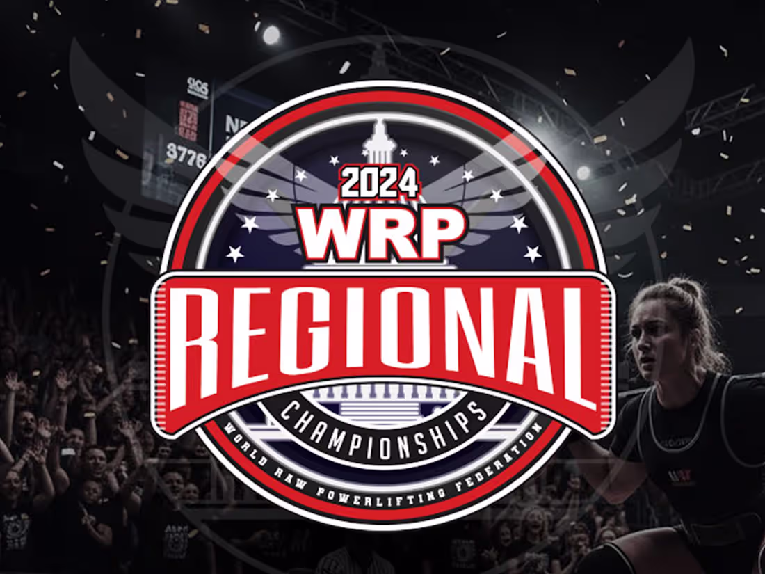
WRP 2024 Regional Championships Branding
Project Overview: I was commissioned to design the comprehensive visual identity for the 2024 WRP Regional Championships. The objective was to create a “Master Brand” that felt powerful and prestigious, while developing unique sub-brands for each geographical region across the United States.
The Design Challenge: The client needed a logo system that remained instantly recognizable as WRP (World Raw Powerlifting), but also gave athletes a sense of local pride. I solved this by creating a modular badge system where the core typography remains constant, but the color palette and background illustrations adapt to the regional landscape.
2
68