The network for creativity
Join 1.25M professional creatives like you
Connect with clients, get discovered, and run your business 100% commission-free
Creatives on Contra have earned over $150M and we are just getting started
Back to feedPost
Taste Test


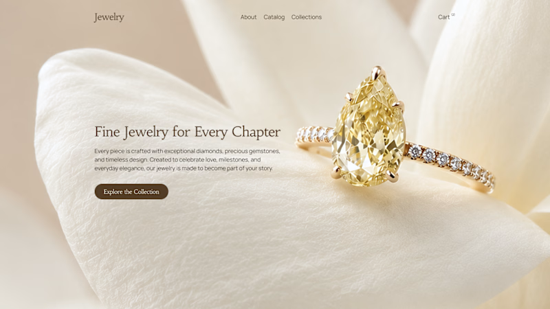
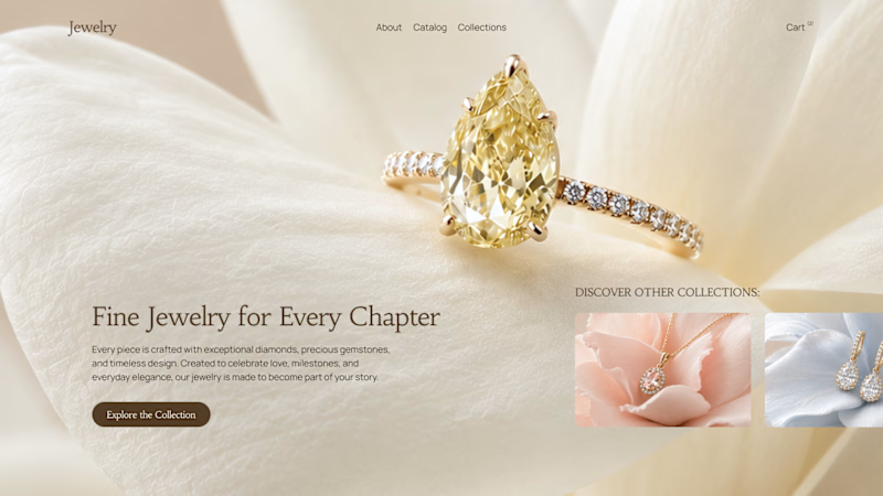
A hero section is more than just a beautiful screen. It sets the tone for the entire experience and shapes the user's first impression within seconds.
Here we explored two approaches. The first keeps the focus entirely on the featured product, while the second introduces supporting collection previews to provide more context and encourage exploration.
Both communicate the same message, but they guide attention differently.
Which one would you choose - 1 or 2?
42 voted
49%
44 voted
51%
86 votes
Closed


I'd go with 2. The collection previews add helpful context without taking focus away.

Ohh it's tough both

Option 1 brings the focus on ring more than Option 2

Option 2 looks better.


1 is better


Great breakdown of hero dynamics! Finding the right balance between product spotlight and storytelling makes all the difference in that initial first impression.

option 2, giving users access to explore few collections

Option two for me


Option 2


The design looks awesome. Great project!

option one for me!

Option 2 feels stronger; the supporting previews add context without distracting from the hero product.

Nice one Serge...I am working on same industry project😊


Great design !

My heart is for straight, minimal accents.

I would go with option 1

Looks good. But in both instances the Navbar falls away a little.


I go for option 1😊


Looks good.


Really liked it 💜

I would go with Option 1 for the hero. The first screen should make one decision obvious, and a single focal product holds attention better than a split view. I would still use Option 2's collection previews, just in the section right below the fold once the hero has landed the message.

I'd lean toward Option 1. For fine jewelry the ring itself is the whole pitch, and giving it the full frame without competing thumbnails keeps that feeling of exclusivity intact.

The network for creativity
Join 1.25M professional creatives like you
Connect with clients, get discovered, and run your business 100% commission-free
Creatives on Contra have earned over $150M and we are just getting started

Challenges
View all


Related posts

My previous poll showed unexpected results (I am very grateful to everyone who took the time to vote and comment 🤍).
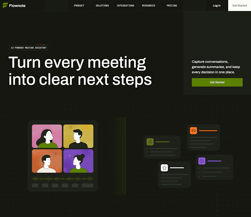
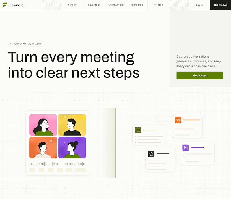
Now I am curious about your opinion on the color mode for this hero section. I definitely like a light theme. What about you?
By the way, I made a nice animation for this design. You can see it on my profile

28 voted
54%
24 voted
46%
52 votes
Closed

To be honest the dark mode looks really good

Bold, without a doubt. The “Safe” direction feels polished, but the “Bold” approach has more personality, stronger visual tension, and a much better chance of stopping the scroll. It feels more distinctive and memorable while still communicating the skincare message clearly.

Safe or bold, which one actually makes you stop scrolling? 🤔
Sans: the serif, tight tracking, one accent color playbook every skincare brand is running right now.
Bold: the same idea, redesigned with attitude. 💅
25 voted
32%
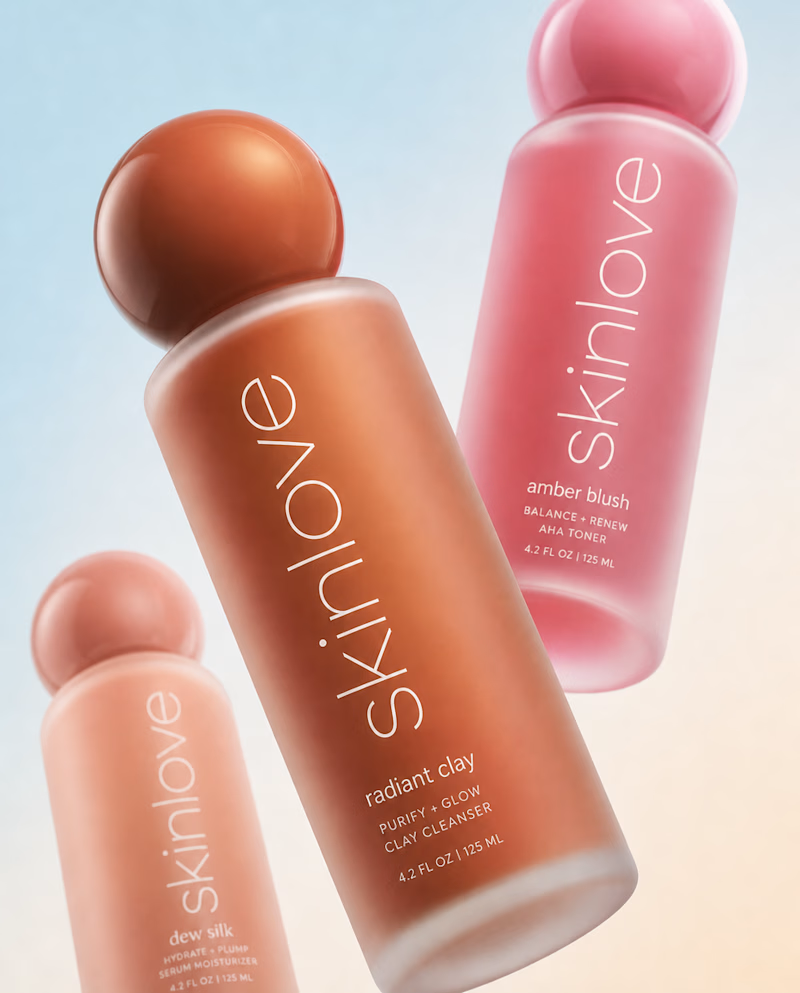
53 voted
68%
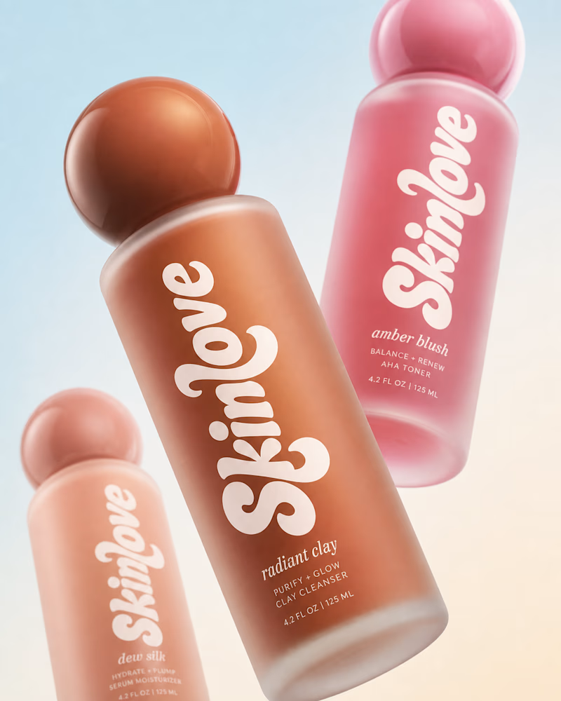
78 votes
Closed


BOLD is better

New website for Beer Zombies Brewing Co. 🍺🧟♂️
Designed to be bold, vibrant, and disruptive. This was a fun build because the BZ brand already has such a strong visual identity and personality. Oversized typography, aggressive motion, interactive effects, and a healthy dose of zombie aesthetics. 🤘
www.beerzombies.com

The oversized type and aggressive motion fit the beer-brand attitude perfectly, especially how the green palette carries from the hero into the product details.