The network for creativity
Join 1.25M professional creatives like you
Connect with clients, get discovered, and run your business 100% commission-free
Creatives on Contra have earned over $150M and we are just getting started
Back to feedPost

What's your one-rule brand? Tell me.
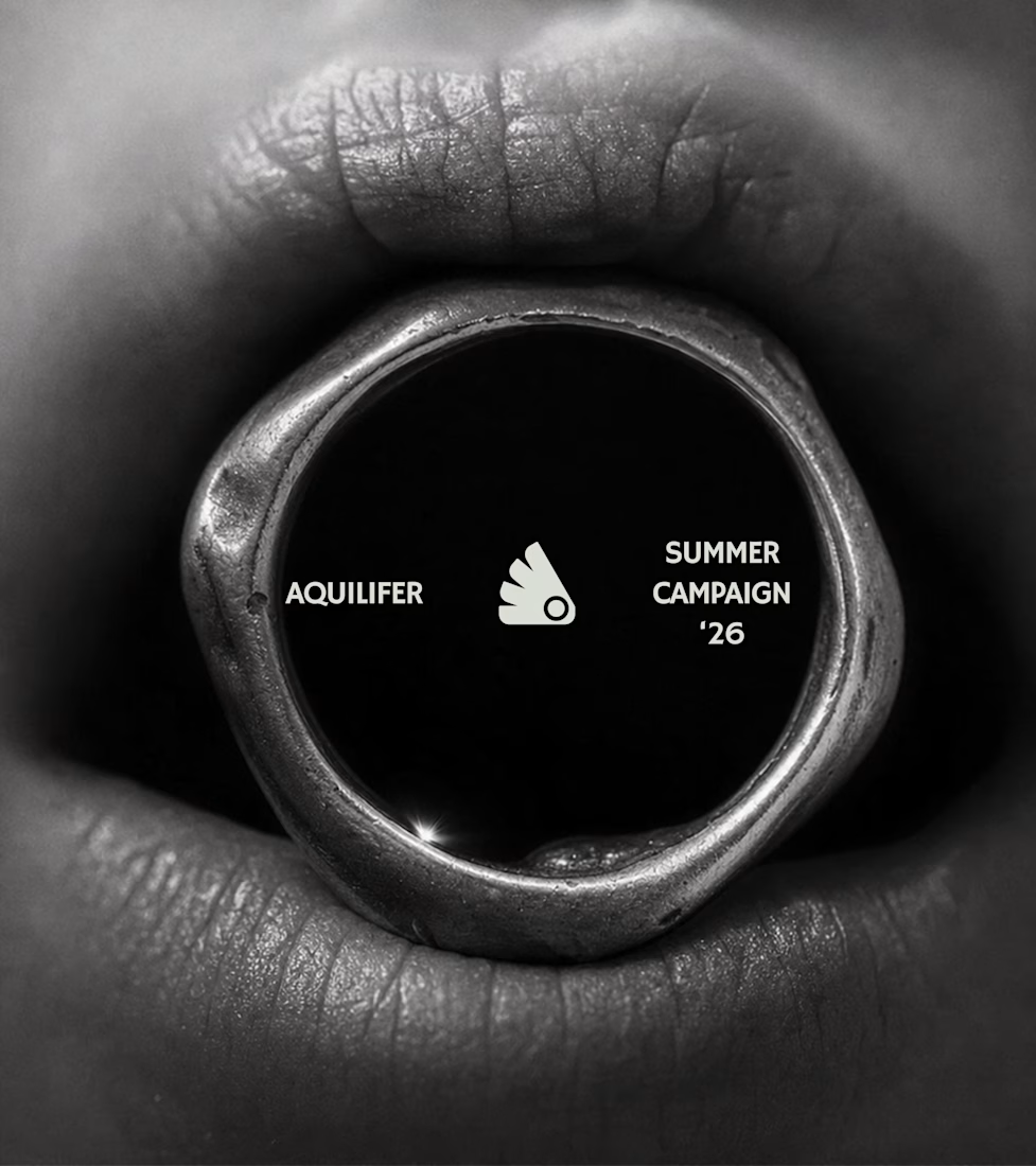
Most jewelry brands photograph the object. This one photographs the grip.
AQUILIFER — a brand I built around one idea: jewelry as something carried, not worn.
Case study + full site now live.
The name comes from Roman military rank. The aquilifer carried the standard — the one thing the legion couldn't afford to drop.
That single word killed my first direction before I'd finished it.
No polish. No faceted stones.
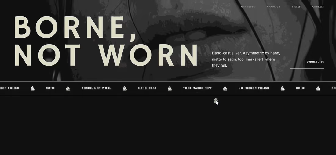
Hand-cast, asymmetric pieces, tool marks left visible.
Photography went extreme macro, unretouched skin, hands gripping the face instead of posing near it.
Color system: two darks instead of one dark + accent.
#1E1E1E and #27331A let the brand shift register — campaign world to product world — without ever going light.
#D9DED4 stays structural only. Never a fill.
Motion rule on the site: diagonal masks only. No rotation, anywhere.
A spinning object reads as being shown off. This brand is about weight, not display.
Same angle, same easing, top to bottom.
One idea, held all the way through — name, object, photography, palette, motion.
That's the whole pitch for how I work.

Mine is that the idea has to survive being said out loud with no images attached — if it only works once you see the art direction, it's a mood, not a rule. "Carried, not worn" clears that, and holding the same angle and easing across every shot is the part most people drop by asset three.


The diagonal-mask rule is the detail that makes the whole system click for me. It turns “carried, not worn” from positioning into something you can actually feel in the motion.


Good Work!

The “carried, not worn” rule gives the identity a strong physical point of view, and the macro grip photography makes that idea instantly legible. The two-dark color system is a smart restraint that lets the material and hands do the storytelling.

Diagonal masks only, no rotation anywhere, is such a disciplined constraint, most brands would've spun the object for cheap production value instead.

The dark, cinematic art direction here is incredible. It perfectly captures the heavy, historic weight of the Roman military inspiration.

Absolutely love your works!
The network for creativity
Join 1.25M professional creatives like you
Connect with clients, get discovered, and run your business 100% commission-free
Creatives on Contra have earned over $150M and we are just getting started
Trending
retrofuturism
Share your favorite designs from the past exploring the distant future. Or your own take on the aesthetic 🚀
halftone
Dots. Texture. Grain. Let's see your designs using the halftone technique.

Midjourney
Creatives are showing off what they're making with Midjourney.
colorgrade
Video editors sound off: How do you enhance the mood of your video in color grading?
Challenges
View all


Related posts

When all crypto brands keep doing it the same way, we went the other way with blink.
Our approach was to create a brand, a website and a trading exchange that feels like a lifestyle brand.

Good Work!

Just published a new case study👀
This project was a good reminder that a product video is not just about making things move. It’s about finding the right way to explain something complex, keeping the visuals clear, and making sure every animation has a purpose.
For this one, I worked on an AI coaching platform, turning its features and workflow into a structured 90-second explainer.
⬇️⬇️⬇️

The motion design is top tier 🔥 , love how the product features was communicated and the use of glassmorphism🙌

Not every growing brand needs to look dynamic to feel ambitious.
With Auren, the challenge was almost the opposite.
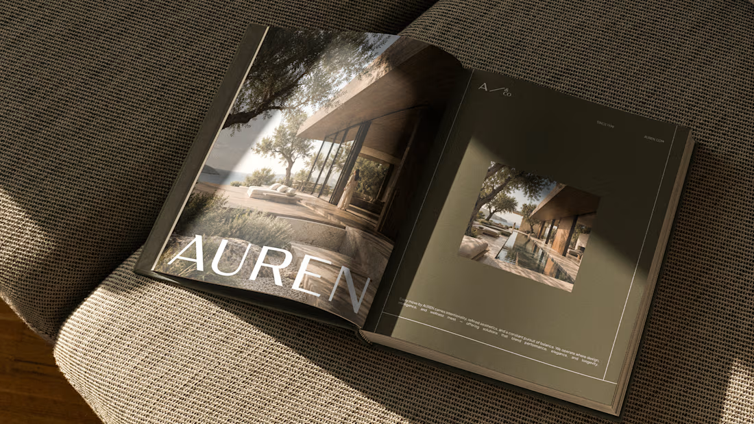
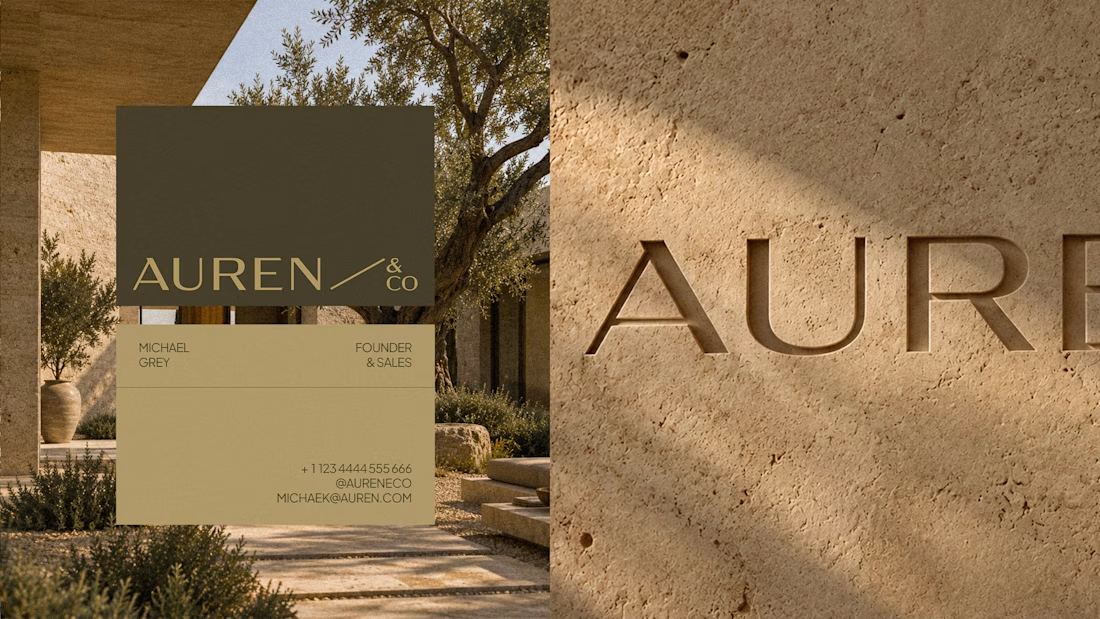
The brand needed to work across real estate, development and wellness without becoming a generic identity trying to fit everything.
So the direction became more restrained, solid and precise.
Less visual noise.
More consistency to support different sides of the business.
For me, that’s one of the most interesting parts of building brands meant to last:
flexibility doesn’t have to mean losing personality.
Full project: https://www.behance.net/gallery/255378471/Auren


the Auren book mockup looks nice. did you make the logo too?


