The network for creativity
Join 1.25M professional creatives like you
Connect with clients, get discovered, and run your business 100% commission-free
Creatives on Contra have earned over $150M and we are just getting started
Back to feedPost
Can a habit tracker feel like a brand experience, not just a table?
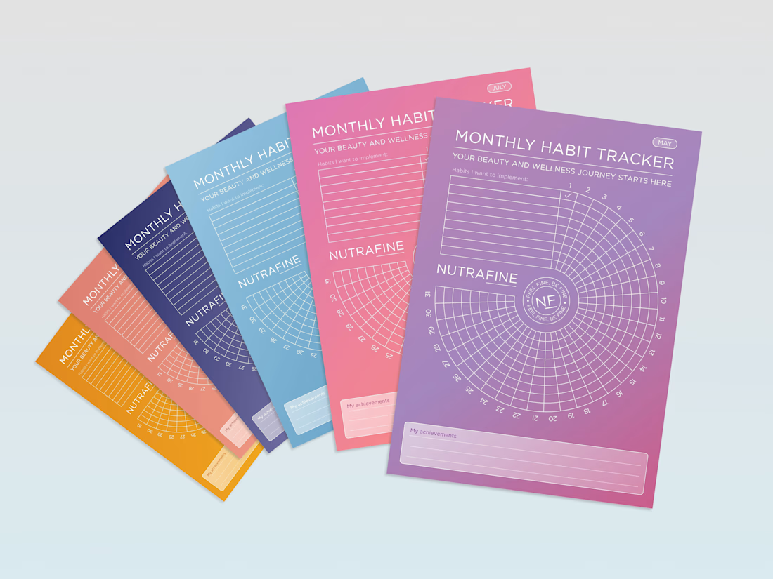
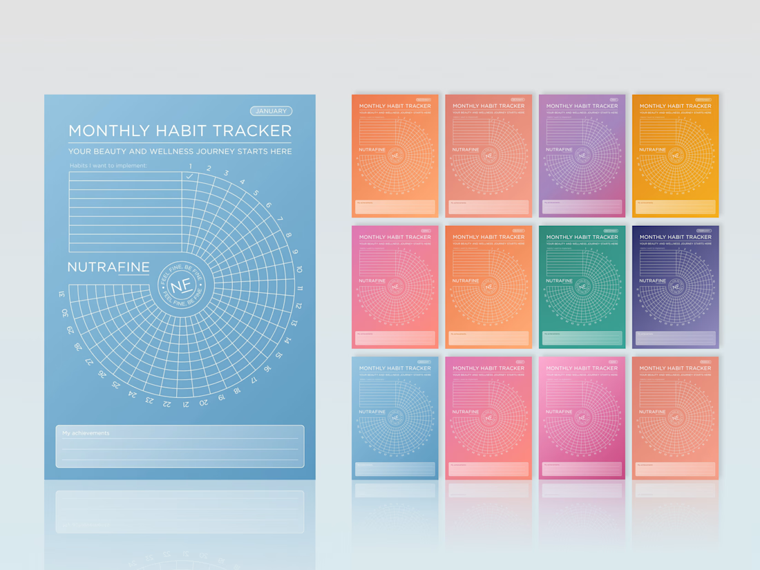
For Nutrafine’s corporate gifting, each month is tied to one SKU, using the same colour as its packaging. It’s more colour than I would usually choose, but the depth of the palette, white linework and typography make the system hold together.
The bigger idea was to make the tracker itself feel less expected. Instead of a grid, we built a spiral, turning a practical tool into something more playful, memorable and distinctly Nutrafine.
#BrandDesign #CorporateGift #WellnessBranding #BrandExperience #CreativeDirection



Love these!

Thank you, Bella!

The spiral is such a smart swap, a grid would've made this feel like homework by week three. With each month tied to its own SKU color, how many months are in the full rotation before it repeats?
Such a great and original question, Maty! Their portfolio currently has 12 products, so the idea is essentially a full 12-month rotation, with each month tied to a different SKU and its packaging color. Two products aren’t shown here, though: one is launching very soon 👀 and...

this looks incredible.
Thank you, Nicolette!

The spiral structure is such a smart shift from a conventional grid—it makes a practical tracker feel like a collectible brand touchpoint. The color system and typography keep the whole series cohesive.
Exactly that was our intention! To incorporate existing color system, with brands's typography and light weighted visual elements such as lines and glass-morph semi-transparent planes that have been used in rebranded visuals we use for Nutrafine accross Amazon for their...

Thank you, Trueframe 🙌

The spiral turning the calendar grid into something closer to a keepsake is smart, corporate gifting usually gets stuck being purely functional. Tying the palette to the SKU each month must have been a fun constraint to design inside of.

Super cool work Jovanka! 💯
Thank you @Tan | Wayrise 😊

Genius
Thank you @Rahman Rahe 😊

The spiral is what makes it memorable, but it also makes it slower to fill in at a glance - probably the right trade when the object is a gift first and a tool second. Does the one-colour-per-SKU rule still read as one system when someone has three months sitting on the desk at once?
That’s a good point @Artur Mikhov 🧠 The typography, white linework and repeated structure were meant to be the constant layer, while each month takes on its SKU colour.
Curious what you’d do here: keep the SKU colour logic and add a stronger shared anchor, or simplify the palette across the full set?

Hvala @Sian V. 😍 😊

Absolutely stunning! 🙌

Wowwww

Very pretty

Beautiful😊.
Thank you🫶

Turning a habit tracker into a brand experience instead of a spreadsheet is a lovely reframe, most stop at functional. The spiral makes tracking feel almost ceremonial, and the bold palette actually pays off here.
The network for creativity
Join 1.25M professional creatives like you
Connect with clients, get discovered, and run your business 100% commission-free
Creatives on Contra have earned over $150M and we are just getting started





Related posts

Luxury Gold Serum - Instagram Ad | 4:3 Premium Product Video
Premium Skincare Product Ad – 24k Gold Serum
I created this luxury Instagram ad (4:3 / 1080x1350) for a Korean skincare brand. Focused on clean, minimal & premium aesthetic.
Tools Used: CapCut, AI Enhancement, Lightroom
Features: White podium, soft studio lighting, bamboo elements for natural feel, gold serum highlight.
Designed to grab attention in 3 seconds and convert viewers into customers. Perfect for Instagram Feed & Stories.


good

Threadly is a SaaS dashboard for independent sellers who need one clear workspace for products, orders, stores, and sales performance.
We focused on making commerce data feel approachable: key metrics are easy to scan, top products stay visible, recent orders are structured clearly, and product quick views give sellers deeper context without interrupting their workflow.
See the design:
https://dribbble.com/shots/27777724-Dashboard-E-commerce

Know someone who needs a haircut? 🙋
Send them to TrimsByTracy.com, where they will find the salon of Tracy Turnblad, a solo hairstylist in Baltimore who needed an expert to tame her booking flow the way she tames manes.
I had a lot of fun working on this Proof of Concept, from ideating design system inspiration to working through the nooks and crannies of a hairstylist's booking flow, to figuring out how to succinctly communicate the value added in an overview video.
I also continue to learn each time I build something new with Lovable. This time I was focused on reducing the amount of time spent testing, which is what my "Process" video is about. I hope you'll take a look at that since I personally think what I shared there is very valuable and should be standard to all builders' workflow and possibly considered for productization by Lovable.
Regardless, I hope you enjoy taking a look around TrimsByTracy! All built with care in Lovable.
- Drake
https://trimsbytracy.com/
https://trims-by-tracy.lovable.app
Software DevelopmentUX DesignVisual DesignAdobe Premiere ProFigmalovablechallengeLovablelovablepartners


The delight of booking, Mr. Pinky made me smile.