The network for creativity
Join 1.25M professional creatives like you
Connect with clients, get discovered, and run your business 100% commission-free
Creatives on Contra have earned over $150M and we are just getting started
Back to feedPost
Taste Test


Thank you!


The 2nd concept is so clean 😍
Thanks a lot!🫶

Concept 02 is sick 💯
Thanks a lot!❤️


I’d go with the cleaner one. Feels more modern and easier to scan.
Thank you! 🌸

2nd one looks really awesome, I don't know why choose 1st?
Haha thanks!🫶
You're welcome Nina

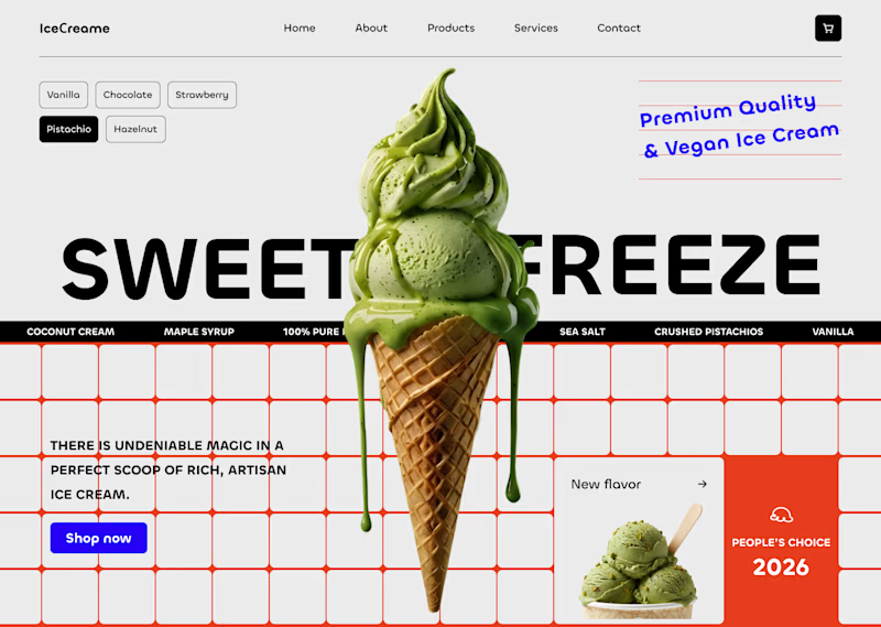
Love concept 02! Much cleaner. I find the red area on 01 a bit distracting and the grid isn't helping the rest of the web's grid. If I explain myelf correctly haha
Makes total sense! 🌸

You wrote exactly my thoughts! haha!

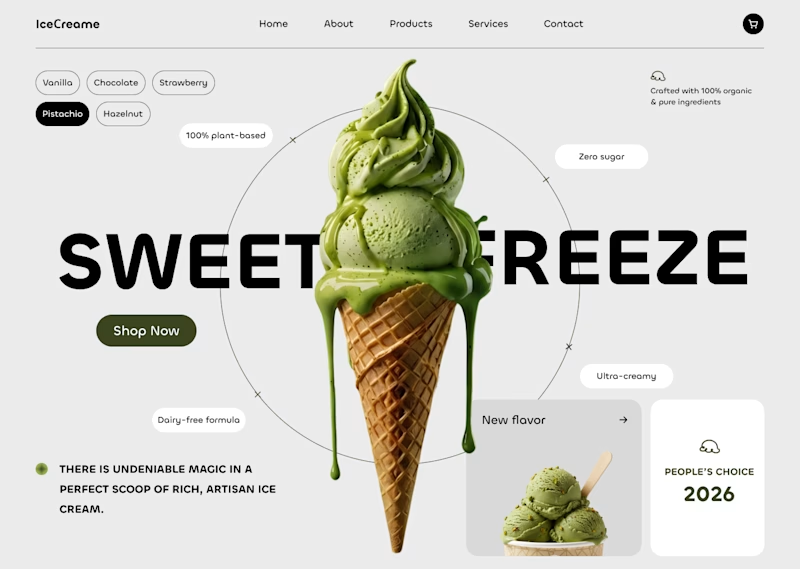
Hi Nina, I voted for Concept 2 because it has a cleaner layout. The dark orange on the first one is a bit too distracting, especially since the lines are a bit too thick in my opinion. On the second concept, the negative space around the ice cream enhances the product itself and...
Hi Emanuele, thanks for the insightful vote! You’re totally right - negative space gives C2 that perfect balance and premium feel. 🤍
Being helpful is always a pleasure. Great work, by the way!
Thank you so much! ❤️

2 Looks great!
Thanks a lot!❤️

The second concept is smooth and clean!
Thanks for your opinion!❤️

concept O2 feels both clean, natural, & a bit futuristic! i love the rounder corners on the buttons in the left hand corner up top, especially paired with the accented circle. there's some sort of play on 'orbit' that feels naturally tied in, an implication that the...

This is so accurate ⚡⚡⚡⚡
great minds, eh?
Wow, I love how you picked up on the 'orbit' vibe! Thanks so much! ✨
Right now I do wish we have access to vote note😆, I just wanna explain how creative and clean this project looks ⚡⚡⚡⚡⚡⚡⚡⚡⚡⚡⚡⚡⚡⚡⚡⚡⚡⚡⚡⚡⚡
Thanks so much! 🫶
You are welcome Nina

2nd one!!
Thanks a lot! 🫶

Organic all the way! The minimalist layout and subtle circular grid with ingredient tags make it feel super premium and natural. Perfect match for artisan ice cream! 🍦💚
Thanks so much! ❤️

the 1st one actually suite what you are trying to build
Thank you so much!❤️

I like Bold one
Thanks a lot! 🫶

Nice concepts, but I'd prefer 02
Thanks!🌸

Love both. But 1 for simplicity
Thanks a lot!🌸

Organic is better!
Thanks a lot!🫶
You're welcome!


Concept 2
Thanks!😊

In the first concept, the red grid and elements pull a bit too much attention away from the hero product. Concept 02 really lets the ice cream shine and matches the 'organic' vibe perfectly! 💚
Дуже дякую за твою думку!🫶

Concept 02: Organic 👍
Thanks a lot!


organic

The second concept is truly organic
Thanks a lot!🫶🌸

Concept 2 is cleaner, and more satisfying
Thanks!🫶

Concept 2 is more clean in the eye the only thing that you need to add is a clear CTA like the option one then you will have a hero that converts

02 Looks amazing
Thanks a lot!🫶

For me organic 👍

Concept 02 looks better

Organic🔥
The network for creativity
Join 1.25M professional creatives like you
Connect with clients, get discovered, and run your business 100% commission-free
Creatives on Contra have earned over $150M and we are just getting started
Trending
retrofuturism
Share your favorite designs from the past exploring the distant future. Or your own take on the aesthetic 🚀
halftone
Dots. Texture. Grain. Let's see your designs using the halftone technique.

Midjourney
Creatives are showing off what they're making with Midjourney.
colorgrade
Video editors sound off: How do you enhance the mood of your video in color grading?





Related posts



Option 2 looks too busy.

Some hero explorations for a dental clinic.
Which one are you picking?

26 voted
76%
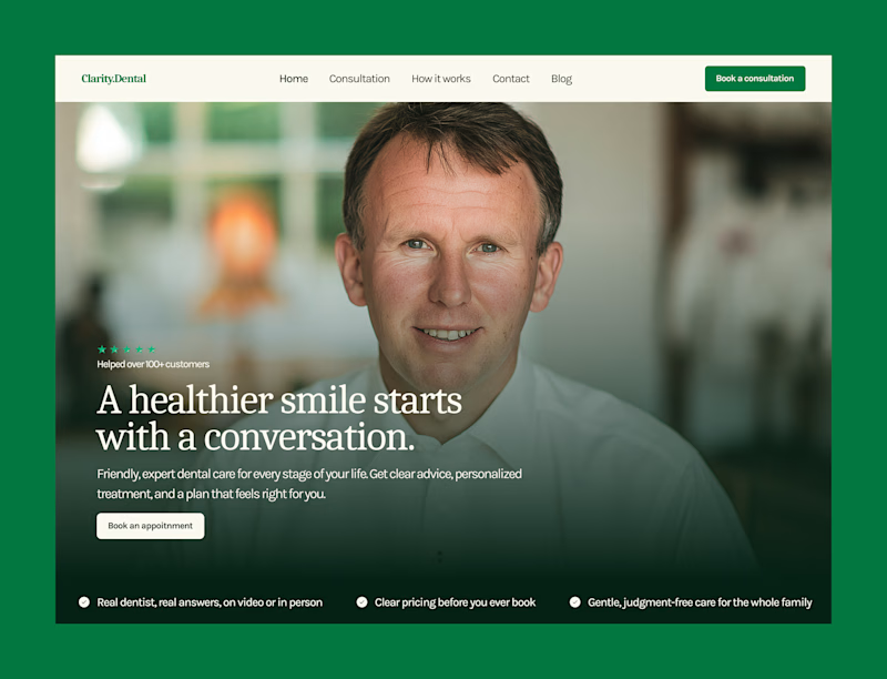
8 voted
24%
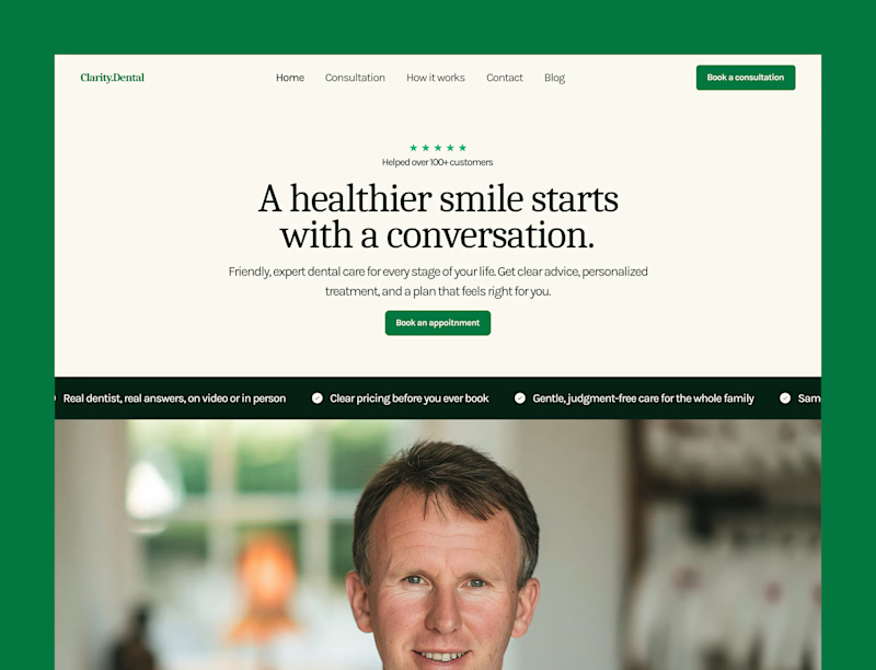
34 votes
Closed

A seems fair but you can make it more better by just scaling the background picture a bit and I have seen your designs you can definitely find a way to make it more appealing.

Social media post for a restaurant, which of them do you prefer the first or the second, your opinion matters to me

5 voted
83%
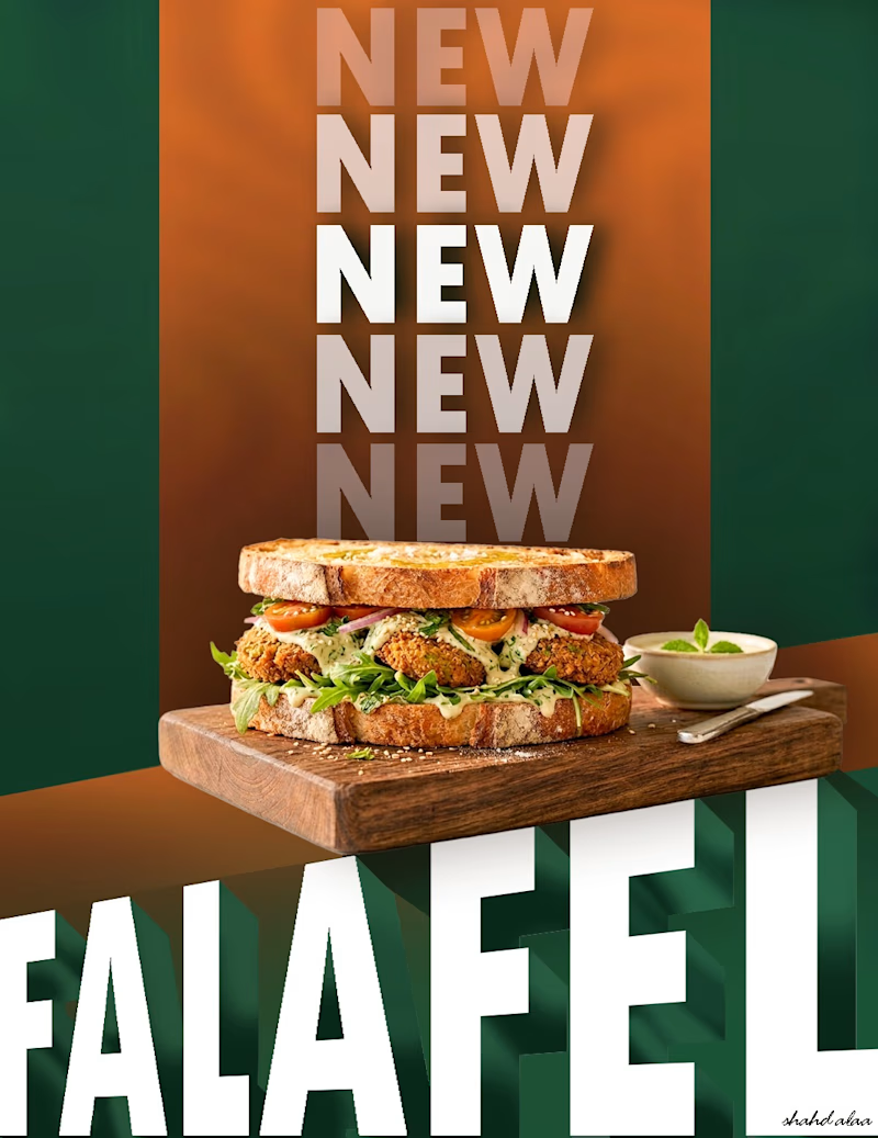
1 voted
17%
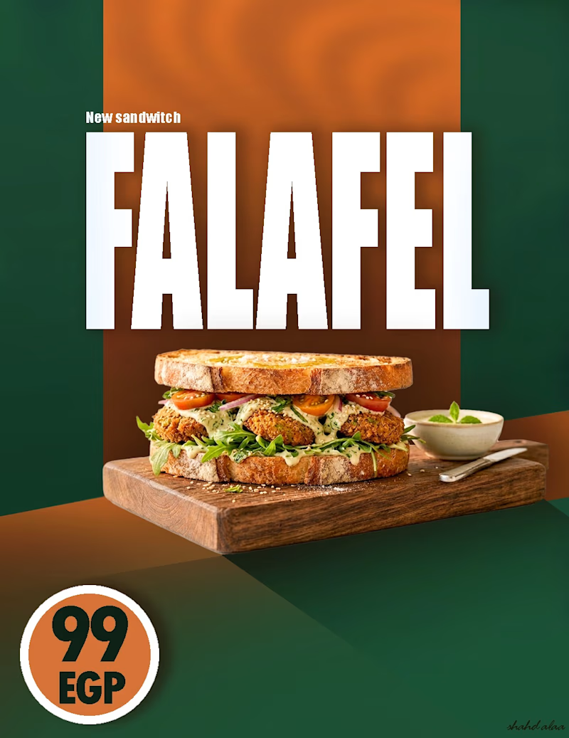
6 votes
Closed
