The network for creativity
Join 1.25M professional creatives like you
Connect with clients, get discovered, and run your business 100% commission-free
Creatives on Contra have earned over $150M and we are just getting started
Back to feedPost
Taste Test

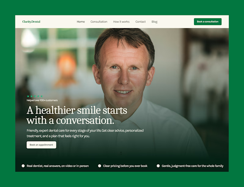
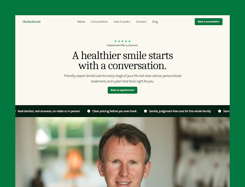
Some hero explorations for a dental clinic.
Which one are you picking?

26 voted
76%
8 voted
24%
34 votes
Closed

I like A more. Making it trusty at the first look
Good choice bro, I also lean more towards A, because that layout is a standard for service based business.

Yes, bro! Had to try more.

A seems fair but you can make it more better by just scaling the background picture a bit and I have seen your designs you can definitely find a way to make it more appealing.
Thanks for the suggestion brother, I will surely try that.
You're welcome.

I’d pick B—the cleaner layout gives the headline more focus and feels more premium for a dental clinic.
Great pick bro!


A for me, the green bar on top pops more
Yes, man! ty

I would go with B
Any reason for that?

Any reason for that?

Good one!

A, because B isnt giving a dental clinic feel.
Yes, this is the same feedback I got from the senior designers.


Premium look !
Thanks mate!

I'm going to go with A! The layout feels so much more welcoming and cohesive than the centered block in B. Awesome design work!
Yeah

B one got my vote
Any for that?

Option A
Good choice!

"A" looks complete...
Ok!!!
The network for creativity
Join 1.25M professional creatives like you
Connect with clients, get discovered, and run your business 100% commission-free
Creatives on Contra have earned over $150M and we are just getting started






Related posts

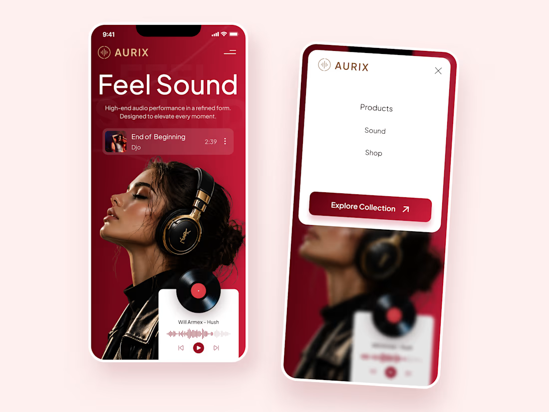
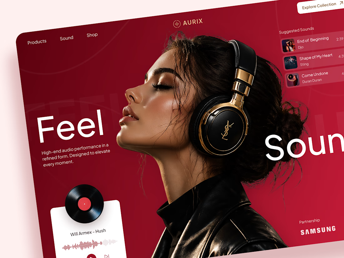
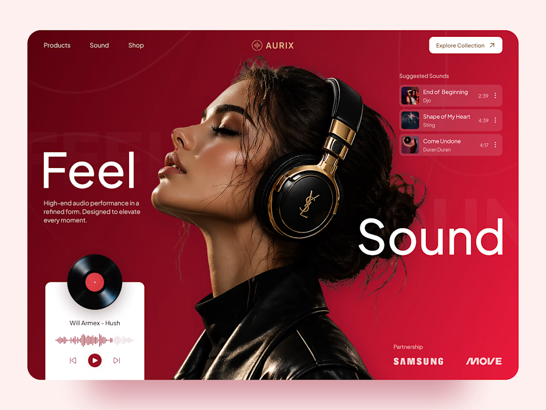
AURIX — Premium Headphones Landing Page 🎧❤️
A bold landing page concept for a premium audio brand, combining luxury headphones, music, and a strong lifestyle aesthetic
The design brings together deep red tones, elegant black and gold details, oversized typography, and immersive lifestyle imagery to create a modern, fashion-inspired experience
Special attention was given to:
• Bold lifestyle-focused hero composition
• Rich red and gold color palette
• Clean, oversized typography
• Music player and suggested tracks
• Premium product presentation
• Responsive mobile experience
• Minimal navigation and clear CTA
The result is a stylish, immersive landing page that connects premium audio with fashion, music, and everyday lifestyle ✨


Love the style!

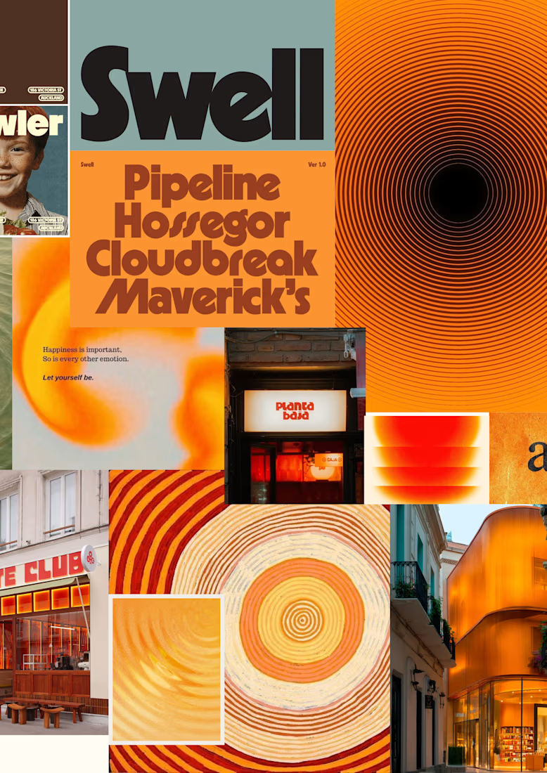
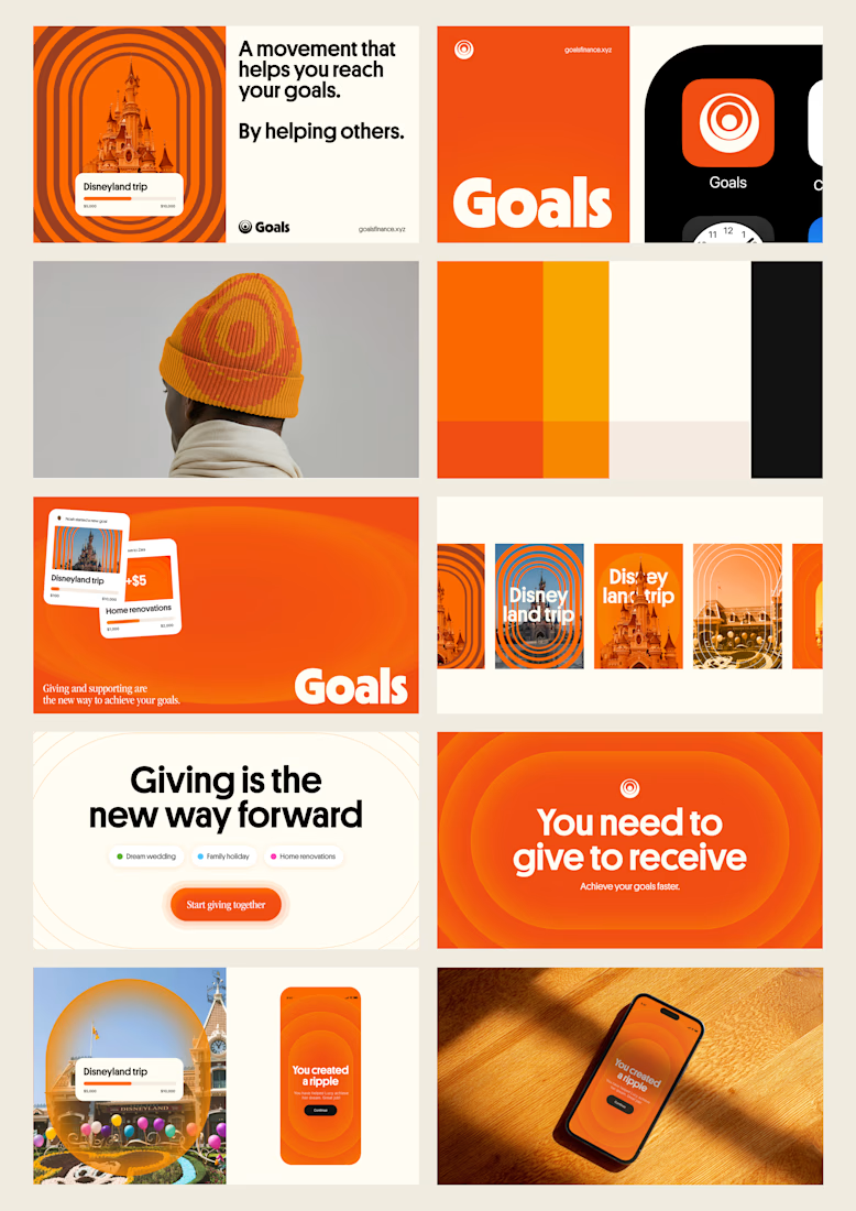
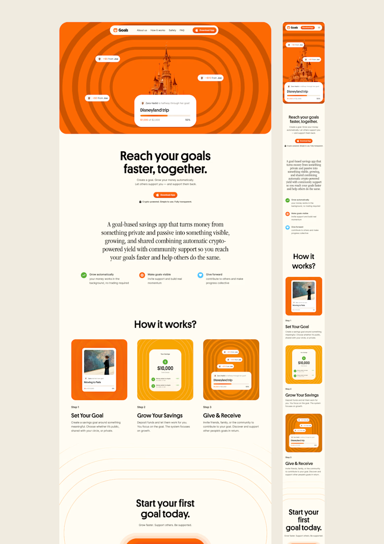
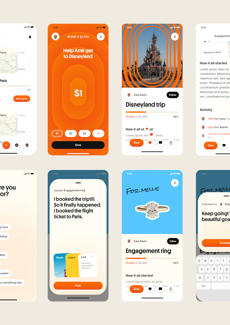
one of my favourite things about running a one-person studio is that nothing gets lost in translation.
the idea behind the brand is the same idea that shapes the website and the product.
no handovers, no starting from scratch, no trying to explain the vision to someone new.
a little look at how that came together for goals, from the first moodboard to the app ↓

Love it!

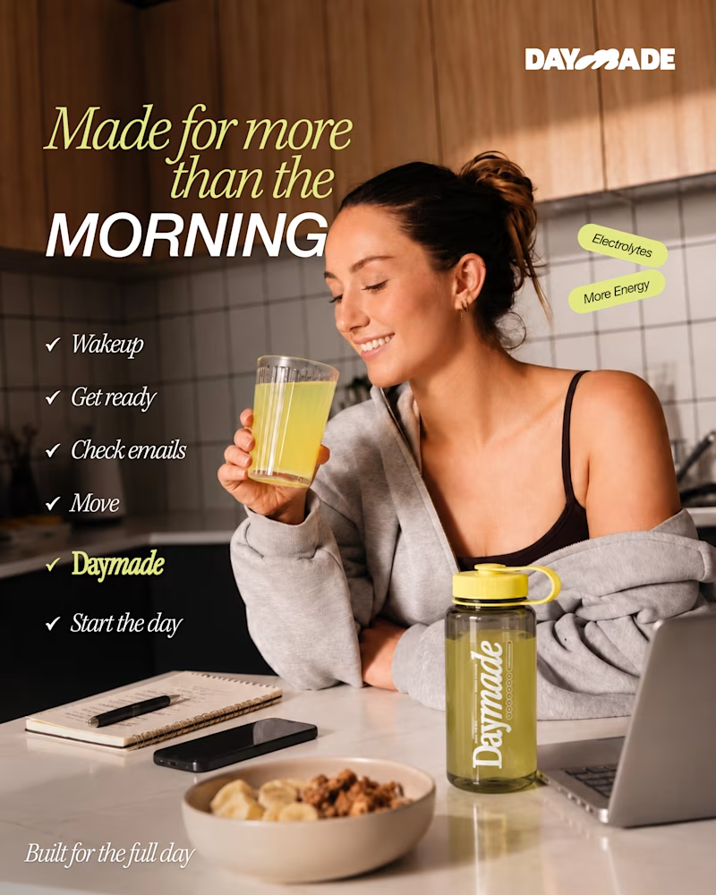
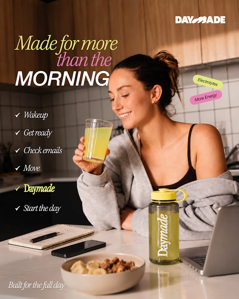
✨ Two styles. One campaign. Which Daymade design hits differently?
I explored two creative directions for Daymade, combining lifestyle storytelling with bold typography and fresh, energetic colors. ☀️🥤
💛 Option 1: Fresh & Minimal 💗 Option 2: Bold & Playful
Which one grabs your attention? 👀
Cast your vote! 🗳️👇
25 voted
26%
73 voted
74%
98 votes
Closed

Option 2 looks better