The network for creativity
Join 1.25M professional creatives like you
Connect with clients, get discovered, and run your business 100% commission-free
Creatives on Contra have earned over $150M and we are just getting started
Back to feedPost
Taste Test
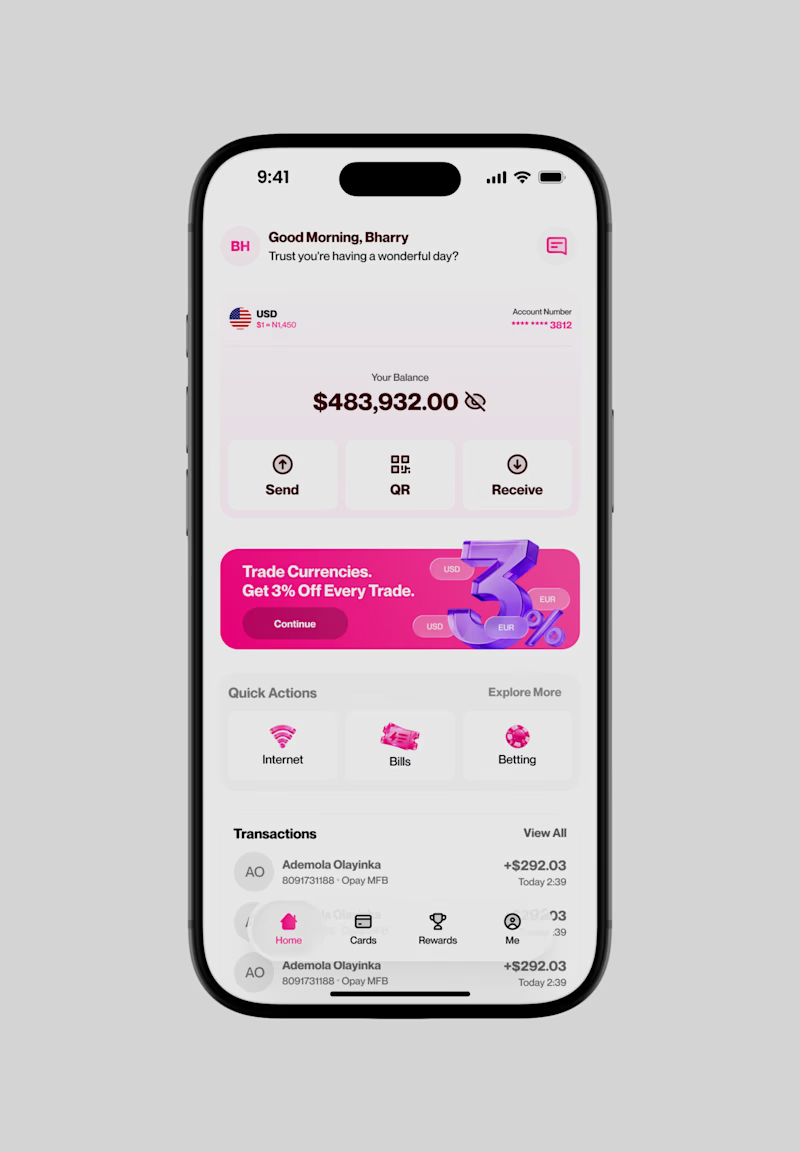
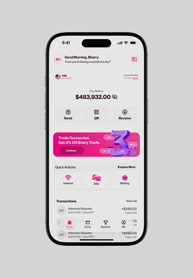
Been working on this fintech concept and I’m curious about one thing: which direction feels better?
A or B? 👀
Same product, slightly different visual approach. One has to go, and I want you to be the judge.
What's your pick?
8 votes
Ends in 4h

To be honest both of them are the same to me but they are great 🎉

thank you Mostafa
Pardon Ademola❤️

These are both great UI designs.
"A" creates a strong visual hierarchy, the gradient background for the account balance area draws immediate focus to the balance card while keeping it distinct from the promo area below.
Well done, @Ademola Olayinka

Both look super clean! The changes between A and B are subtle at first glance, but those micro details really do act as game changers for UI balance. What specific detail made you lean towards A for the final pick?

Both look clean!

Went with B. The cleaner background lets the pink promo card stand out more.

my preference is option A
The network for creativity
Join 1.25M professional creatives like you
Connect with clients, get discovered, and run your business 100% commission-free
Creatives on Contra have earned over $150M and we are just getting started
Related posts

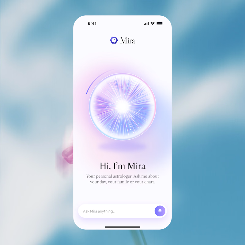
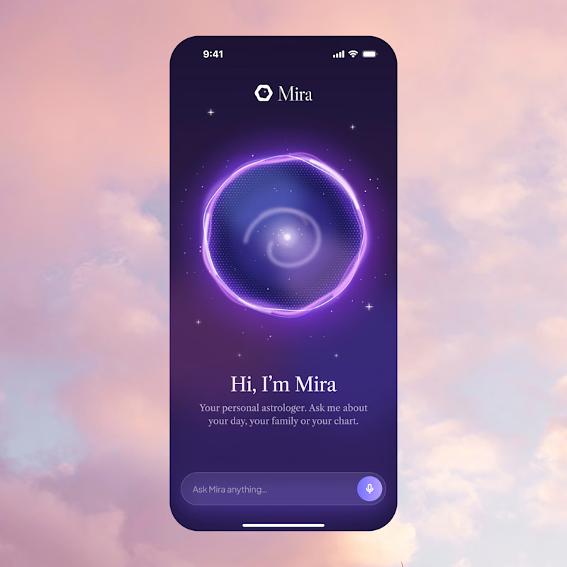
Two directions for Mira, an AI astrologer you talk to by voice.
Only one made it past the client. Which one would you ship, and why?
12 voted
75%
4 voted
25%
16 votes
Closed
A is better if you can make a dark version of it thats incredible

If you do motion, you know this choice is never small. Two fly-ins, same scene. A or B?

8 voted
44%
10 voted
56%
18 votes
Closed
Option 2 is unique ❤️


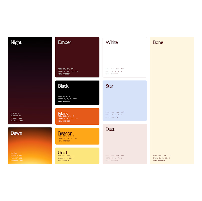
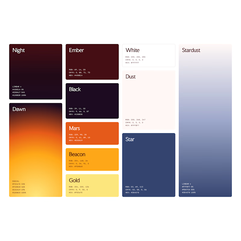
Which color palette feels more masculine to you?
16 voted
15%
94 voted
85%
110 votes
Closed
