The network for creativity
Join 1.25M professional creatives like you
Connect with clients, get discovered, and run your business 100% commission-free
Creatives on Contra have earned over $150M and we are just getting started
Back to feedPost


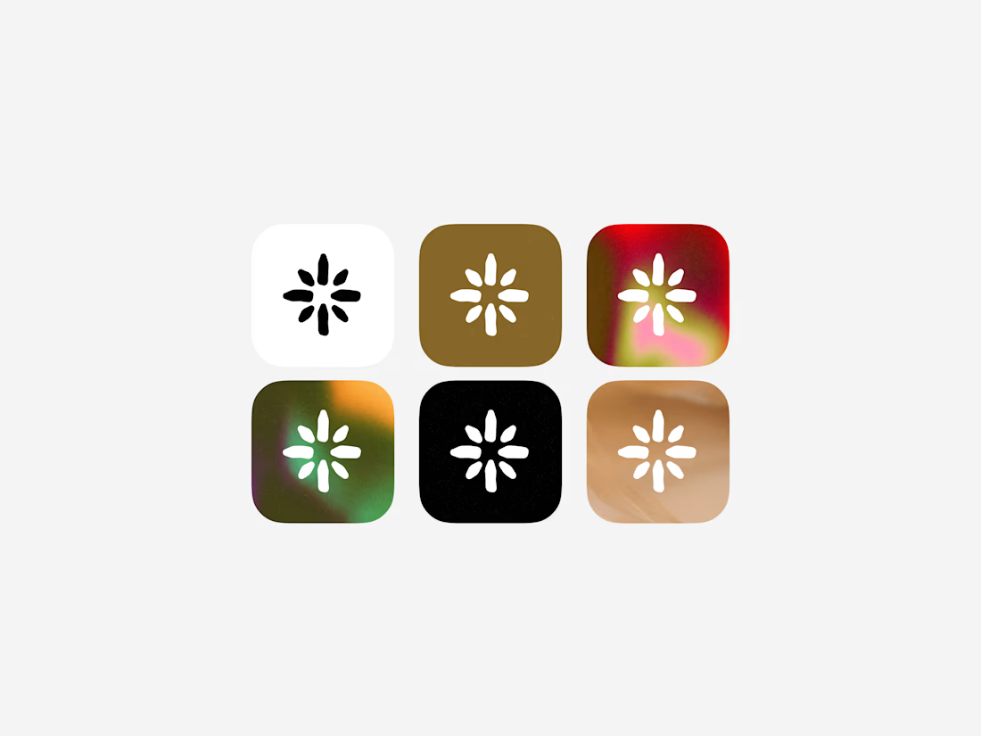

Honestly this is a creative skill. The icon is imperfect to be perfect and unique.🫡🫡

I like the white and black ones and those with Simi transparent background nice I like it ❤️❤️


love these, especially those funky gradient options!

This is a really nice color direction. I think it could be especially cool during development if the app icon color changes based on how you use the app - so different usage patterns or preferences could automatically determine which icon variation you get.


I liked 💯 clear design


clean icons

Great Work!

I love the gradients

One of the best designs I’ve seen today. Really solid work
The network for creativity
Join 1.25M professional creatives like you
Connect with clients, get discovered, and run your business 100% commission-free
Creatives on Contra have earned over $150M and we are just getting started











Related posts




Clean and confident work! The green gradient with the mark feels very modern for fintech - trustworthy but not boring. The app screens look really polished. Curious how you landed on this mark, does it represent growth / movement?

Pulse Athletics... Branding & App design✨
Check it out
#app #sport #productdesign #uiuxdesign #uidesigner #uxdesigner #pulse #branding #brandidentity #brandstrategy #brandguidelines #logo #homepage
That's really stunning app design🔥🔥🔥
Great job Ziva🎉🎉🎉

Designed a step tracking screen where you can see your daily progress and weekly trend in one glance.
Same screen, two shots. Which one would stop your scroll? 👀

11 voted
73%
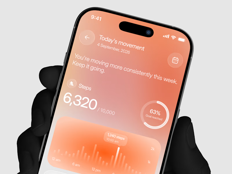
4 voted
27%
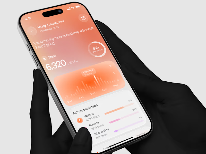
15 votes
Closed


