The network for creativity
Join 1.25M professional creatives like you
Connect with clients, get discovered, and run your business 100% commission-free
Creatives on Contra have earned over $150M and we are just getting started
Back to feedPost
Taste Test
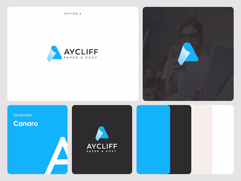
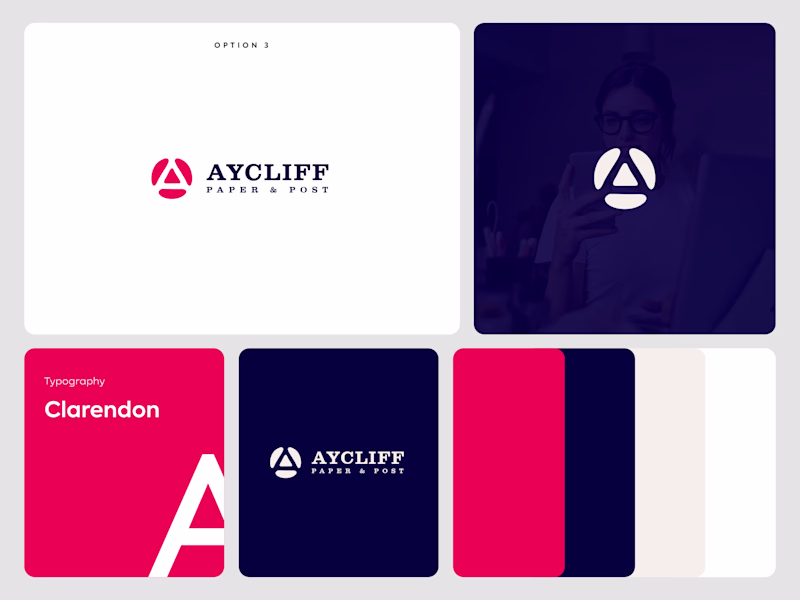
Exploring two logo directions for AYCLIFF Paper & Post and would love some feedback from the Contra community 👇
🔹 Option 1 focuses on simplicity and clarity, using a folded-paper-inspired symbol to reflect the brand’s industry in a modern way.
🔸 Option 2 takes a bolder approach with a custom geometric mark designed to create a stronger, more memorable brand presence.
If you were the client, which direction would you choose and why? 👀
11 voted
65%
6 voted
35%
17 votes
Closed
Option 1 looks great and passes the message
Thanks!
Thank you!
Going with Option 1. The folded-paper mark actually connects to the brand's industry in a way that Option 2's geometric A doesn't. Option 2 feels like it could belong to any startup.
Thank you😊
Option 2
Thank you!
You are welcome
though both are lovely, i have to say the clarity focal point of option 1 jumped out at me before i even got to glance back up to review your explanations of each. to me, it feels like a clean, more simplistic palette makes sense there, & the shade of blue you chose is SO...
Thank you very much Nicolette!
Option 1
The network for creativity
Join 1.25M professional creatives like you
Connect with clients, get discovered, and run your business 100% commission-free
Creatives on Contra have earned over $150M and we are just getting started
Trending
Claude
Claude has entered the design space. How are you using Claude Design?
Contra University
Learn from expert creatives how to earn more using next-gen AI tools.
creativeaiflow
Creative AI workflows are evolving. What tools do you use, and what are their strengths and weaknesses?
freelancerlife
Freelancer life is wins, pivots, and everything in between. What’s yours right now?
Related posts
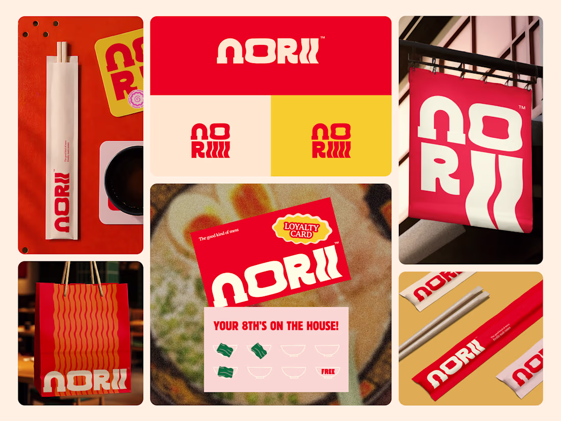
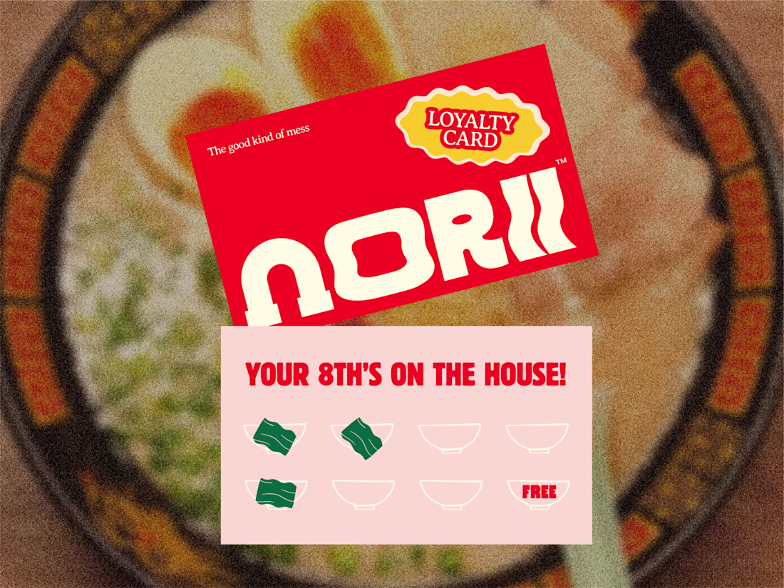
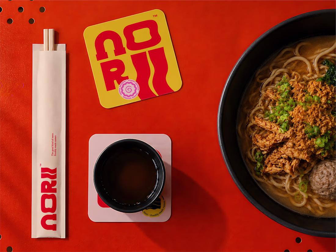
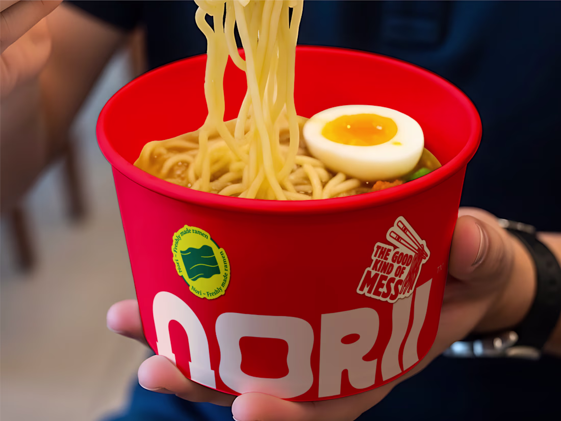
Some food brands play it safe. Norii was designed to do the opposite.
Bold red, warm yellow, a wavy wordmark that moves like noodles in a bowl, and a brand voice confident enough to put "the good kind of mess" on a loyalty card. Every touchpoint chopstick sleeves, takeaway bags, hanging signage, and sticker collateral is built to feel like the same world from street level to tabletop.
"Your 8th's on the house." Even the reward mechanic has personality.
This is restaurant branding that works as hard outside the door as it does inside it.
Does this make you want to find the nearest Norii? 👇
Tools: Illustrator · Figma
#FoodBranding #BrandIdentity #PackagingDesign #LogoDesign #RestaurantBranding #ContraFreelance
Impressive Work
This logo mark began with research into South African heritage. I kept returning to the country’s flag, especially the green Y-shaped form at its center. I isolated that shape, refined it, and rotated it around a central axis until each piece aligned into one balanced symbol.
The result feels warm, natural, and rooted in heritage, while still giving the skincare brand a modern and distinctive identity.
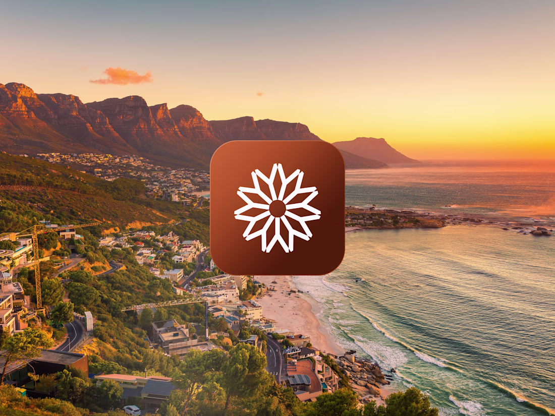
Pulling the mark from the flag's Y-shape instead of designing a generic botanical icon is what gives this an actual story. It reads like a flower at first glance but has real meaning behind it once you know where it came from.
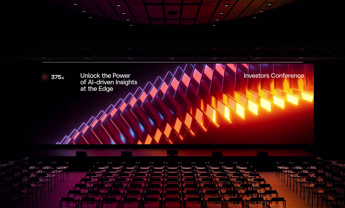
I've shared some 375ai work this week already, but there's one part of this project I keep coming back to: watching the same logomark hold up everywhere.
When I was designing it, I was mostly worried about the small stuff, whether the mark would still read as an app icon or a favicon. Then a few months later it's 20 meters wide behind a speaker at an investors conference, and somehow it still feels like the same brand.
The video shows how the mark is built, next to the actual lidar scans the product makes. That's where the dot pattern came from in the first place, so it never felt like decoration to me.
Curious how other designers approach this: do you start from the smallest size a logo has to survive at, or design the big version first and scale down?
Saw this on behance few days ago and can't help but comment here again... You did a great job