pro
Oluwatoyin Atanda
Graphic Designer | Logo & Brand Identity Specialist
- 5.00
- Rating
- 46
- Followers
Design isn’t just about looking good, it’s about getting results.
I create high-converting ad banners for brands that want attention, clicks, and sales.
From e-commerce promotions to product launches, every design is built with strong visual hierarchy, and persuasive messaging.
If you’re building a brand that deserves to feel this intentional, my DMs are always open.
1
18
Visual Identity Design for TELORE.
TELORE is a premium wine brand created to explore the intersection of heritage, craftsmanship, and modern luxury branding.
The goal was to design a visual identity that feels timeless yet contemporary, something that could stand confidently alongside established wine houses while still feeling distinct.
Full case study loading soon.
0
28
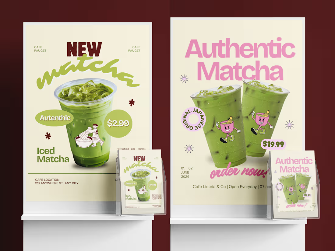
Exploring a fun and expressive direction for a matcha brand.
Bold type, vibrant tones, and a touch of character, designed to stop the scroll and spark curiosity.
What do you think?
2
1
49
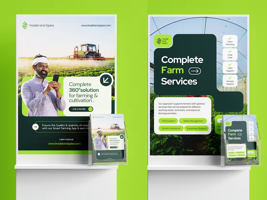
Designing clarity for modern agriculture.
A smart, scalable brand system built to communicate trust, innovation, and real impact.
Social mdedia design for an agriculture business.
What do you think?
2
2
188
A lot of digital agencies look the same. Same colors. Same tech style. Same tone.
So the challenge with Senia was simple: how do we make it feel modern and digital without it feeling generic?
Case study uploaded on Behance:
https://www.behance.net/gallery/245123335/Senia-Visual-Identity-Design?platform=direct
What do you think?
2
265
Senia Brand Identity Design
1
2
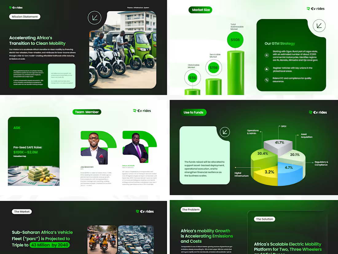
Sneak peek into a pitch deck I designed for a brand I recently built the identity for.
I treated every page with intention, refining the details, simplifying the story, and making sure the design supports the vision, not distracts from it.
Intentional. Clean. Investor-ready.
What do you think?
If you’re building a brand that deserves to feel this intentional, my DMs are always open.
1
375
I just wrapped up a brand identity project for EV Rides; a clean mobility brand focused on building the systems that make electric transportation possible.
The logo was designed as a bold, vertical, layered form to represent stability, trust, and durability, with a subtle upward movement symbolizing progress. The grounded geometry reflects EV Rides’ role as a dependable financial and operational backbone, while the mark subtly forms the letter “R.”
The work later expanded into a full visual system, from color and typography to digital and physical applications, built to scale and stay consistent.
If you’re building a brand that deserves to feel this intentional, my DMs are always open.
4
3
427
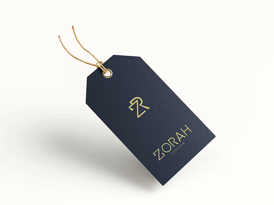
I started by really listening to the client’s vision and understanding the essence of Zorah, luxury, and timelessness. From there, I dove into research to see how similar brands express these qualities visually, while looking for ways to make Zorah unique and bold.
Kindly go through full case study here:: https://www.behance.net/gallery/238964621/Fashion-Clothing-Visual-Identity
3
391
The goal was to build a brand identity that reflects motion, energy, and progress, core to OrbitFit’s mission. I started by researching space-inspired motion systems and how orbital movement can represent continuous growth.
I started with a brand strategy foundation, defining three core visual themes:
Motion – Representing progress and constant movement.
Technology – Clean, minimal forms with a futuristic edge.
Energy – A tone that motivates and inspires.
From there, I sketched out early concepts inspired by orbital paths and circular motion, which aligned perfectly with the idea of "OrbitFit." The final logomark features an abstract orbit encircling the brand’s initial, symbolizing momentum, flow, and connection.
The Full Case Study here: https://www.behance.net/gallery/233495605/Fitness-Brand-Identity-Design
3
7
381
Elpusfly approached me to create a complete brand identity that communicates their core values, reliability, innovation, and exceptional customer service, while appealing to a diverse audience of travelers.
The goal was to develop a fresh, modern look that could be easily applied across various touchpoints, including digital platforms, signage, uniforms, and marketing materials.
I began by deeply understanding Elpusfly’s vision to create an airline that embodies seamless travel, innovation, and trust. Research on the airline industry, especially African markets, helped me identify key expectations from travelers and gaps in competitor branding. This ensured the design would stand out and resonate with the target audience.
Full case study on https://www.behance.net/gallery/231655209/Elpusfly-Brand-Identity-Design
13
10
436
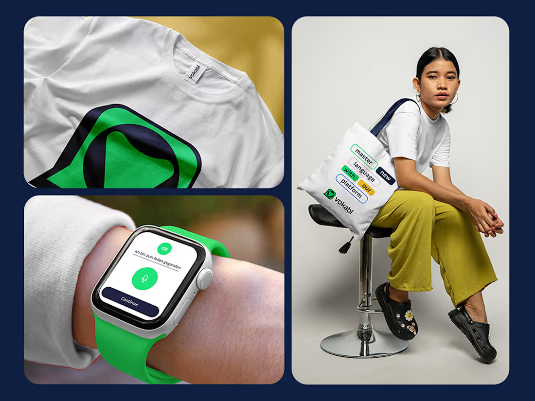
Vokabl is an edtech language-learning startup built to help people achieve fluency while encouraging meaningful communication across cultures.
They reached out to me to design their brand identity, and the project became a deeply rewarding collaboration, from early ideas to final delivery.
As an edtech platform, Vokabl needed a brand that felt trustworthy and professional, while still being friendly and accessible. It had to stand out in a competitive language-learning space without feeling generic or overly academic.
The goal was to create an identity learners could trust, connect with, and enjoy using every day.
What do you think?
1
1
396
Minimalist Luxury Fashion | Clothing Visual Identity
1
1
Logo and brand identity design
0
1
Logo & Visual Identity Design - Nevada
1
0
Elpusfly | Logo and Brand Identity Design
2
6
