Senia Brand Identity Design
Oluwatoyin Atanda
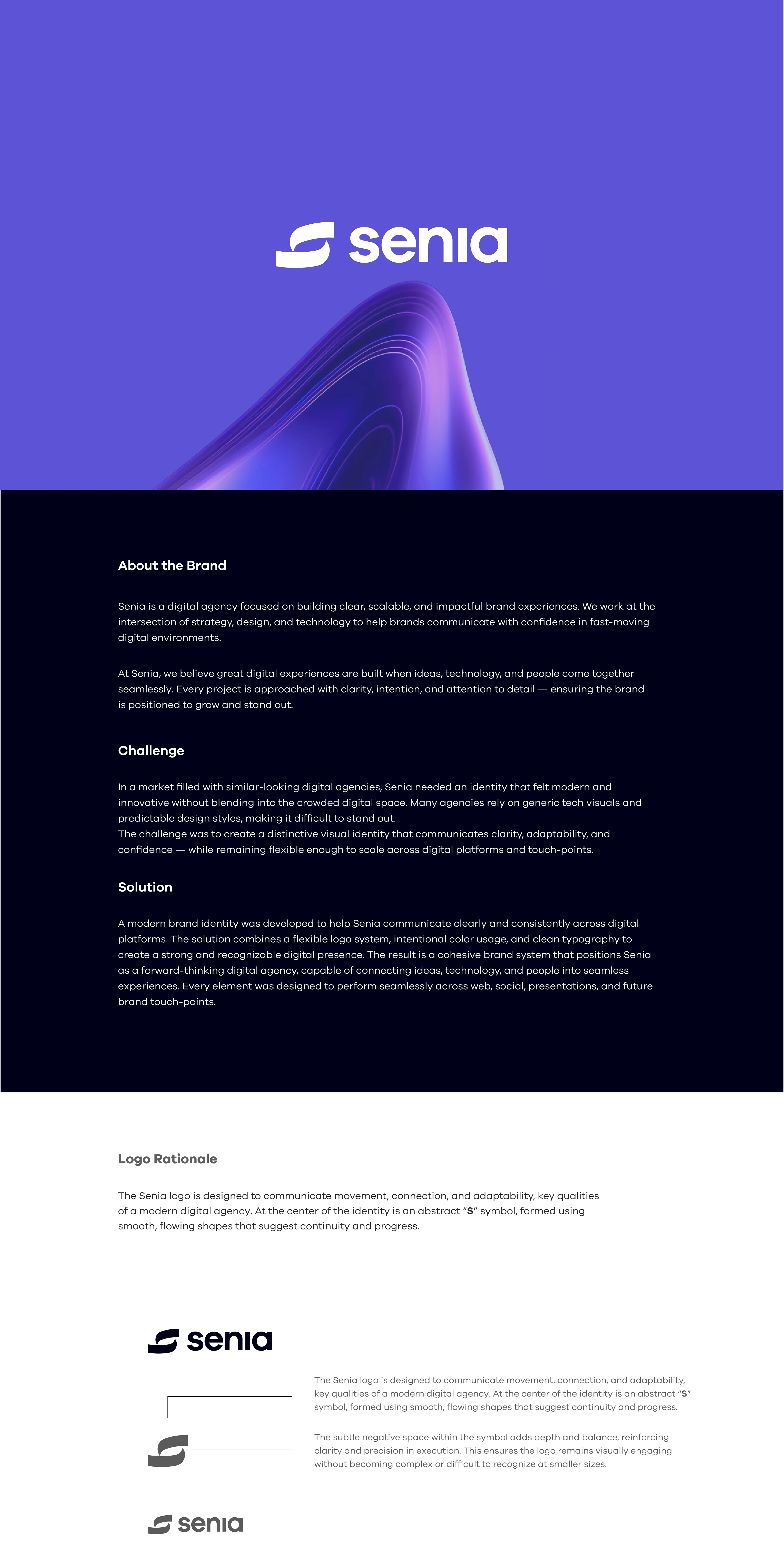
About Senia
Senia is a digital agency focused on building clear, scalable, and impactful brand experiences. We work at the intersection of strategy, design, and technology to help brands communicate with confidence in fast-moving digital environments.
Challenge
In a market filled with similar-looking digital agencies, Senia needed an identity that didn’t just look modern — it needed to feel intentional, confident, and adaptable. The goal was to create a brand presence that stands out while remaining clear and versatile.
Logo Rationale
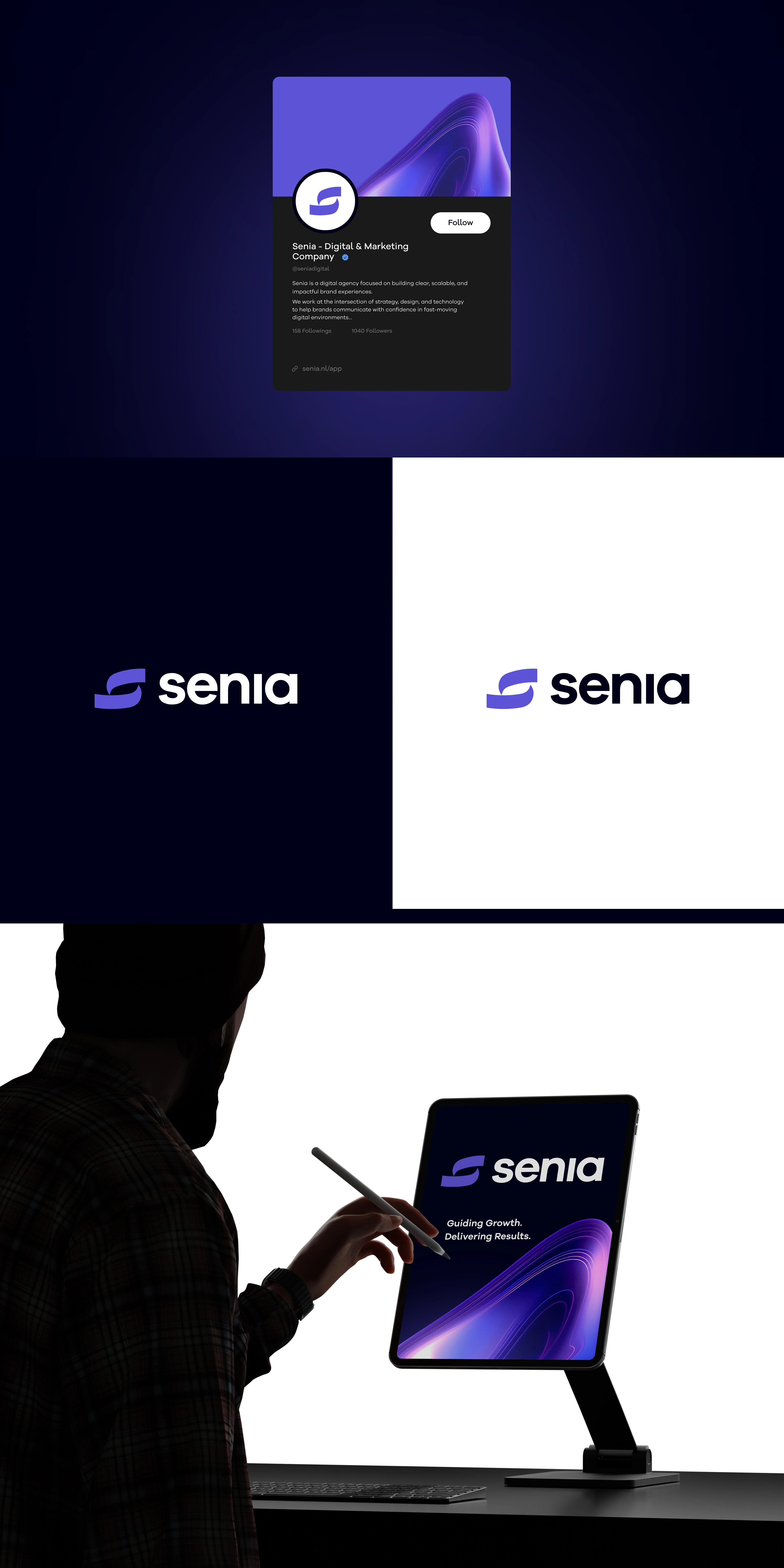
The Senia logo is designed to communicate movement, connection, and adaptability, key qualities of a modern digital agency. At the center of the identity is an abstract “S” symbol, formed using smooth, flowing shapes that suggest continuity and progress.
The open construction of the mark represents flexibility and collaboration, reflecting how digital agencies evolve with technology and adapt to changing client needs. Rather than using sharp or rigid forms, the logo leans into fluid geometry to convey approachability while still maintaining a professional presence.
The subtle negative space within the symbol adds depth and balance, reinforcing clarity and precision in execution. This ensures the logo remains visually engaging without becoming complex or difficult to recognize at smaller sizes.
Paired with a bold, contemporary wordmark, the symbol creates contrast between motion and structure. This balance reflects the agency’s role in blending creativity with strategic thinking, delivering solutions that are both expressive and results-driven.
Overall, the logo is designed to be timeless, versatile, and digitally native, allowing the brand to scale confidently across platforms while maintaining strong visual consistency.
Solution
A lot of digital agencies look the same. Same colors. Same tech style. Same tone.
So the challenge with Senia was simple: how do we make it feel modern and digital without it feeling generic?
The goal wasn’t to overcomplicate things. It was to build something clean, flexible, and strong enough to grow with the brand.
The solution was to create a simple but intentional identity system. The logo mark was designed to express flow and connection, reflecting how the agency connects ideas, technology, and people. The typography was kept confident and clear, and the color direction was chosen to feel modern but still professional.
Everything was built with digital use in mind, website, social media, presentations — so the brand doesn’t just look good, but works consistently wherever it shows up.
In the end, Senia now has a foundation that feels clear, adaptable, and ready to compete in a crowded digital space.
If you're building a digital brand and need clarity, let’s talk.
Like this project
Posted Mar 4, 2026
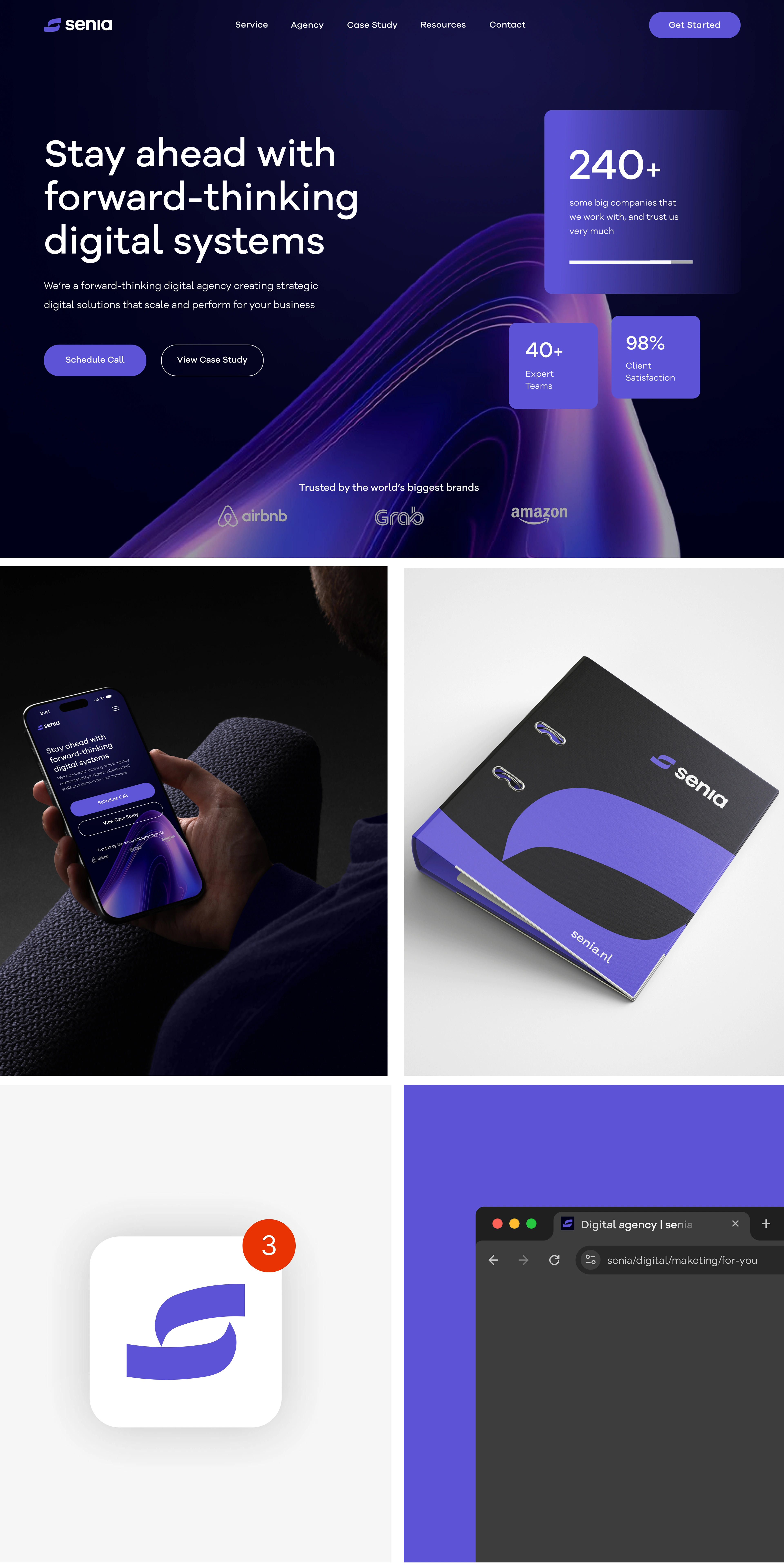
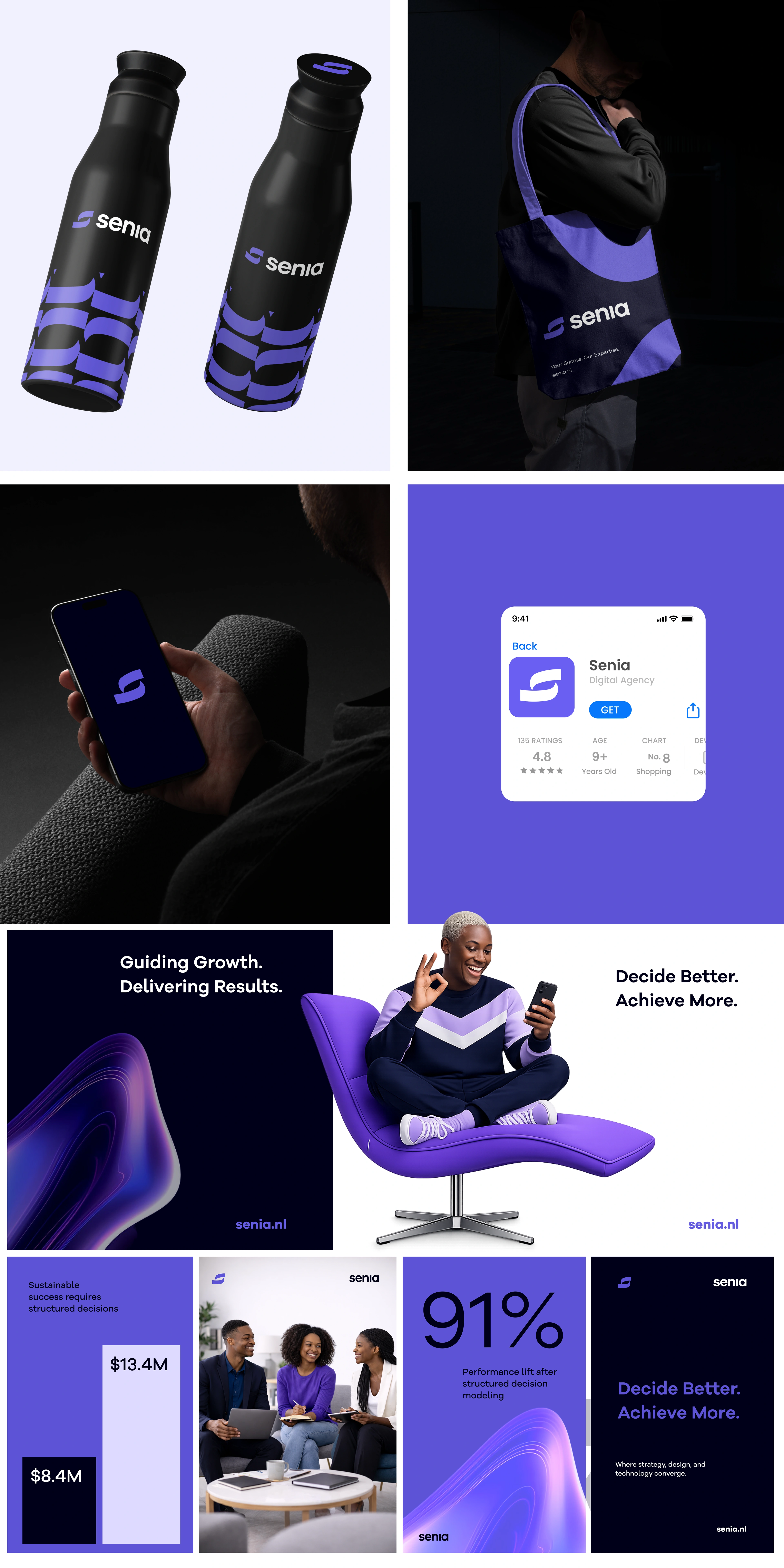
I developed a complete visual identity for Senia, covering the logo system, website landing page, mobile responsiveness, and supporting brand graphics.