
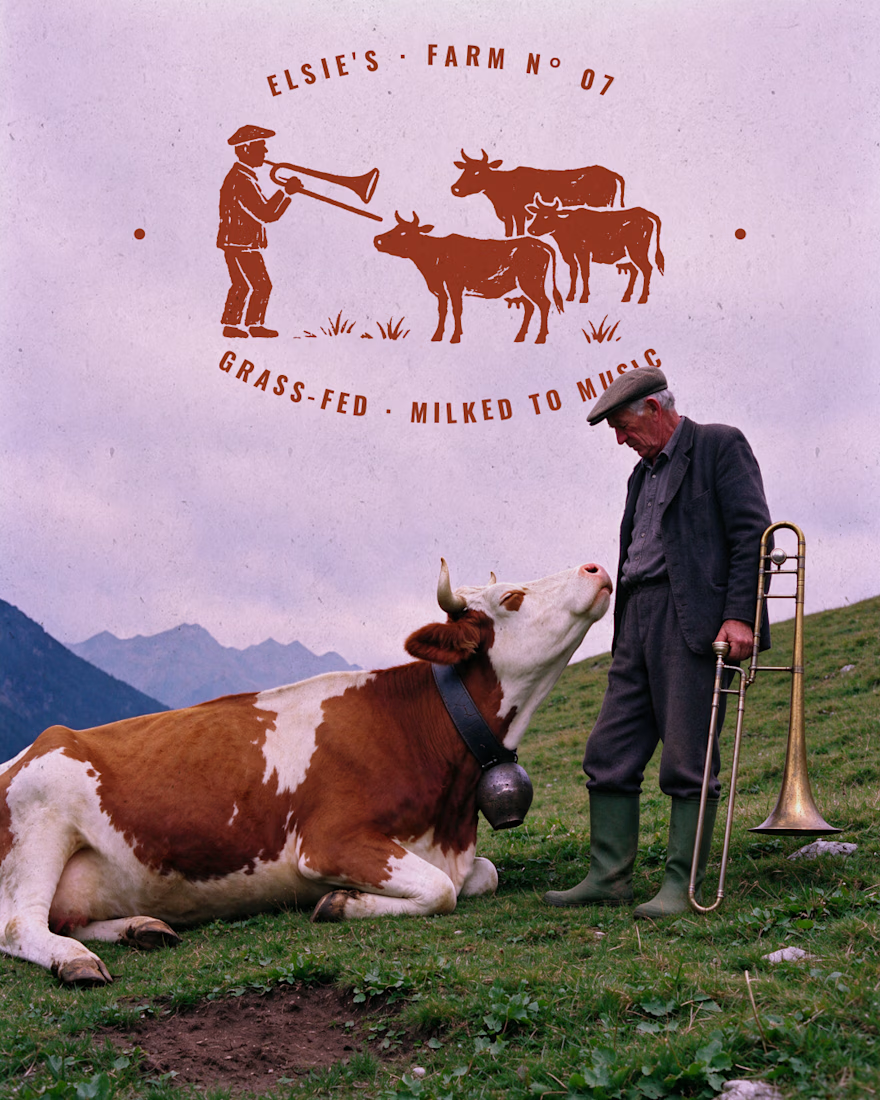
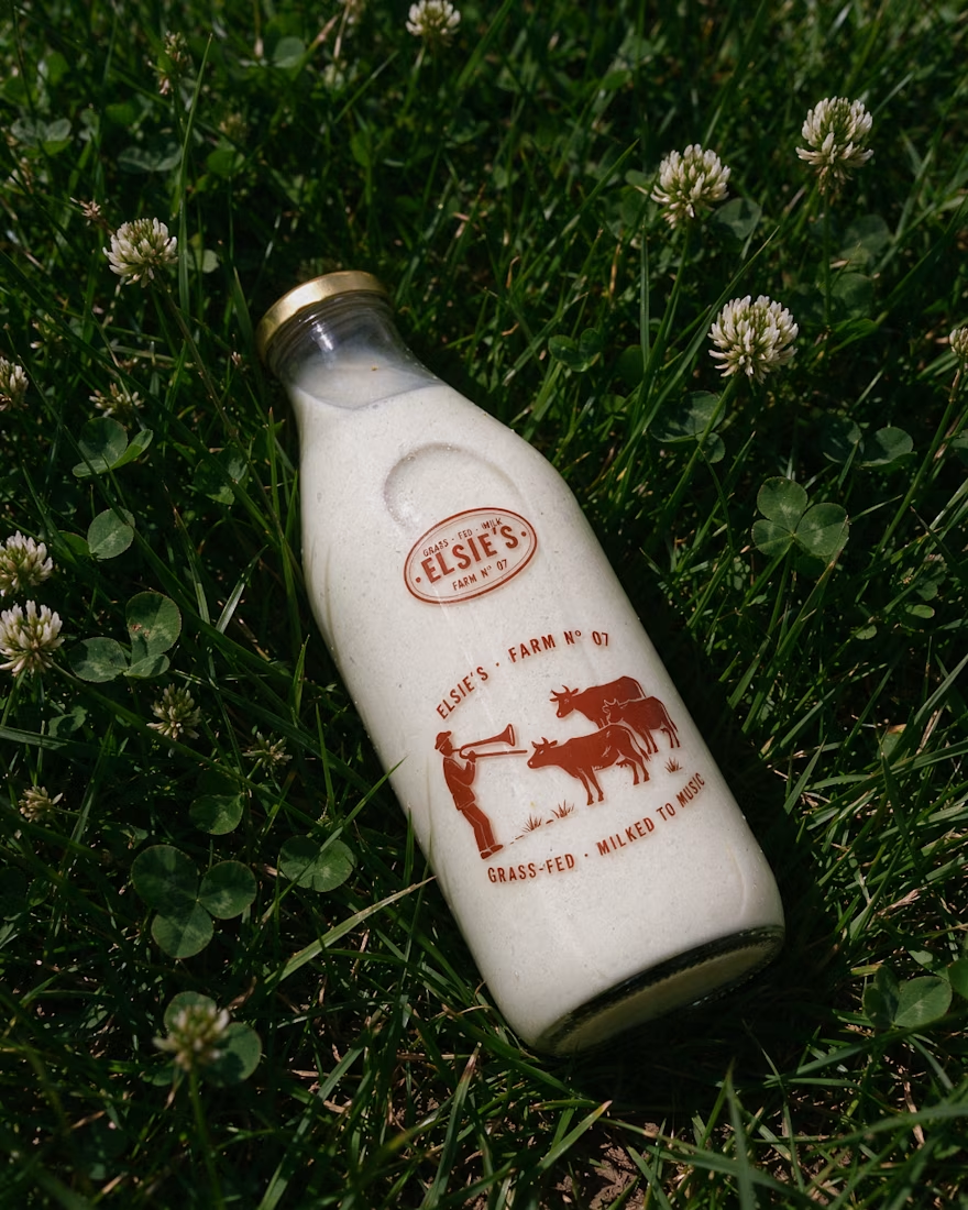
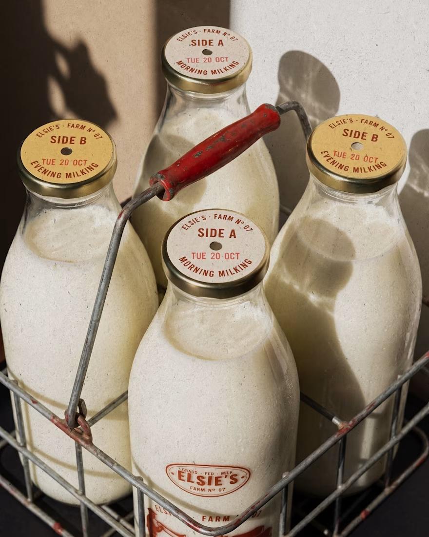
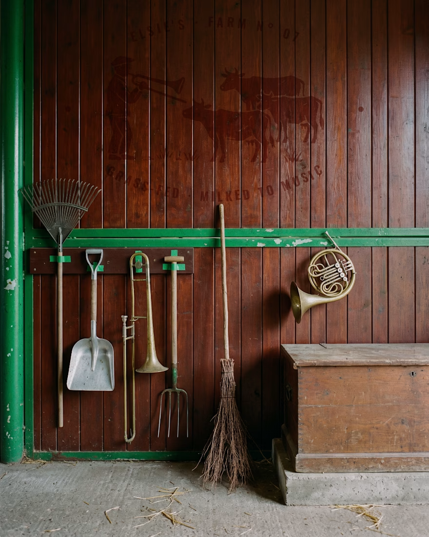
Elsie's: brand identity and packaging for the @designerbriefs weekly challenge (Brief 183). An organic milk brand from very happy cows who love fresh grass and good music.
The logo comes from the brass name plates farmers fixed to their milk cans, with every letter struck by...


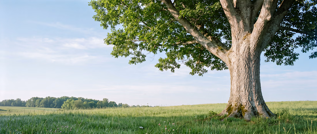
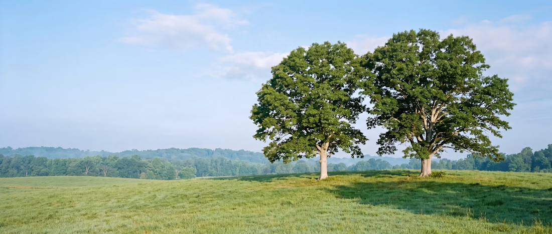
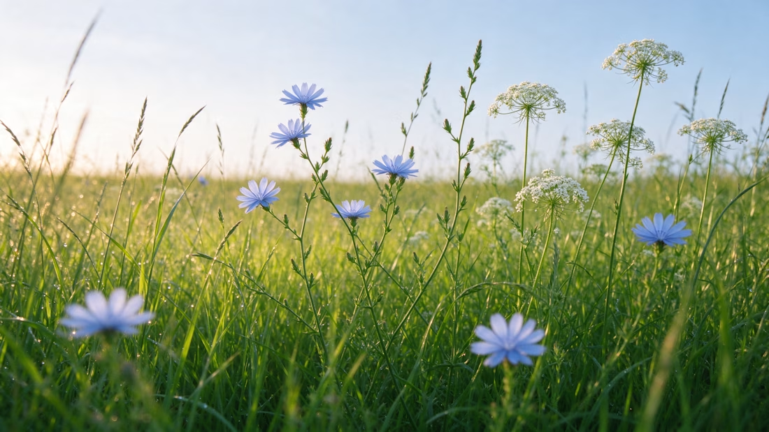
Scott, founder of Glenwood Primary Care and Geriatrics, came to me looking for stock photos for his new website. I proposed building an image library for his brand instead, guided by a clear visual guide based on his patients, his logo and the local landscape. The result was 20...
It’s a pleasure to work with clients like this. Thanks, Jasper!
RECOMMENDED
“Andreu was so amazing to work with! We needed a rebrand and he delivered our vision perfectly. He works fast and his communication too! Will continue to work with Andreu for future projects!”


Jasper Jorolan
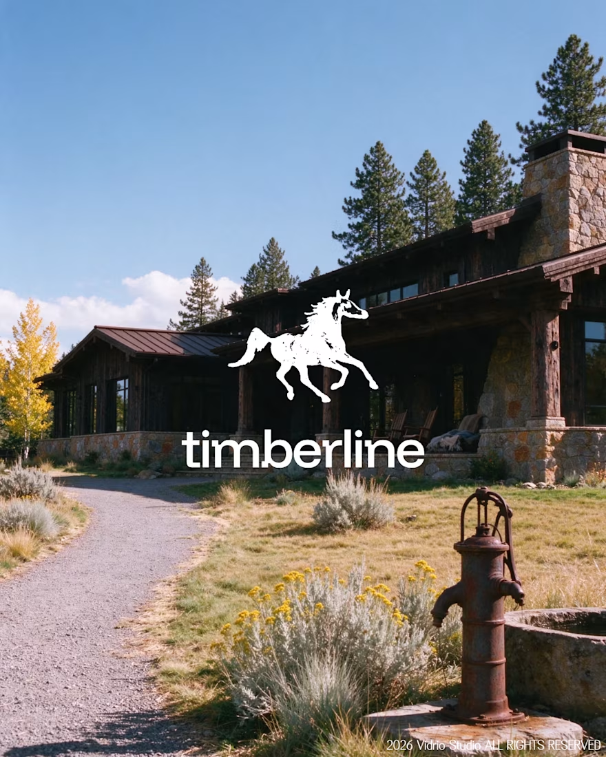
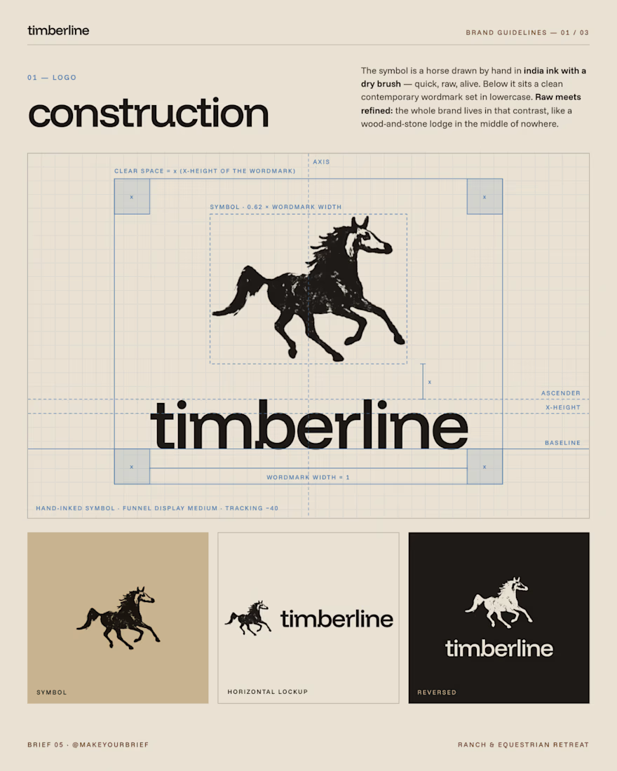
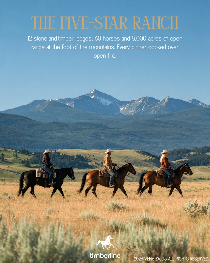
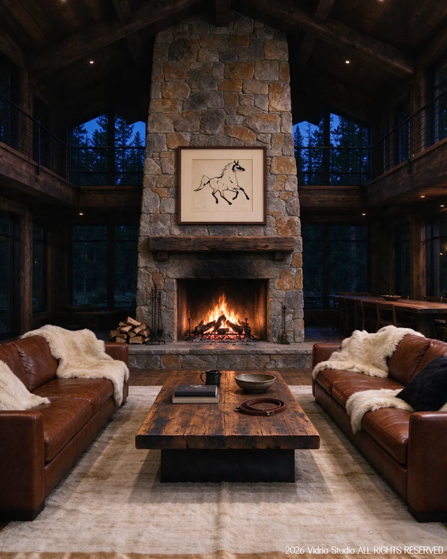
Visiting WrldI worked on Brief 05 of the @makeyourbrief challenge: a brand identity for Timberline, a luxury ranch and equestrian retreat. I hand-drew the horse symbol with a marker, paired it with a clean modern wordmark and an earthy palette, and extended it into merch and lodge...
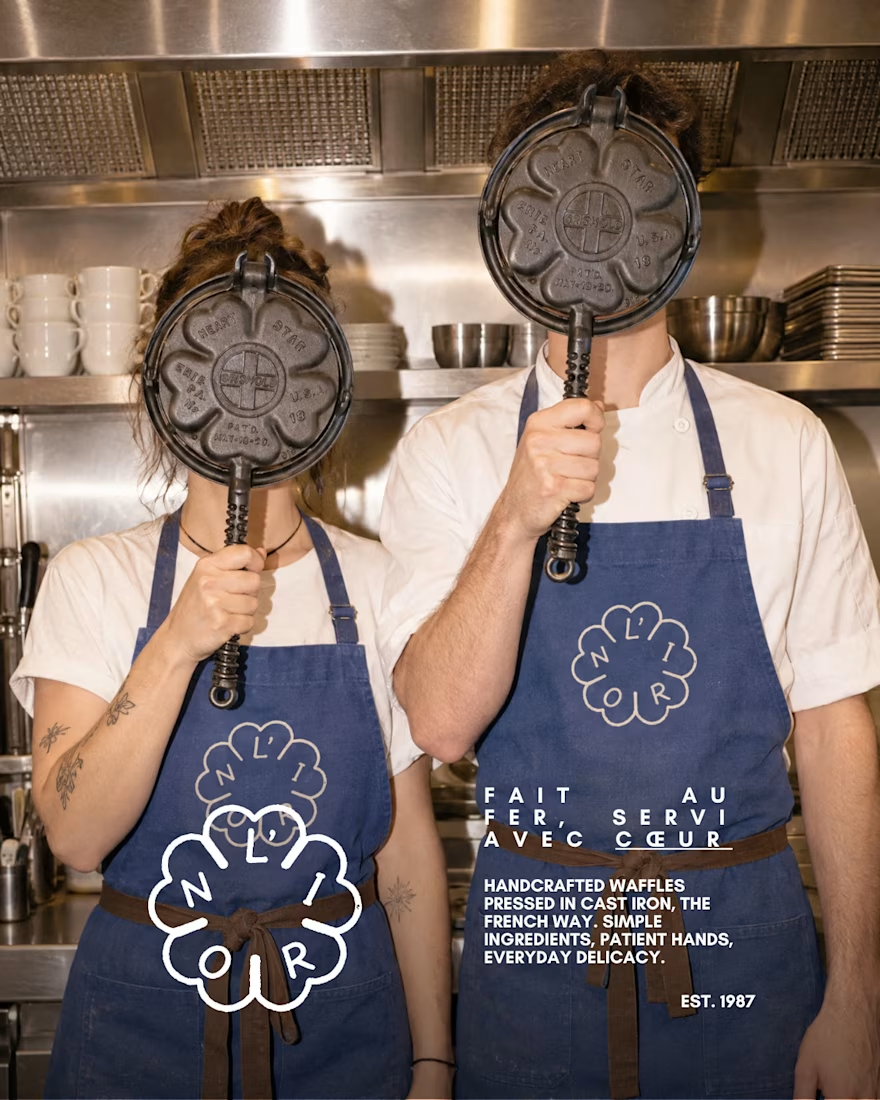
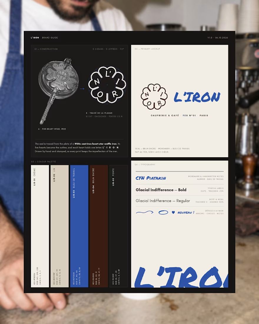
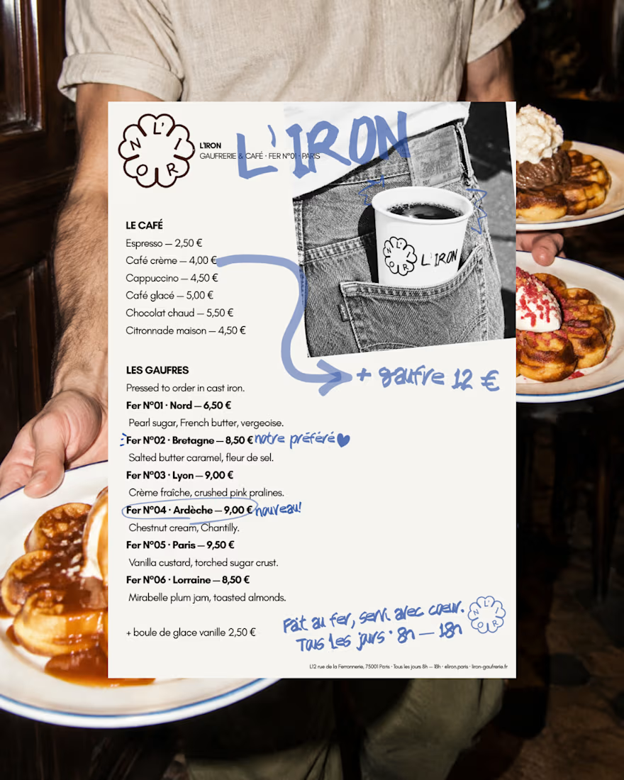
L'IRON is a brand identity for a modern French waffle house, created for the Designerbriefs weekly challenge (Brief 181). The logo is traced from the plate of a 1920s heart-star waffle iron: five hearts, five letters, L' · I · R · O · N. It works as a hand-stamped seal paired...