
pro
Andreu Martínez
Brand Identity Designer & Art Director — Vidrio Studio


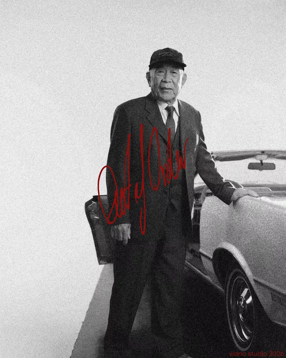
Out of Order® — Brand Identity & Label Design
Out of Order is a fictional streetwear brand created for the @designerbriefs weekly challenge (Brief 185): clothing for people inspired by the fear of being average.
What do you think about the aesthetic?
Full case study on my web: notvidrio.com
0
39
Out of Order® — Brand Identity & Label Design
Out of Order is a fictional streetwear brand created for the @designerbriefs weekly challenge (Brief 185): clothing for people inspired by the fear of being average.
The logo isn't designed, it's signed. I wrote it by hand with a felt-tip pen, inspired by the autographs scrawled across old photographs and signed band tees, then scanned and vectorised it without cleaning up the line. It works like a real signature: the last mark added to every photo, cap and tee. Everything around it stays quiet, with black-and-white imagery, heavy film grain, clean typography (Inter + Space Mono) and a single colour, a deep Out Red.
The campaign images follow my Augmented Art Direction process: AI generation guided by a defined art direction, then composited, retouched and signed by hand in Photoshop. The AI is the tool, and the hand is what makes it the brand.
Which shot would you wear?
2
117

VISITING WRLD — Brand Identity Refresh
2
11
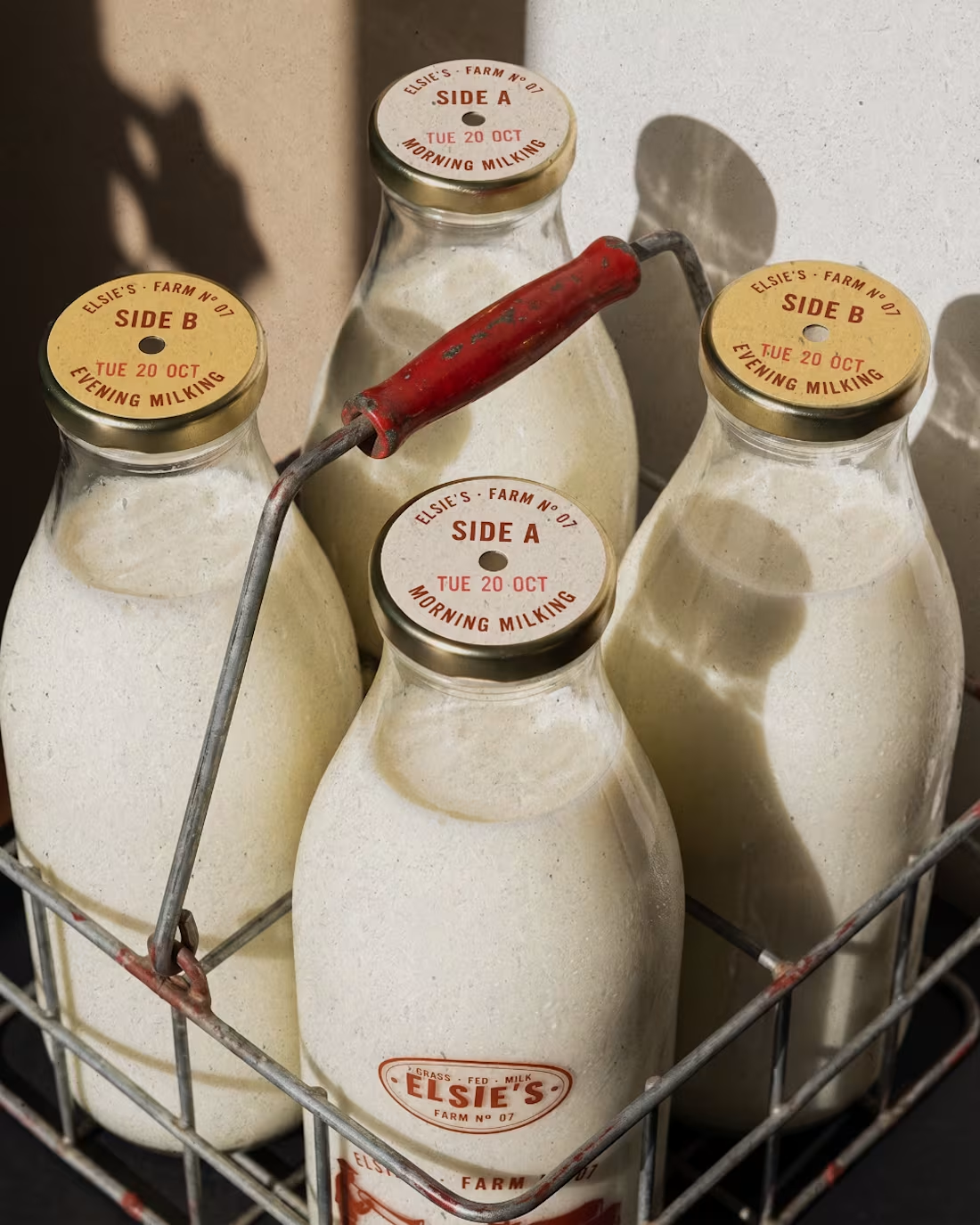
Elsie's: brand identity and packaging for the @designerbriefs weekly challenge (Brief 183). An organic milk brand from very happy cows who love fresh grass and good music.
The logo comes from the brass name plates farmers fixed to their milk cans, with every letter struck by hand. Then came a stamp-style illustration of a farmer playing to his herd, and a returnable glass bottle printed in barn red. All the imagery was made with my Augmented Art Direction process: AI as the tool, art direction and Photoshop retouching to finish every image by hand.
What song would you play to Elsie's cows? 🎺🐄
15
25
1.4K