
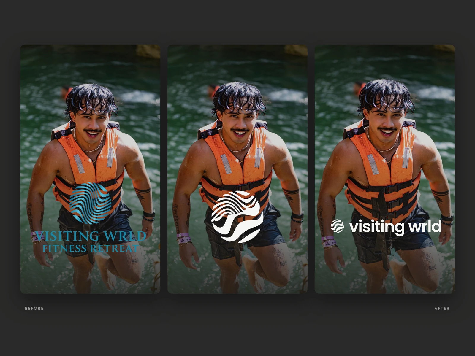
From the old logo to the new one. We kept the globe and the waves, but simplified them into five bold bands with a W hidden in the middle, tilted 20° like the Earth. The wordmark moved to a clean lowercase sans that stays readable at any size.
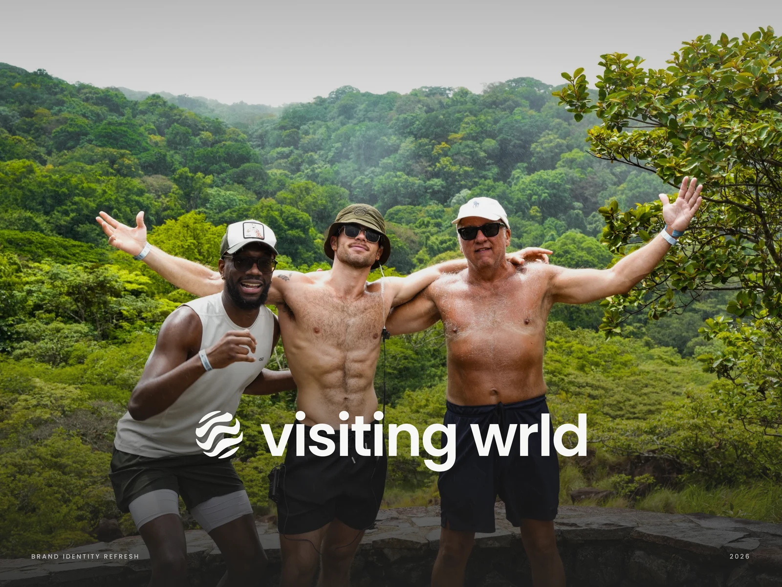
VISITING WRLD runs premium fitness retreats around the world for LGBTQ+ men. We refreshed the identity to keep its spirit of travel, water and community, and to make it feel more premium, modern and consistent across every touchpoint.
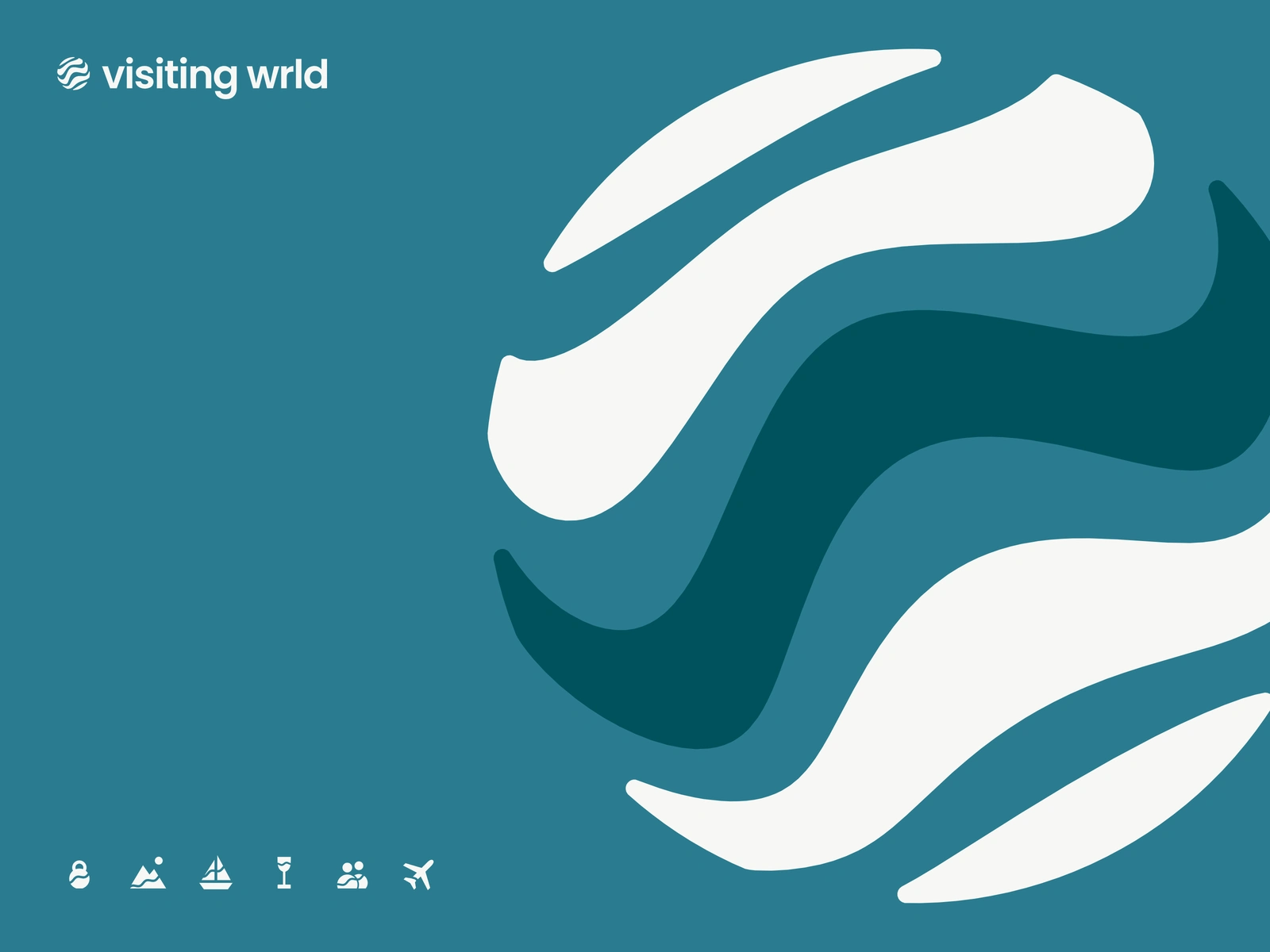
The symbol up close. WRLD Blue leads the palette, and the W band carries its deepest tone. The icon set is cut with the same wave as the logo, so every piece feels part of one family.
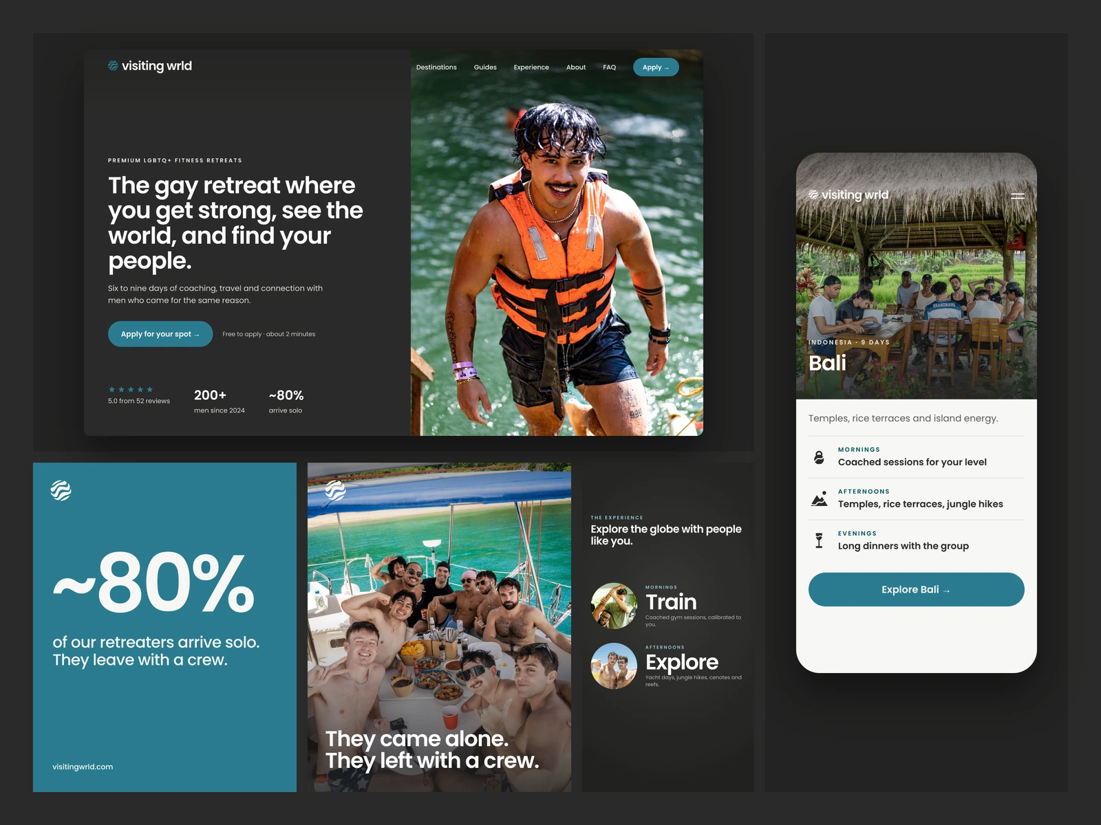
The identity in use across the website, mobile, Instagram posts and stories. A dark, photo-led layout lets the retreats speak for themselves, with blue saved for key moments and calls to action.
Brand reel. A short motion piece that brings the system to life: the bands roll in like waves, the globe settles at its tilt and the W lights up, followed by the brand across photography, type and layouts.
2 likes · 11 views · Oct 20, 2026
Brand refresh for premium fitness retreats for gay and queer men: a wave globe with a hidden W, icons, 34-page guidelines and motion.
Timeline
Oct 11, 2026 - Oct 19, 2026
Tags


What the client had to say
Andreu was so amazing to work with! We needed a rebrand and he delivered our vision perfectly. He works fast and his communication too! Will continue to work with Andreu for future projects!


Jasper Jorolan, Visiting Wrld
Oct 19, 2026, Client