The network for creativity
Join 1.25M professional creatives like you
Connect with clients, get discovered, and run your business 100% commission-free
Creatives on Contra have earned over $150M and we are just getting started
Back to feedPost

Out of Order® — Brand Identity & Label Design
Out of Order is a fictional streetwear brand created for the @designerbriefs weekly challenge (Brief 185): clothing for people inspired by the fear of being average.
The logo isn't designed, it's signed. I wrote it by hand with a felt-tip pen, inspired by the autographs scrawled across old photographs and signed band tees, then scanned and vectorised it without cleaning up the line. It works like a real signature: the last mark added to every photo, cap and tee. Everything around it stays quiet, with black-and-white imagery, heavy film grain, clean typography (Inter + Space Mono) and a single colour, a deep Out Red.
The campaign images follow my Augmented Art Direction process: AI generation guided by a defined art direction, then composited, retouched and signed by hand in Photoshop. The AI is the tool, and the hand is what makes it the brand.
Which shot would you wear?


The network for creativity
Join 1.25M professional creatives like you
Connect with clients, get discovered, and run your business 100% commission-free
Creatives on Contra have earned over $150M and we are just getting started
Related posts

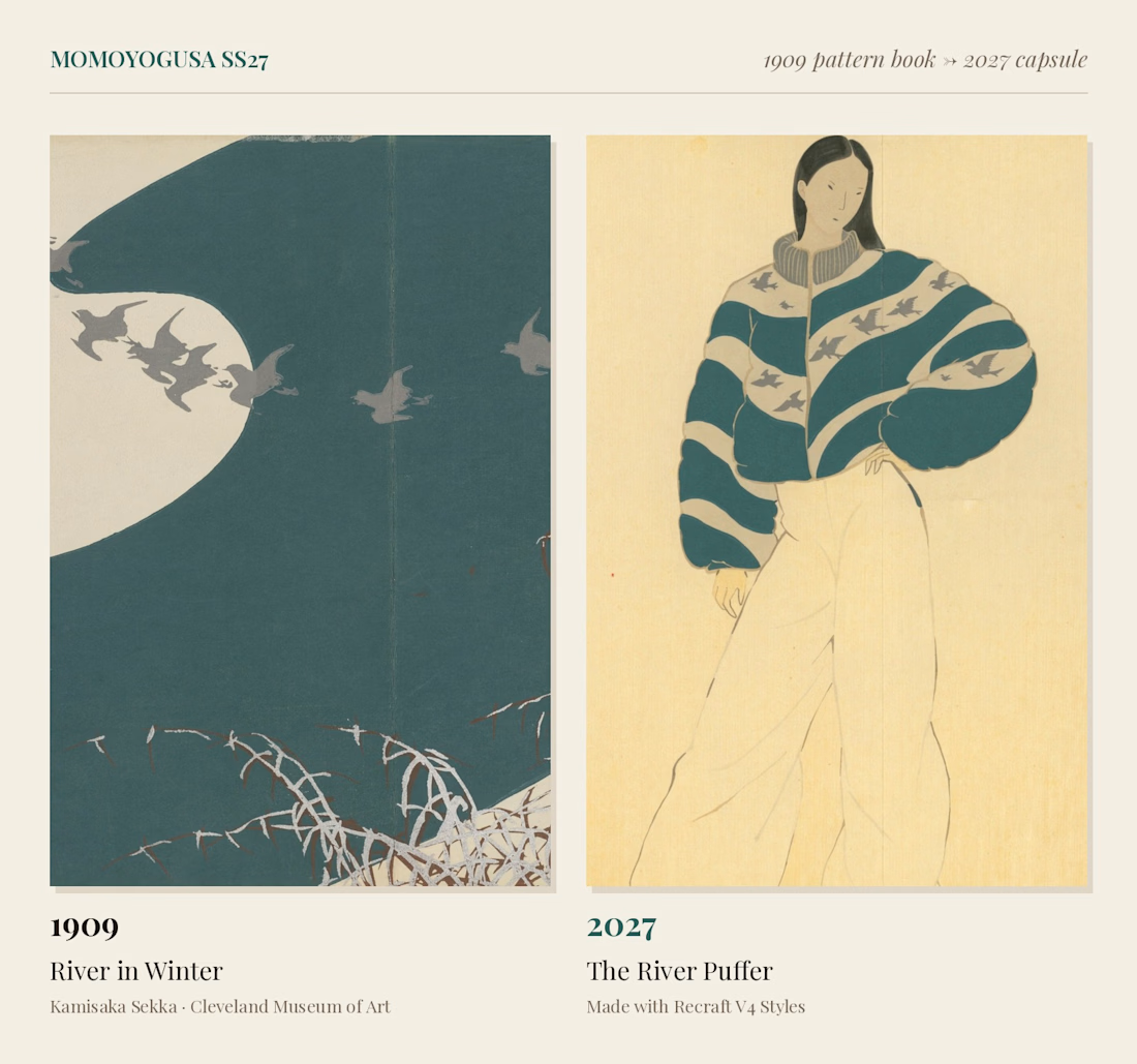
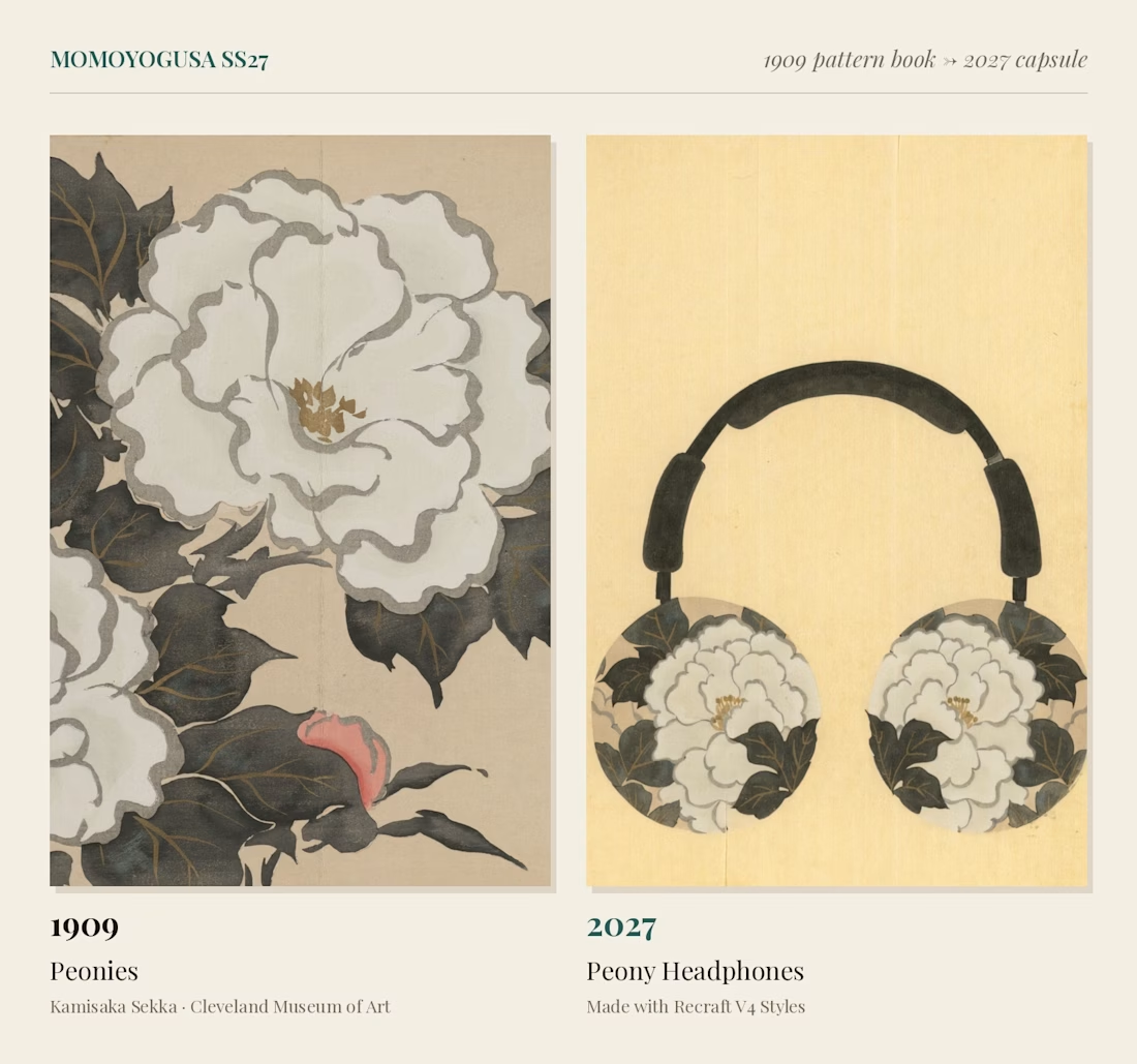
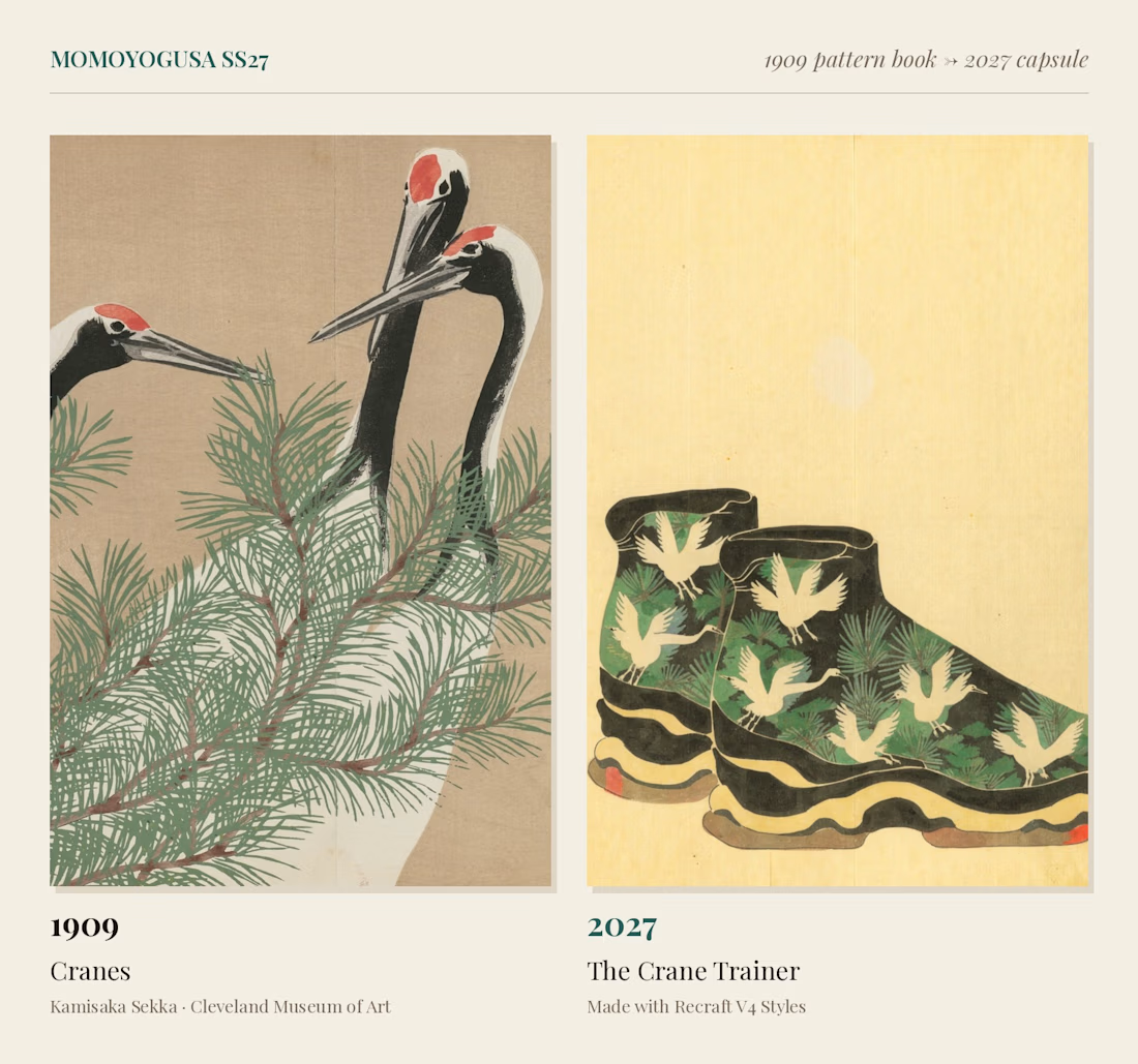
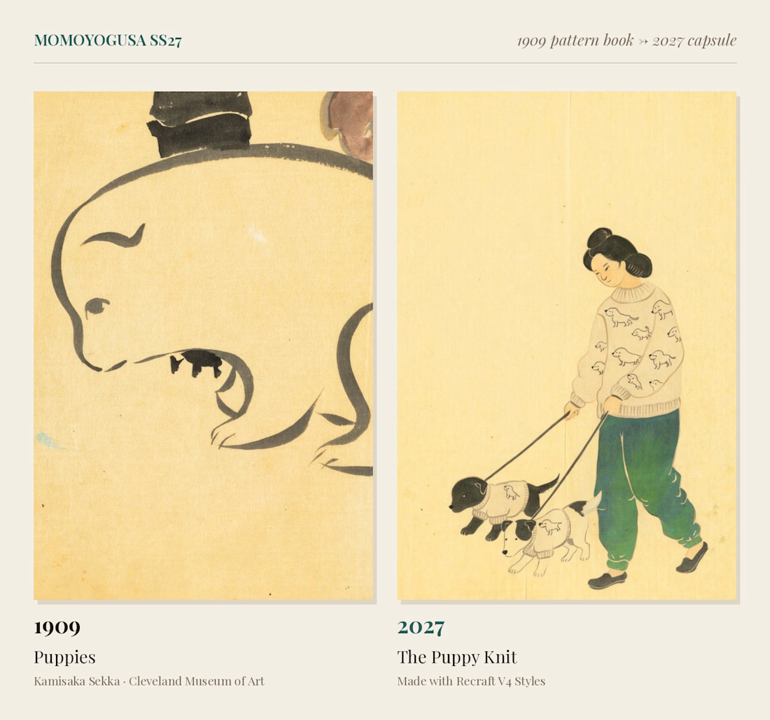
Momoyogusa SS27: A 1909 Pattern Book Art-Directs a 2027 Capsule
In 1909, Kyoto designer Kamisaka Sekka published Momoyogusa ("A World of Things"), three volumes of woodblock-printed patterns so flat and graphic they still look modern a century later.
I trained a Recraft V4 Style on eight plates from the Cleveland Museum of Art's public-domain copy, keeping Sekka's flat colour fields, metallic accents and empty paper grounds.
Then I handed him a 2027 brief: a streetwear capsule. His winter river became a quilted puffer, his cranes climbed onto chunky trainers, his peonies bloomed on headphones, and his dancers came back in matching tracksuits.
A pattern book from 1909, working as a fashion house's design studio.



AI Mental Wellness Platform UI/UX Design
Designed a modern and intuitive AI-powered mental wellness website focused on emotional well-being and personalized digital experiences.
The platform features an AI therapist, mood tracking, meditation, sleep improvement, wellness plans, and data-driven insights. A calming blue color palette, immersive visuals, clean layouts, and thoughtful UI elements create a seamless and engaging user experience.
mentalhealthwebsitedesignartificialintelligenceAI VIsual DesignerResponsive DesignWeb DesignClaudeFigma


love how calm the mood tracking and meditation screens feel in this wellness design

Stressa here (again)! for my second entry, I wanted to make another little cinematic adventure, but this time it’s about Stressella’s frens going to CapCut World LA 🦆✨
It all started when these little guys had been hearing about CapCut World NONSTOP. Every day, it’s CapCut World this, CapCut World that. And honestly? They got a little TOO invested lol.
And off they went. No proper travel plans, no tickets, just an expired Wishing Dust and colossal yellow duck with a propeller helmet. They flew through the clouds, startled half the birds in Cornwall, splashed down in Marina del Rey, and started running through LA like they had an actual appointment to keep.
I wanted to turn all that CapCut World hype into a chaotic little adventure, with cinematic scenery, ridiculous characters, and the kind of journey that absolutely did not need a 12-metre duck but got one anyway.
This was alsoooo genuinely so much fun to make! I hope you have as much fun watching it as I did creating it! wml 🤞🥹


Ughhh i love the idea 🙌