The network for creativity
Join 1.25M professional creatives like you
Connect with clients, get discovered, and run your business 100% commission-free
Creatives on Contra have earned over $150M and we are just getting started
Back to feedPost
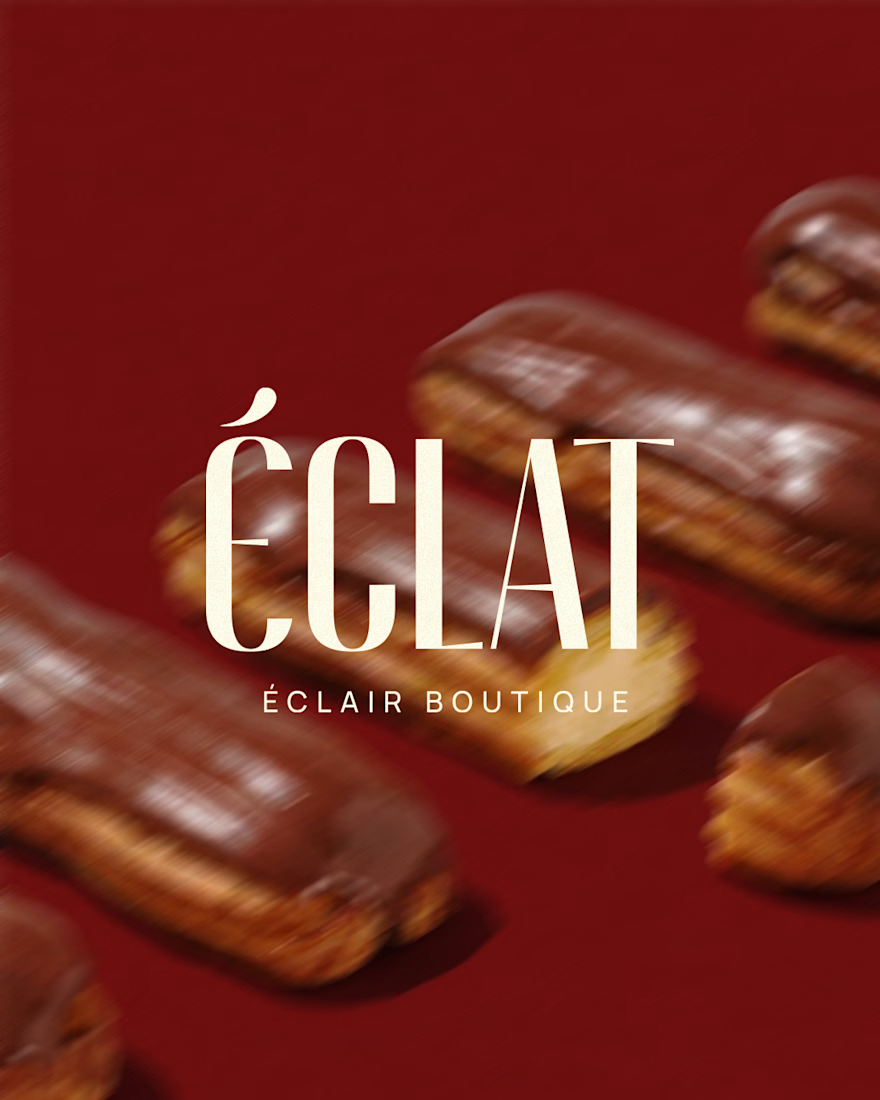
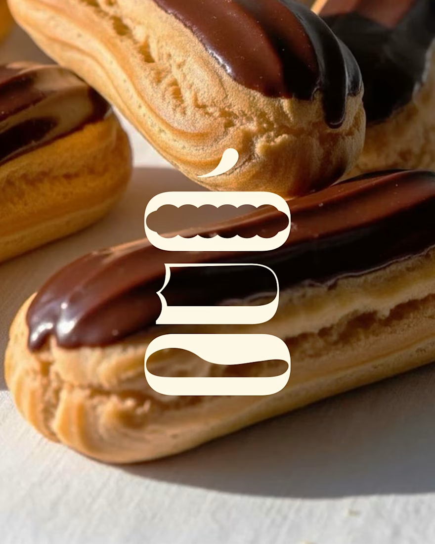
The custom logotype for Éclat is a visual homage to the geometry of French pastry. The typography is inspired by the iconic, elongated silhouette of the éclair, where the soft, rounded lines of the letterforms mirror the structure of the pastry.


Ooh, love this!

Thank you!!😍

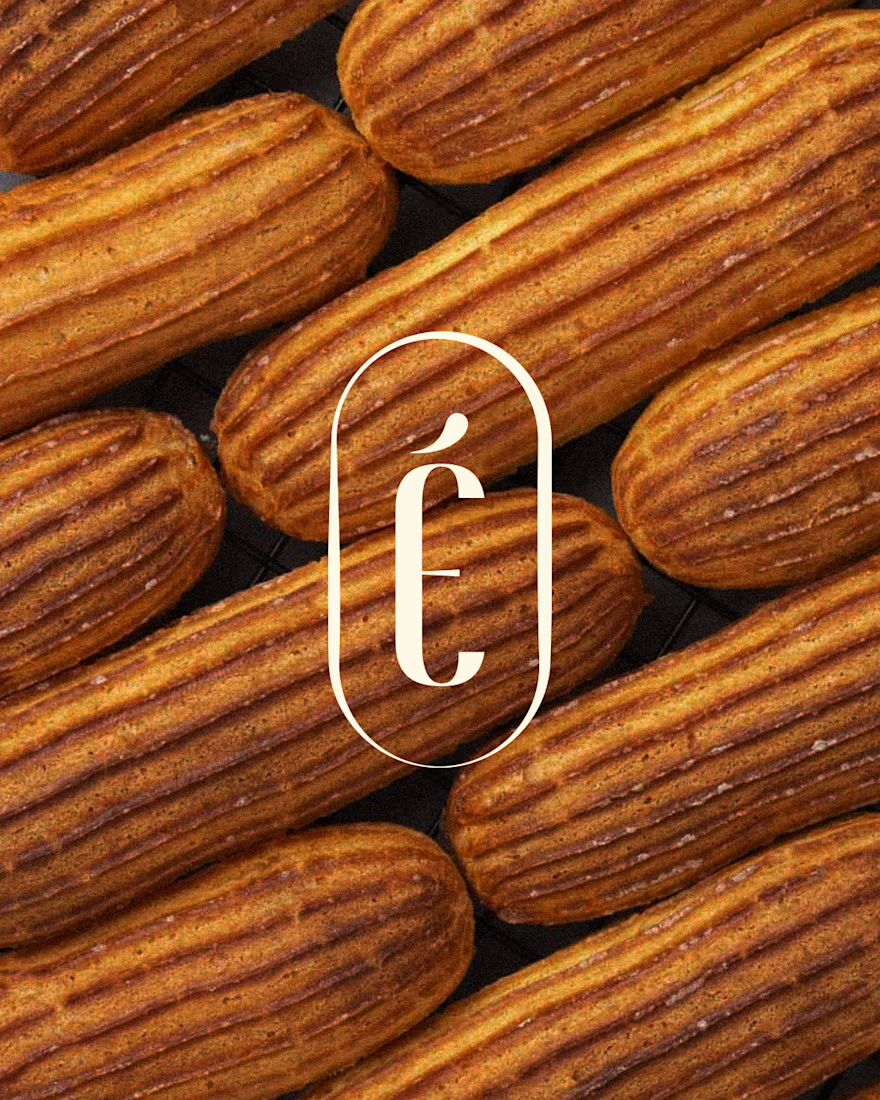
Letters shaped like éclairs, that's such a sweet idea. The tall monogram in the oval is my favourite.

The close-up pastry shots make the letterform study easy to follow. Nice choice keeping the wordmark so tall and narrow against those wide image crops.
The network for creativity
Join 1.25M professional creatives like you
Connect with clients, get discovered, and run your business 100% commission-free
Creatives on Contra have earned over $150M and we are just getting started


Related posts

Orjin Mimarlık – Logo Design
Project Overview
A logo design project developed for Orjin Mimarlık, with the aim of creating a distinctive visual identity for an architecture-focused brand.
Services
Logo Design
Brand Identity Concept
Design Approach
The design focuses on establishing a recognizable brand mark that can represent the architectural field and provide a consistent foundation for future brand applications.
Deliverable
Custom Logo Design


was the circle around the skyline there from the first sketch or added later?

A modern brand identity concept designed for the architecture, interior design, and construction industry.
The visual identity is built around a distinctive geometric symbol, combining four interconnected forms to create an abstract interpretation of the letter “N.”
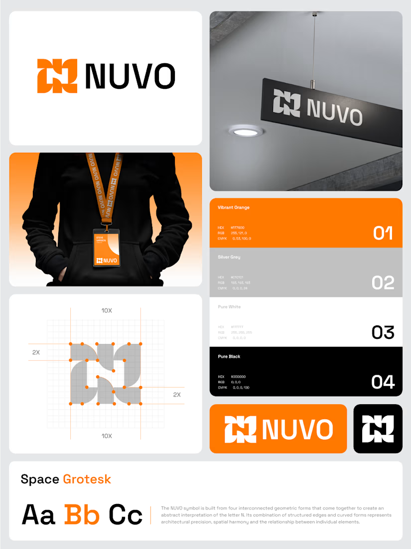

The construction grid with those 2X margins makes the N read as a system, not a one-off mark. Did you test the four-form symbol at favicon or lanyard-badge size, where the gaps between the forms start to close up?

Can AI create a professional-looking logo?
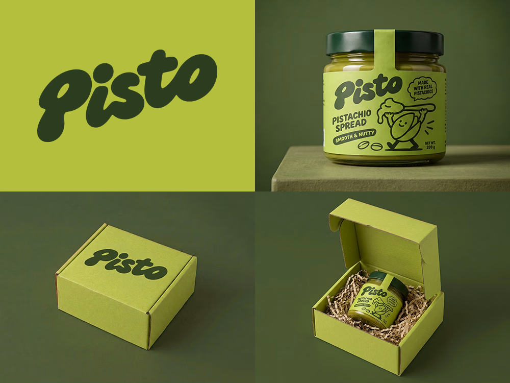
I tried to create a logo concept for a pistachio spread brand using Recraft Logo Maker.
After answering a few questions about the brand and going through several variations, I finally landed on a logo that felt right and captured the fun, fresh personality I had in mind.
But I didn't want to stop at just the logo.
I took it a step further by exploring how the identity could come to life through product packaging and a branded mailer box.
A quick process video is included in the comments.
What do you think?