The network for creativity
Join 1.25M professional creatives like you
Connect with clients, get discovered, and run your business 100% commission-free
Creatives on Contra have earned over $150M and we are just getting started
Back to feedPost

A modern brand identity concept designed for the architecture, interior design, and construction industry.
The visual identity is built around a distinctive geometric symbol, combining four interconnected forms to create an abstract interpretation of the letter “N.”
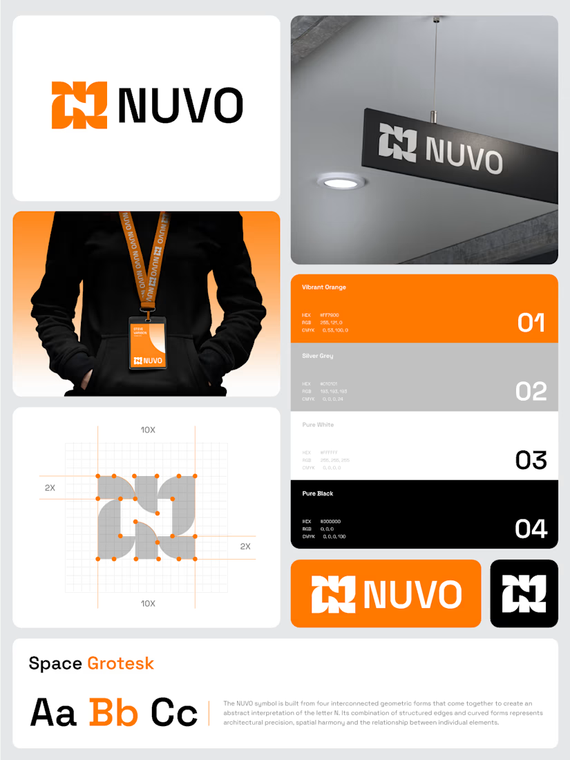

The construction grid with those 2X margins makes the N read as a system, not a one-off mark. Did you test the four-form symbol at favicon or lanyard-badge size, where the gaps between the forms start to close up?
The network for creativity
Join 1.25M professional creatives like you
Connect with clients, get discovered, and run your business 100% commission-free
Creatives on Contra have earned over $150M and we are just getting started



Related posts

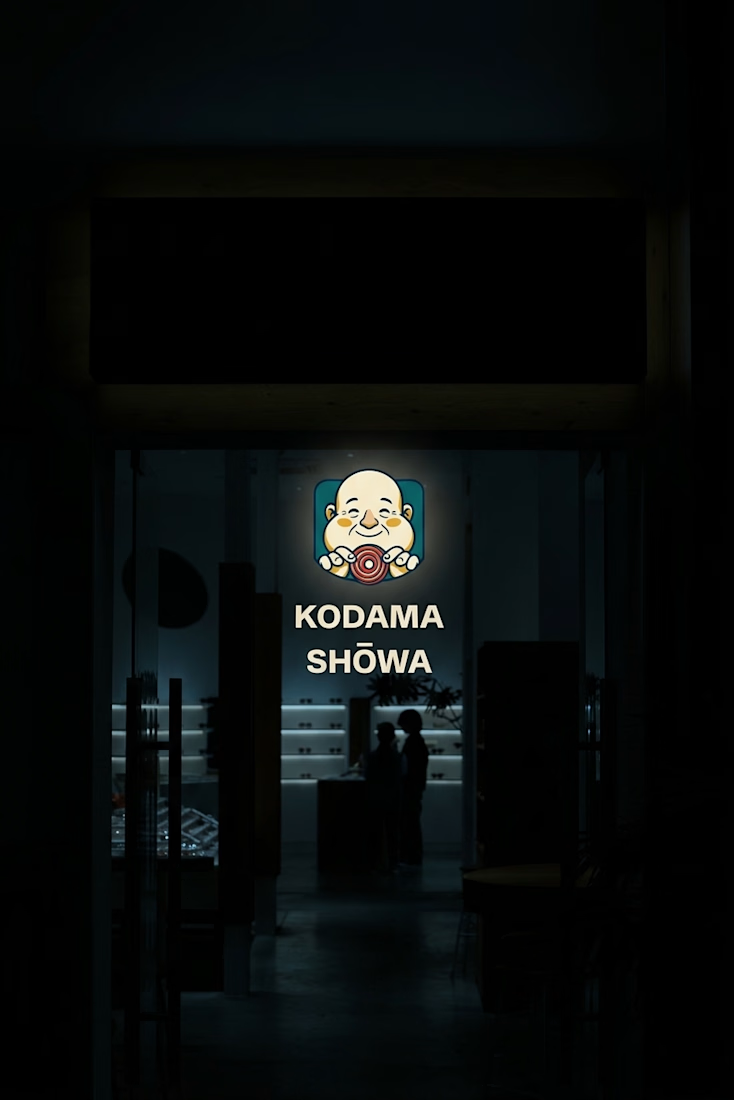
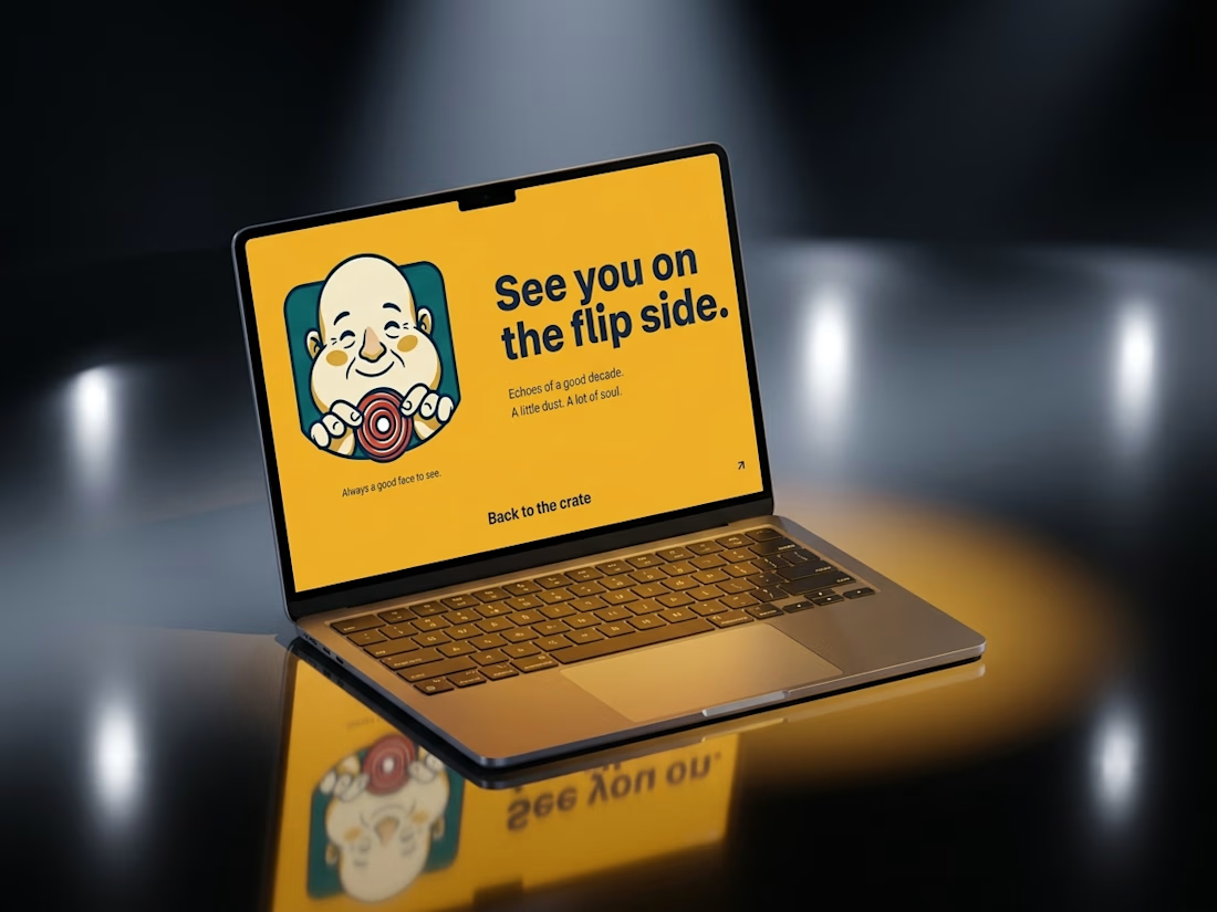
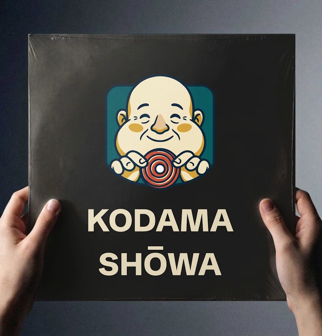
Ever wondered what a 1974 record shop would look like if it had a brand system?
Kodama Shōwa is coming soon: one old shopkeeper, five inks, and a camera at knee height.

Nice!


Web design is not that important.
I mean - it is, but ultimately all it can do is to present your content in the best way. Put emphasis on your messaging first, then design around it.

You are Right. I completely agree with you, @Roman Avshalumov