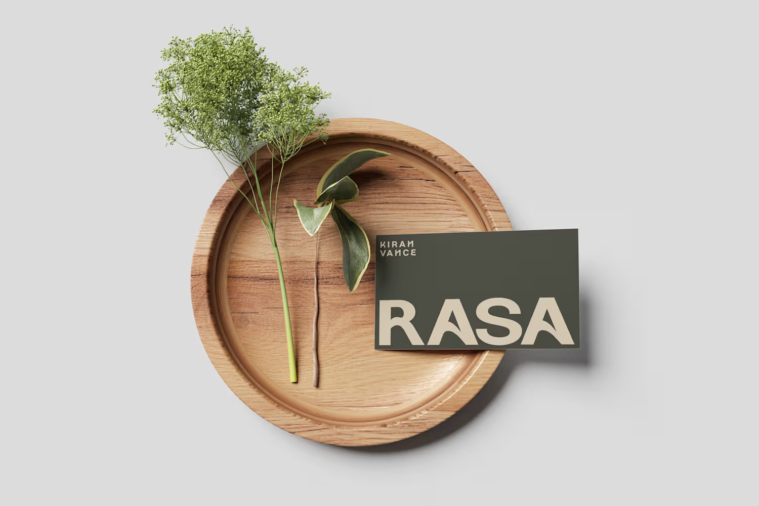


Most brand refreshes fail for the same reason: they start with "make it look better" instead of "what does this actually need to do."
A new logo doesn't fix a pricing problem. A new color palette doesn't fix a shelf-presence problem. Packaging that doesn't match the price point...
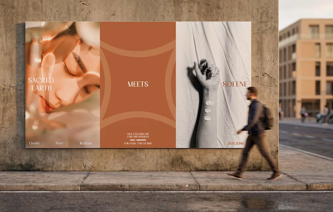
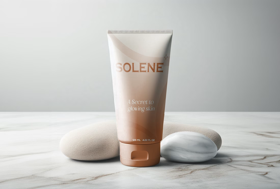
SOLENE is done — a full face, hair, and body identity built to work across six very different pack formats without losing the plot.
Make "gentle and unique" feel true on shelf, not just printed on the label. One warm terracotta gradient carries the whole range — tube, bottle,...

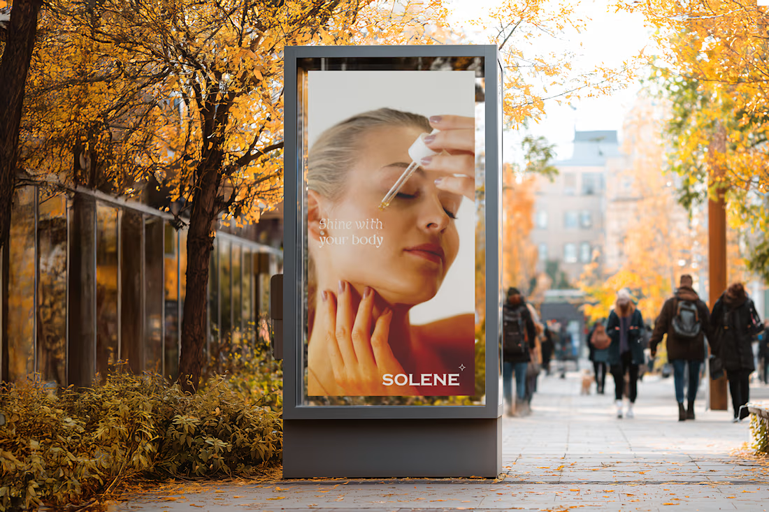
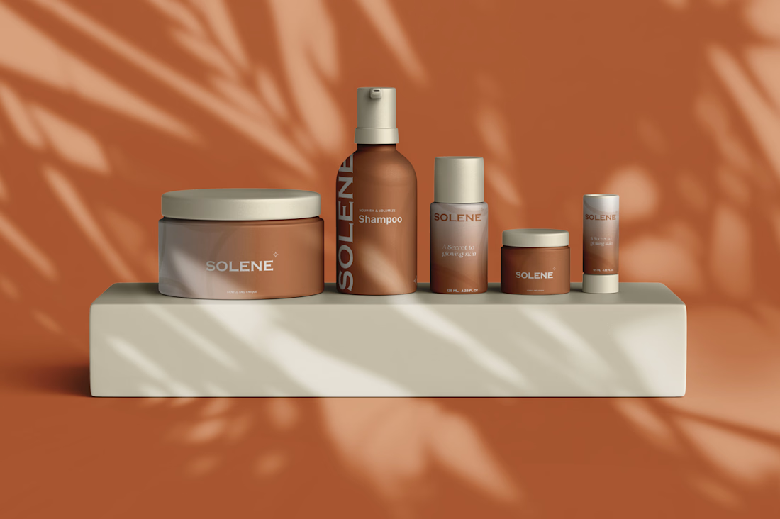
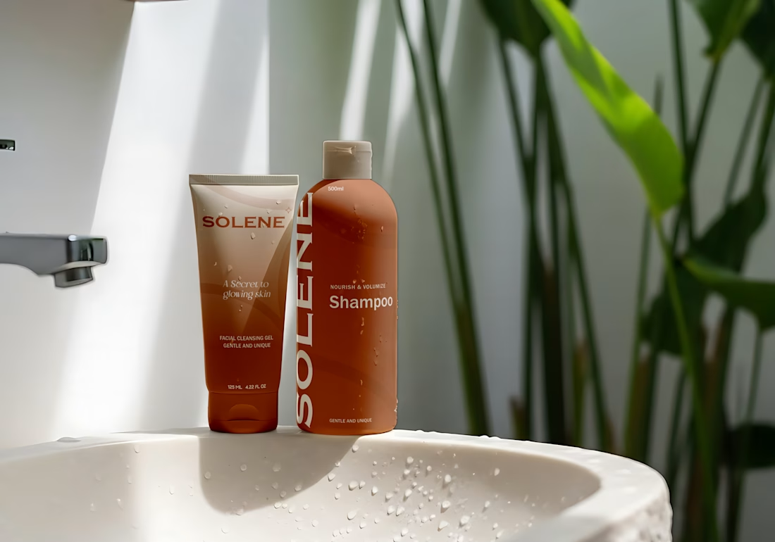
A packaging-first identity for a SKU personal care line, designed to read as one brand across a cleansing gel, shampoo, body cream, lotion pump, mini jar, and stick.
Challenge: Personal care ranges usually fracture into a different look per format — a bottle brand, a jar brand, a...


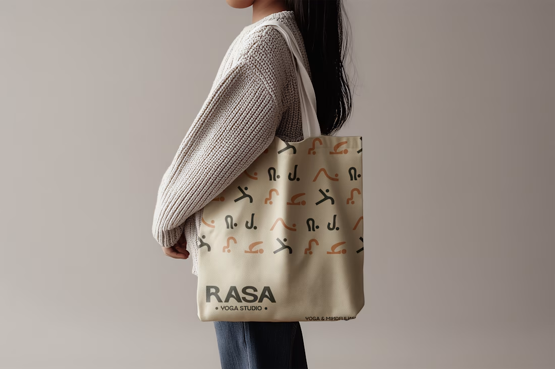
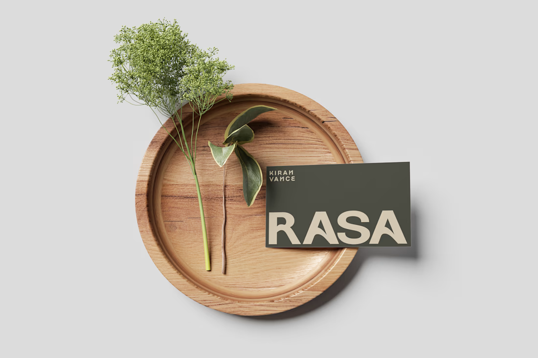
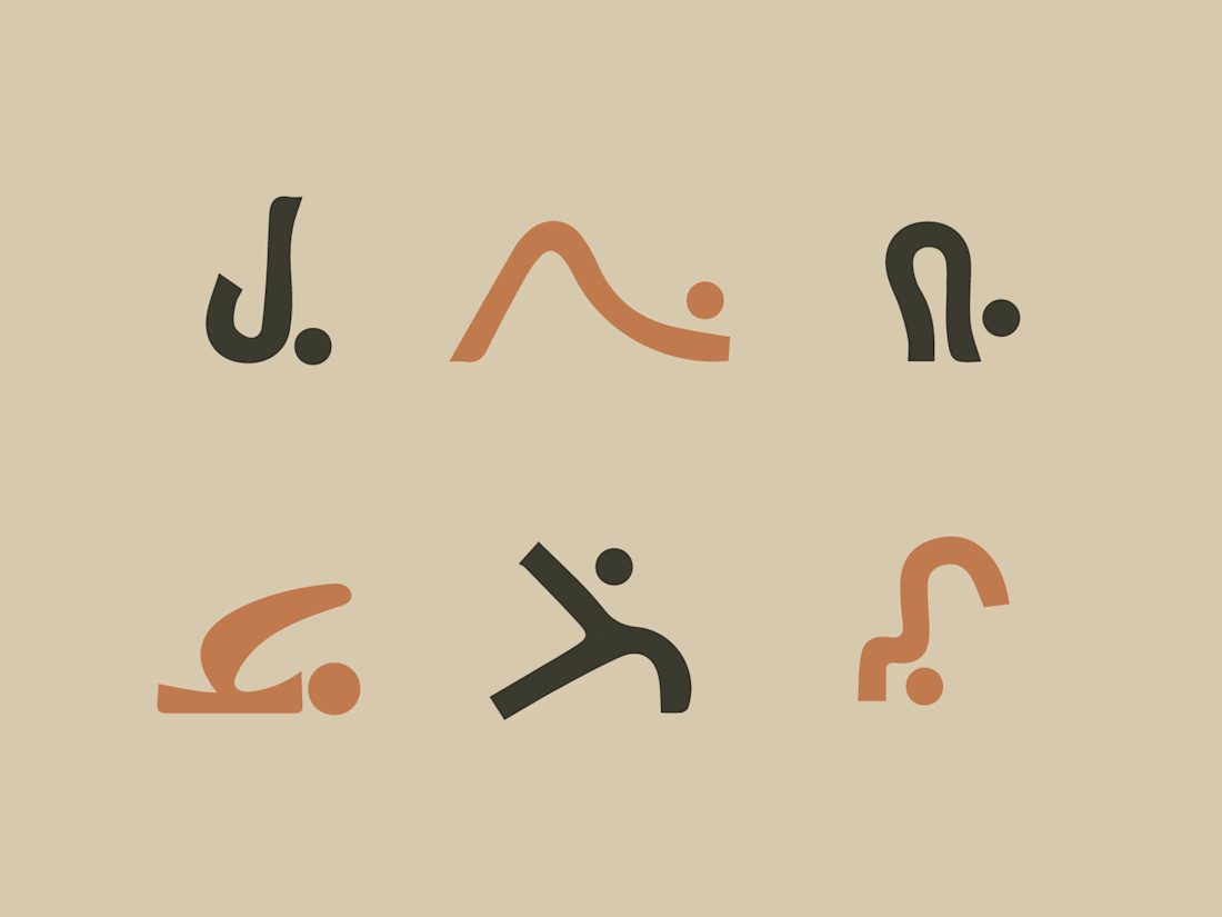
Most wellness brands chase the same soft-pastel, stock-zen look. RASA needed to feel like a practice, not a trend.
Before any visuals, I built out full brand strategy — positioning, voice, the actual tension in the audience — so every design decision had a reason behind it, not...
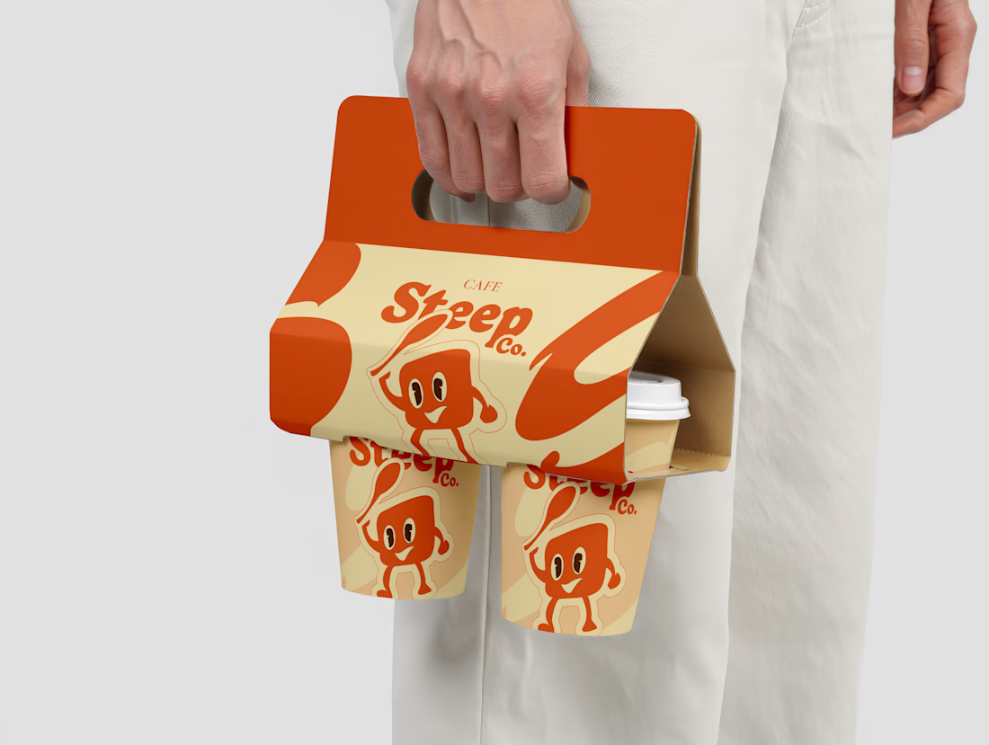
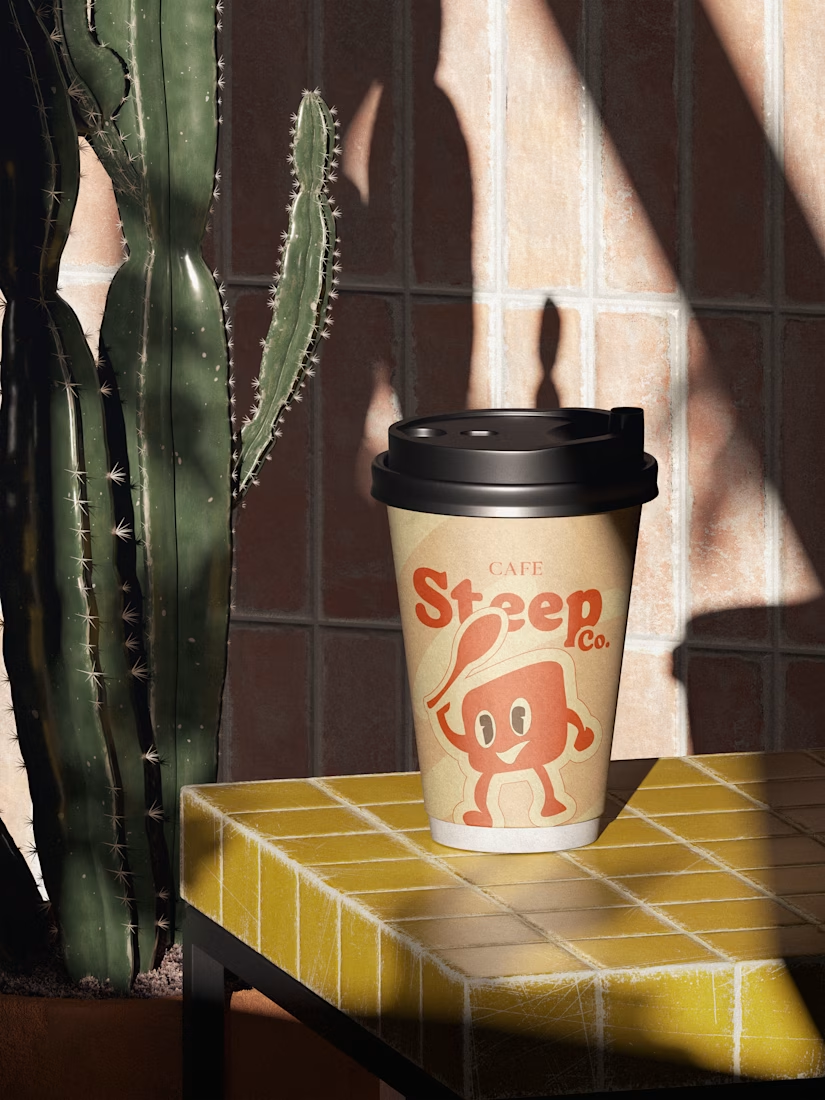
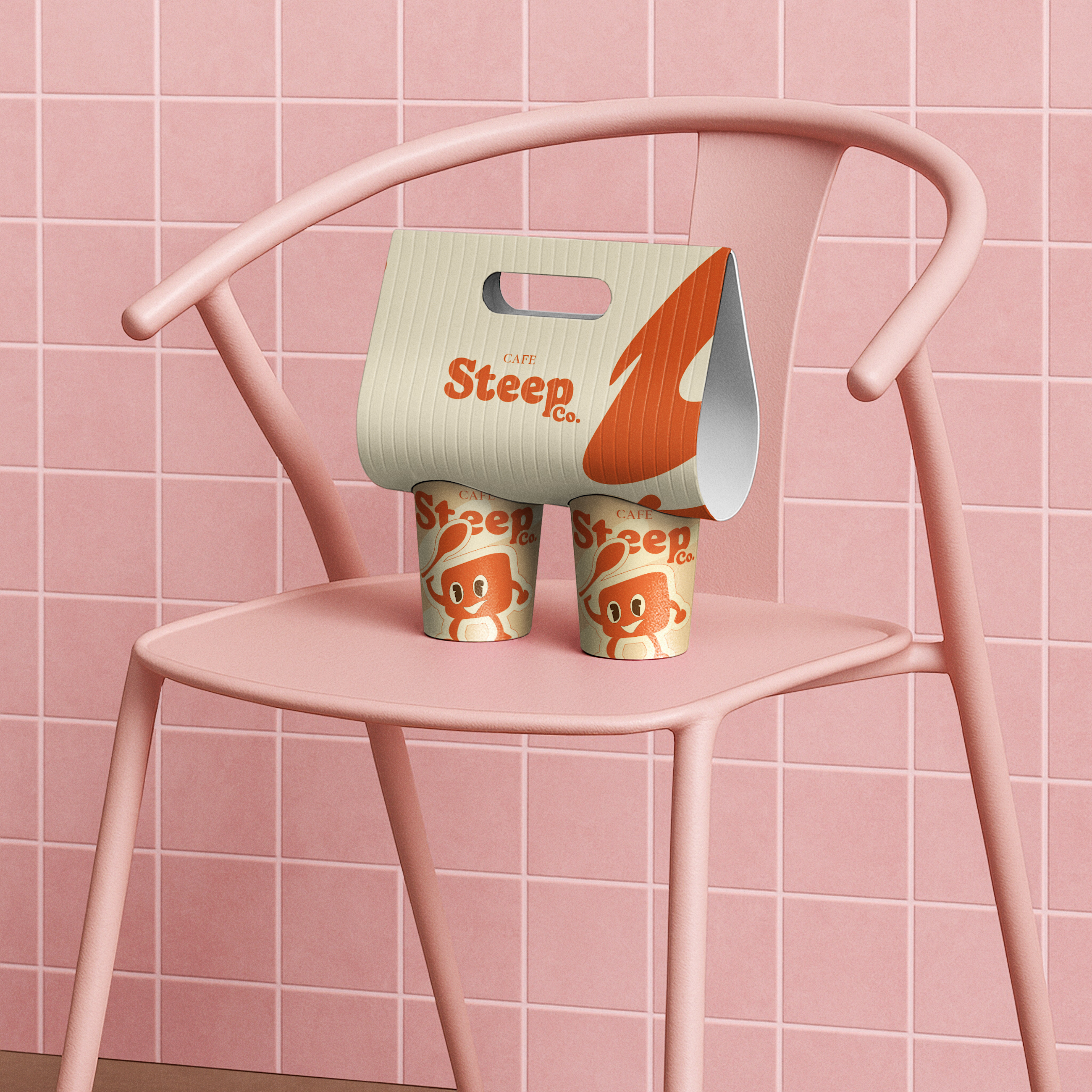
Most café brands look cozy on Instagram. Then you see the cup in person and it says nothing.
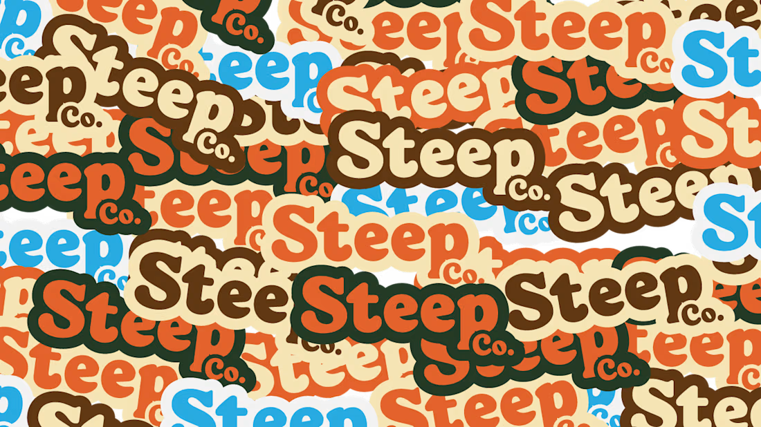
That was the problem I set out to fix with Cafe Steepco.
The brief wasn't just "make it pretty." It was: build an identity that feels warm before someone even takes a sip — from the logo...