The network for creativity
Join 1.25M professional creatives like you
Connect with clients, get discovered, and run your business 100% commission-free
Creatives on Contra have earned over $150M and we are just getting started
Back to feedPost


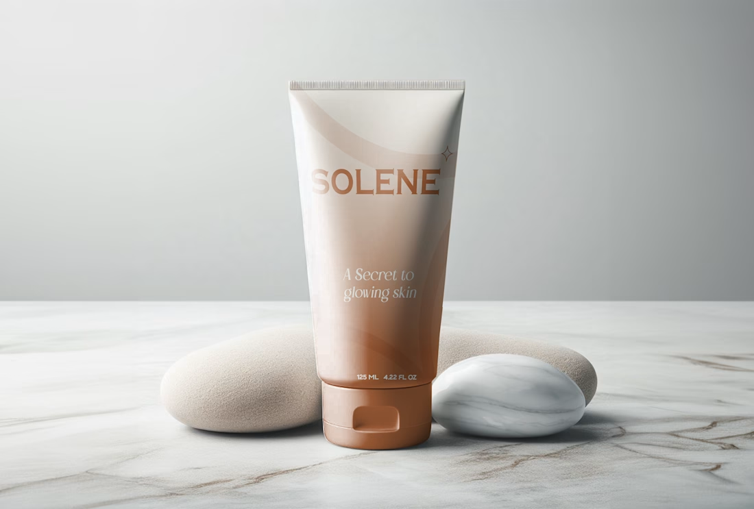
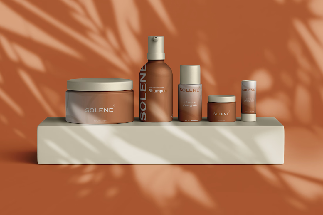
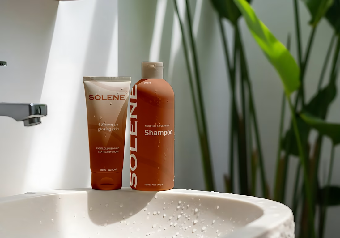
A packaging-first identity for a SKU personal care line, designed to read as one brand across a cleansing gel, shampoo, body cream, lotion pump, mini jar, and stick.
Challenge: Personal care ranges usually fracture into a different look per format — a bottle brand, a jar brand, a tube brand. Solene needed one visual system flexible enough to hold all six together as a single, recognizable range.
Approach: A single warm terracotta gradient scales across every format and size, anchored by a clean serif/sans wordmark and a small diamond mark. "A secret to glowing skin" carries the emotional promise; "gentle and unique" does the functional positioning work directly on-pack.
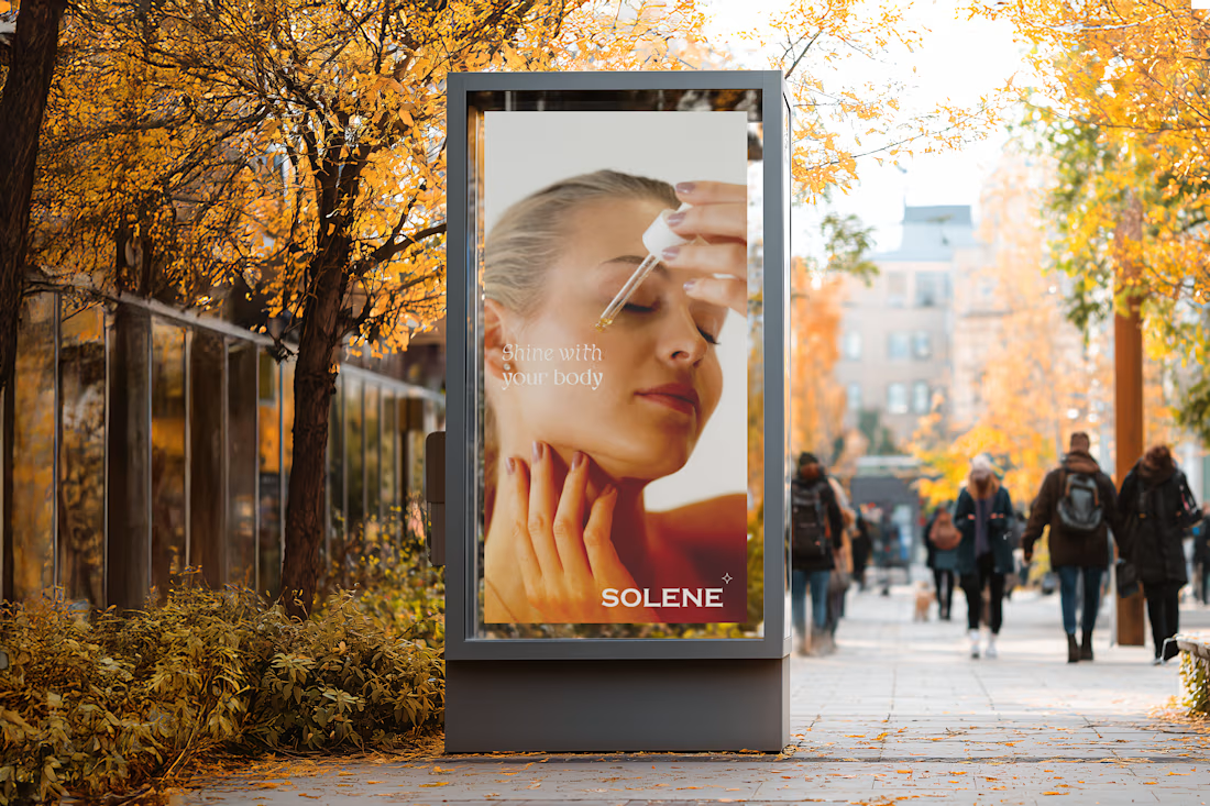
Deliverables: Logo & wordmark · Packaging system · OOH ad concept · Lifestyle & shelf mockups



Stunning work on unifying the brand identity! That terracotta palette and cohesive typography look fantastic across all packaging formats.
The network for creativity
Join 1.25M professional creatives like you
Connect with clients, get discovered, and run your business 100% commission-free
Creatives on Contra have earned over $150M and we are just getting started




Related posts

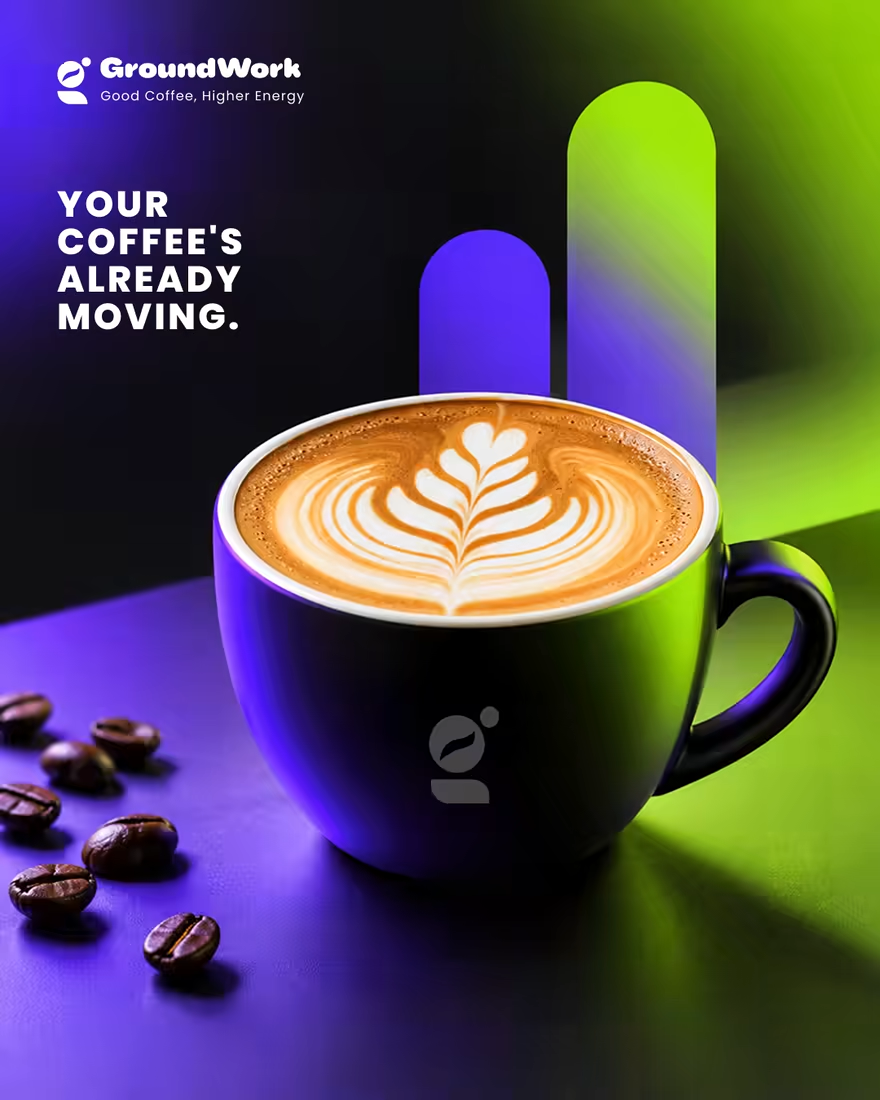
☕ GroundWork — Good Coffee, Higher Energy.
🎨 Brand Identity · 📱 UI/UX · 📦 Packaging
A modern coffee brand built around energy, creativity, and momentum. ⚡
💡 The Idea
I wanted to create a coffee brand that feels as energetic as the first cup of the day.
🎨 Visual Direction
🖤 Charcoal — premium foundation
💜 Electric Violet — creativity
💚 Neon Lime — energy & freshness
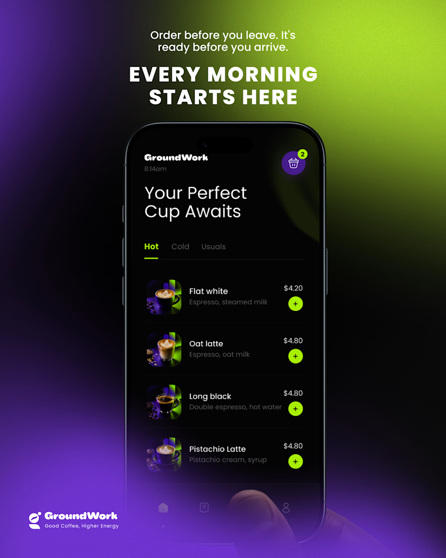
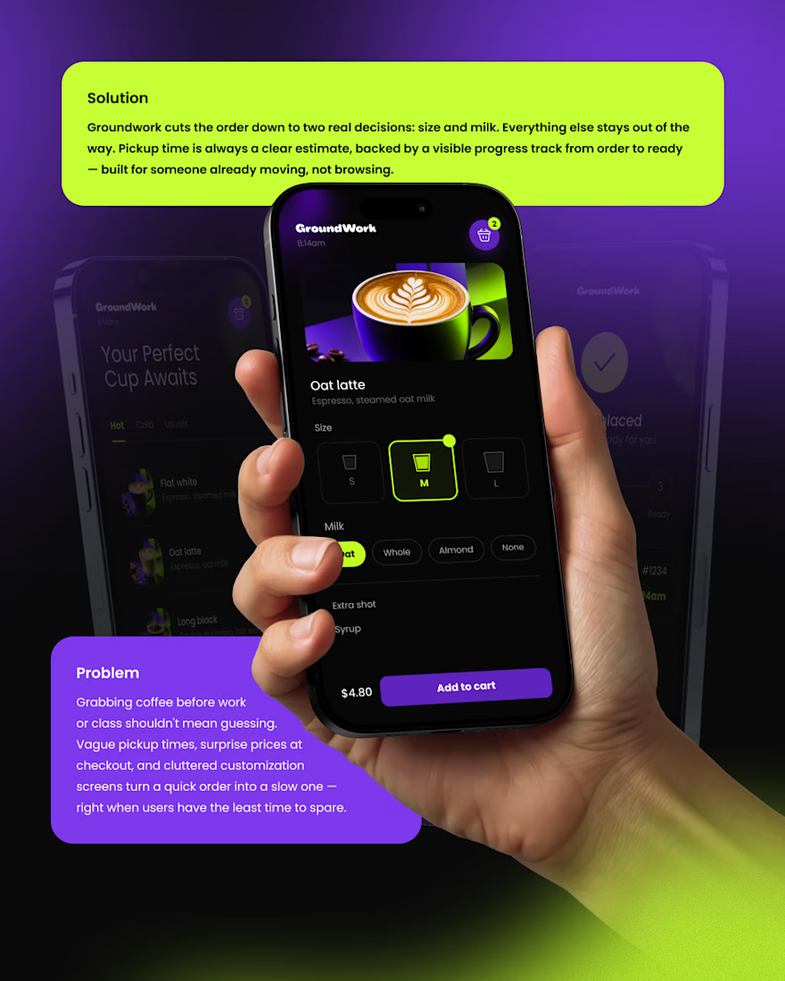
📱 Digital Experience
A clean mobile ordering experience designed to make getting coffee simple, fast, and engaging.
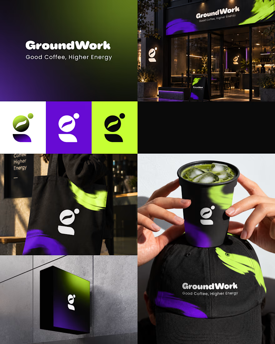
☕ Brand Experience
I extended the identity across cups, caps, totes, packaging, and storefronts — creating one consistent visual system.
✨ The Result
A bold coffee identity that connects digital + physical experiences under one idea:
Good Coffee, Higher Energy. ⚡
What’s your first impression of GroundWork? 👀☕

I personally don't like the colors intensity or shade

Wonder -- Brand Expressions



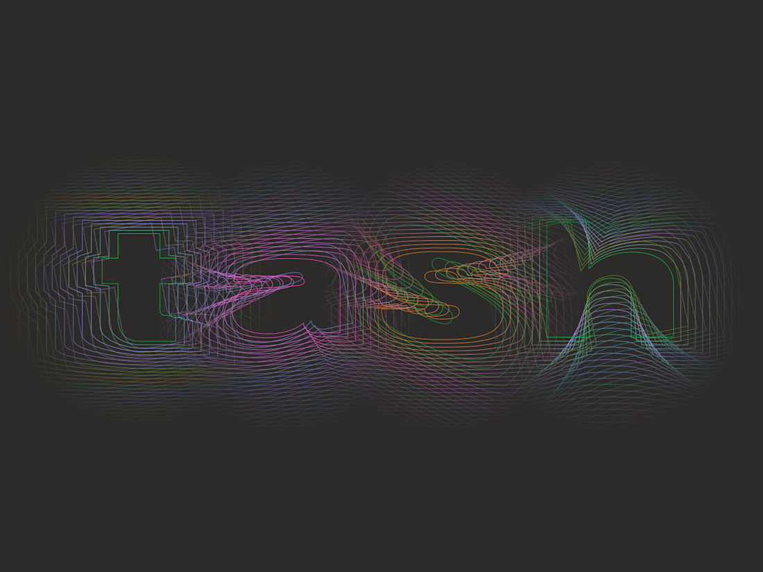
Tash rendered in a custom holographic alphabet, built from patterned letterforms in Figma.

The holographic effect makes it really stand out.