The network for creativity
Join 1.25M professional creatives like you
Connect with clients, get discovered, and run your business 100% commission-free
Creatives on Contra have earned over $150M and we are just getting started
Back to feedPost


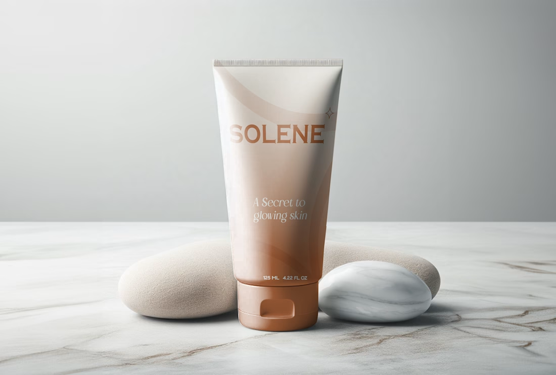
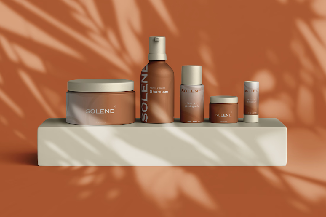
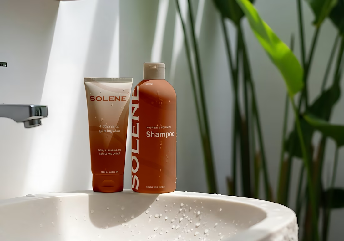
A packaging-first identity for a SKU personal care line, designed to read as one brand across a cleansing gel, shampoo, body cream, lotion pump, mini jar, and stick.
Challenge: Personal care ranges usually fracture into a different look per format — a bottle brand, a jar brand, a tube brand. Solene needed one visual system flexible enough to hold all six together as a single, recognizable range.
Approach: A single warm terracotta gradient scales across every format and size, anchored by a clean serif/sans wordmark and a small diamond mark. "A secret to glowing skin" carries the emotional promise; "gentle and unique" does the functional positioning work directly on-pack.
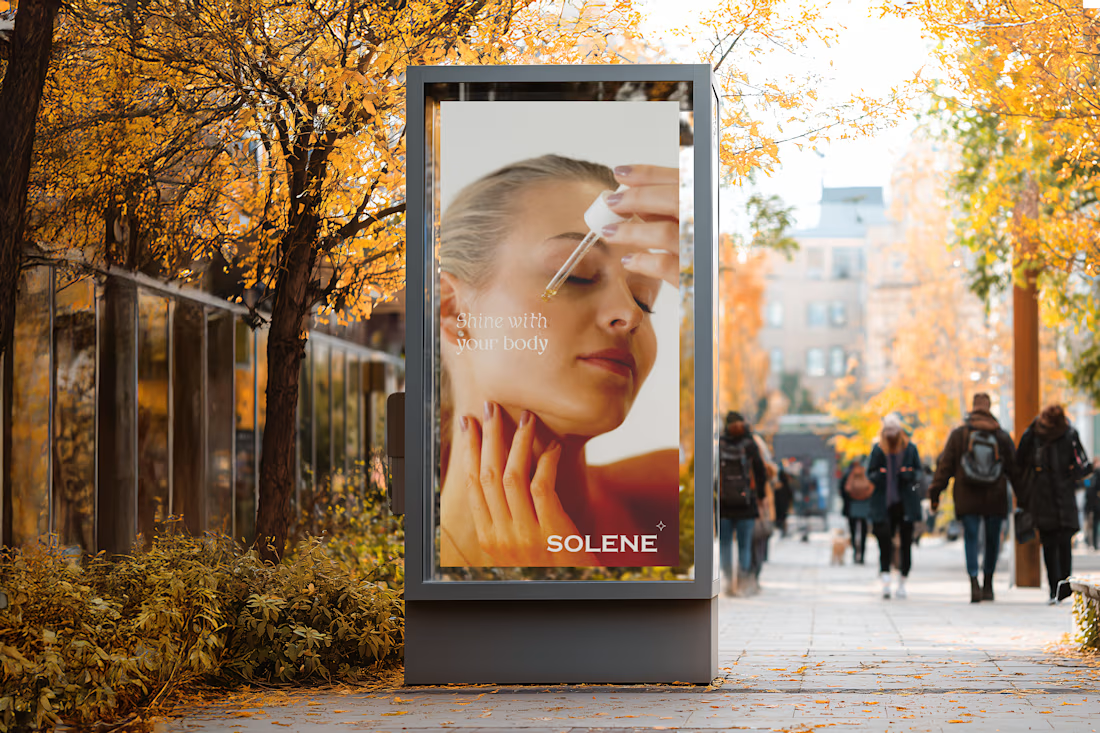
Deliverables: Logo & wordmark · Packaging system · OOH ad concept · Lifestyle & shelf mockups



Stunning work on unifying the brand identity! That terracotta palette and cohesive typography look fantastic across all packaging formats.
The network for creativity
Join 1.25M professional creatives like you
Connect with clients, get discovered, and run your business 100% commission-free
Creatives on Contra have earned over $150M and we are just getting started
Trending

Claude
Claude has entered the design space. How are you using Claude Design?

Contra University
Learn from expert creatives how to earn more using next-gen AI tools.
creativeaiflow
Creative AI workflows are evolving. What tools do you use, and what are their strengths and weaknesses?
freelancerlife
Freelancer life is wins, pivots, and everything in between. What’s yours right now?








Related posts

Another concept from our archives that we're still proud of.
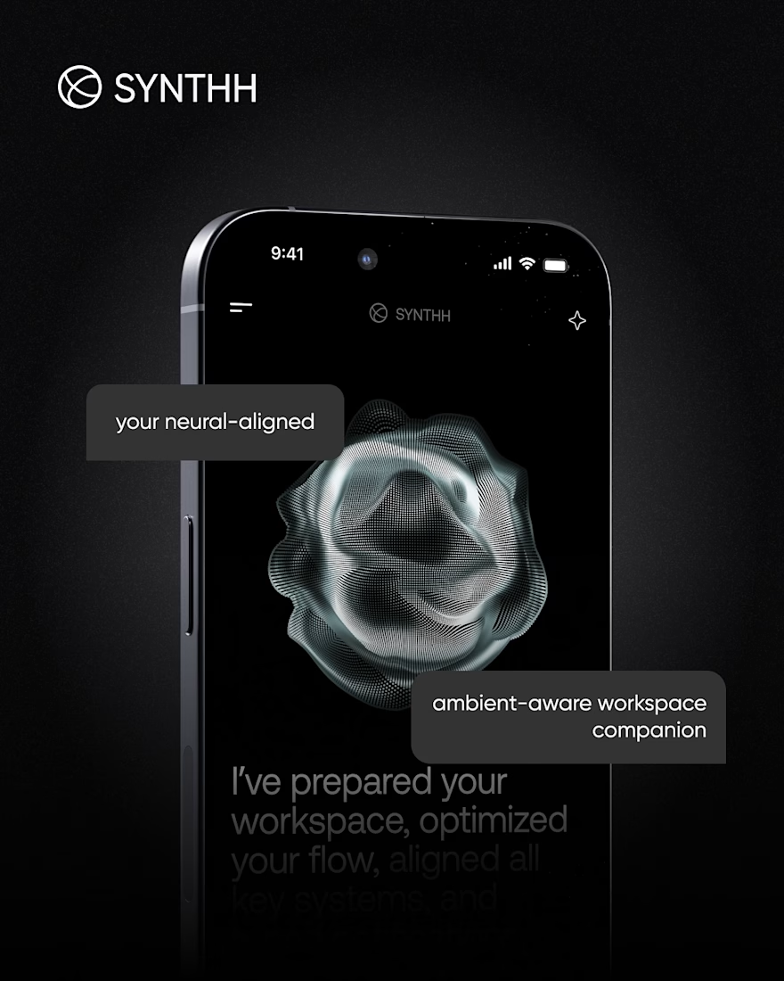
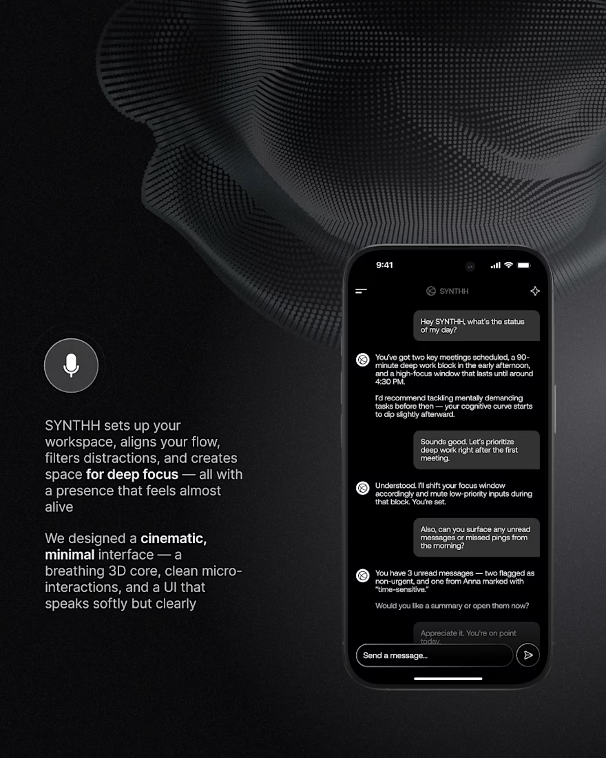
SYNTHH was our take on what an AI workspace assistant could feel like if it was designed around focus instead of constant notifications.
Instead of another chat interface, we explored a calmer experience with cinematic visuals, subtle motion, and an interface that fades into the background while helping you stay in flow.
We wanted every interaction to feel intentional, from the ambient UI to the conversational experience and the overall visual language.
It's always fun looking back at concepts like this and seeing ideas that are becoming more relevant today than when we first designed them.


Amazing work!

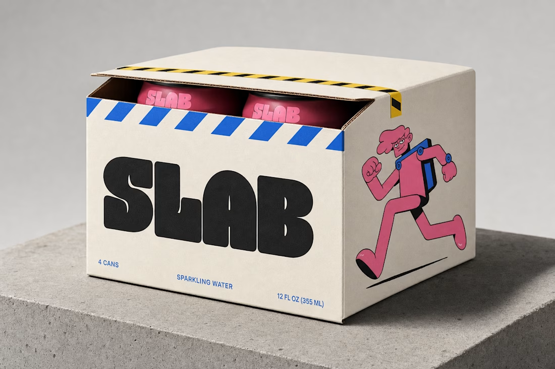
what if your energy drink mascot was made of the same poured concrete as the building it's climbing? built SLAB's whole identity around that one collision — bolted joints, a wordmark poured like a slab, and a character big enough to hand you a can from twelve stories up


A work that fits my aesthetic and perfect as usual. Really good work and your signature contrast colors once again, executed perfectly.


Really excited to share this one. Stay tuned for a video showcasing the whole site, but even better, why don't you just experience it for yourself: https://thebluehorizon.ai/
These guys have received over 1 billion impressions on their videos and they came to us to make their website match the caliber of work they put out at an inhuman rate.
That website is incredible.