The network for creativity
Join 1.25M professional creatives like you
Connect with clients, get discovered, and run your business 100% commission-free
Creatives on Contra have earned over $150M and we are just getting started
Back to feedPost
☕ GroundWork — Good Coffee, Higher Energy.
🎨 Brand Identity · 📱 UI/UX · 📦 Packaging
A modern coffee brand built around energy, creativity, and momentum. ⚡
💡 The Idea
I wanted to create a coffee brand that feels as energetic as the first cup of the day.
🎨 Visual Direction
🖤 Charcoal — premium foundation
💜 Electric Violet — creativity
💚 Neon Lime — energy & freshness
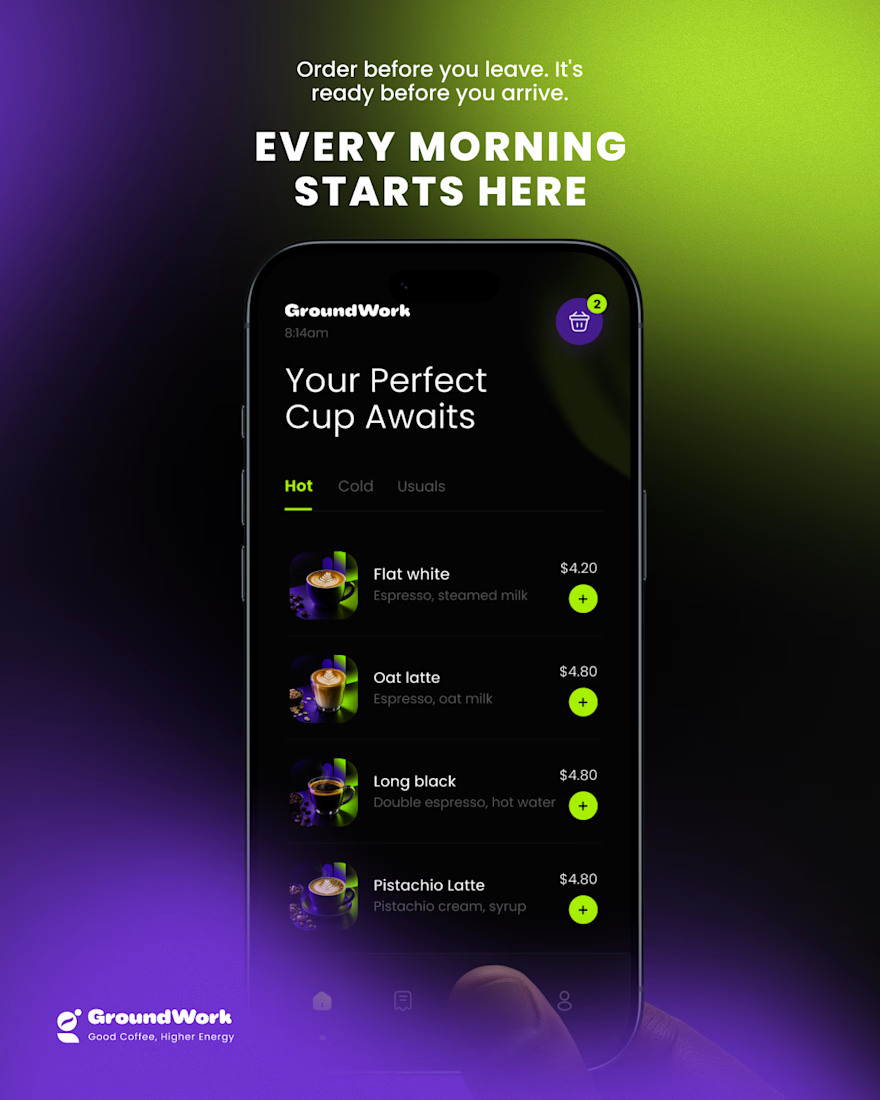
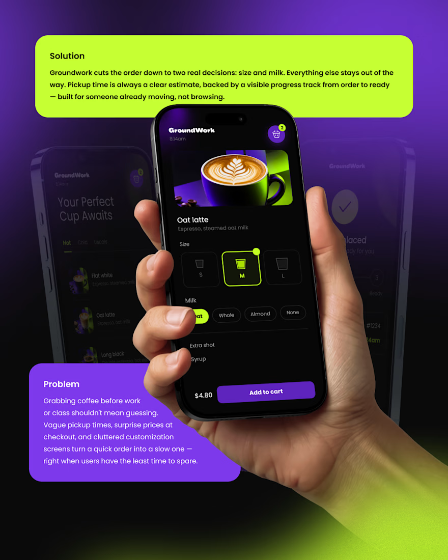
📱 Digital Experience
A clean mobile ordering experience designed to make getting coffee simple, fast, and engaging.
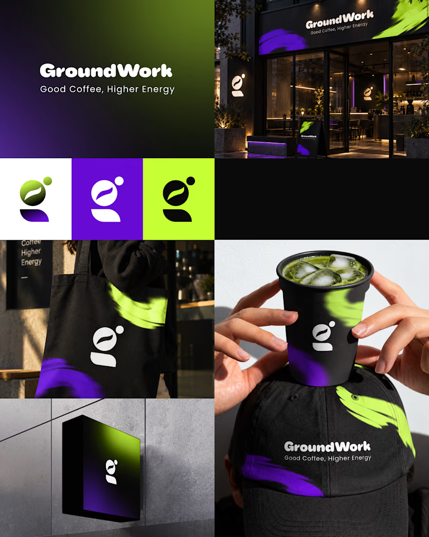
☕ Brand Experience
I extended the identity across cups, caps, totes, packaging, and storefronts — creating one consistent visual system.
✨ The Result
A bold coffee identity that connects digital + physical experiences under one idea:
Good Coffee, Higher Energy. ⚡
What’s your first impression of GroundWork? 👀☕



TOP!

Thank you! 🙌⚡ Glad you liked the direction!

I personally don't like the colors intensity or shade
Thanks for the feedback! 🙌 The bold violet + lime contrast was intentional for the energy-focused concept. Curious what color direction you’d explore instead?
I would like bit darker shade of those with more & expanded blur
🙌 I wanted the palette to feel bold and energetic, but I can definitely see how a slightly darker treatment could make it feel more premium.


the purple coffee cup pops. did you try a warm color too?
Thanks! ☕💜 I explored a few directions, but wanted the violet + lime combination to push the energetic side of GroundWork. A warmer variation could definitely be an interesting direction to explore!

Thank you! 🙌⚡ Glad you liked the direction!

Great work
Thank you 😊🔥

so green and black already great color combo, green match in black cup wow, now i have to grab a cup of matcha
Thank you! 🙌⚡ Glad you liked it!


Fantastic work👏🔥🔥
Thanks a lot 🔥🌟


Extraordinary branding work here
Thanks a lot 🔥🌟

Really strong vibrant colors, my eyes know exactly where to go.
Thanks for the feedback! 🙌

the clarity in this brand direction is really strong
Thanks a lot 😊 🔥


Wonderful concept! 🚀
Thankyou 💟 Glad you liked it 😊
The network for creativity
Join 1.25M professional creatives like you
Connect with clients, get discovered, and run your business 100% commission-free
Creatives on Contra have earned over $150M and we are just getting started








Related posts


Design Sprint: ESCO Token
How do you build a brand for a business most people can't explain?
ESCO Token is built to become the standard behind Europe's Digital Product Passport: the system that will track what a product is made of, where it came from and where it goes next. Necessary, regulated, and completely abstract for most people.
One sprint. Zero to an identity that works:
- Micro-design style: restraint over noise, shaped by European design discipline.
- Wordmark and symbol built to hold up anywhere.
- Full brand identity.
- Landing page ready for the go-to-market.
When a business is hard to explain, the brand has to do the talking.
Teaser below.
Wonderful craftsmanship! 🎯


Clean layout pure focus

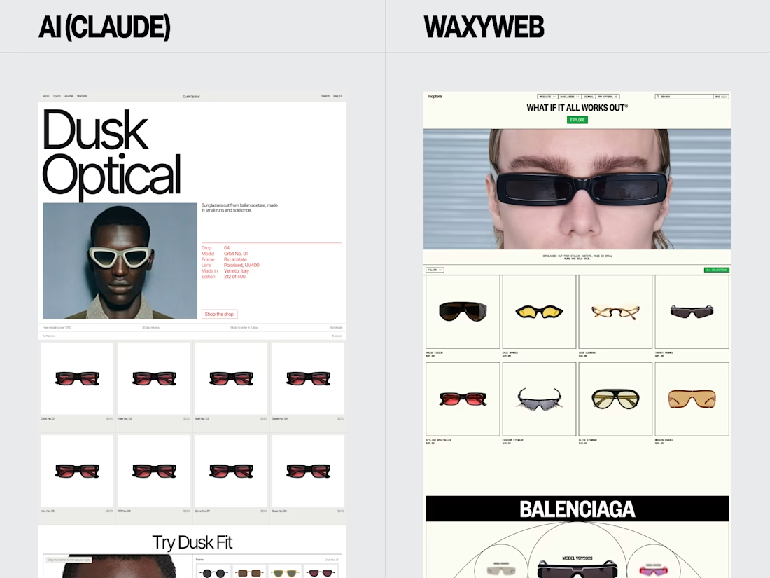
Eyewear Ecommerce Website Redesign — AI vs. WaxyWeb
A side-by-side design comparison exploring two approaches to an online eyewear store.
The WaxyWeb redesign focuses on the relationship between product presentation, collection browsing, editorial imagery, and the store’s visual identity.
Design considerations:
Eyewear product presentation
Ecommerce layout and hierarchy
Collection and product discovery
Fashion-focused visual direction
Consistent online shopping experience
For fashion, eyewear, and lifestyle brands, the goal is to create a store that presents products clearly while giving the brand a recognisable visual presence.
Website design and development: www.waxyweb.com

WaxyWeb