
Muhammad Ratul
Helping Startups & Brands Build Scalable Digital Products


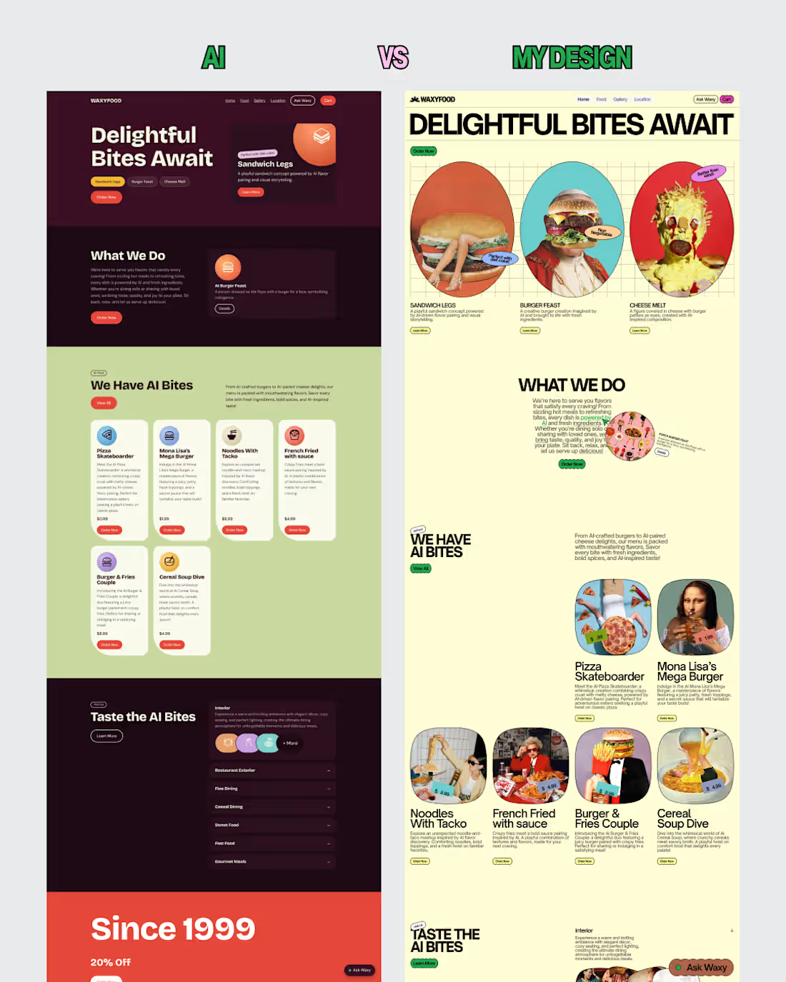
What happens when AI and a designer approach the same website brief?
For this experiment, I explored two different creative directions for WaxyFood, a fictional food brand.
The AI generated version follows a familiar restaurant website structure, while my approach explores a more experimental editorial direction.
My design focuses on:
• Bold and expressive typography.
• Unconventional food imagery.
• Playful layouts and compositions.
• A distinctive visual identity.
• A more memorable brand experience.
The goal wasn't simply to make something different. It was to explore how creative direction can transform the way a brand communicates visually.
Same brief. Different thinking. Different experiences.
1
3
77
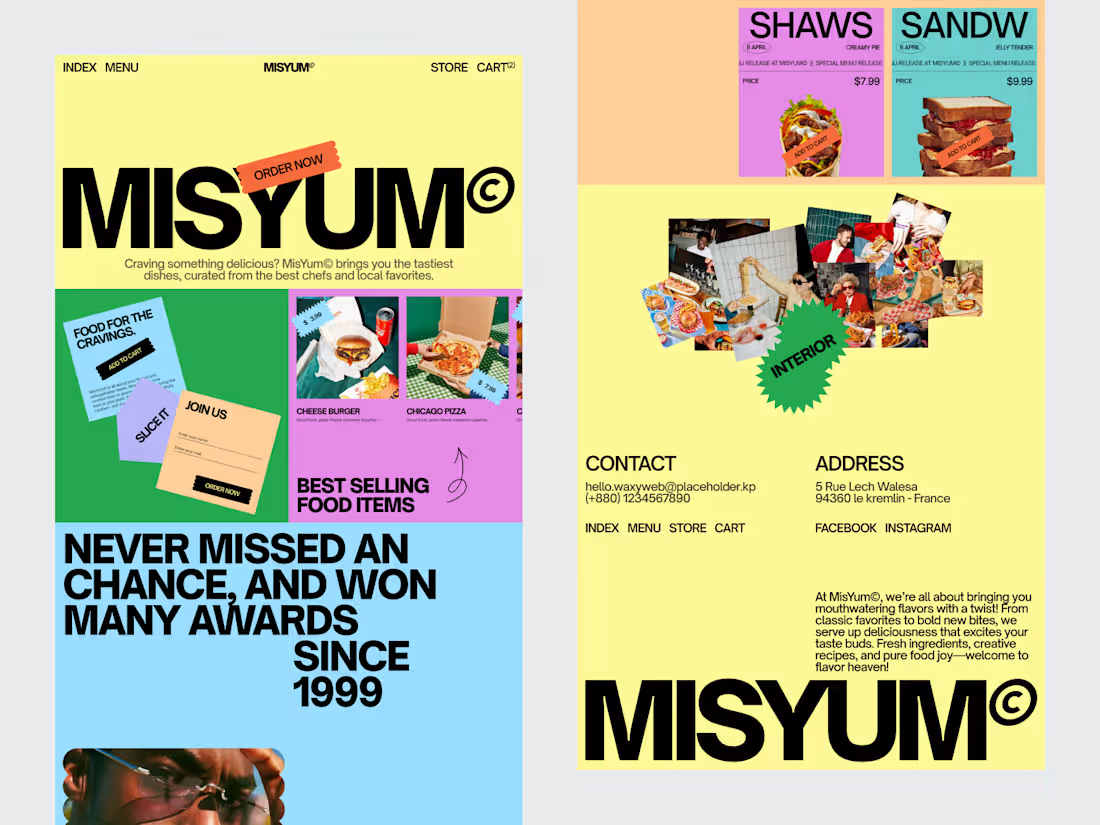
A RESTAURANT WEBSITE BUILT LIKE A BRAND EXPERIENCE.
MisYum explores how bold art direction, food branding and thoughtful UX can transform a restaurant website into something much more memorable than a digital menu.
• Distinctive visual identity
• Editorial web direction
• Bold typographic system
• Food and interior storytelling
• Clear menu and ordering UX
Every page was designed to feel like part of the same visual world.
The result is a restaurant experience that feels playful, confident and unmistakably MisYum.
Designed by WaxyWeb.
3
74
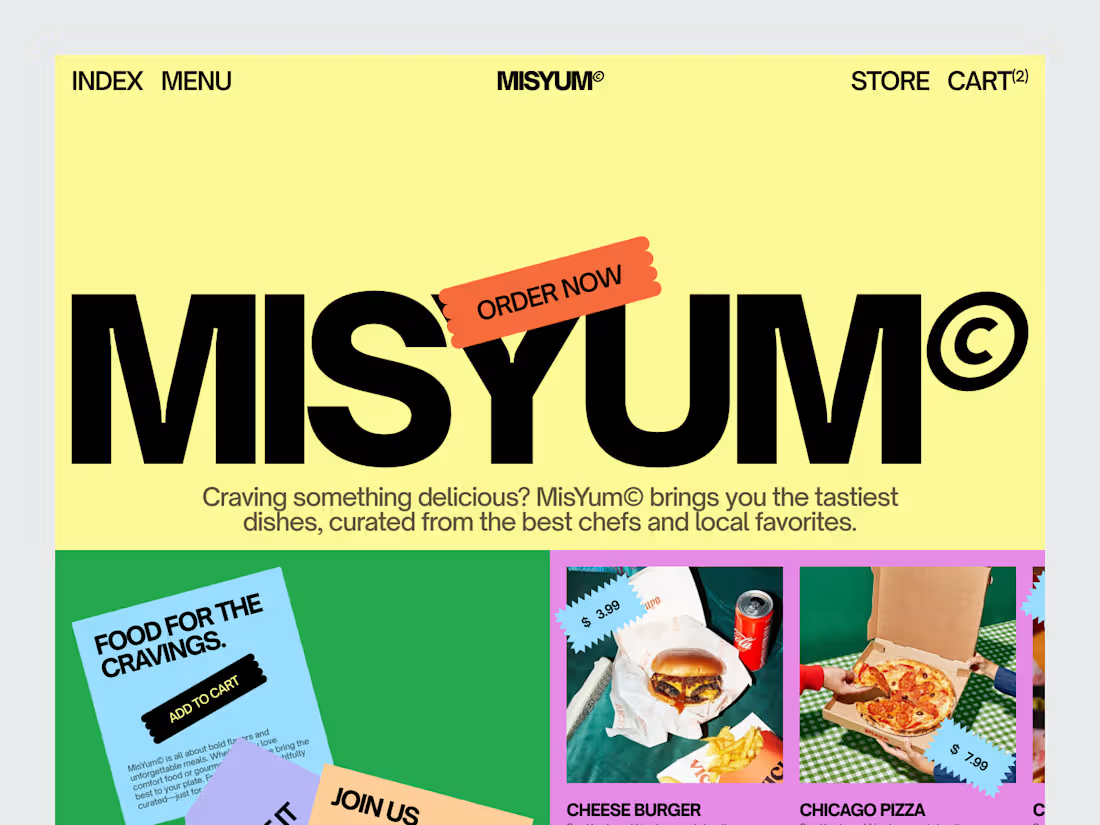
A FOOD WEBSITE DESIGNED TO FEEL LIKE A BRAND.
MisYum explores how bold art direction and thoughtful UX can turn a restaurant website into a memorable digital experience.
• Editorial visual direction • Distinctive food branding • Bold typography system • Intuitive product discovery • Conversion focused ordering journey
The idea was simple:
Don’t just make people hungry. Make them remember you.
Designed by WaxyWeb.
7
19
437
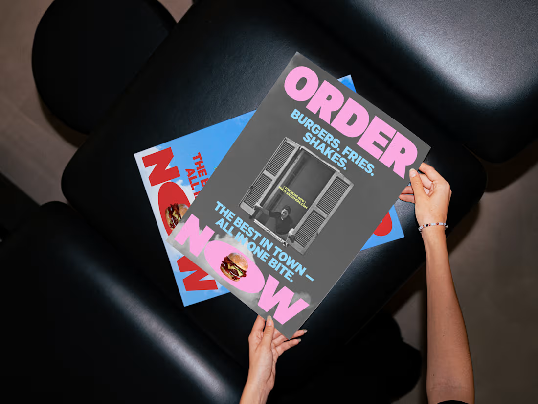
WHEN A FOOD AD STARTS FEELING LIKE EDITORIAL.
A poster design exploring how typography, photography, and composition can turn a simple burger campaign into a distinctive visual identity.
• Bold typographic hierarchy
• Editorial art direction
• Strong visual contrast
• Playful food storytelling
• Memorable campaign personality
The goal was never to make another food advertisement.
It was to create something people would actually want to look at.
Designed by WaxyWeb.
2
3
197