tooba Iftikhar
Product & Visual Designer | UI/UX, Branding & AI Creative


✨ Bringing Biodance to Life: A Minimalist Skincare Campaign ✨
The Story😍
Every great skincare product tells a story of care, purity, and renewal. For this project, I set out to capture that exact feeling for Biodance and their iconic Collagen Peptide Eye Patches.
Instead of a traditional shoot, I wanted to build an ethereal, dreamlike world where the product takes center stage. I crafted a visual narrative using soft pastel pink gradients, reflective glass display surfaces, and pristine studio lighting to evoke a sense of deep hydration and soothing luxury. The grid layout and fluid transitions came together to create an immersive, hypnotic journey through texture and form.
The Result 🌟
A polished, high-end commercial visual campaign tailored for modern digital marketing and premium e-commerce staging.
Which one you like the most? 👀💭
0
34
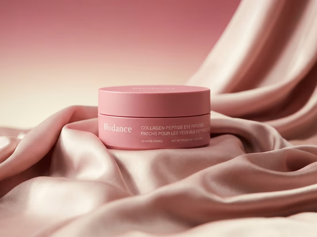
✨ Biodance Skincare Campaign & 3D Product Staging ✨
Role: 3D Artist & Art Director 🎨
Deliverables: Commercial product imagery, brand staging, and visual asset creation.
Project Scope: Designed a minimalist, high-end visual campaign for the Biodance Collagen Peptide Eye Patches, focusing on clean commercial aesthetics and premium skincare branding.
✨ I'd love to know your take! What’s your favorite detail in this render? Let’s chat in the comments! 💬
1
96
✨ Proud to showcase my latest independent project:
Figma Aurora Icons! 🚀🔮
This comprehensive icons highlights my expertise in modern UI/UX design, custom iconography, and brand visual systems. Whether you need custom icons for an upcoming app launch or a complete design system overhaul, I'm available for freelance projects and collaborations. 🤝💼
#UIUXDesign #FigmaExpert #ProductDesign #Iconography #RemoteFreelancer
0
54

🍽️ Cheeni — Connecting Restaurants & Suppliers
🔎 The Challenge
Restaurants and their suppliers often rely on 📞 phone calls, 💬 WhatsApp messages, and 📒 paper order books to manage orders.
This creates a fragmented process that can be ⏳ time-consuming, difficult to track, and prone to miscommunication.
💡 The Idea
Cheeni is an AI-powered ordering platform designed to bring 🍽️ restaurants and 📦 suppliers onto the same page.
Instead of managing orders across multiple channels, both sides can use one connected platform to communicate, place, manage, and track orders more efficiently.
🎨 My Role
I worked as the UI/UX Designer for the Cheeni mobile and desktop application.
My work covered the complete design process — from 🧠 understanding user needs and structuring workflows to 📝 wireframing, 🖥️ interface design, and creating the final UI.
🚀 The Solution
I designed a clear and intuitive desktop experience that simplifies complex ordering workflows and makes important information easier to understand and act on.
The goal was simple:
Replace 📞 calls + 💬 WhatsApp chaos + 📒 paper orders with one connected digital experience.
✨ The Outcome
Cheeni transformed a traditionally fragmented ordering process into a more organized digital workflow, giving restaurants and suppliers a shared space to manage their everyday ordering experience.
Full Case Study 👉https://www.behance.net/gallery/254649221/AI-Powered-Ordering-Platform
1
109