
tooba Iftikhar
UX/UI Designer | SaaS, Fintech, Web3 | Dashboards, Web & Mob
- 15
- Followers


Glance — Reimagining AI Creation
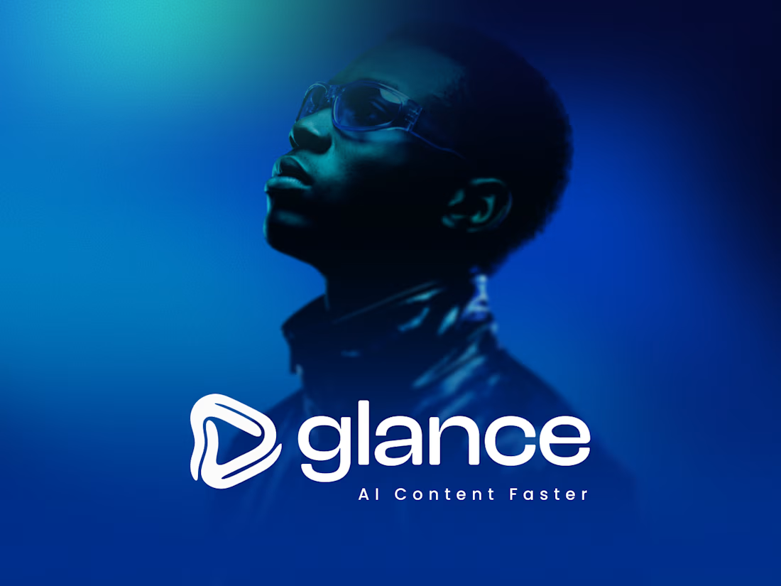
When Glance first launched, its identity was anchored by a friendly robot mascot. It was approachable, but as AI technology evolved from a novelty into a high-speed engine for modern businesses and creators, the brand needed to evolve with it.
The goal was clear: move away from playful tropes and build an identity that feels established, powerful, and effortlessly fast.
Form Follows Function
At the heart of concept is a symbol everyone understands instantly: the play button. It represents media, action, and forward momentum.
By softening the edges and folding the shape inward, the mark becomes a continuous ribbon drawn in a single fluid stroke. This seamless loop visually captures the core promise of Glance: taking raw URLs and turning them into publish-ready content without breaking stride.
The inner line acts as a lens, giving the mark depth and movement. It whispers speed without shouting, embodying the seamless fusion of artificial intelligence and human creativity.
The Palette of Digital Trust
To anchor this direction in enterprise-grade authority, we introduced a refined monochromatic blue palette. Deep midnight tones establish foundation and trust, while vibrant neon blue and turquoise accents convey innovation, speed, and energy.
This concept isn't just a logo redesign—it's a visual manifestation of content created faster, smarter, and with absolute confidence.
If you enjoyed this visual breakdown, hit Appreciate or drop a comment with your thoughts!
0
59
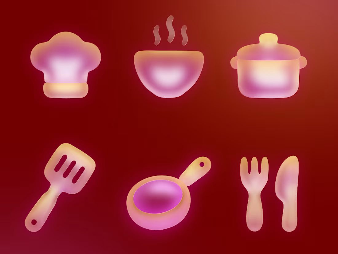
Good Food, Beautifully Reimagined. 🍔✨
Just wrapped up this set of playful 3D food illustrations featuring vibrant colors and glossy, frosted-glass gradients. From bowls and spatulas to pizza and the final chef hat, every asset was crafted to bring a tactile, touchable feel to digital UI.
Which icon is your favorite? Drop it in the comments! 👇
2
2
176
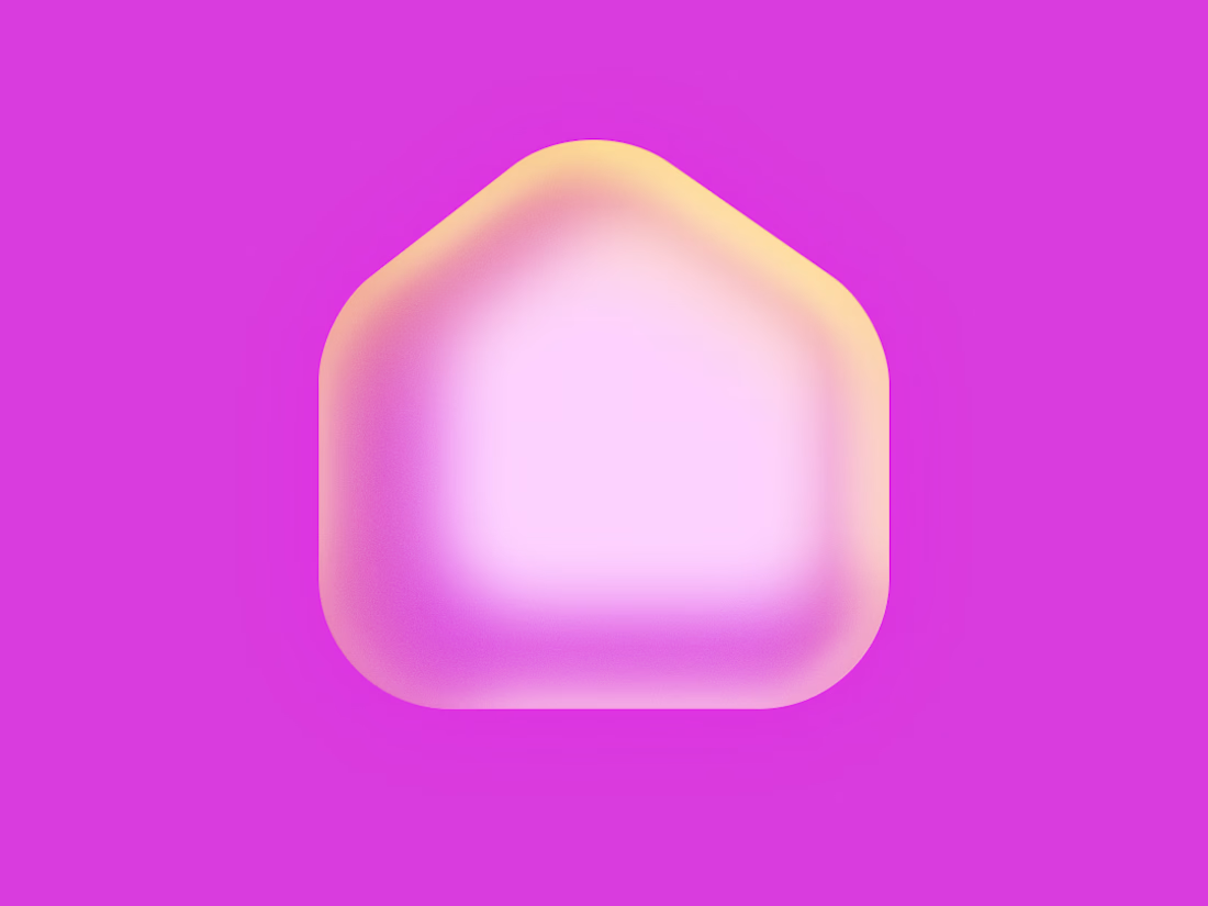
Frosted glass, soft lighting, and clean UI components—built in Figma. 🧊✨
There’s something deeply satisfying about nailing that tactile, touchable 3D depth. No flat vectors here, just smooth gradients and custom volumetric highlights.
What do you think of this color palette? Drop your thoughts below! 👇
#UIUX #Figma #3DDesign #Glassmorphism #DesignTrends #DigitalArt
1
160
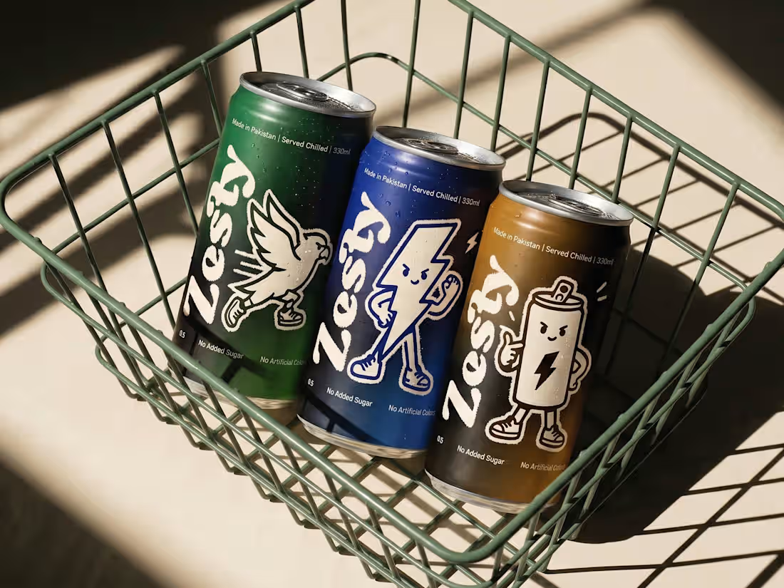
Zesty — Energy Drink Branding, Character Design & 3D Lifestyle Visuals 🌟
Rebranding energy with a dose of retro nostalgia.
Zesty is a concept energy drink brand that blends 1930s rubber-hose character illustrations with a modern streetwear aesthetic. Instead of doomscrolling, I designed a complete visual identity system—from 2D character design and packaging wrap layouts to full product renders and editorial lifestyle campaign assets.
Let me know your thoughts.. 💭👀
2
1
225