The network for creativity
Join 1.25M professional creatives like you
Connect with clients, get discovered, and run your business 100% commission-free
Creatives on Contra have earned over $150M and we are just getting started
Back to feedPost


Most café brands look cozy on Instagram. Then you see the cup in person and it says nothing.
That was the problem I set out to fix with Cafe Steepco.
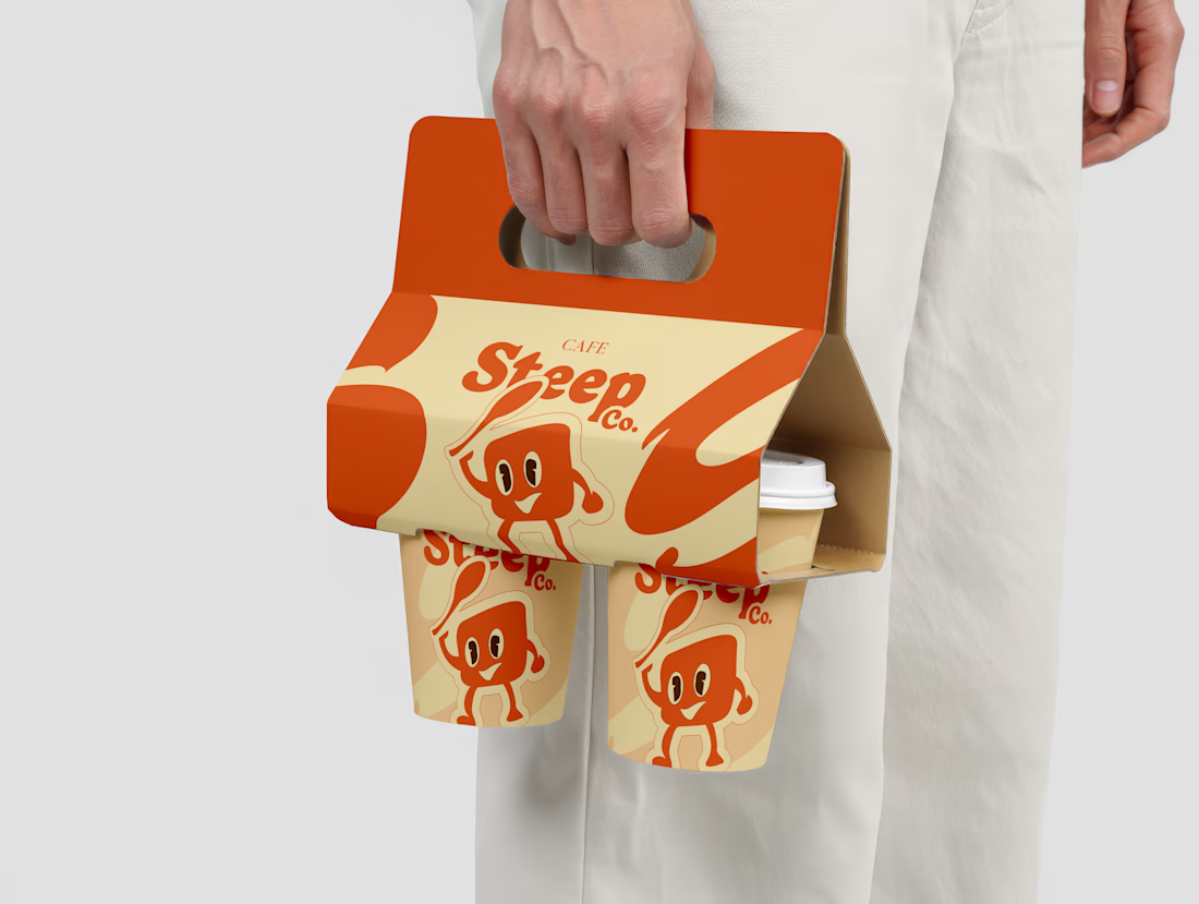
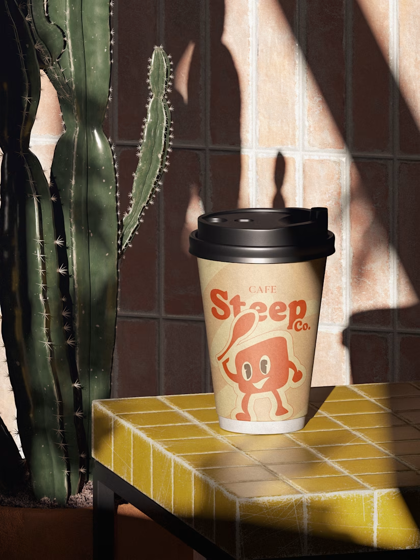
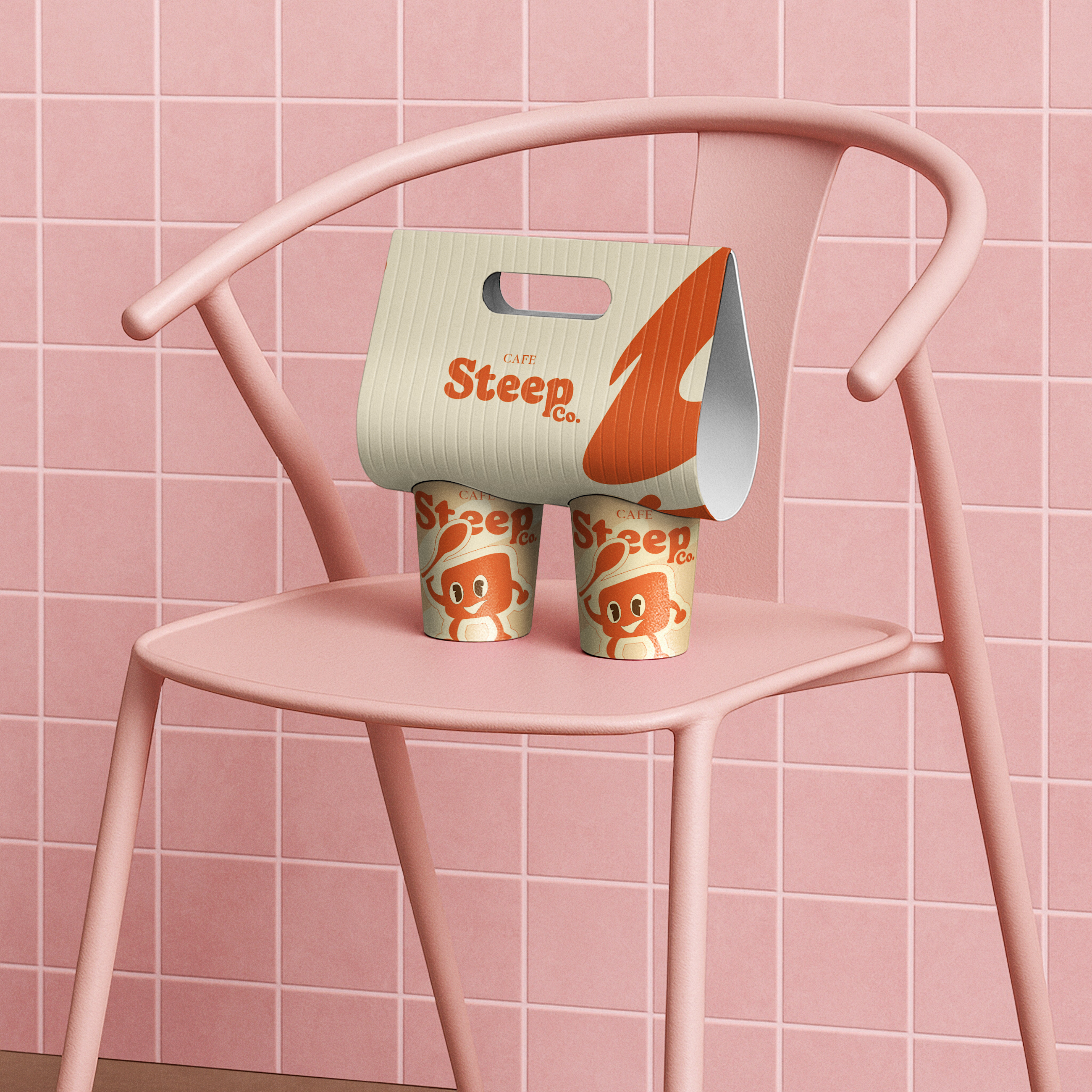
The brief wasn't just "make it pretty." It was: build an identity that feels warm before someone even takes a sip — from the logo to the label to the packaging system.
Here's what drove every decision:
→ The color palette had to feel like the first hour of morning, not a generic brown café
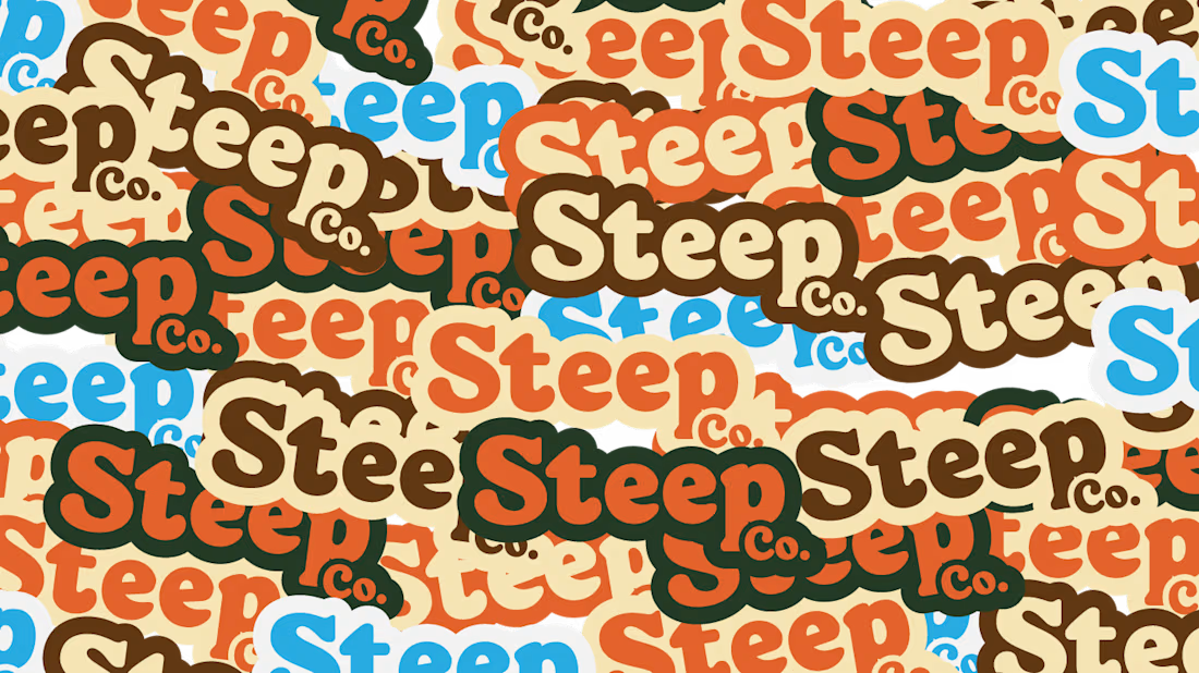
→ Typography had to be readable on packaging and feel premium in a logo lockup
→ Every touchpoint needed to tell the same story — or it wasn't doing its job
The result: a cohesive brand identity that works on a cup sleeve, a pouch, and a storefront sign without losing its character.
If you're building a food, beverage, or lifestyle brand and your packaging doesn't match the quality of your product — that's a positioning problem, not just a design problem.
I fix that.
📌 Open to new CPG, DTC and lifestyle projects. DM me or check my services.


The network for creativity
Join 1.25M professional creatives like you
Connect with clients, get discovered, and run your business 100% commission-free
Creatives on Contra have earned over $150M and we are just getting started
Trending

Claude
Claude has entered the design space. How are you using Claude Design?

Contra University
Learn from expert creatives how to earn more using next-gen AI tools.
creativeaiflow
Creative AI workflows are evolving. What tools do you use, and what are their strengths and weaknesses?
freelancerlife
Freelancer life is wins, pivots, and everything in between. What’s yours right now?








Related posts





Crown pairs surprisingly well with that mountain texture, most crown marks lean literal but the asterisk treatment keeps it abstract. Prism's diagonal cut mark is doing the most work of the four for me.

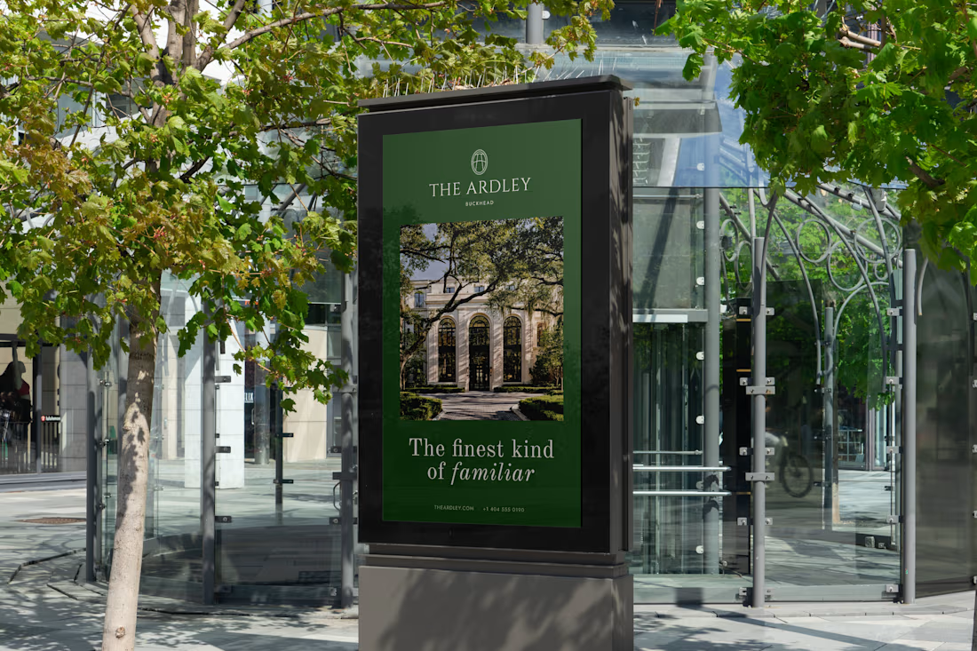
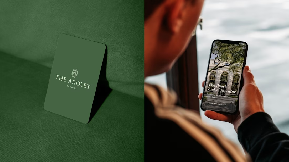
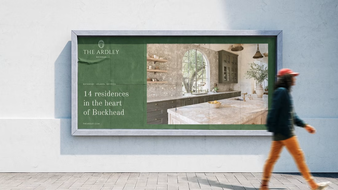
Just wrapped a brand identity project for a luxury residential development in Buckhead, Atlanta.
The Ardley is a 14-unit boutique condo in Chastain Park, one of Atlanta's most established neighborhoods. The brief: bring the brand to life for an investor presentation, with no existing identity and a pre-construction property.
I built everything from scratch: wordmark, monogram, color palette inspired by the mature trees and understated prestige of the neighborhood, typography system, OOH mockups, and interior touchpoints.
Project done through Gerbz Agency.
Check it out

You made the brand 'The Ardley' feel premium!

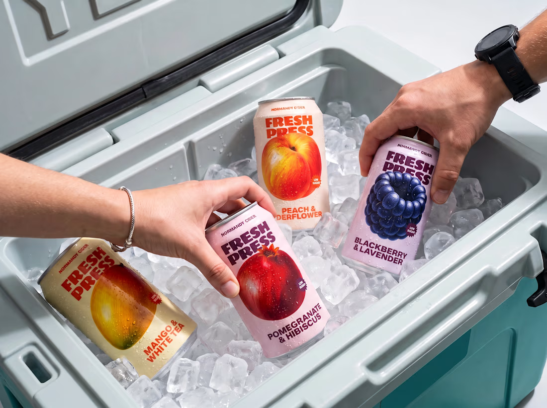
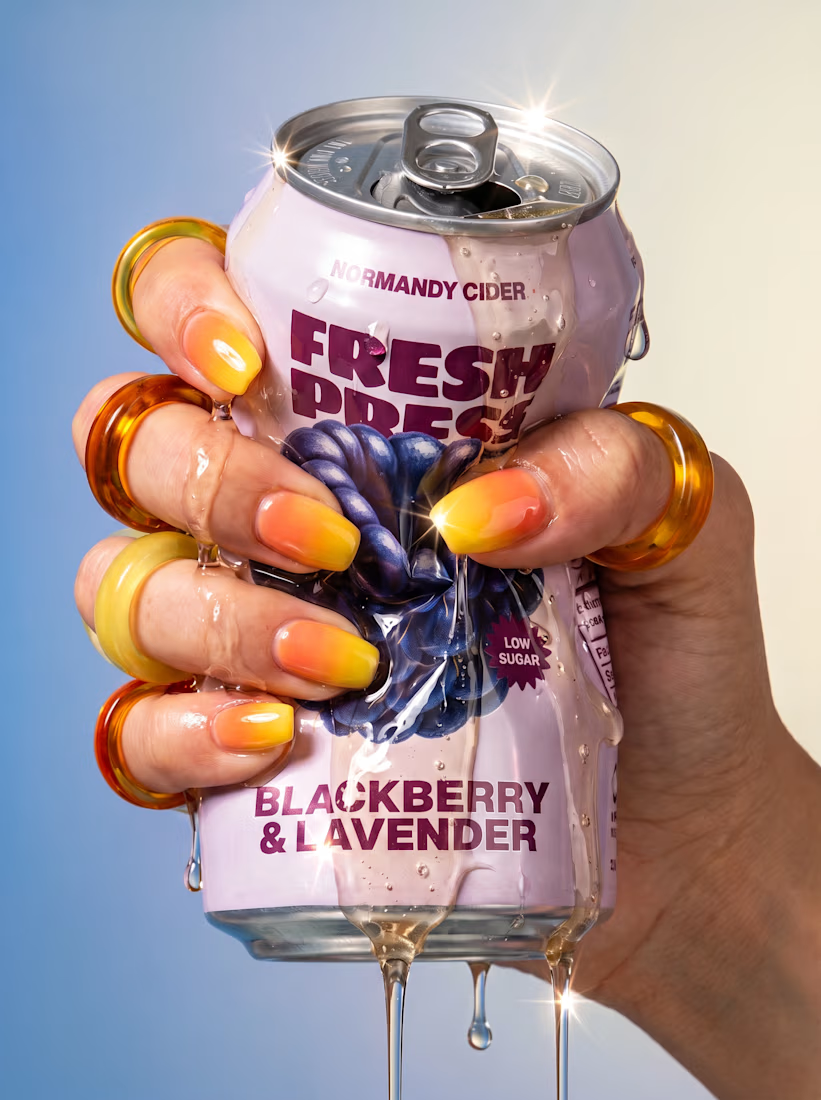
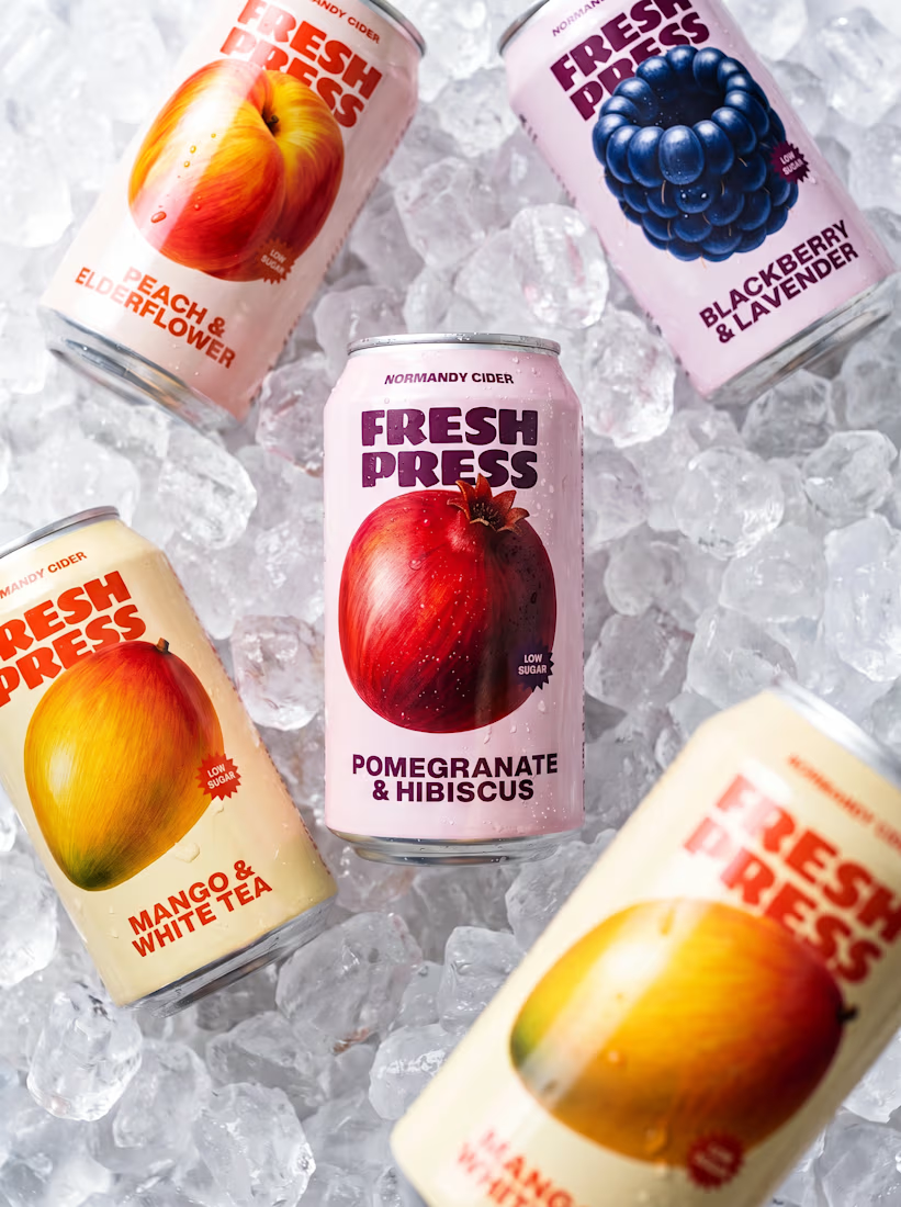
New summer drop for Fresh Press 🫐🥭
Four new flavors, custom illustrations, and packaging design by me

Can I get one? 🔥