
pro
Josiah Damilare
Performance Designer for B2B and SaaS Teams | Ads & LPs
Ready for work
Josiah is ready for their next project!
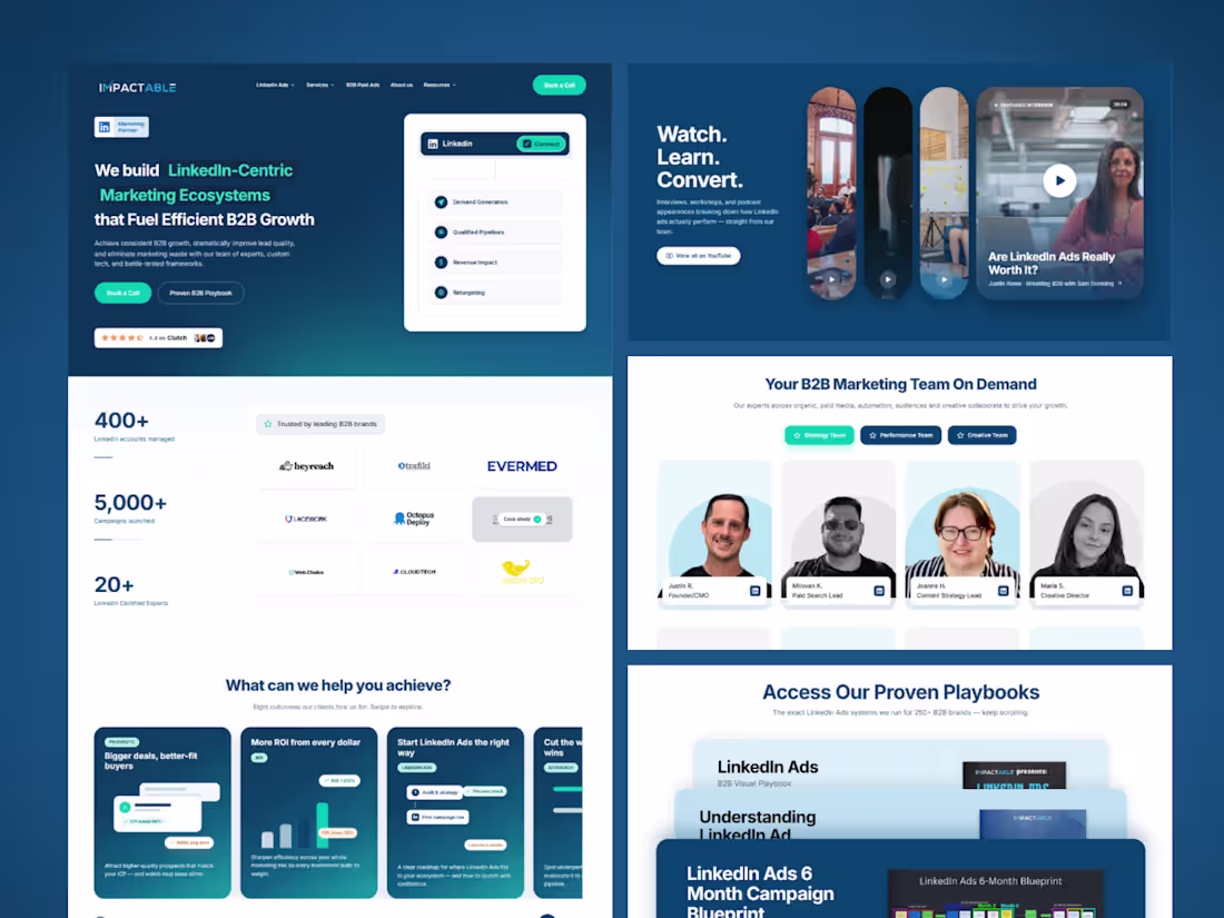
I was in the middle of auditing Impactable's homepage because I felt it could convert better.
The strategy was done, and the redesign was already mapped out. Then, right before I started the design execution... I came across Wonder's design challenge. Perfect timing.
Instead of jumping into Figma like I normally would, I thought...
"Why not put Wonder through a real B2B project?"
This wasn't a concept or a fake landing page, It was a real redesign I plan to pitch to the company.
As a Performance Designer for B2B and SaaS teams, my job isn't just making things look good. It's auditing websites and ads, finding conversion gaps, building strategy, and turning those decisions into landing pages that drive results.
The strategy is the fun part, but the execution is usually the slow part.
So I let Wonder take over that stage.
Instead of spending days designing every section from scratch, I used Wonder to bring my ideas to life, one section at a time, while I stayed focused on the creative direction. The experience felt like having a UI Designer do the execution work for me.
The result was incredible. A project that would normally take me around 10 days was ready in just 3. That's 70% of my time back.
Less time pushing pixels. More time solving real business problems.
Here's the Wonder file if you're curious to see how it came together:
🔗 https://app.wonder.so/josiah-damilare/files/019f2a19-450b-7a87-a138-86ee0a065ec0
And here's the first deployed version:
🚀 https://impactable-web-build.vercel.app/
Huge shout out to the Wonder team for building something that fits the way I already work instead of asking me to change my entire workflow.
9
7
550
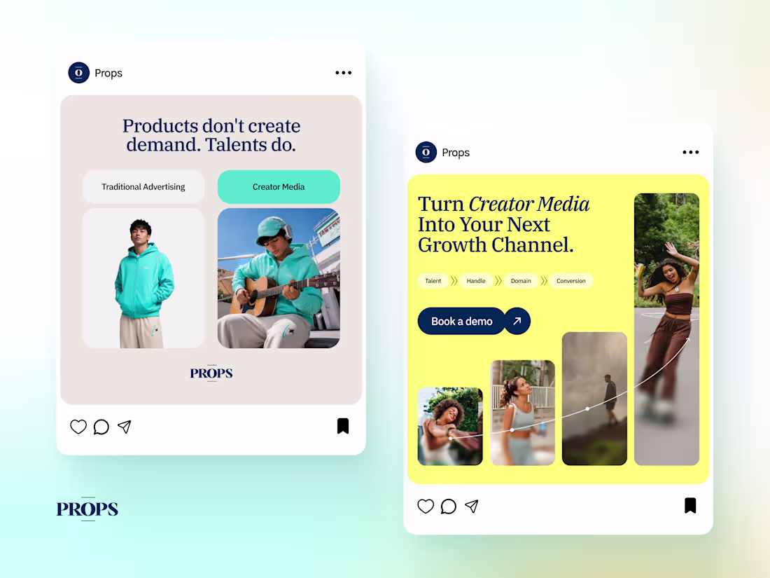
Rebuilding Props (https://www.props.co)' LinkedIn Campaign Through a Demand Generation Lens
Props is a B2B platform helping brands scale through creator led media. Their positioning is built around a simple belief: people trust people more than they trust brands. Inspired by their unique approach to advertising, I challenged myself to explore how their LinkedIn campaigns could better reflect the personality, storytelling, and visual identity already present across their website.
Using my EPAC Demand Generation Framework (Educate → Proof → Authority → Convert), I rebuilt the campaign into a four ad series where each creative served a specific purpose in the buyer journey.
Ad 1 • Educate
Rather than introducing Props immediately, the first ad challenges the audience's existing beliefs about advertising. I used a familiar internet meme to show why creator led content naturally earns more attention than traditional ads, making the message instantly relatable.
Ad 2 • Proof
Instead of relying on a performance metric alone, I transformed a 28% average CPM reduction into a visual story. A confident tightrope walker became a metaphor for trust, demonstrating that when audiences trust the story, advertising becomes more efficient.
Ad 3 • Authority
To position Props as the category expert, I created a simple visual comparison between traditional product marketing and creator led storytelling. The product stays the same, but the way it's presented completely changes how people connect with it.
Ad 4 • Convert
The final ad turns interest into action by visualizing the Props growth process. Rather than using a standard call to action, the creative explains how creator media compounds into measurable business growth, making the final conversion feel natural and earned.
Key Takeaways
Align your ads with your brand experience. Your ad should feel like the first page of your website.
Lead with emotion before explanation. People feel first, then think.
Build demand in stages. Educate, prove, establish authority, then ask for the conversion.
3
72
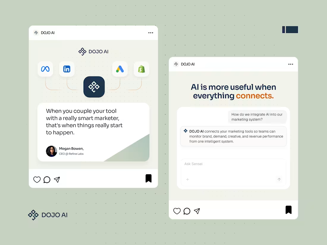
AD Designs for DOJO AI. We structured the campaign using the EPAC system (Educate, Proof, Authority, Convert), creating a full funnel of touchpoints:
Educate (Awareness): Teach the audience about marketing blind spots and DOJO’s “signal” philosophy.
Proof (Validation): Share compelling data and results (e.g. performance improvements) to build credibility.
Authority (Trust): Leverage third-party endorsements and user quotes to show DOJO is trusted by experts.
Convert (Action): Use clear calls-to-action inviting prospects to engage (demos, trials).
2
49
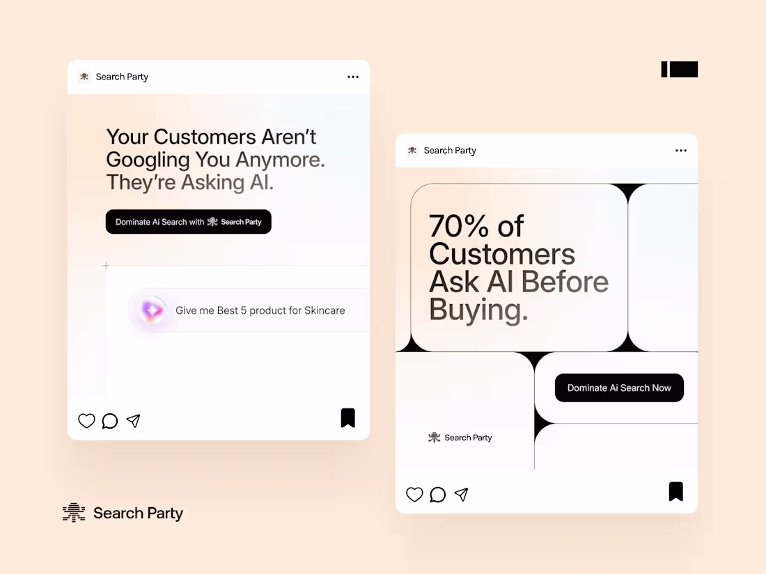
Had some fun working on these two ad variations. AI search is changing the game, and these creatives show exactly how.
1
46
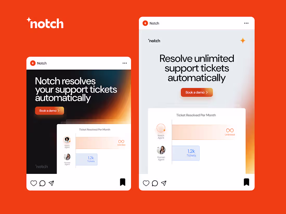
For this case study, I chose Notch (https://www.linkedin.com/company/notchapp/) because I genuinely like what they’re building. AI that actually resolves customer support tickets, not just responds with scripted replies. Real automation that removes friction for both teams and customers. It’s also great seeing companies like Outset (https://www.linkedin.com/company/outset-ai/) AI using AI to fix customer frustrations in smart ways. That’s the kind of product I enjoy designing for.
So I started with one clear message and adapted the execution based on behavior. On the square feed (1:1), I kept things balanced and clear since users scroll casually and will read a short sentence.
On the 4:5 vertical feed, I reduced the copy and went bigger visually because the format dominates the screen and needs impact more than explanation.
On the 9:16 portrait format for Reels and Stories, I made the text extremely short, used oversized typography, and intentionally left space at the bottom so interface elements like the profile name, like, comment, and share buttons don’t cover important details.
For the wide 3:1 web banners, I treated them like billboards and kept everything bold and minimal so one promise and one clear CTA can land instantly.
Same message, different execution. That’s how you design for performance, not just for looks.
1
73
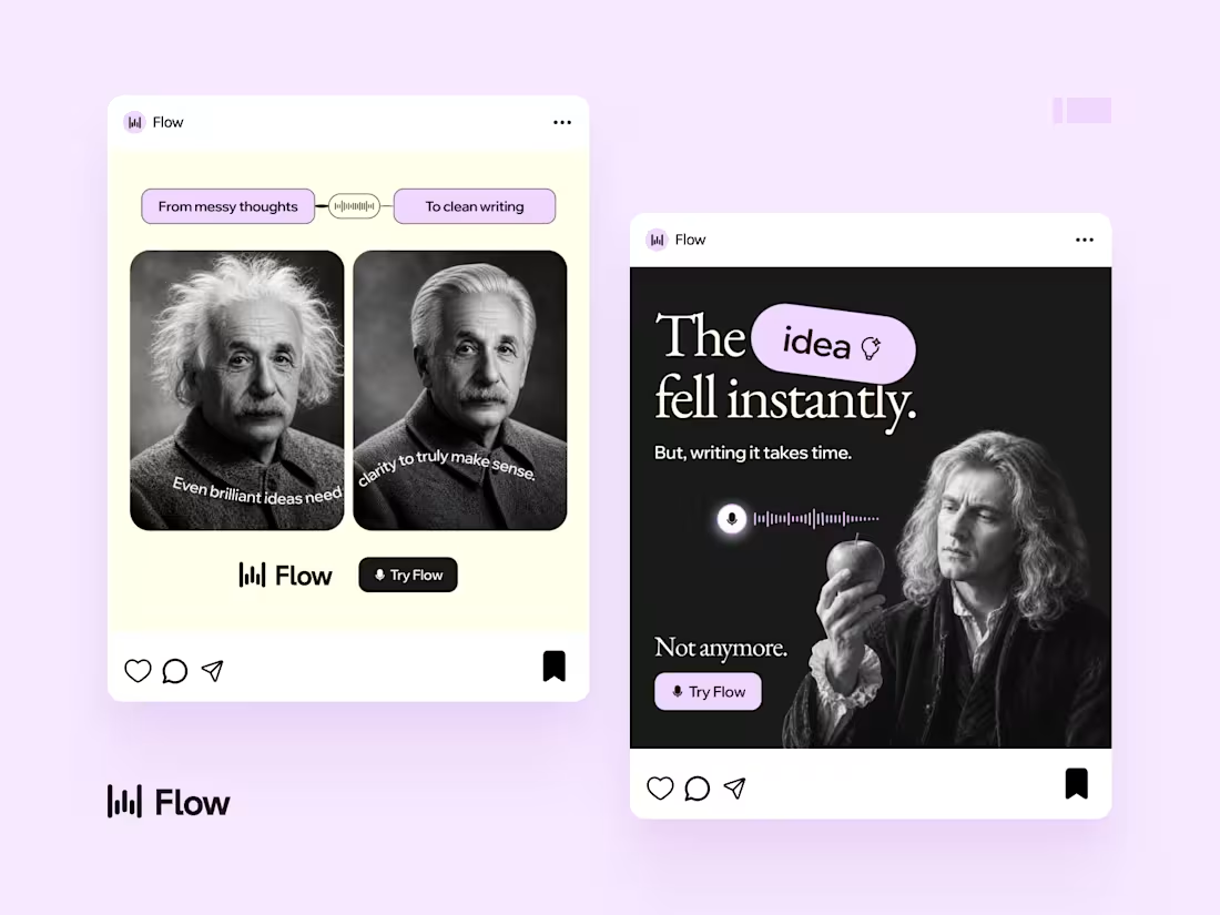
Overview: Flow turns spoken thoughts into structured writing. The real challenge wasn’t awareness, it was belief. Most people assume the problem is their thinking, when in reality, it’s their expression layer. So instead of explaining the product, this campaign visualized a single truth: Your ideas are already good. They just don’t come out that way.
Insight: People think faster than they can type. Studies show speech is up to 3x faster than typing, yet most communication still depends on typing. At the same time, over 70% of professionals struggle to express ideas clearly in writing. This creates a frustrating gap between what people mean and what people read.
The Strategy: Every ad in this campaign visualizes a transformation. Not features, not UI, but a visible shift from messy to clear. I focused on contrast, familiarity, and real-life tension. The goal was simple: make people see themselves instantly.
1
116