Notch: Ad Campaign + Landing Page (Spec)

Josiah Damilare


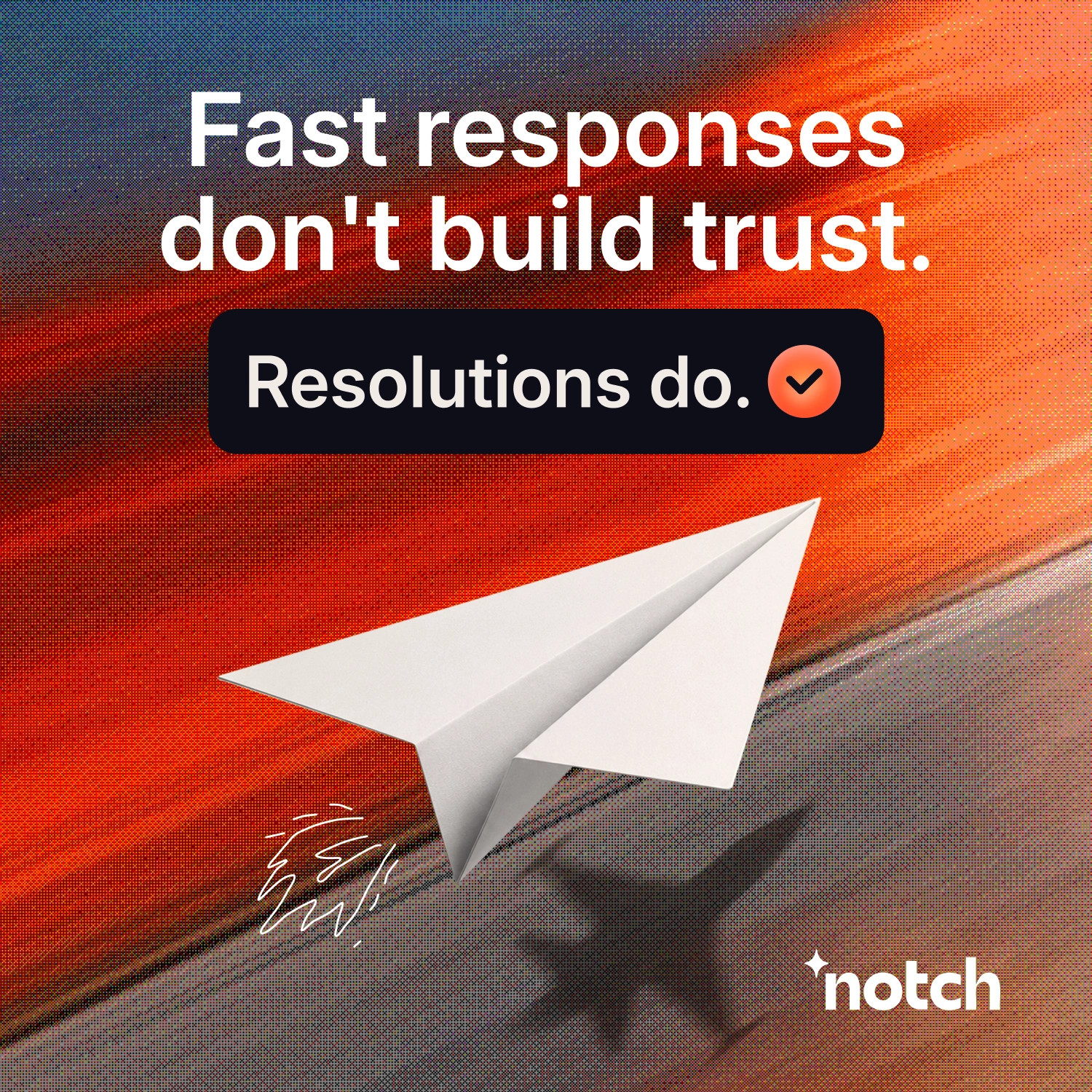
Spec Campaign: Ads + Dedicated Landing Page for Notch
Notch is a B2B insurance and fintech SaaS platform that helps businesses manage and resolve customer support tickets. For this speculative project, I designed a complete demand generation campaign from scratch: 5 ad creatives across multiple aspect ratios and a dedicated landing page, all unified around a single conversion promise.
The goal was to demonstrate how a focused, full-funnel campaign can outperform the common approach of sending paid traffic to a generic homepage.
The Problem: Why Homepages Kill Paid Traffic
Most B2B companies make the same mistake with their paid campaigns. They spend significant budget getting people to click an ad, then drop them on a homepage that tries to explain everything the product does.
Think of it this way: imagine clicking on a Netflix trailer for a movie that looks amazing. You're excited, you hit Play, but instead of taking you to that movie, Netflix drops you on the homepage. The movie is somewhere on the platform, but now you're the one searching through categories, recommendations, and thumbnails to find the very thing you clicked for.
That's exactly what many landing pages feel like. The ad makes one specific promise. The homepage makes dozens. That disconnect creates friction, and friction is one of the easiest ways to lose a potential customer.
The principle I built this entire campaign around is simple: give people what they came for as quickly as possible.
The Strategic Approach
Every ad in this campaign revolved around one promise: resolving customer support tickets. Running those ads to the Notch homepage wouldn't make sense because the homepage has to explain everything Notch does, while the ads are only making one promise.
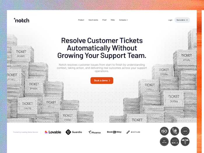
That's why I designed a dedicated landing page focused entirely on ticket resolution. The landing page continues the exact message from the ads seamlessly, so the visitor never has to reconnect the dots or search for the thing that made them click in the first place.
This approach ensures message continuity from the first impression (the ad) through to the conversion point (the landing page CTA). No navigation distractions, no competing messages, no friction.
EPAC Framework: How Each Ad Serves the Buyer Journey
I structured the campaign using my EPAC Demand Generation Framework. EPAC stands for Educate, Proof, Authority, Convert. Each letter represents a stage in the buyer journey, and each ad creative is designed to serve one specific stage. Here's how it played out for Notch:
Educate (Awareness)
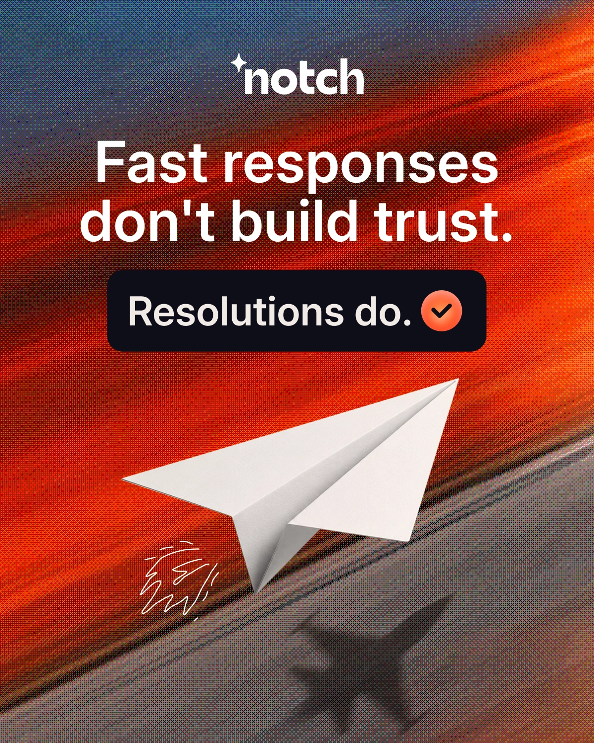
The first ad doesn't introduce Notch at all. Instead, it challenges the audience's existing beliefs about customer support. The goal is to make the problem feel real and personal before presenting any solution. If the audience doesn't feel the pain, they won't care about the cure. This ad is designed to stop the scroll by creating a moment of recognition: "That's exactly what happens to us."
Proof (Validation)
The second ad moves from problem awareness to evidence. Instead of relying on a performance metric alone, I transformed the data into a visual story. The creative uses visual metaphor to demonstrate that when audiences trust the story, the results follow naturally. This ad builds credibility through showing, not telling. Prospects who felt the problem in the first ad now see that a solution exists and it works.
Authority (Trust)
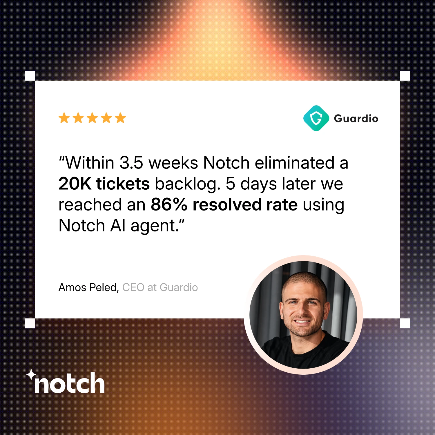
The third ad positions Notch as the category expert. I created a simple visual comparison between the old way of handling support and Notch's approach. The product stays the same, but the way it's presented completely changes how people connect with it. This ad leverages third-party signals and endorsements to build the kind of trust that makes prospects comfortable moving forward.
Convert (Action)
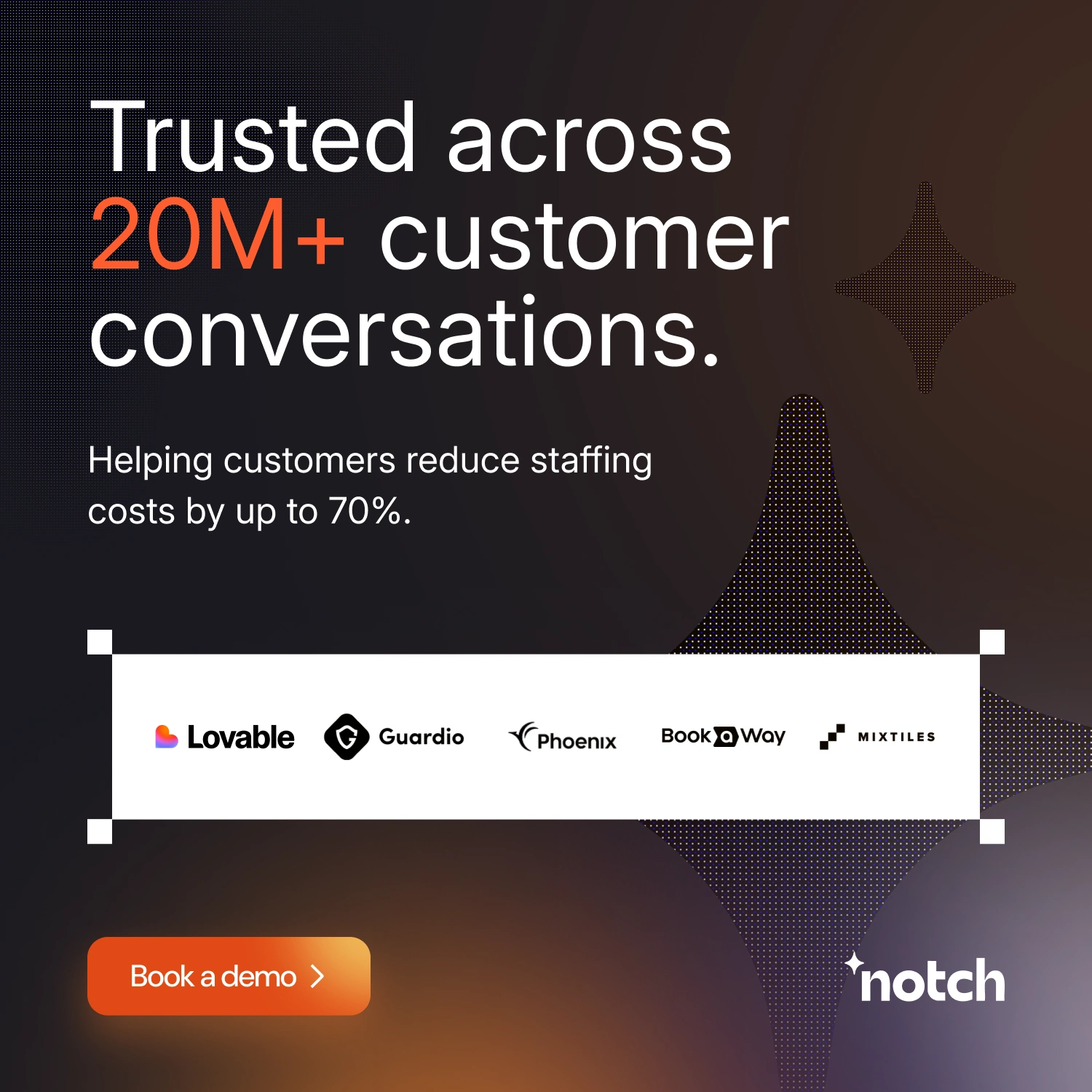
The final ad turns interest into action. Rather than using a standard "Book a Demo" call to action, the creative visualizes the Notch growth process. It explains how resolving tickets faster compounds into measurable business improvements, making the final conversion feel natural and earned rather than forced. By this point, the prospect has been educated, shown proof, and given reasons to trust. The ask feels like the logical next step.
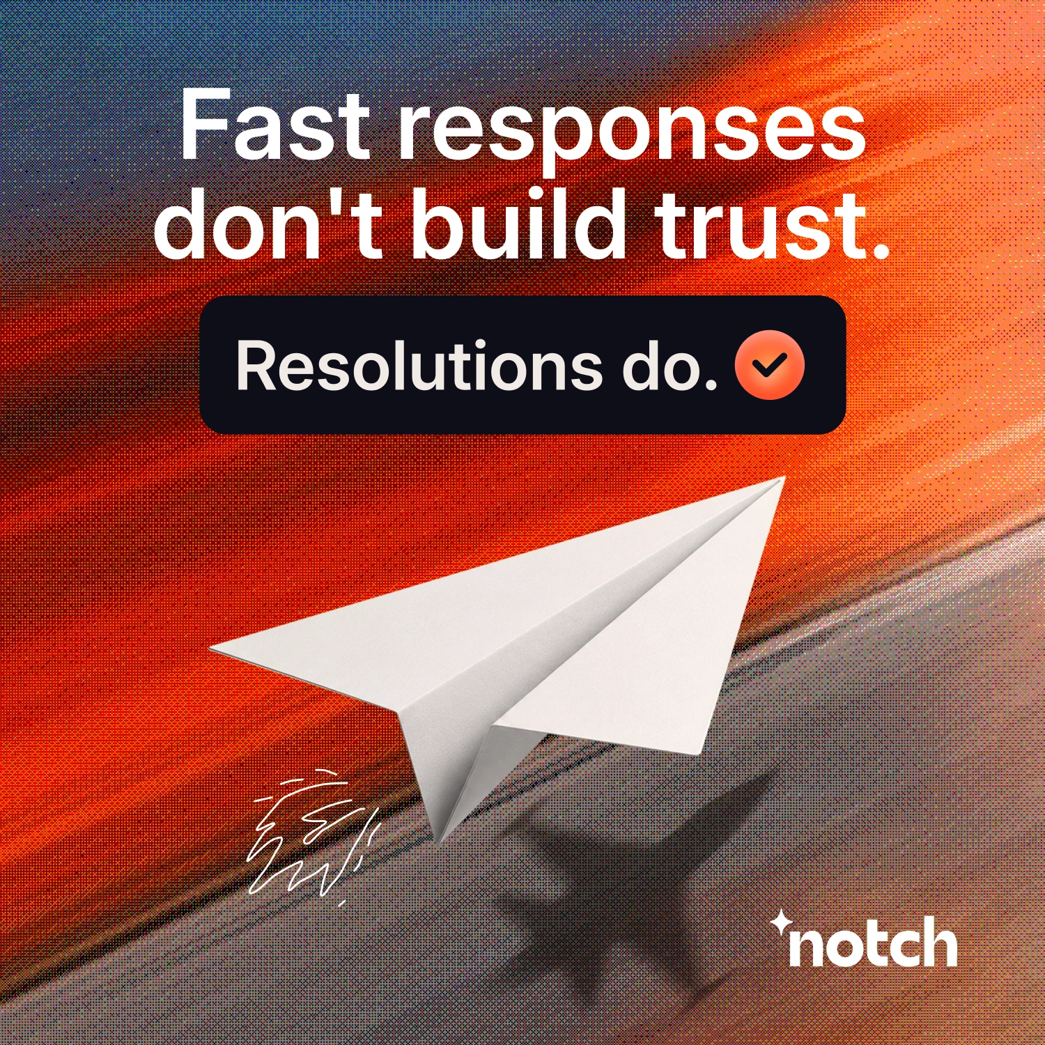
Notch Ad Creative 1:1
Notch Ad Creative 4:5

Notch Ad Creative 2
Notch Ad Creative 3
Notch Ad Creative 4

Notch Ad Creative 5
The Landing Page: Continuing the Promise
The landing page was designed as a direct extension of the ad campaign. When someone clicks an ad about ticket resolution, they land on a page that talks about nothing else. No product overview, no feature tour, no "About Us" section competing for attention.
The page structure follows a clear conversion path: headline reinforces the ad promise, supporting copy expands on the specific benefit, social proof validates the claim, and a single CTA makes the next step obvious. Every element on the page exists to move the visitor closer to one action.
This is the core principle: your ad and your landing page should tell the same story. When someone clicks an ad built around a single promise, the landing page should immediately continue that promise.
Key Takeaways
Message continuity matters more than design polish. A beautiful landing page that doesn't match the ad's promise will underperform a simple page that does.
One promise per campaign. The more focused your message, the easier it is to build a landing page that converts.
Build demand in stages. Don't ask for the conversion before you've earned it. Educate, prove, establish authority, then convert.
The full campaign, including all five ads, the commercial, and the landing page, is available at josiahlabs.com.
Like this project
Posted Jul 26, 2026
Spec campaign for Notch (B2B fintech SaaS): 5 ad creatives + dedicated landing page, built around a single conversion promise using the EPAC demand generation framework.