


Full scroll of Golden Flash, a photography studio template. The process list is just big yellow step names, and only the one you're on is lit while the next one fades in under it as you scroll.
https://waidastudio.com/templates/goldenflash
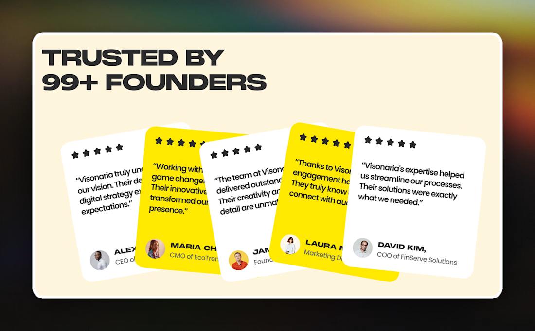
Most testimonial sections I see are a tidy three card grid or a slider. On Visonaria, a digital agency template, the five quotes are fanned out like a hand of cards in white and yellow, so only the last one reads in full.
Not sure cutting off four quotes is a fair trade for the look.

Not sure mixing two typefaces in one headline works for a medical product, but Medonix does it on most sections. Plain sans for the line, then one word in italic serif, like "Dashboard" in the hero, "Smarter" on the about block and "Answered" on the FAQ.
https://waidastudio.com/templates/medonix
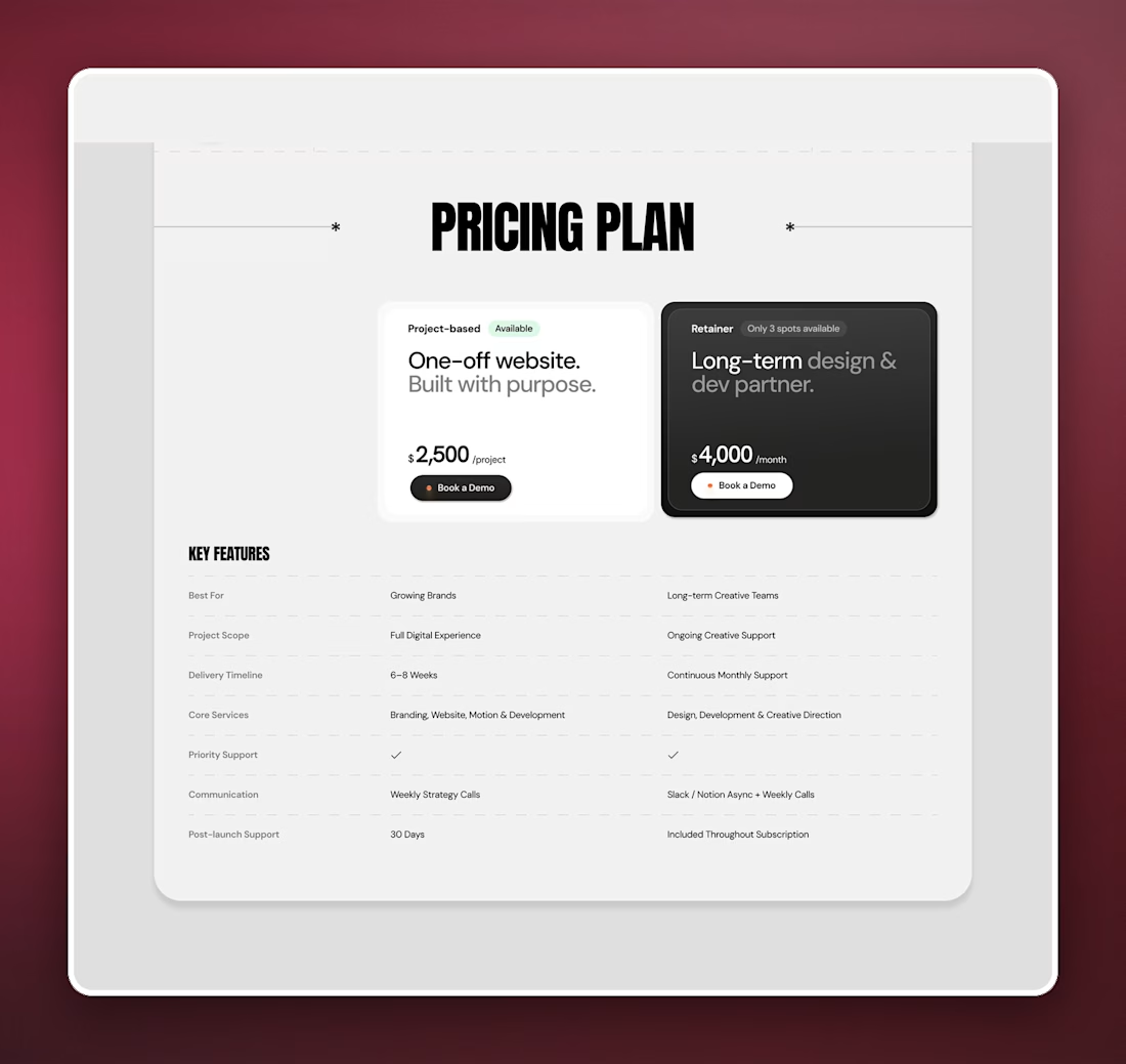
Put the two plan cards on this freelancer portfolio template right on top of their own columns in the comparison table. So the $2,500 project and the $4,000 a month retainer don't carry bullet lists, the rows underneath do that job.
Not sure people actually read a table on a pricing page though.
Full scroll of ShieldifyVPN, a template for VPN and security brands. Every heading is set in a monospace font, so the whole page reads a bit like a terminal without actually looking like one.
Kept going back and forth on whether that's too cold for a consumer product.
https://waidastudio.com/templates/shieldifyvpn