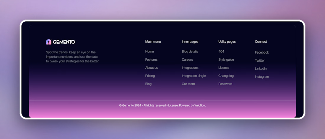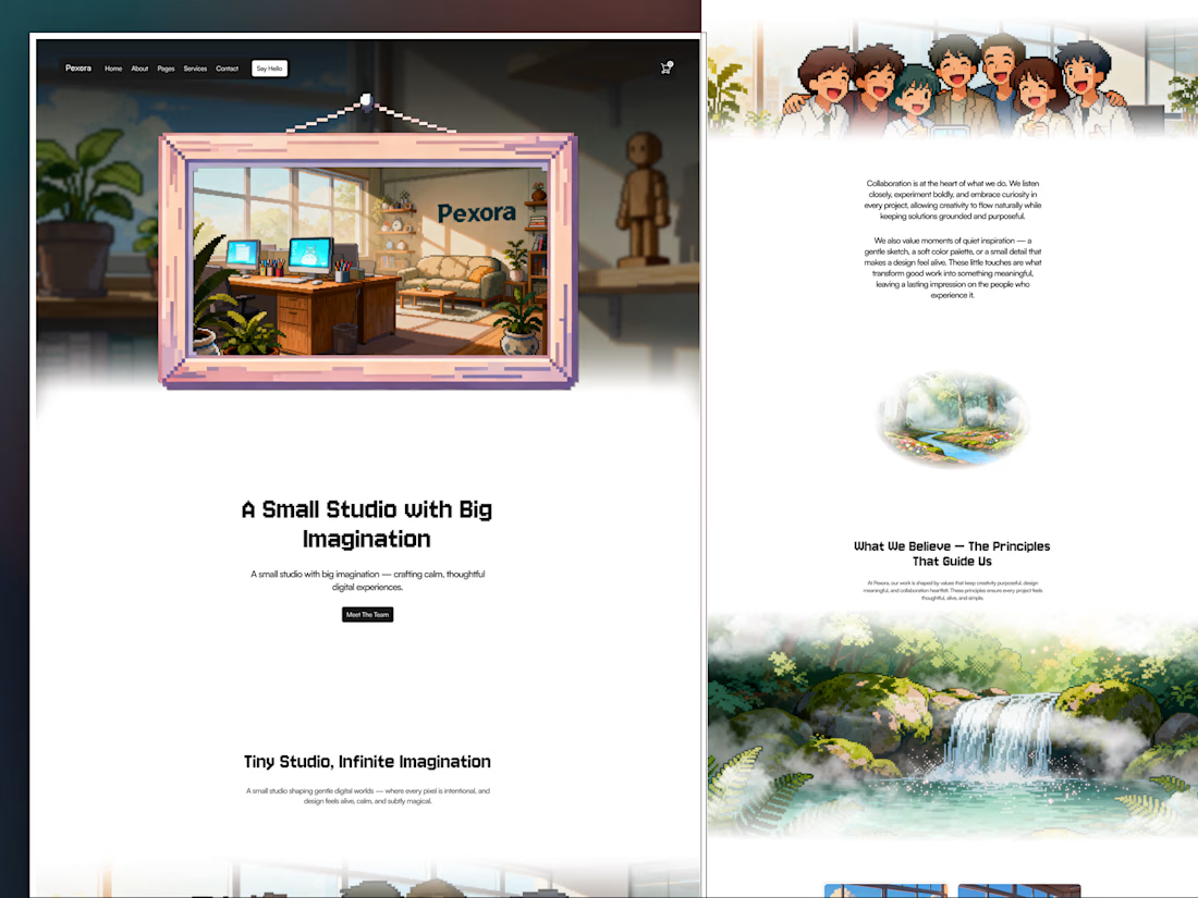


Put the two plan cards on this freelancer portfolio template right on top of their own columns in the comparison table. So the $2,500 project and the $4,000 a month retainer don't carry bullet lists, the rows underneath do that job.
Not sure people actually read a table on a pricing page though.

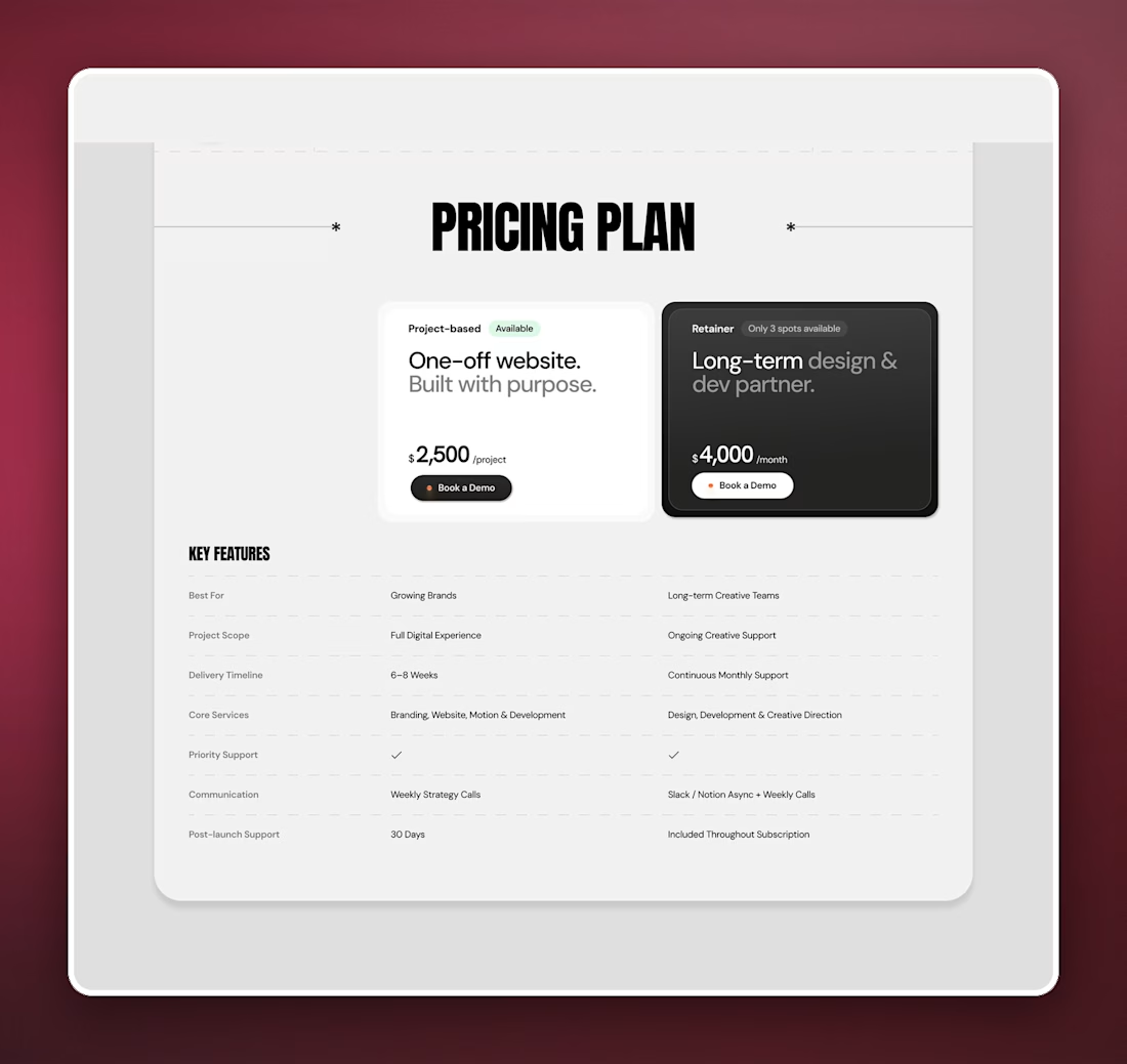
Most footers I build end on a newsletter box. The one for Steelcrest, a roofing template, skips it and opens with a big "Book a Consultation" headline and a single Schedule Service button, since nobody really signs up for roofing updates.
How are you all ending footers for local service businesses?
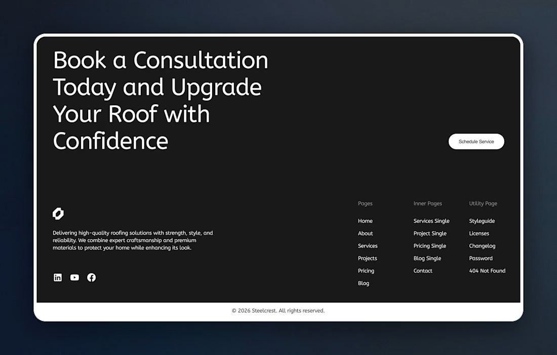
Most SaaS footers stay one flat dark color top to bottom. This one for Gemento, an analytics tool template, lets a purple to pink gradient rise from the bottom edge, so the link columns sit on near black and the copyright bar ends up the brightest strip on the page.
How do you all end a dark page without it just stopping?