Vijay Krishna's Work | ContraWork by Vijay KrishnaVijay Krishna
Extraordinary Brands & Web for Digital-native B2Bs.
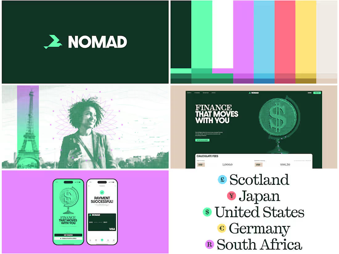
Brand Experiments for NOMAD.
A global financial platform built to make moving, managing and organizing money across borders much simpler.
A few weeks ago, I happened to look closely at a currency note I had with me. Not just the denomination or the illustration, but all the tiny details around it. Micro text, security threads, guilloche, spirographs, patterns and gradients, all working together in a way I had never really paid attention to before.
I was honestly a little mesmerized by how much design was packed into something we handle every day. Kudos to currency designers 🫡
I did not want NOMAD to fall into the usual fintech language of 3D coins, floating cards and abstract 3D visuals. I wanted to see if the visual logic of physical currency could be translated into something that feels native to a digital financial platform.
That led me to build a procedural currency-style ASCII tool for the brand, translating imagery into dots, linework, microtype and currency-inspired details.
Since AI is part of NOMAD, I liked the idea of giving the identity its own generative visual system rather than simply borrowing an AI or fintech aesthetic.
For the logo, I explored the silhouette of the Arctic Tern, the longest migrating bird on the planet. I felt the idea of movement across continents fit naturally with NOMAD.
The palette starts with financial greens (Turquoise variant accent because WISE has pretty much claimed the green space already), then expands into brighter colours for different currencies and digital states.
For the type highlights, I’m using Kyoto by Pangram Pangram. I liked how it carries some of the character of serif typography found on currency notes, while still feeling at home in a digital interface.
Still very much a WIP, but I’m enjoying where this is going.
Open to feedback, thoughts, and anything you think could be pushed further :) COSMOFLOW Website - WIP ✨
We’ve been rebuilding our website from the ground up.
The goal was simple: create a site that feels closer to the work we’re putting out and gives us more room to show what we are becoming.
We reworked how we present our projects, introduced new sections around our approach and capabilities, experimented with interactions throughout the experience, and built a visual system that feels much more like us and "Digital Cosmos".
There are still a few details being refined, but it’s finally coming together.
A small look at what we’ve been working on. 👀 Direct Design Branding & Website
Direct Design is a digital-first creative agency built on a simple belief: there’s always a clearer, more direct way forward.
We started this project with just two words: Direct Design, and complete creative freedom.
We explored a lot of narratives around what “Direct” could mean until we landed on something that felt obvious: roads, traffic signs and wayfinding. In the design world, everyone is trying to find a more direct way forward. Better decisions, fewer detours, clearer direction. So we built the brand around that idea.
What we did:
Brand Strategy + Narrative
Brand Identity
3D Design
Web Design + Development
We probably spent way too much time obsessing over details most people will never notice, but that’s also what made this one so fun.
And yes, it’s completely human-made. No AI. Even the 3D was manually built in Blender.
Full case study coming soon! CHECK OUT THE WEBSITE: https://wearedirect.co/
Let us know what you think in the comments, and follow for more. Frames from the PIL identity project.
PIL is a leading textile company specializing in men’s shirting fabrics, offering comprehensive B2B solutions from ideation to manufacturing. Collaborating with brands like Raymonds, Peter England, and Van Heusen, PIL integrates tradition with innovation to create collections of timeless elegance and contemporary flair.
We created a dynamic visual system based on well-known fabric patterns in the textile industry.
The new visual identity employs a grid system for precise positioning, reflecting the studio's meticulous design approach. The pattern-based concept focuses on repetitive textile patterns as the central element, highlighting the intricacy and beauty of textile design. This direction creates a rich and engaging brand image, showcasing the artistry and complexity of textile craftsmanship.
This updated identity positions PIL as a vibrant, energetic, and appealing presence in the textile industry, enhancing its brand experience and emphasizing the richness and depth of textile design.