The network for creativity
Join 1.25M professional creatives like you
Connect with clients, get discovered, and run your business 100% commission-free
Creatives on Contra have earned over $150M and we are just getting started
Back to feedPost

Direct Design Branding & Website
Direct Design is a digital-first creative agency built on a simple belief: there’s always a clearer, more direct way forward.
We started this project with just two words: Direct Design, and complete creative freedom.
We explored a lot of narratives around what “Direct” could mean until we landed on something that felt obvious: roads, traffic signs and wayfinding. In the design world, everyone is trying to find a more direct way forward. Better decisions, fewer detours, clearer direction. So we built the brand around that idea.
What we did:
Brand Strategy + Narrative
Brand Identity
3D Design
Web Design + Development
We probably spent way too much time obsessing over details most people will never notice, but that’s also what made this one so fun.
And yes, it’s completely human-made. No AI. Even the 3D was manually built in Blender.
Full case study coming soon! CHECK OUT THE WEBSITE: https://wearedirect.co/
Let us know what you think in the comments, and follow for more.


The “direct” idea comes through beautifully—clear type, playful motion, and that generous layout make the brand feel confident without overexplaining itself.
Thanks for the comment Rohan!

The way you turned “Direct” into a full wayfinding system is such a strong concept. Love how the narrative carries through the identity, 3D, and web experience without feeling forced really thoughtful work 👏
Glad you liked it! Thanks for the comment, Gabriela.

wow amazing
Thanks man!

The wayfinding idea is such a good fit for the name. Nice work, Vijay!
Agreed Mauricio! Glad we actually executed that idea. Thank you so much!
The network for creativity
Join 1.25M professional creatives like you
Connect with clients, get discovered, and run your business 100% commission-free
Creatives on Contra have earned over $150M and we are just getting started





Related posts


Twenty-five years of credits, finally on a website that looks the part.
Just take a look at what kind of web we create ✨👇
Reflection of the brand history with taste, precision, and premium branding.
Scroll responsibly: https://productionportugal.com 😉🔥


Wow! Nice setup 🎥

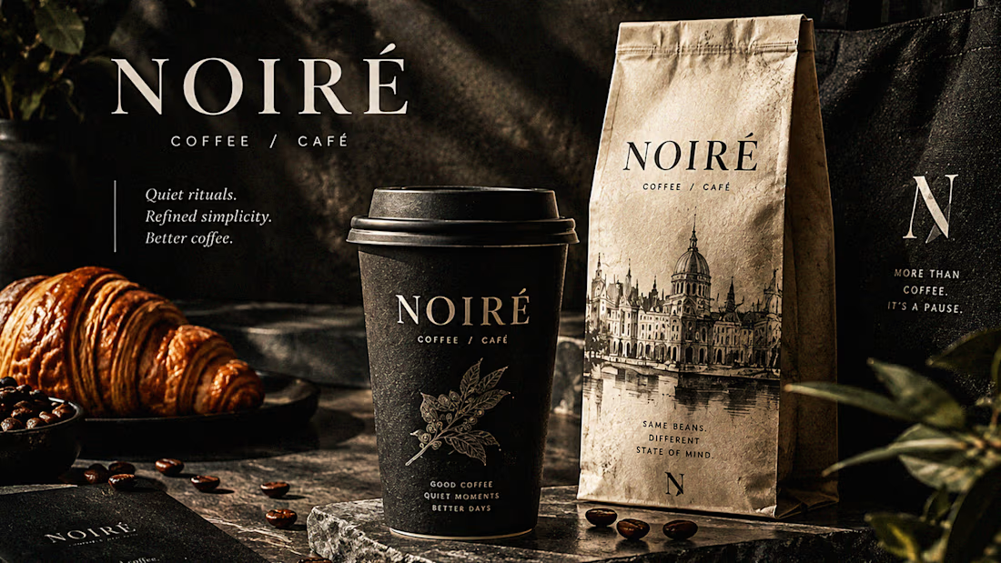
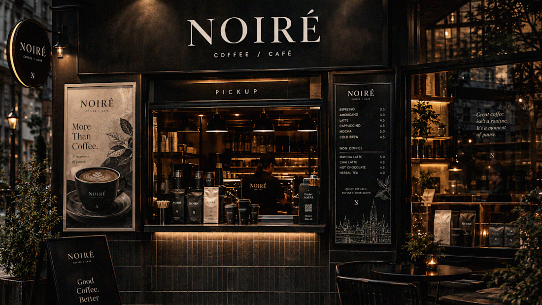
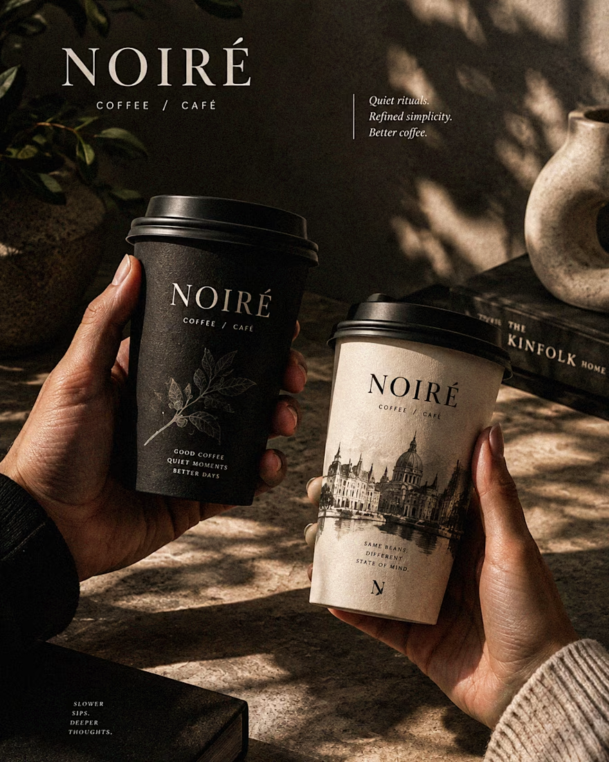
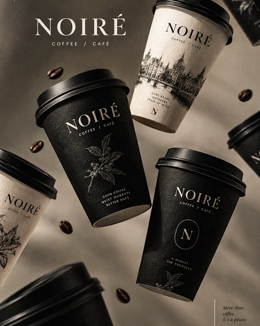
I Just Created NOIRÉ 🔥
A Coffee Brand Built Around the Pause.
NOIRÉ is a premium café brand built around a simple idea:
Great coffee should feel like a moment of pause, not another part of the
routine.
The project explores a complete visual identity, packaging
system, takeaway cups, coffee bags, tote bags, menu design, café applications and lifestyle campaign direction.
Instead of relying on the usual loud coffee aesthetics, I
built NOIRÉ around deep charcoal, warm ivory, soft graphite, refined
typography, subtle botanical illustrations and quiet editorial compositions.
The visual language is intentionally dark, tactile, and understated - giving every touchpoint the feeling of a slow morning, a quiet table, and coffee worth taking your time with.
From the cup in your hand to the café around you, every detail was designed to make the brand feel like a ritual.
Waiting for your thoughts in the comments 🙌🔥
branddesignertastetestBrand DesignGraphic DesignPackaging DesignAdobe IllustratorAdobe InDesignAdobe Photoshop




Okay, I finally joined the typography trend too. 👀
Had to try one myself - so here’s a little typography experiment I’ve been playing with.
Sometimes you just see a trend everywhere and think, okay… my turn. 😂
What do you think - should I make more of these?
Graphic DesignMotion DesignTypographyAdobe After EffectsAdobe Illustratortypographykinetictypographymotiongraphics

TOP!!