Urwa Nasrullah
Brand Identity | Art Direction | Social Media Design
- 1
- Followers

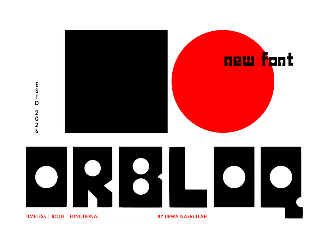
I built a font. Not just a visual experiment, an actual working one.
This started as a simple question: what would happen if every letter was built only from two shapes, a square and a circle?
No extra curves. No decorative tricks. Just sharp square structures with circular cuts pushed into them until the alphabet started feeling usable.
I developed the direction with AI, refined the logic through ChatGPT, and used Claude Code to help turn it into a functional, downloadable font file. I tested it inside Photoshop, and it works.
It’s still experimental, but that’s the point. I wanted to see if AI could help move a type idea beyond a pretty mockup and into something that actually functions as a design asset.
This is the first version of the typeface. Let me know if you would like to try it and I would love to provide it to you.
Workflow provided by: https://x.com/Ror_Fly
1
0
170
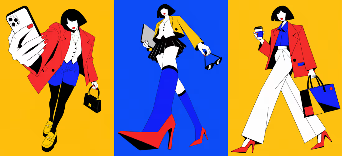
I’ve been making one visual experiment a day to see where my taste goes without client brief limits.
This one started as a fun exploration but turned into an AI-assisted art direction study around Gen Z officewear.
The style sits between geometric editorial fashion illustration, neo-Bauhaus color blocking, and flat vector poster art, bold outlines, absurd camera angles, exaggerated silhouettes, and officewear that feels too dramatic for a normal 9–5.
I may build this into a fictional fashion campaign later, but for now, I’m using it to push style, composition, and AI direction.
What do you think this should become next? A fictional fashion brand, a campaign series, or a poster collection?
3
1
292
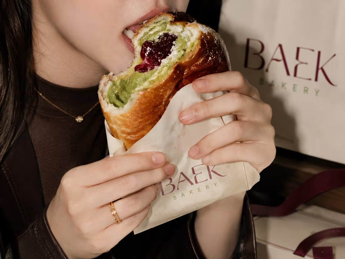
BAEK Bakery | Café Brand Identity & Packaging
1
18
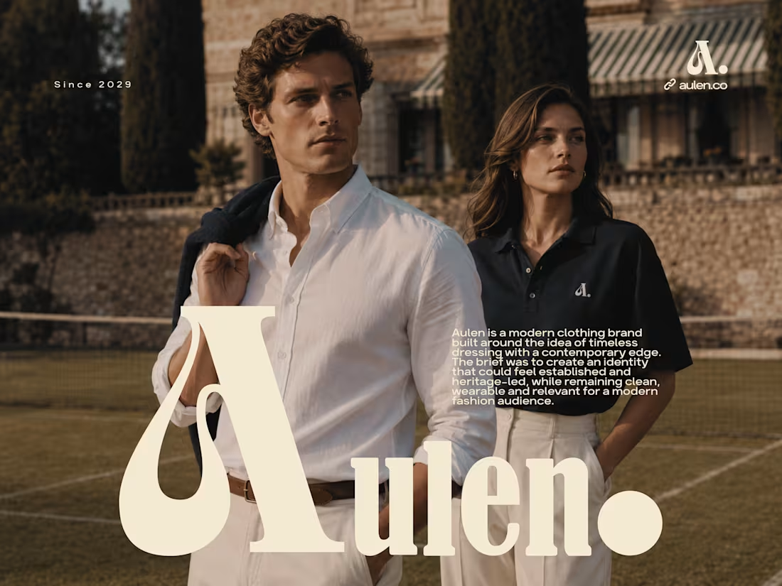
Aulen | Clothing Brand Identity & Logo Design
0
19